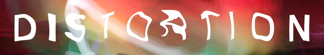
POSSIBLE IDEAS
The Links between photography/art and music, the way it effects the connotations of the pictures
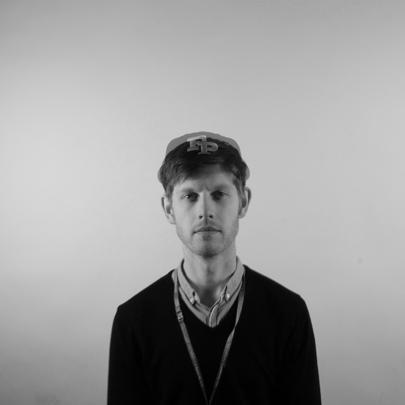
Sean Bloodworth
Erosie
LOOK AT DISTORTING IMAGES, digital editing
John Stezaker
Fabriclive covers for Commix, A-Trak, Switch & Sindendryden goodwin
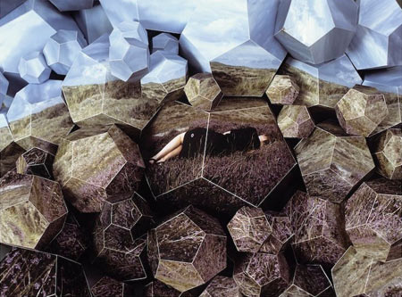
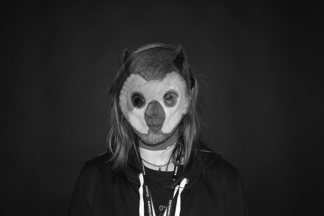
Szymon roginski
Paul Smith Photography
Sean Bloodworth
Erosie
LOOK AT DISTORTING IMAGES, digital editing
John Stezaker
Fabriclive covers for Commix, A-Trak, Switch & Sindendryden goodwin
Szymon roginski
Paul Smith Photography
Possible Techniques
Project Plan
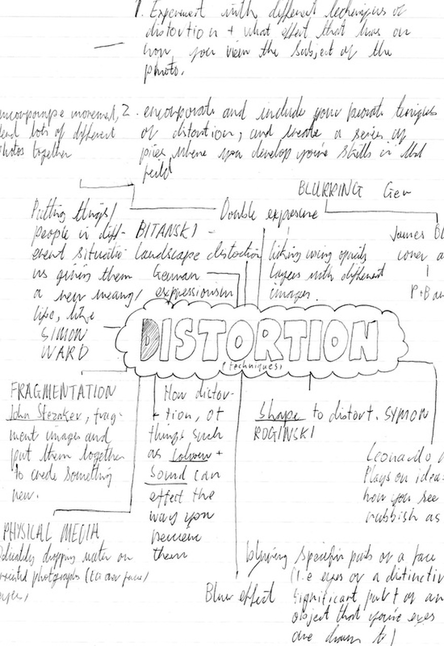
EXPEREMENT WITH A VARIETY OF DIFFERENT TECHNIQUES RELATING TO THE THEME OF DISTORTION AND IT'S EFFECTS
-
PICK WHICH TECHNIQUES WORK MOST EFFECTIVELY, WHICH ELEMENTS OF THEM YOU WOULD KEEP AND WHICH YOU WOULD'NT
-
DEVELOP THESE TECHNIQUES FURTHER
-
CONDUCT MORE EXEPER
-
PICK WHICH TECHNIQUES WORK MOST EFFECTIVELY, WHICH ELEMENTS OF THEM YOU WOULD KEEP AND WHICH YOU WOULD'NT
-
DEVELOP THESE TECHNIQUES FURTHER
-
CONDUCT MORE EXEPER
Digital/Manual Manipulation
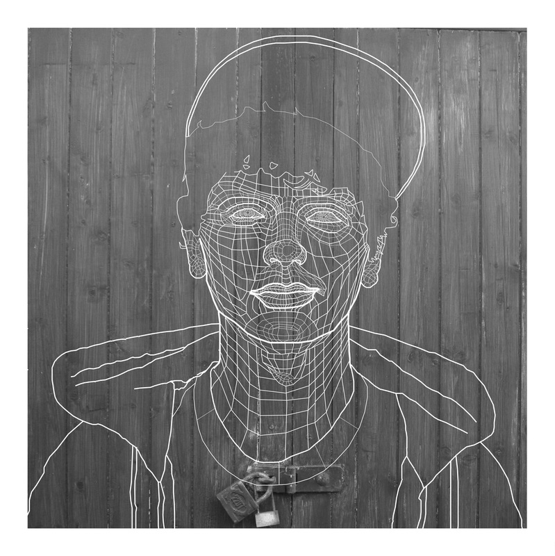
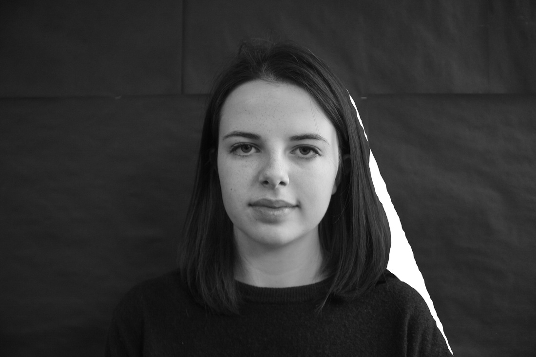
When a 'standard' photo is taken of someone, you get an impression of the photographers interpretation of that person, or the photographer themself, but only to an extent, no matter what the background is, how different the lighting is or what camera settings they use, this is the same person, that is always constant. I figured if i had the ability to digitally manipulate a photo as well as being able to draw in other elements to it, I have the the ability to completly change how you see the subject of the photo, using the reality as an inspiration instead of being restricted to it.
Distorting an altering images is an action which can involve an almost infinite number of seperate techniques all with the option to explore expand and develop.
In this project I intend to start by experimenting with a variety of different techniques of distortion; I will then evaluate them based on how visually impressive I find them and how they comply with my intended effect of distortion which is to take one original image and distort the way you view that image through that distortion, do this I intend to take one image and bombine it with others, and making it so that insted of seeing a series of indervidual images you create a whole new image and percieve it in a different way.
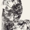
Szymon Roginski
They is sparse personal information about Szyom Roginski but his work himself inspires me, especially his use of distortion and fragmentation in these pieces. This method of creating small indervidual objects/images and using them to create one whole image is one I would certanally like to explore in my project.

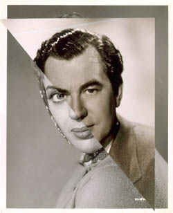
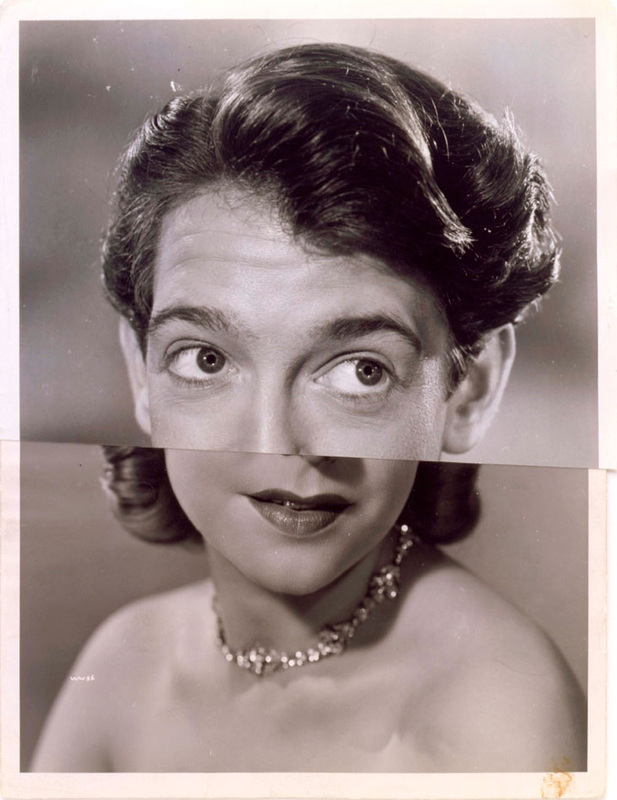
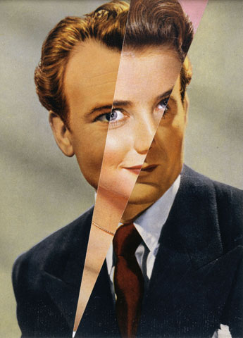
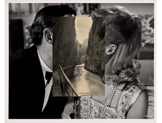
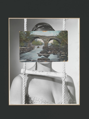
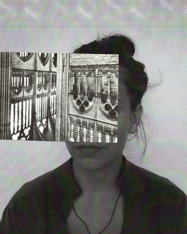
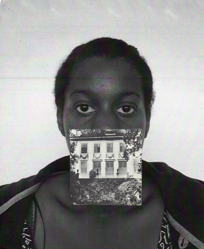
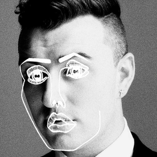
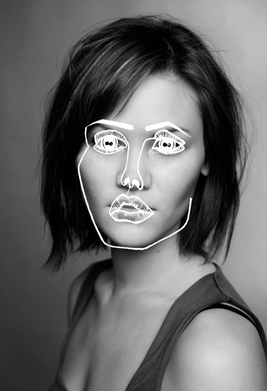
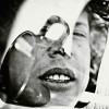
John Stezaker
These Works if Steazaker are from his 'marrage' series based oublicity shots of famouis movie stars creating as he puts it 'hybrid' film stars.
Personally, Stezaker's work inspires me for the same reason that Brick Stowell's work does, its simple and distinct, recidnisable. It's simplicity makes it feel accessible, and this in tern makes it seem fun. By this I mean that the simplicity makes it seem as though anyone can create a piece that looks like a John Stezaker piece, lending to the notion that the merit for his work is based more in experimentation and creativity as opposed to dilligence and precision hinting at the sense that his work is original and playful, almost cheeky. This critique is pointed mainly towards the first thee images that play with how you see the subjects' eyes as the other six would have taken considerably more attention to details and preportions when combining different faces, or faces with places.
My theme is exploring distortion and how these visual changes to a photo distorts your opinion of the subject as viewer. It is a theme I think Stezaker is interested to explore as well as the way he distorts portraits completely turn your perception of how you see the subject on it's head particually in the last 6 pictures provided. For example, when you see the picture (3 right, 1 down) you can place your hand over the man's face so you can see only the womans and then you realise your perception of her is considerably different, this may sound tediously obivious but what i mean is that he combies the images in such a way that you don't see two seperate people placed next to each other but one interly new person, to coin his phrase.. a 'hybrid' celebrity. I intend to explore this effect with experimentin with how my manipulation and distortion of images effects how the viewer see's the subject proir and after this distortion.


Response Pieces


Brick Stowell
Brick Stowell is the creative director for the famously crudley publicised, US Hip-Hop group, Odd Future; He produces everything from T-shirts, to CD covers to promotiona artwork. He focuses of capturing ethos of contravesy surrounding the band by creating artwork that brushes off as slightly disturbing and unsettling but why does it inspire me? That creapy aspect i find refreshing; most art i come across to be sucessful and most od my art infact is supposed to be detailed and beatiful, visually pleasing, but this is ugly and unsettling. Personally I think this is a considerably under-rated contrabuting factor in Odd Futures appeal through the notion of being edgy, uncompremised and rebelious.
The second reason I find his work inspiring is the way it comes across as being easy, simple, spontainious. This makes it come across and seeing frech and somehow accessable like anybody could go on photoshop
The second reason I find his work inspiring is the way it comes across as being easy, simple, spontainious. This makes it come across and seeing frech and somehow accessable like anybody could go on photoshop


Ben Stowell appears 1:31 Minutes in breifly explaing how breif the process from idea to reality the odd future t-shirts.
Experimentation using Photoshop
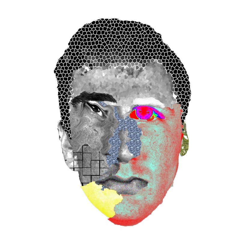
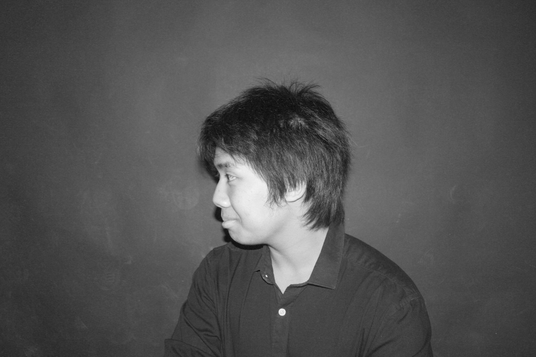
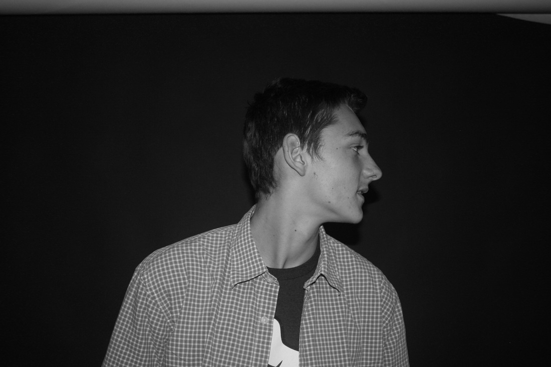
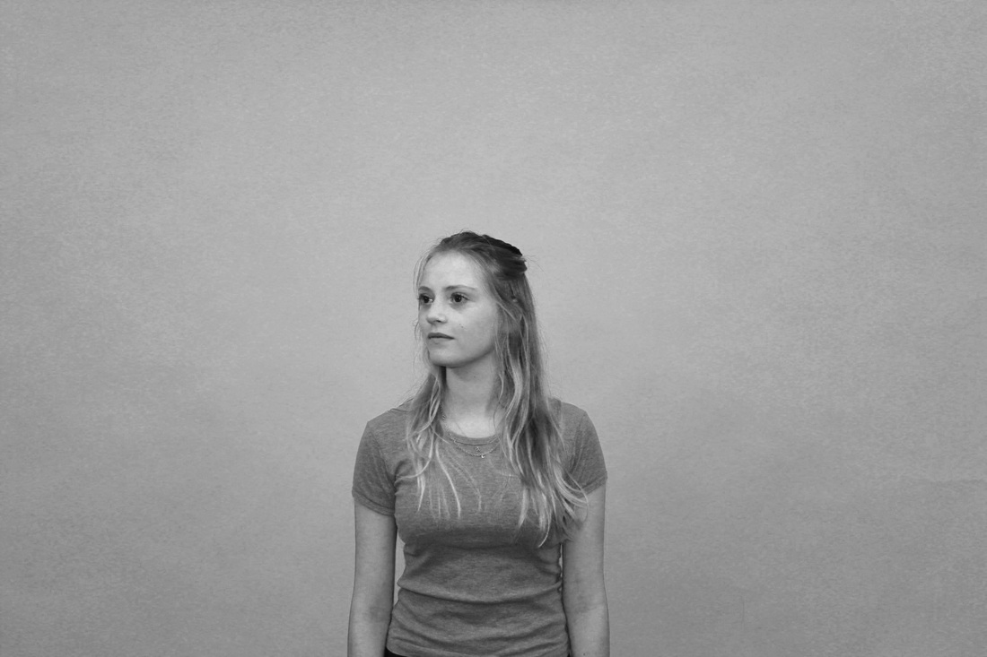
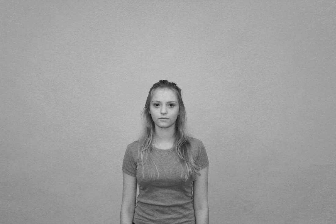
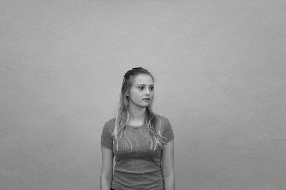
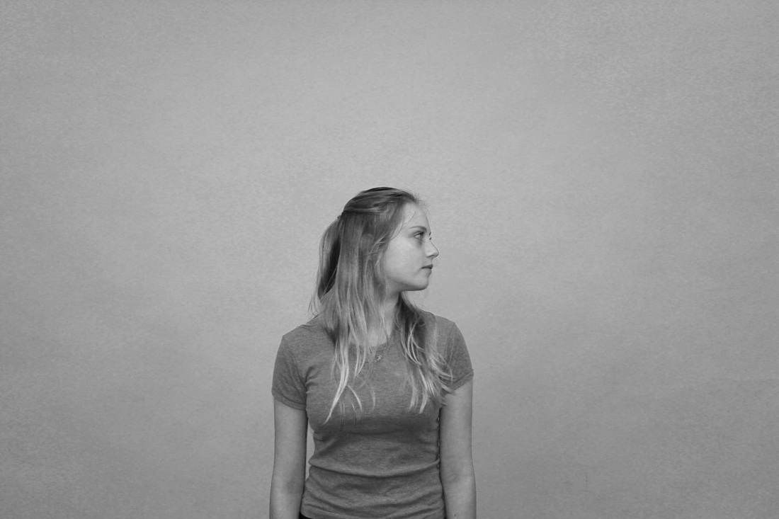
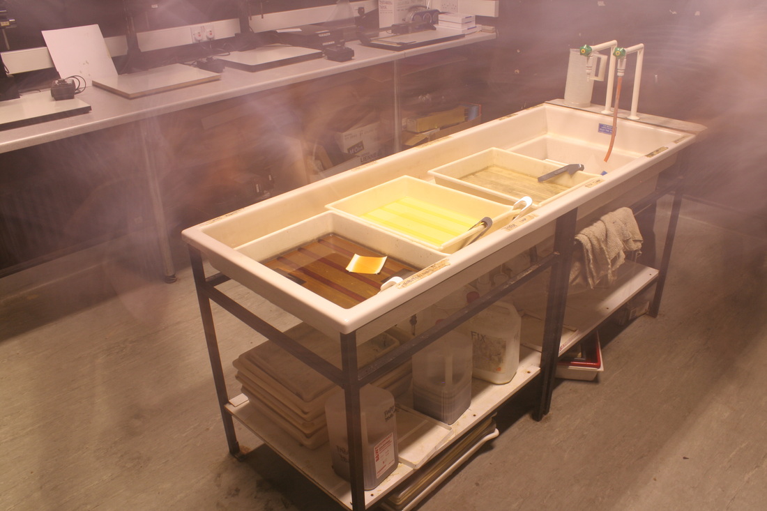
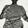
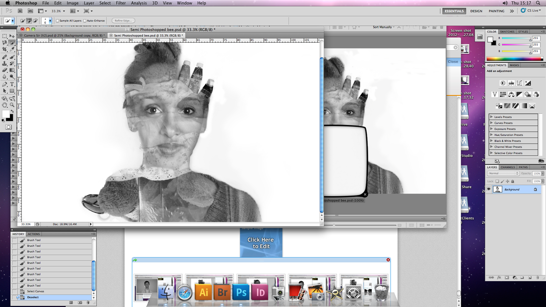
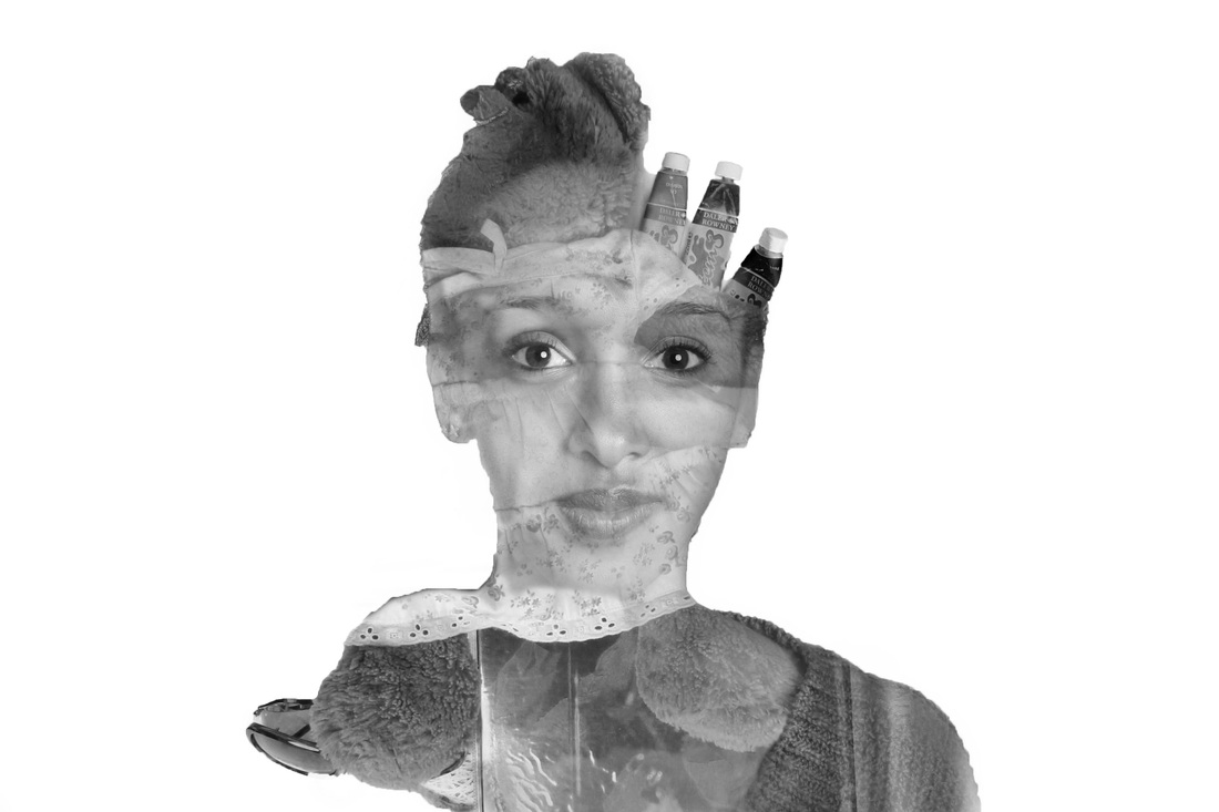
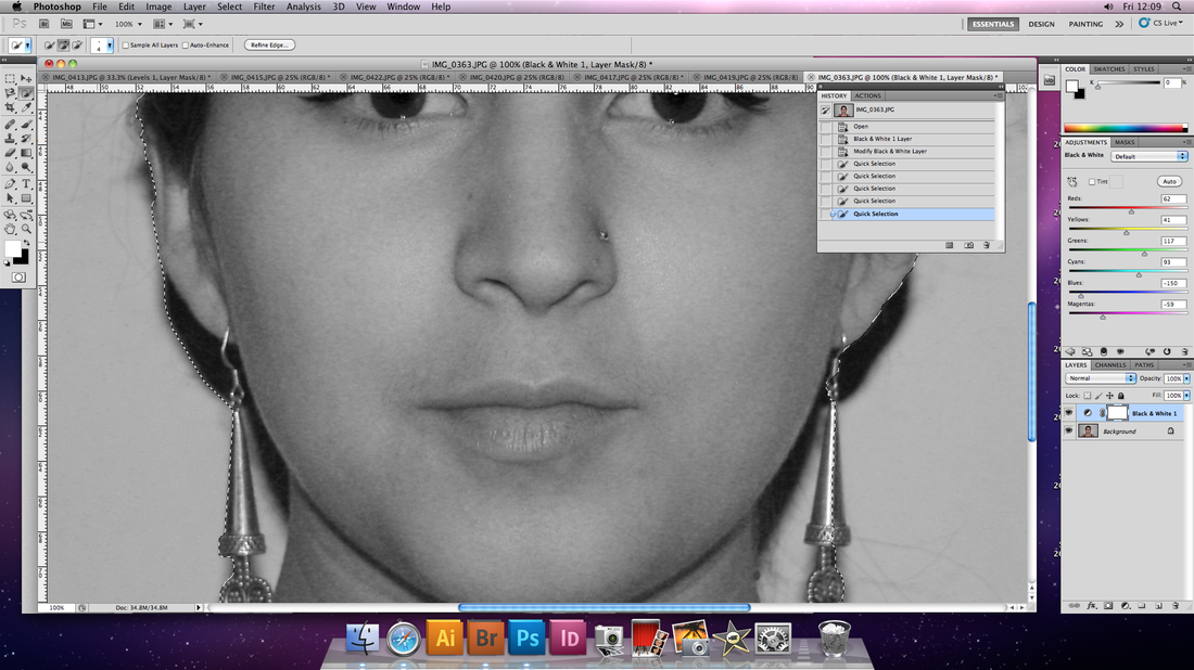
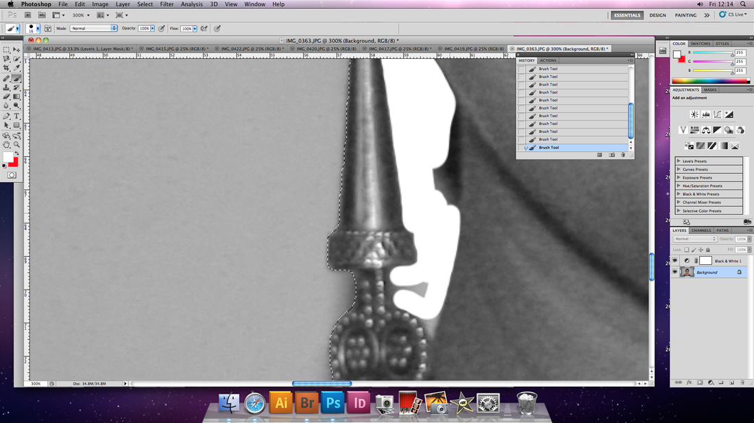
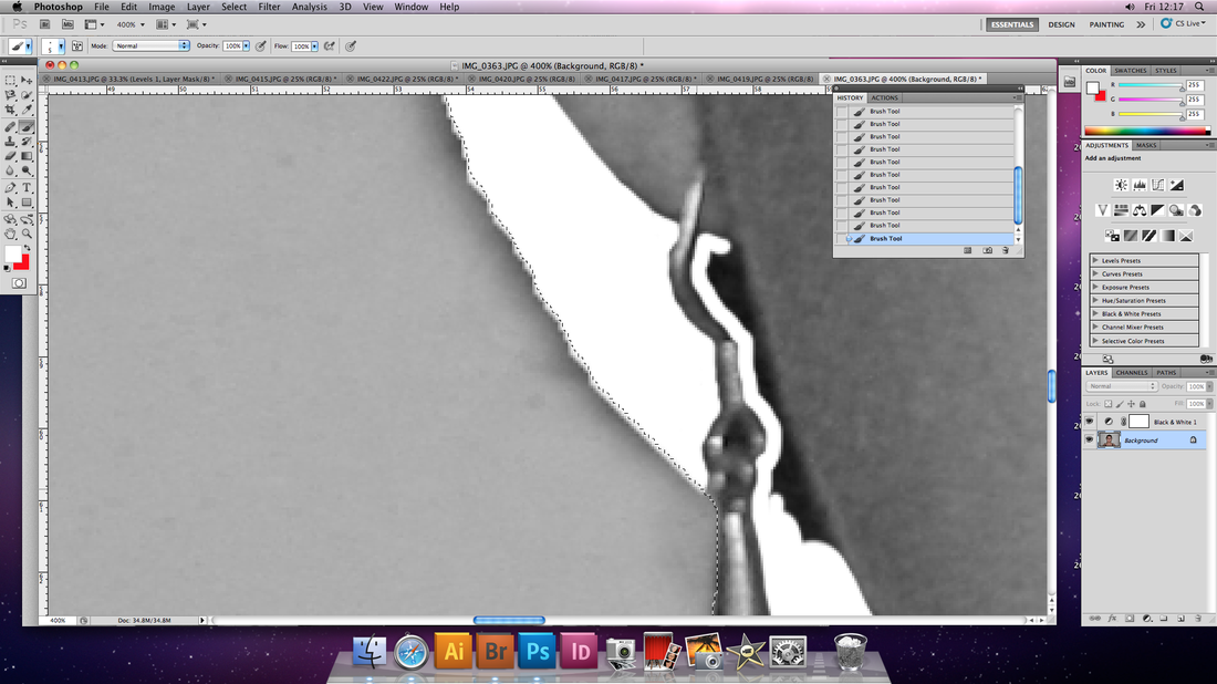
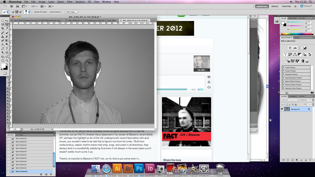
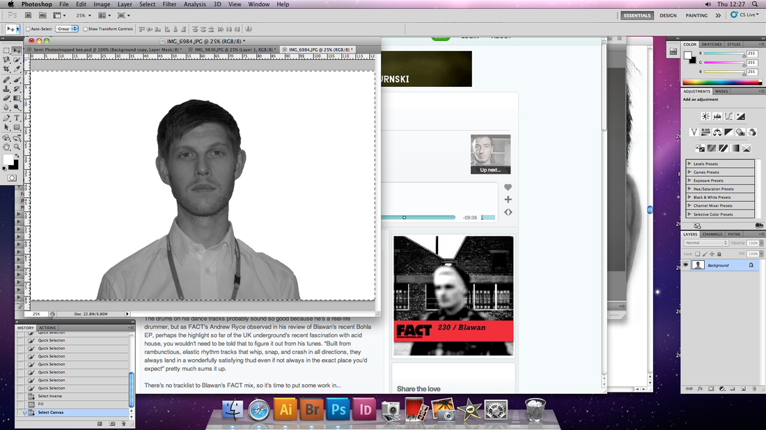
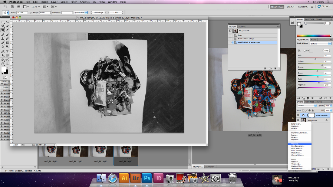
In these initial stages of my project I figured it would be important to experiment with both digital and physical methods of distortion, in this case, digital. The point of this picce was a way of being able to experiment with every possible direct photoshop-based method of distortion available to me, not only to find out if they was any techniques I would like to expand upon in future, but also to see how they would work in combination. It covers most areas of direct digital distortion, from the more extreme distortion of shape, to more subtle colour variations. I acheived this piece by selecting a series of different sections of my face using the quick selection tool, isolating them by dragging-and-dropping them into a separate window, distorting them with an effect and then gradually building the image back together with these indervidual distorted segments.
WRITE ABOUT THIS
Distortion using lighting

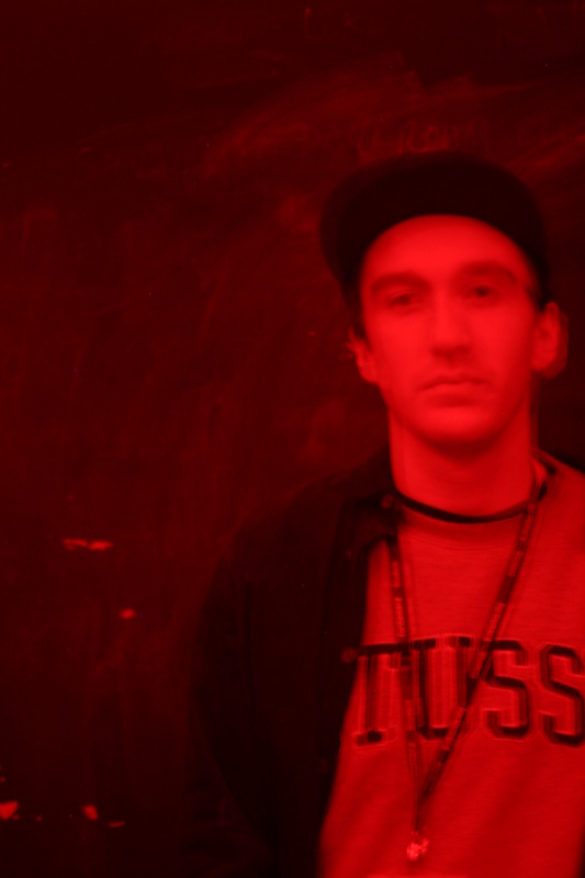
The aim of thse photos was to experiment with how different light settings effect the way in image is perceived.
Photo(s) #1 & 2- Using slow shutter speed in room lit with a red light.
Photo #3 & #4 - Using a shutter speed of 4 seconds , taking a photo on the subject in yellow light and then before the shutter re-opened replacing that yellow light with the red light demonstrated in the first two photographs.
Photo(s) #1 & 2- Using slow shutter speed in room lit with a red light.
Photo #3 & #4 - Using a shutter speed of 4 seconds , taking a photo on the subject in yellow light and then before the shutter re-opened replacing that yellow light with the red light demonstrated in the first two photographs.
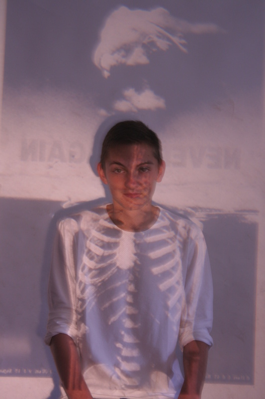
'Hudson Mohwake' - Projected publicity photos
WHITE ABOUT THIS

Distortion through drawing onto images
Disclosure cover Art
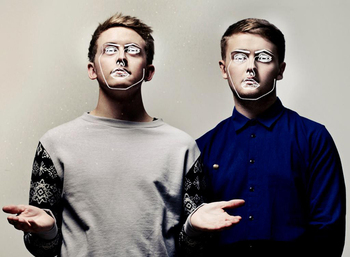
Disclosure are a Producer/DJ duo from London. In a recent interview for 'yetiinthebassment.com' they spoke about their musical background and how that helped them be more confident exepermenting and making their own sound as a result. Suspite being brothers from the same family, they both had very different tastes in music growing up. The older brother, Guy (left) grew up listening to a lot of Hip-Hop where-as the younger, Howard, (slightly embarraced) says he was listened mainly to 80's Pop.
Disclose are recent leading lights in the revamping of house and bass music here in the UK, but why does their art inspire me? The first reason is the reason most album art, graphic art or most art is successful, it is distinctive. Not just me but anyone who saw these original pieces on this weebly page, and then saw another photo of anyone with a white line over their jawline, eyes and mouth, you would think of disclosure, which is a brilliant tactic when it comes to getting your name out there and is probably one of the reasons they have become so successful so quickly. I think the relationship between art and music is very important; I personally think peoples taste in music is not a resut of some random abstract appreciation for sound, but the assosiations they have with that music, and the relationship between what art I, or you find inspiring and please with what music you or I like is no exception. Most songs I like I can associate them with a positive experience/feeling, and possibly if that association wasnt there I wouldn't appreciate that song as much... or at all. For example, it might be the way you here it in a mix, the mood your in when you hear it, the location, maybe and experience, time period, person it reminds you of, they is honestly an infinite amount of association variables that can contribute to your opinion of a song when you hear it. As I mentioned; the art you associate with that music is no exception to this notion. I honestly believe that if the only time I saw the artwork for Disclosure was say, on a billboard off the motorway as an advert some.... face-cream for example, then it wouldn't have anywhere near the name positive impression on me, all I have to assiate it with is face-cream.... And I'm not particually passionate/facinated by face-cream.
Disclousure's artwork relates to my theme of the meeting of reality and the surreal by taking two depictions of the same subject through two considerably different medias and combining them in the same image. In this case It's the media of photography and mouse-drawn computer design, something i intend to create in my project.


In light of this specific experimentation, I have decided that I will not be expanding this technique in my project. This is becuase, although I am pleasued with the results in a visual sense, I don't think it conveys the theme of distortion clearly enough, the more refined pieces on the right side, aim to replicate the original images insted of distort them. In addition, the changes I have made to the images don't really blend into the original smoothly enough, it the lines our too bold. In future I would look at technques involving other photographs insted of just drawing onto them.
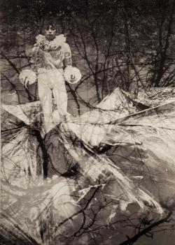
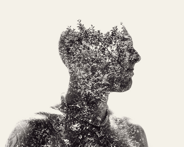
Idris Khan
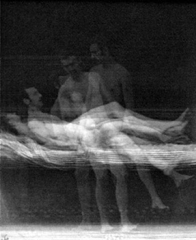
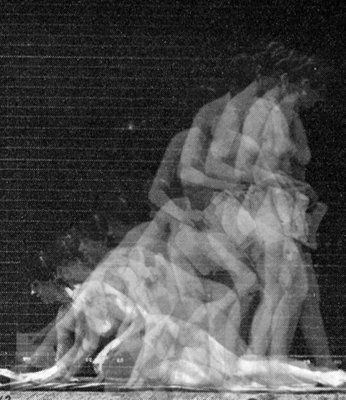
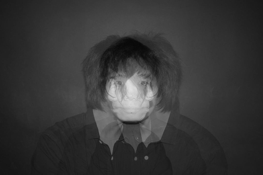
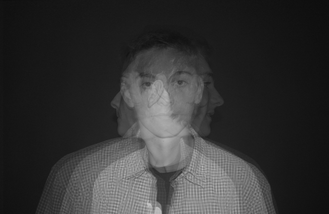
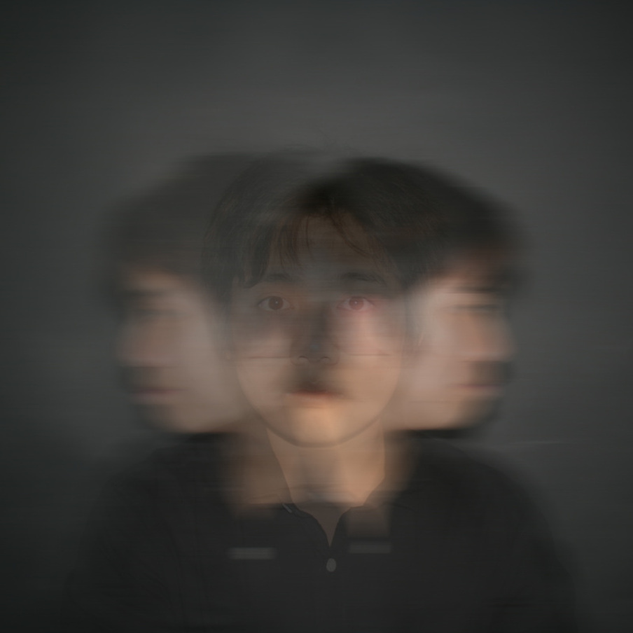
This want to distort photos using others lead me to the work of 35 year old Birmingham based artist/photographer Idris Khan; His photography introduced me to the idea of double exposure as a technique of distortion. This is due to the fact i believed it to be an effective way of, not only distorting the over-all shape of the subject, but also the over-all impression you recieved of that subject, a running theme in this project so far. In addition, it interests me how his work often manages to achieve the effect of motion using just a series of still images, which, potentially, could be still, this is a technique I also intend to explore this effect.


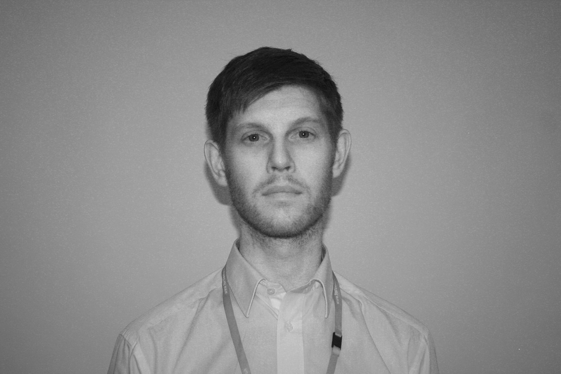
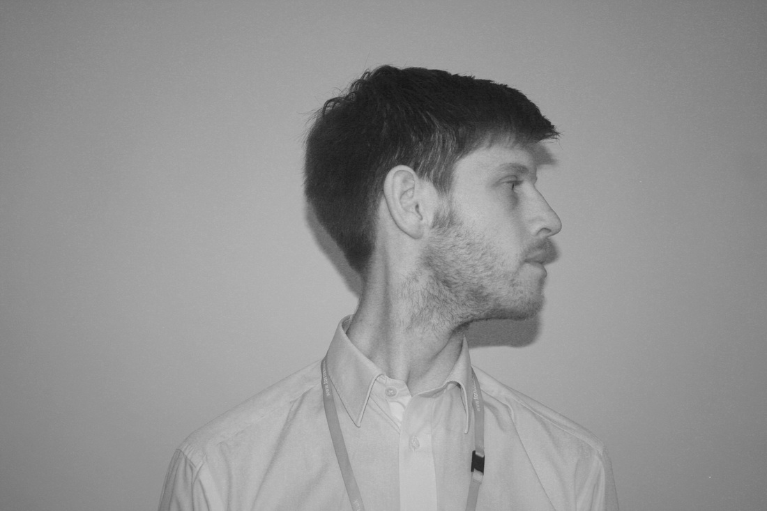
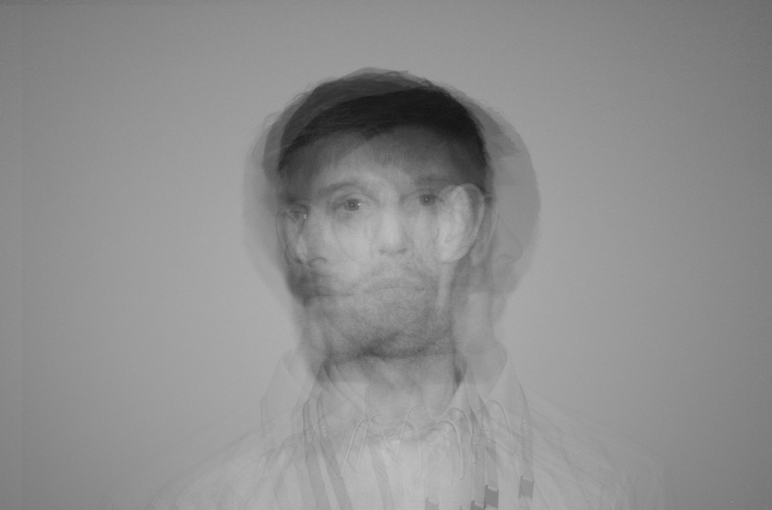
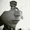
James Blake - Debut Album Cover
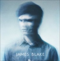
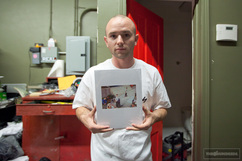
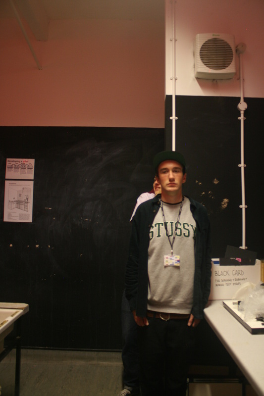
James Blake is a producer and DJ from East London. The his debut album simply titled 'James Blake' was partly responsible for me being inspired to experement with distortion through means of using multaple exposure pictures. The actual cover was created by James Blake himself and the picture was taken by Sean Bloodworth (see year 12 portraiture section for more information), using a film camera with a blue filter over it, when being created each would be projected over the other until they fitted together (roughly), under the saftey of a light filter, then would be impsed on the original image.
This piece fits in not only with my theme but what that theme is trying to achieve; It does achieves a similar effect to the work of John Stezaker and Iris Khan by taking a selection of original photos and combining them to distort the image into something new. This means that when you look at the finial product you don't see the combination of two seperate images, you see a whole new image you have created through that medium, the way you percieve the original is distorted.
This piece fits in not only with my theme but what that theme is trying to achieve; It does achieves a similar effect to the work of John Stezaker and Iris Khan by taking a selection of original photos and combining them to distort the image into something new. This means that when you look at the finial product you don't see the combination of two seperate images, you see a whole new image you have created through that medium, the way you percieve the original is distorted.
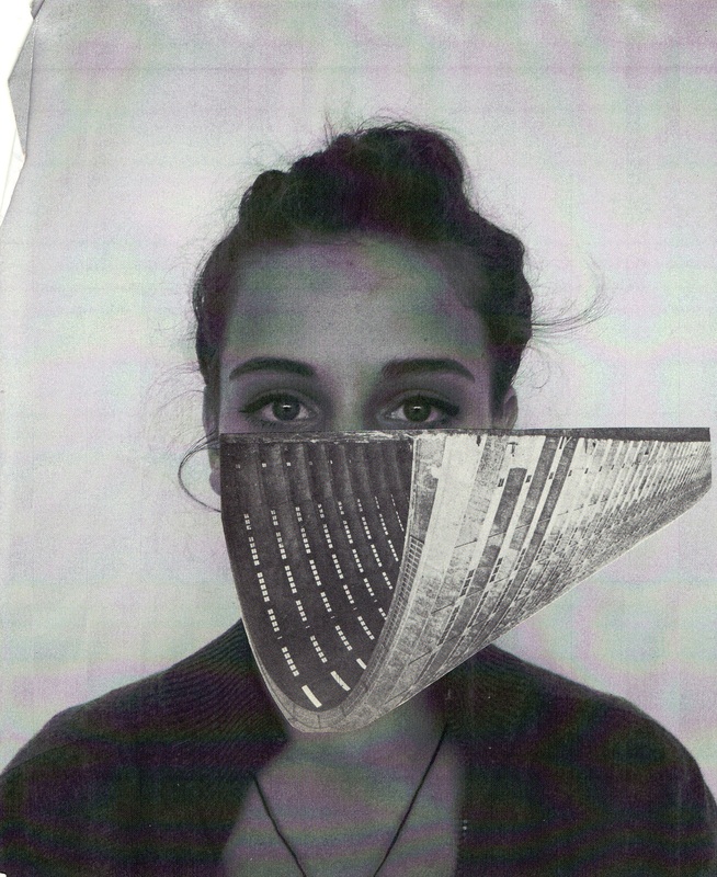
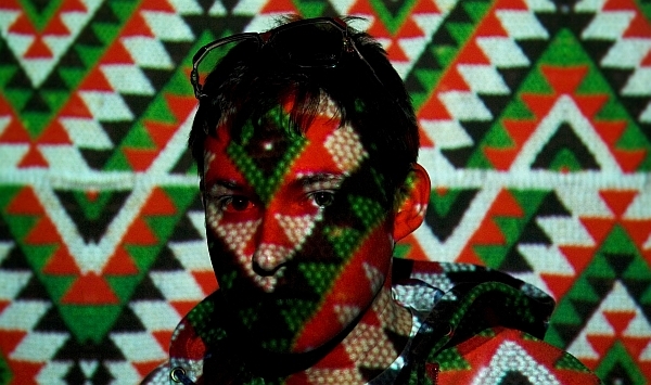
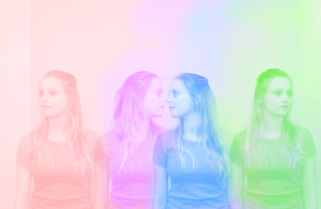
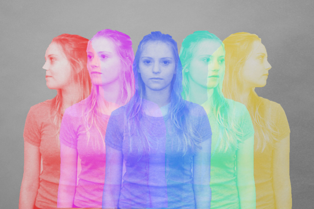
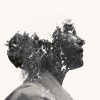
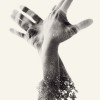
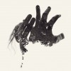
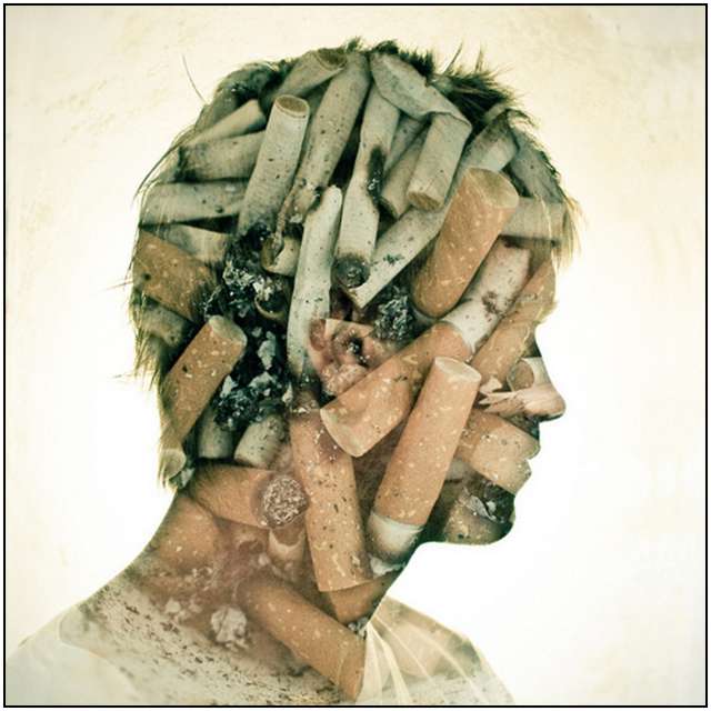
Multable/Double Exposure
I intend to explore the way in which people/objects are percieved when they are imposed on other images, this form of distortion involves splittting a series of images up where you can choose to see the whole picture as a created hybrid of thses congoined images or the indervidual images for what they are selectivly much like Stezaker's work. For example in this photo i took using a manual film camera, you can choose to group the images together or to see them indervidually.
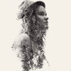
The photos below are created using a similar effect. Each end product will be compiled of each of the photos of the same person from different angles layered over each other. The photo at the bottom on 100% opacity and the ones above with the opacity lowered to the degree that gives the best over-all effect. These indervidual photos were shot using a non-flash setting on with a shutter-speed of 400 under studio lighting.


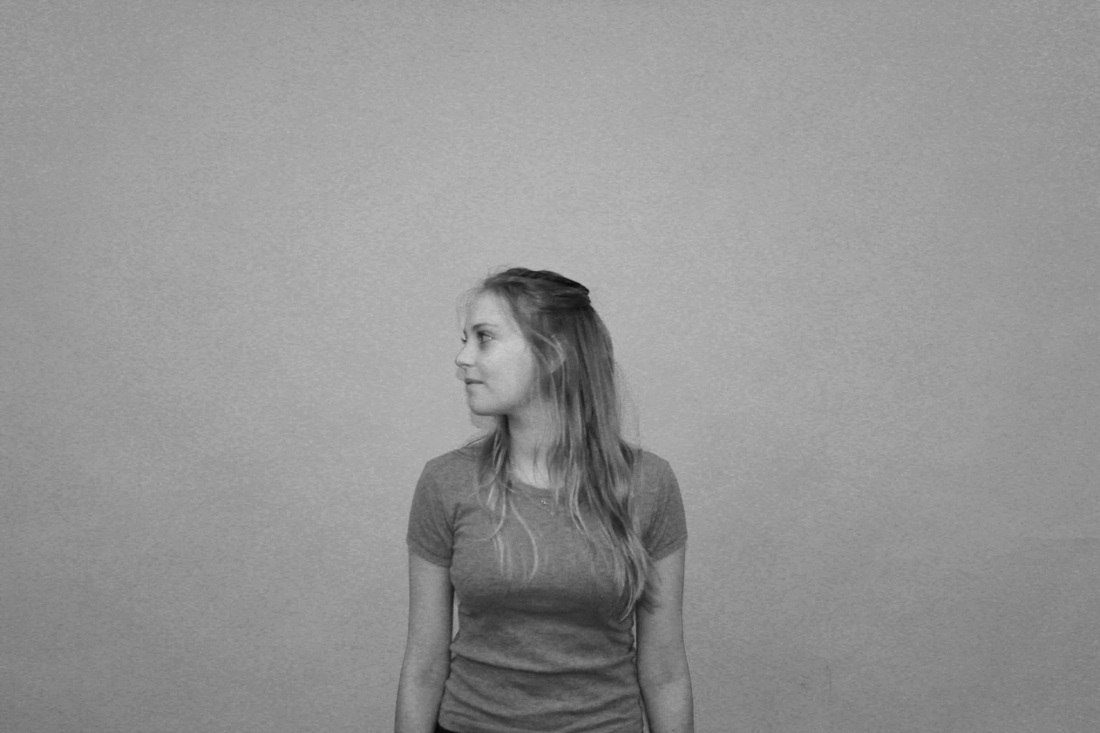
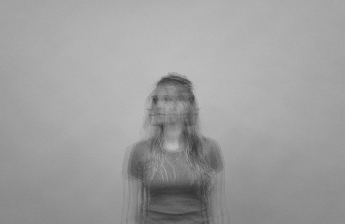
Each picture demonstrates the distortion of the subject through seeing all the different angles they are to them, this notion lends itself to distortion of personality. I thought of ways I could experiment with this technique using slightly different methods, as shown below:
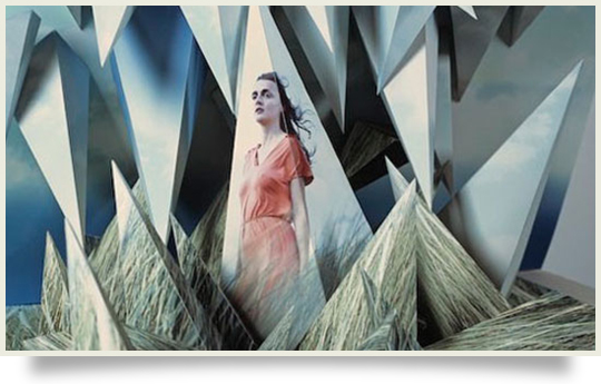
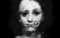
Flying Lotus, 'Until the Quiet Comes' - Album Cover
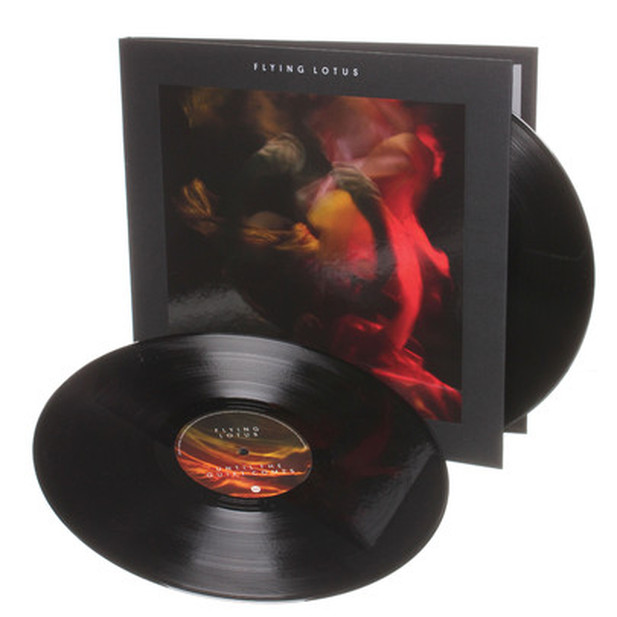
'Util the Quiet comes' is the long-anticipated third album from L.A based Trip-Hop, Electronic producer 'Flying Lotus'. Released in October last year, the cover features a picture of someone drowning after being shot in a swimming pool and is the inspiration for the forthcoming experimentation with my current double exposure, distortion portraits. Why? I was interested y how the use of colour gave an visually interesting, artistic edge on the initial eary effect of the photo and the issues it portrays, thinking it would be a perfect to experiment with colour so I could know if it was an aspect I wanted to employ in future work. The picture itself is a still from the short film made to ocumpony the release of the album, also titled 'Until the Quiet Comes', directed by Kahlil Joseph and .O.F.T.B. Presenting a surrealist take on an issue all too real for some, gun crime, with in it's direct and indirect effects to around it, you can see the view itself in the link below.
EXPERIMENTATION - Colour Distortion
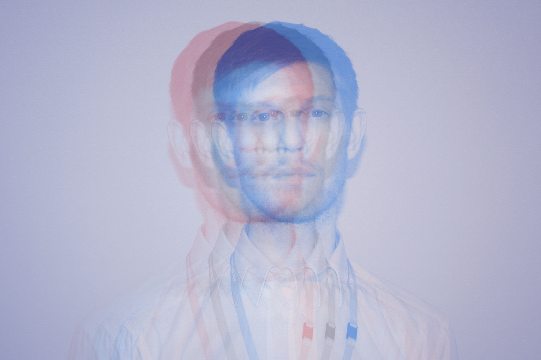
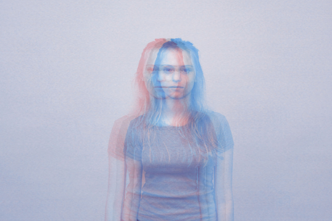

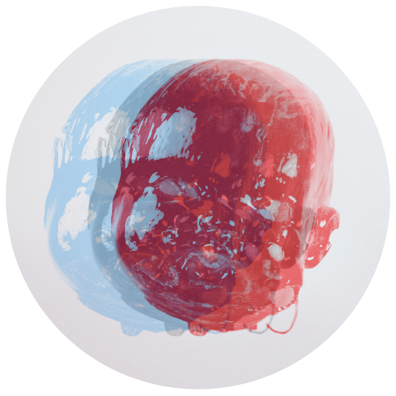
I wasnt particually pleased with the result of this experiment especially the latter state of the four colour pieces; They if I developed this idea further, the colours would have to be more subtle, I liked the way in the Flying Lotus cover 'Until the Quiet Comes' (see above) seperate images blend into each other, working in neatly with the effect I wanted to achieve from the theme of distortion, taking a variety of images and distorting it to change the way you see it and make something new, whereas with these pieces you just see a selection of indervidual images without (what i think to be) truly distorting the original image and how you percieve the subject of the original image.
EXPERIMENTATION: Distortion through Blur


I found this technique of layering the original image over a motion blurred version of it to be unsucessful. The pictures look too saturated using the effect and it doesn't really link into the ida of distortion of personality or identity like the previous selection did above, subsequently, this technique will not be featuring in any of my future development in this project.
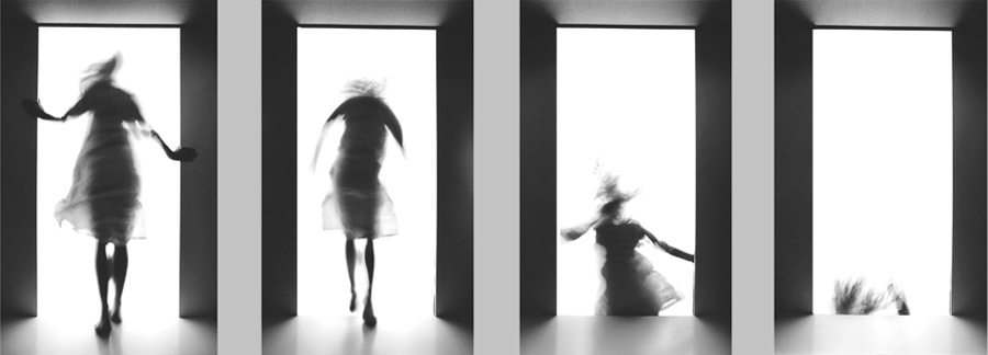
Laurence Demaison
The idea to experiment with the technqiue of double exposure was inspired originally by the work of Laurence Demaison, specifically, 'Saute d'humeur', a pice featuring four seperate images conveying seperate stages of movement sequentially. I was inspired by the way this simple technqiue distorted the natural shape and appearane of the subject so effectivly and expressivly. The work also had a slightly un-nerving feel to it which interested me as this is a common effect and significance of, what i believe to be, distortion's role in photography.
EXPERIMENTATION: DISTORTION OF IDENTITY: Objects

IDEAS:
When layering photos over each other, apply the 'blur' tool on photoshop, this, in turn, will help enforce the idea of one version of yourself remaining a constant while other material things such as fashion and possions distort that.
IDENTITY
Through exploring my starting point of distortion, I looked not only at how to distort the appearance of an image and what affet that had, but also what is destorted and how. Throug my research I came to the conclusion that distortion can accure 'naturally' when the subject of that change isn't just visual. From this point i delved into how concepts could also be distorted through visual or physical means, by this I am refering to how people's identitys to do with how and hwo they are can be distorted by the world around them and how, in turn, they can hone their identity in on superficial things.
http://www.exactitudes.com/index.php?/expo/all/
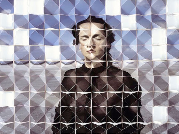
David Noonan
The inspiration from David Noonan's work is visual level rather than a conceptual one, I admire the way, much like the other artists i have researched in this topic, he uses two separate images, merging the impressions they give you individuality, fused to create something new.
This corresponds to my projects development into the exploration of identity, how we percieve others, and how this can be distorted or even possibly enhanced through the technique of double exposure.
This corresponds to my projects development into the exploration of identity, how we percieve others, and how this can be distorted or even possibly enhanced through the technique of double exposure.

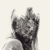
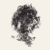
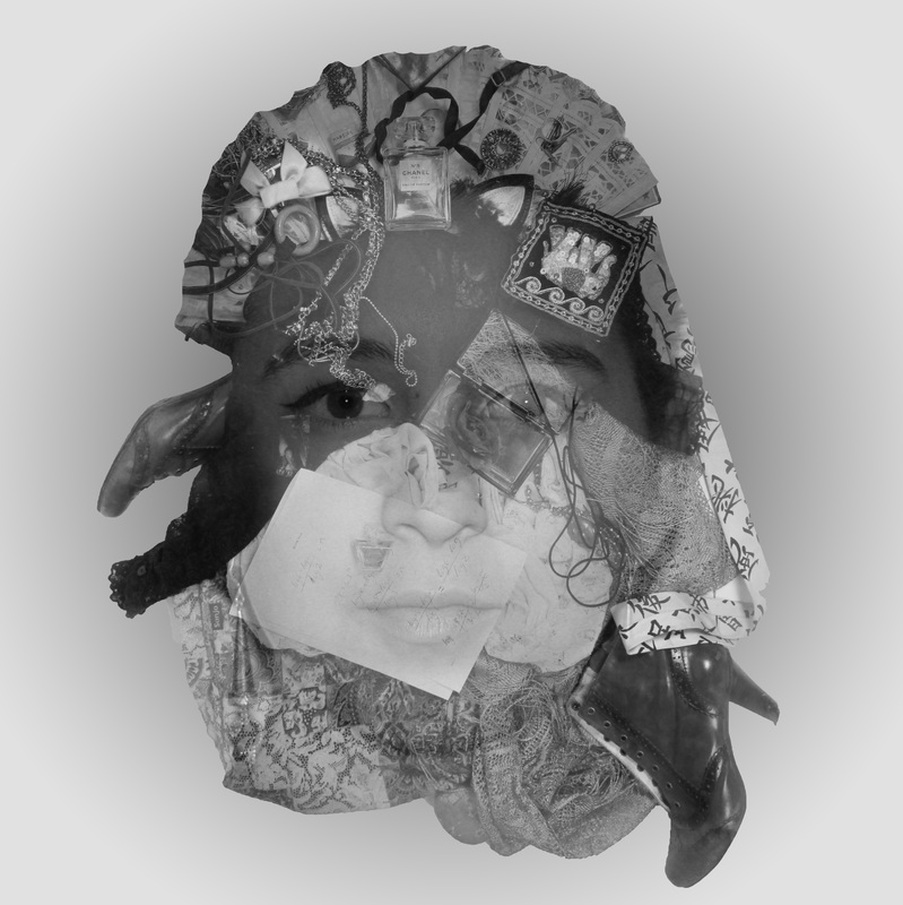
Objects and People: Does this Show their Identity or just Distort it?
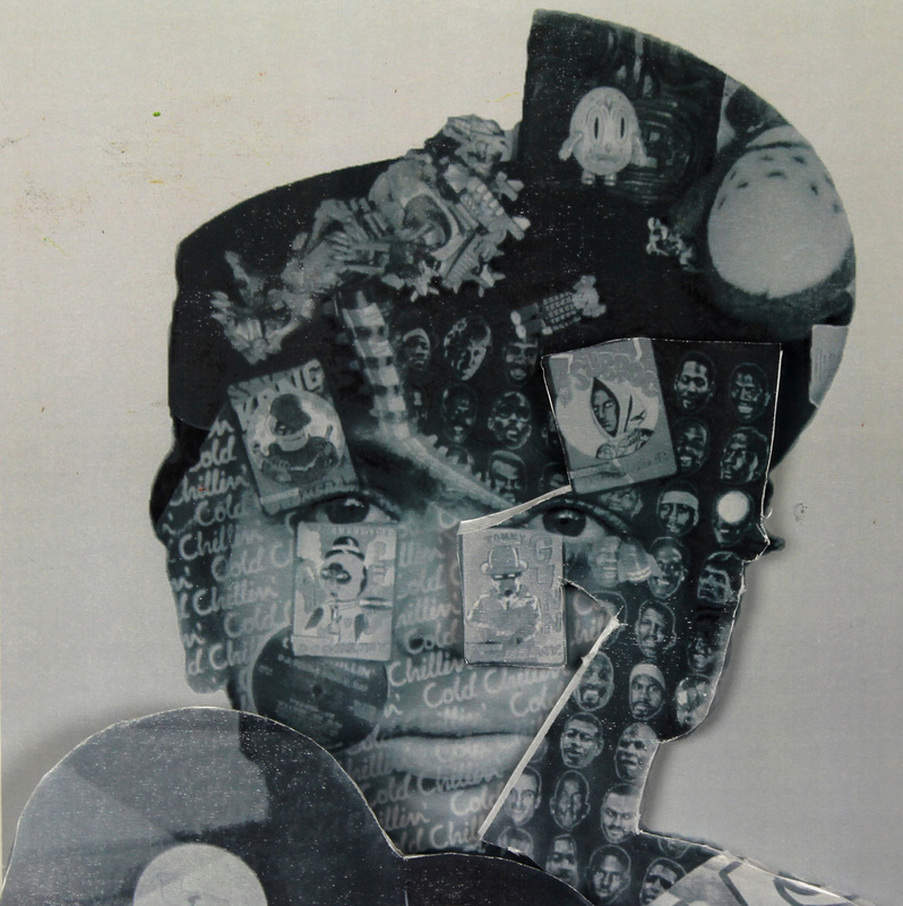
LEONCE RAPHAEL AGBODJÉLOU
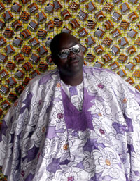
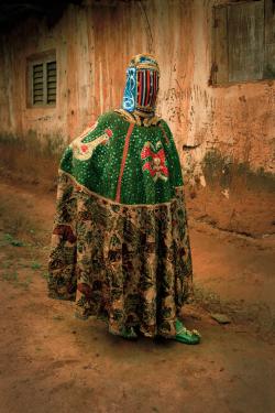
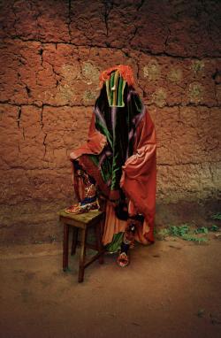
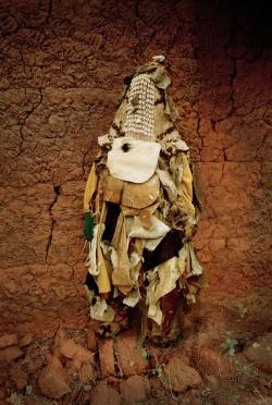
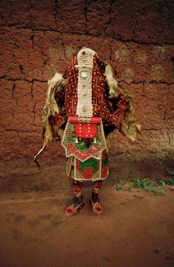
Conceptually, Leonce Raphael Agbodjelou is a key player in my inspiration for the following series of portraits made from objects. His work is relivannt becuase it descusses the issue of identity, whether material possessions distort it or embody it. The issue was encapsulated with his portaiture series at the Saachi Gallery as I descovered when I was a visitor in summer 2012 during the latter stage of my AS course.

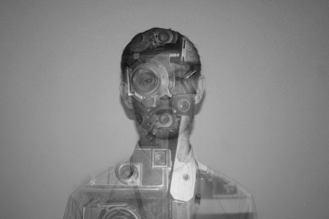

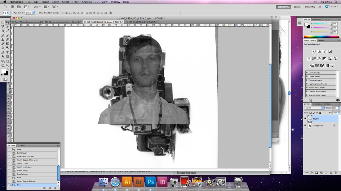
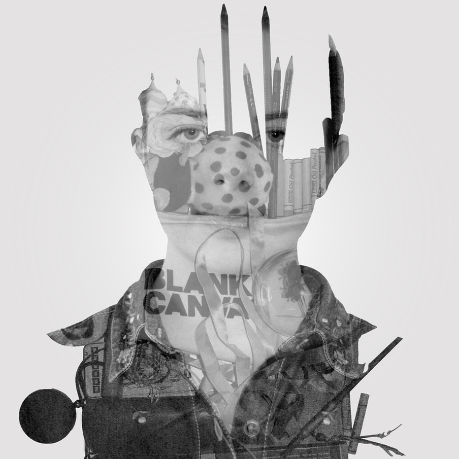
PORTRAITS MADE FROM OBJECTS - MULTAPLE EXPOSURE
http://www.dantobinsmith.com/#
http://www.mrianwright.co.uk/playlounge-toy-shop-trans-former
http://www.mrianwright.co.uk/playlounge-toy-shop-trans-former
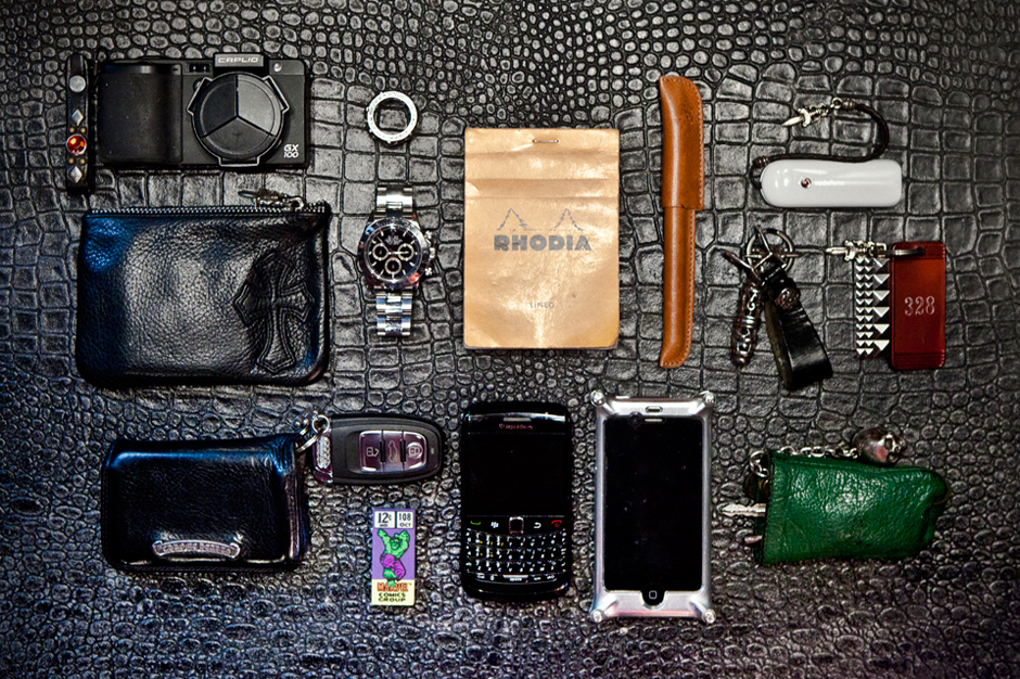
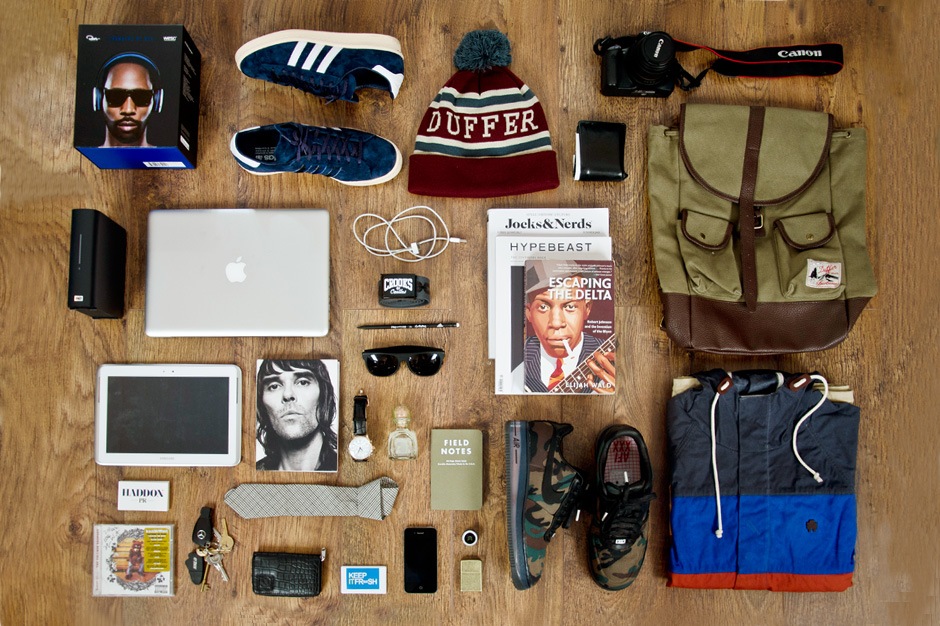
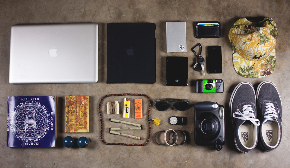
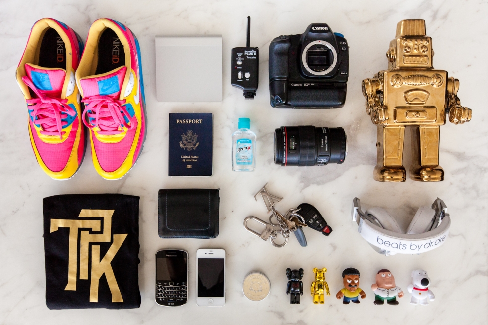
'Essentials' Series for Hypebeast Blog
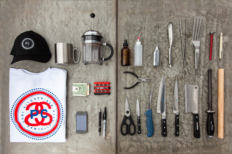

Christoffer Relander


Possibly shine a light behind the faces
IDEA - I could create portraits of people using objects they find express themselves, BUT insted of using the double exposure technqiue, i could build in the rest by using the line drawings I use for art...? I would be able to build up a lot of work as I'll be being them in both subjects, but at the same time i wouldnt just be doing the same thing. ALTHOUGH they would look pretty similar
The Process
As this is a technqiue I intend to develop and refine, I will explain the process for creating this one in it's entirity, and then annotate how this process changes and develops, why it changes and how succesful those changes are.
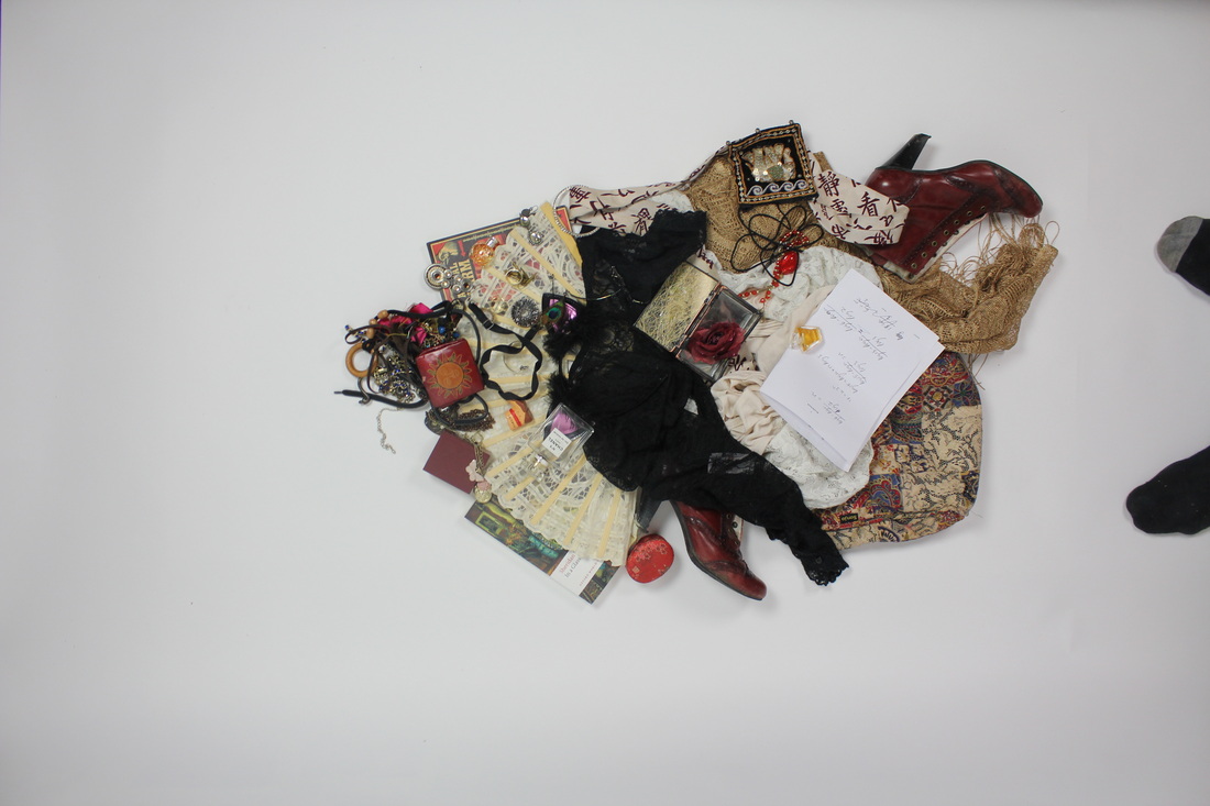
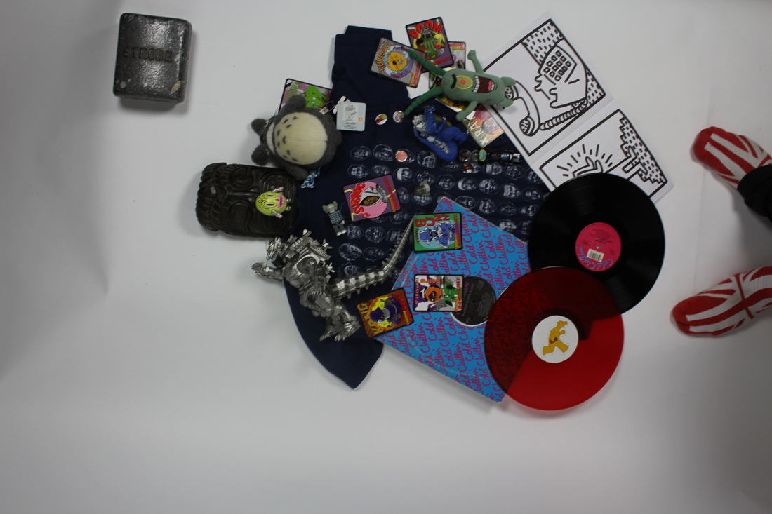
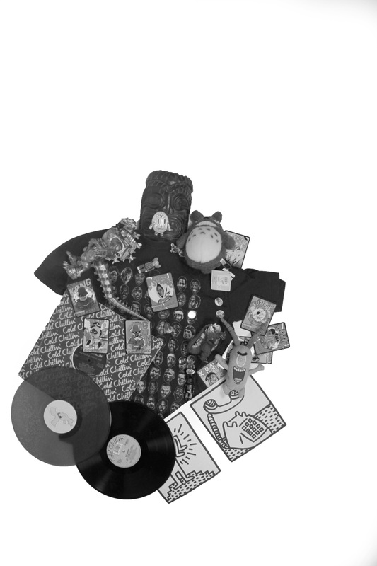
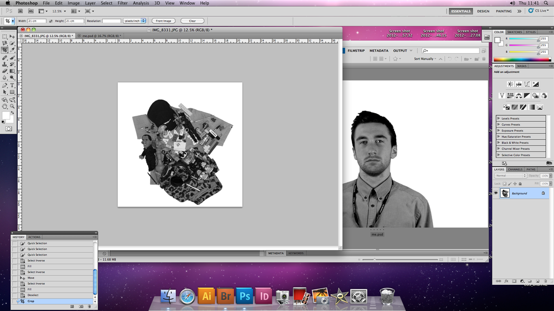
The process of production with this piece will be explained by this text and accompanied by images chronologically. First, I took a selection formally composed pictures of the subject in the studio, when I had chosen one, I went on to photograph their objects. Like the I did with the former, taking a selection oh photos and whittling them down to the most appropriate, judging them on even exposure, how exact the arial shot of them was, and if they were unwanted feflectios from the studio lights facing down it them from above, common problems for this were CD, magazine covers and the iPhone in the picture.
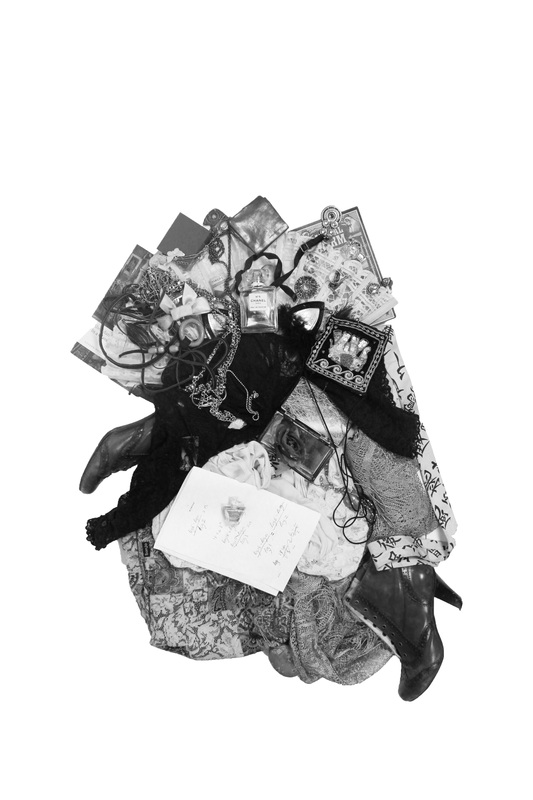
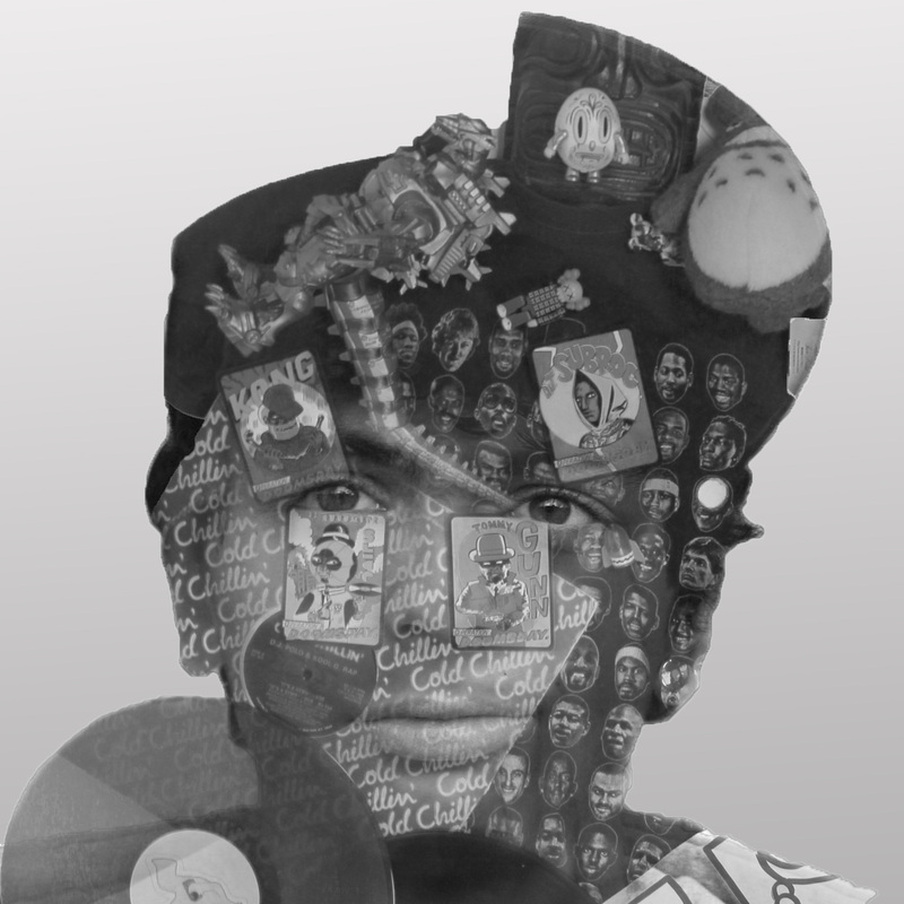
With the capturing and selction of the images complete, it was time for the digital miniplulation of them. In response to the images by Christoffer Relander I wanted for the two images I combined, eventually, to merge sophisticadly in the way that the shape of the merged image would be created by a combination of the two orginal outlines of the two photos and not just a picture of one cut into the shape of another. This is explained by the illustration bellow:
As this is a technqiue I intend to develop and refine, I will explain the process for creating this one in it's entirity, and then annotate how this process changes and develops, why it changes and how succesful those changes are.
The process of production with this piece will be explained by this text and accompanied by images chronologically. First, I took a selection formally composed pictures of the subject in the studio, when I had chosen one, I went on to photograph their objects. Like the I did with the former, taking a selection oh photos and whittling them down to the most appropriate, judging them on even exposure, how exact the arial shot of them was, and if they were unwanted feflectios from the studio lights facing down it them from above, common problems for this were CD, magazine covers and the iPhone in the picture.
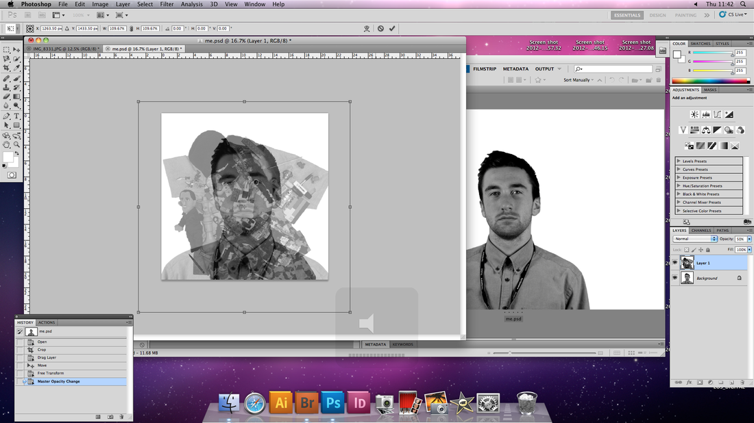
With the capturing and selction of the images complete, it was time for the digital miniplulation of them. In response to the images by Christoffer Relander I wanted for the two images I combined, eventually, to merge sophisticadly in the way that the shape of the merged image would be created by a combination of the two orginal outlines of the two photos and not just a picture of one cut into the shape of another. This is explained by the illustration bellow:

I would try to achieve this effect once I had familiarized myself with the former stage; imposing one image over another using double exposure. This was the goal for my first experiment, if this was sucessful, I would go on to made the technqiue more sophisticated like I mentioned.
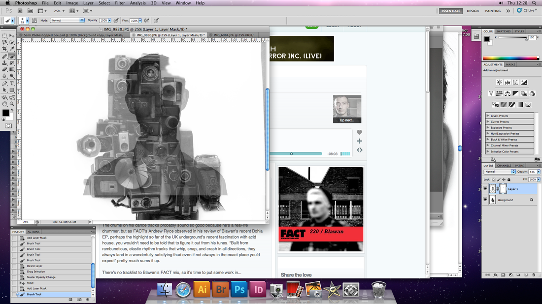
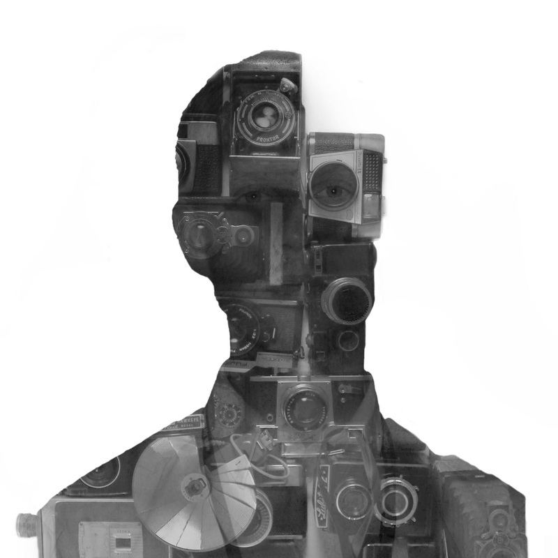
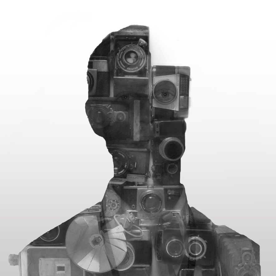
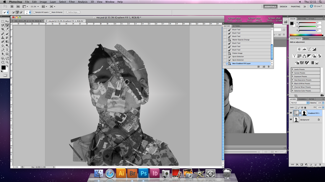
1. Caspar
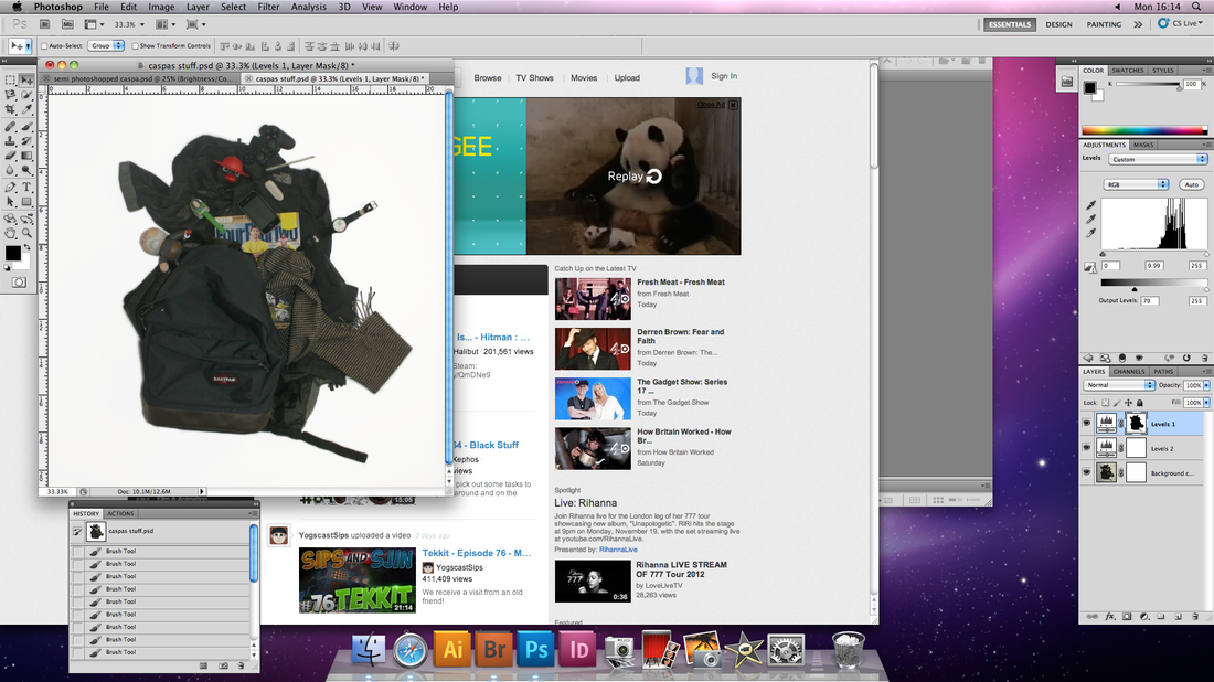

ADD CASPAR PICTURE
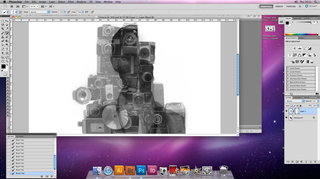
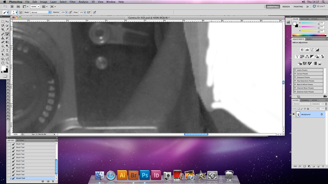
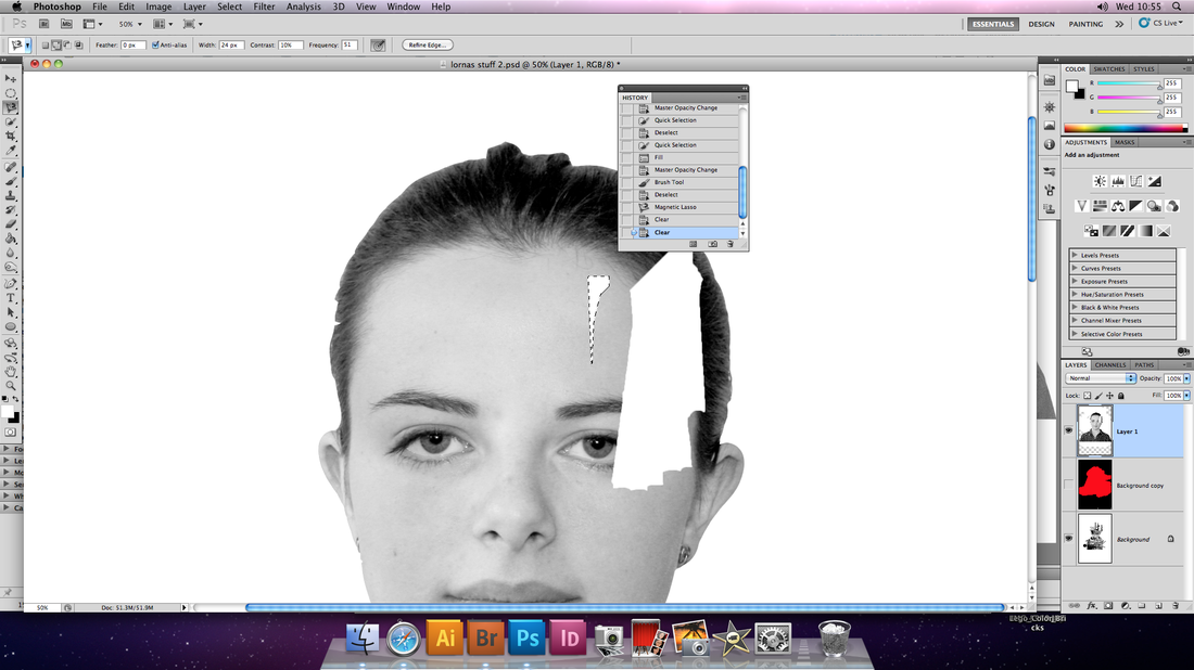
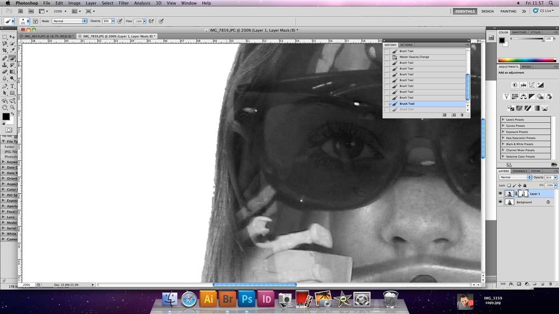
What went well: Through much trial and error, I managed to merge the pictures successfully. I started by using a layer mask on the latter image and blending it into the original, but this was too complicated for the primary stage, and made it appear messy, as well as taking to long for an expriment to achieve. I then decided to drag and drop the image of the objects below the image of the subject using a low level of opacity on the picture above so I could see what I was doing. When the images were positioned correctly, I selected all the space surrounding the actual outline of the subject, when this was complete, I re-lowered the opacity creating the picture you see above this paragraph.
What needs improvement: Two imperfections, the former being that the background is too harsh and plain, making the image look un-natural and out of place unlike the examples from Christoffer Relander, perhaps a subtle gradient should be introduces in further development. The latter imperfection was a mistake on my part; I wanted to introduce a layer mask to bring out the lighter parts of each photo, making it look more three dimensional, however, by mistake, I painted using black and white on the original photos and not the layer mask, lending to the slightly cartoon-like effect in the picture above, they was no way to undo this, or rub it out without rubbing out the picture I had painted onto at the same time. This would have to be something I would learn from.
In future: In future I will learn from the mistakes I made in the second paragraph and develop those in the first. The double exposure went well so I am going to develop this idea.
2. Banait
What went well: In terms of achieving the intended effect of the final image sharing an outline with both pictures of the objects and the subject themselves, this was successful.
What needs improvement: The background is still too bright, a gradient should still be introduced. Some outlines are messy and unattractive, more ettention to detail required. I also need to find a way I can layer the images using the shared outlines simply using the opacity too like I did with my previous piece, with this one I had to blend the images using a paintbrush on the layer mask and this doesnt give an even enough ratio of the two separate images. This technique is promising but still needs work.
What needs improvement: The background is still too bright, a gradient should still be introduced. Some outlines are messy and unattractive, more ettention to detail required. I also need to find a way I can layer the images using the shared outlines simply using the opacity too like I did with my previous piece, with this one I had to blend the images using a paintbrush on the layer mask and this doesnt give an even enough ratio of the two separate images. This technique is promising but still needs work.
3. Mira
7. Mira
WHAT WENT WELL
- The merging of the two images is considerably more advanced than in the previous piece.
WHAT COULD BE IMPROVED
- I think the in future I should make it so that the objects reach the bottom of the crop so the picture of subject can as well, as based on earlier pieces, this looks more effective.
- Having the outline of just the objects makes it appear as if it is more about the objects in the person,I would prefer it to be balanced.
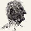
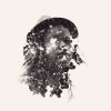
3. Mr. Holden

4. Griffin

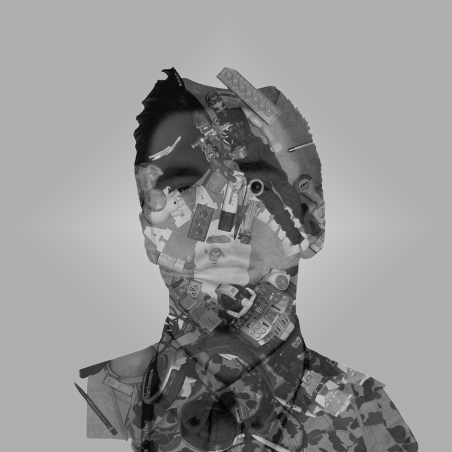
5. Leo (Me)


6. Lorna


I would argue that these two pieces ('Lorna' and 'Leo') are the most successful, a product of the natural refinement of this ever-present technique. The combination of outlines from both original pictures has worked well, demonstrated by things such as the smoother edges.
Each piece gives me an insight into how to create a better one, for example, with the portrait titled 'Griffin", with all these images I have icolate them from the background they were originally photographed against, so i cant artifically create a new background for the combined image (using gradient fill layer), this was hard to do with the 'Griffin' portrait and the others made prior to this, so in these two potraits I took considerations with this in mind. I chose subjects who's hair and general outline was neat, my hair is short and Lorna's hair was tied back making it easy for the 'selection tool' to tell the difference between us and the backgrounds we stood in front of. In addition, the other photos were of a more neutral contrast, this also made them tricky to select so I made sure to highten the contrast both on Photoshop and by using the flash on my SLR.
Other considerations include the cropping of the final product, to give the effect that this is a series thus complimenting each other piece.
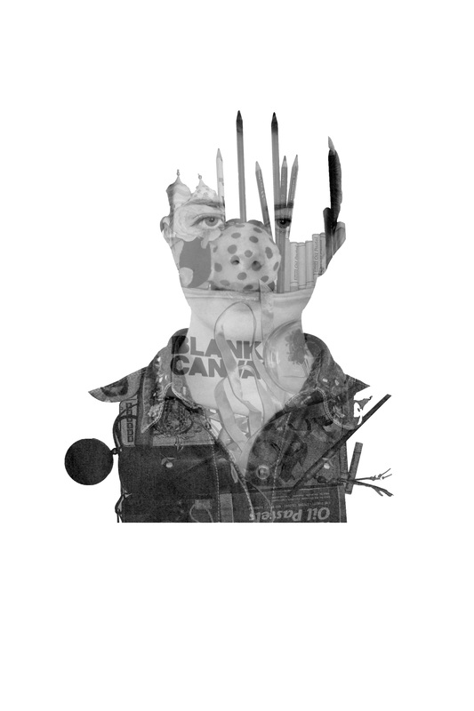
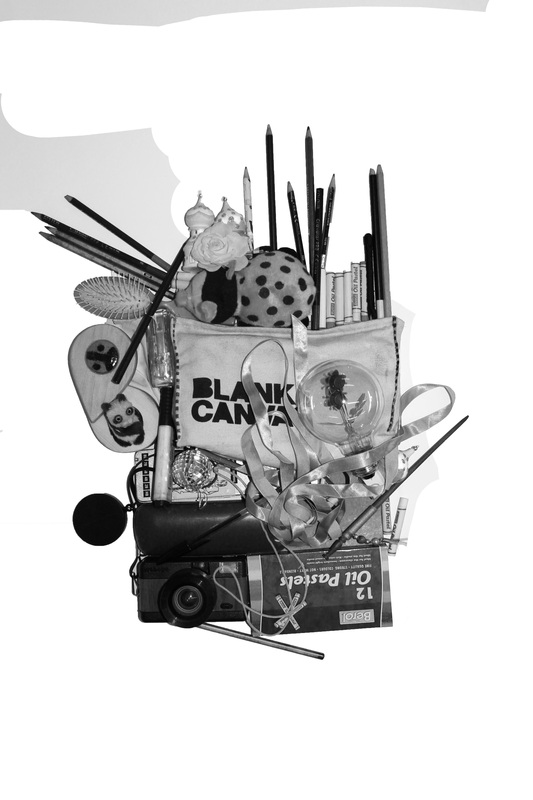
7. Edie


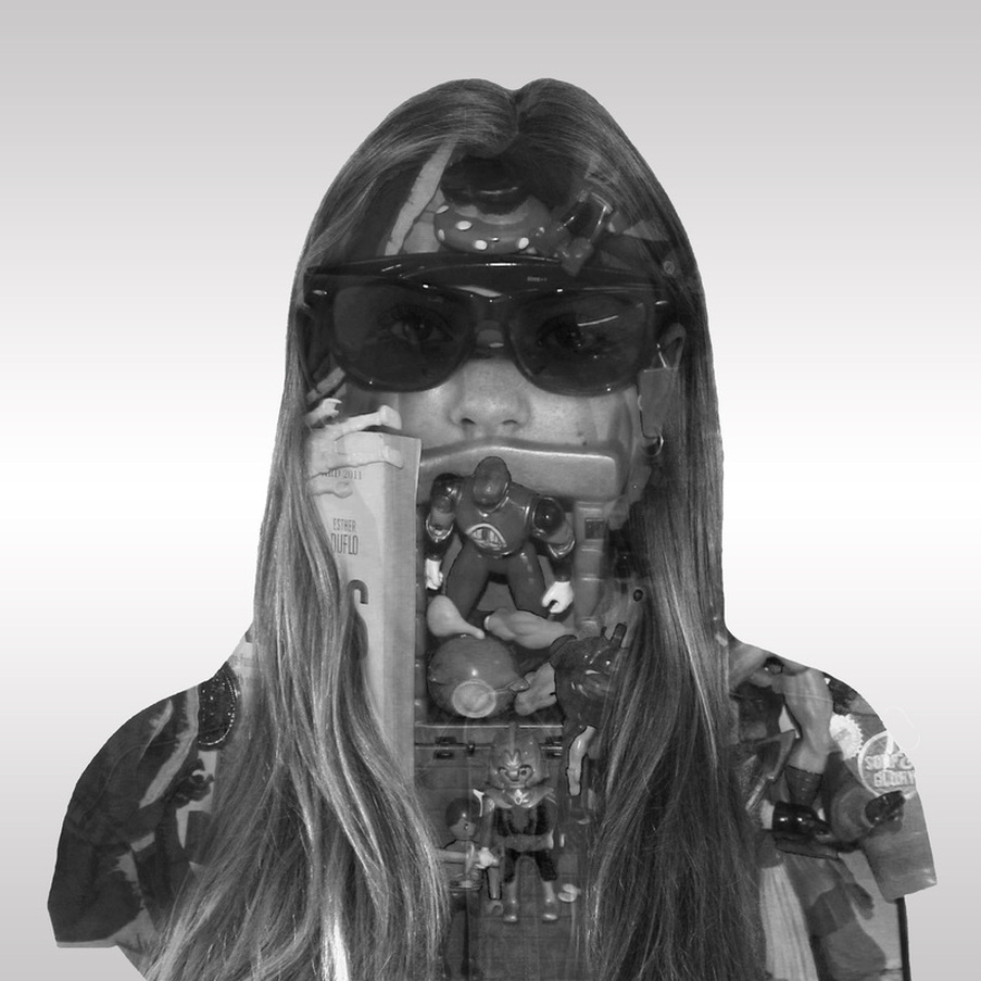
This piece is slightly different from my other portraits in the sense that I have made more effort to divide and blend the two images of the subject and their possessions through use of a layer mask on Photoshop. This was with the intention of making it appear more three dimensional, less flat, and make the layering appear less simplistic. In addition, I have focussed more on appropriating the different objects in accordance with the structure of the photo, the sunglasses fitting directly over the eyes of the subject. I would argue this to be the result of the refining of this technique.
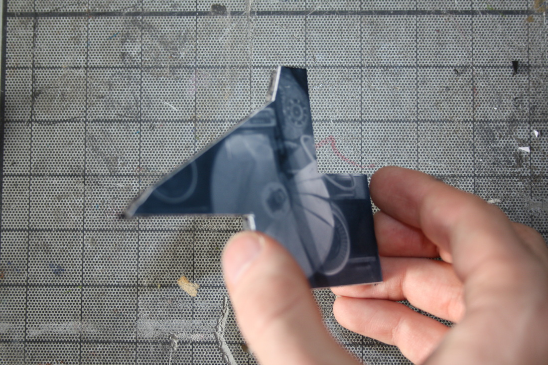
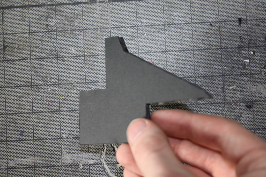
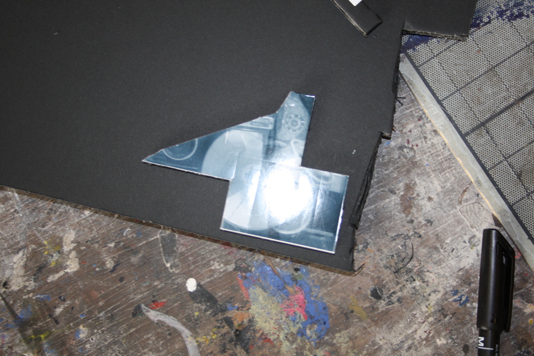
Development - 3D Cut-Outs
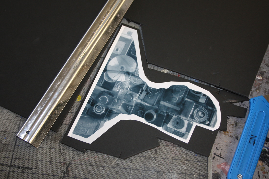
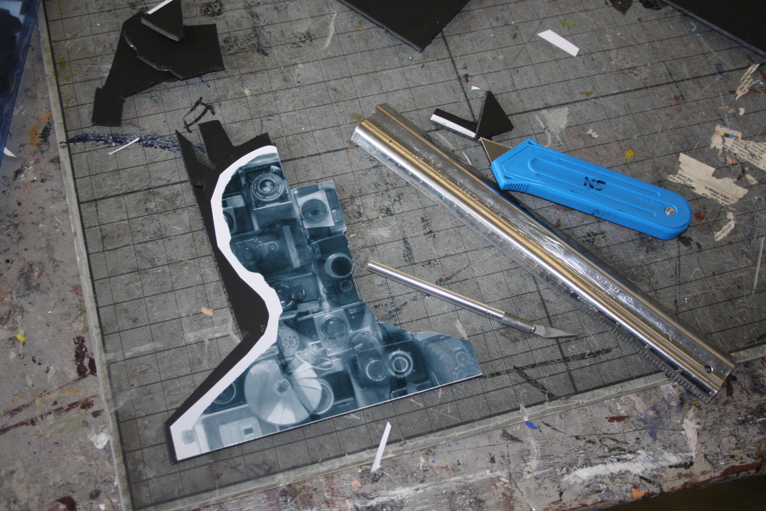
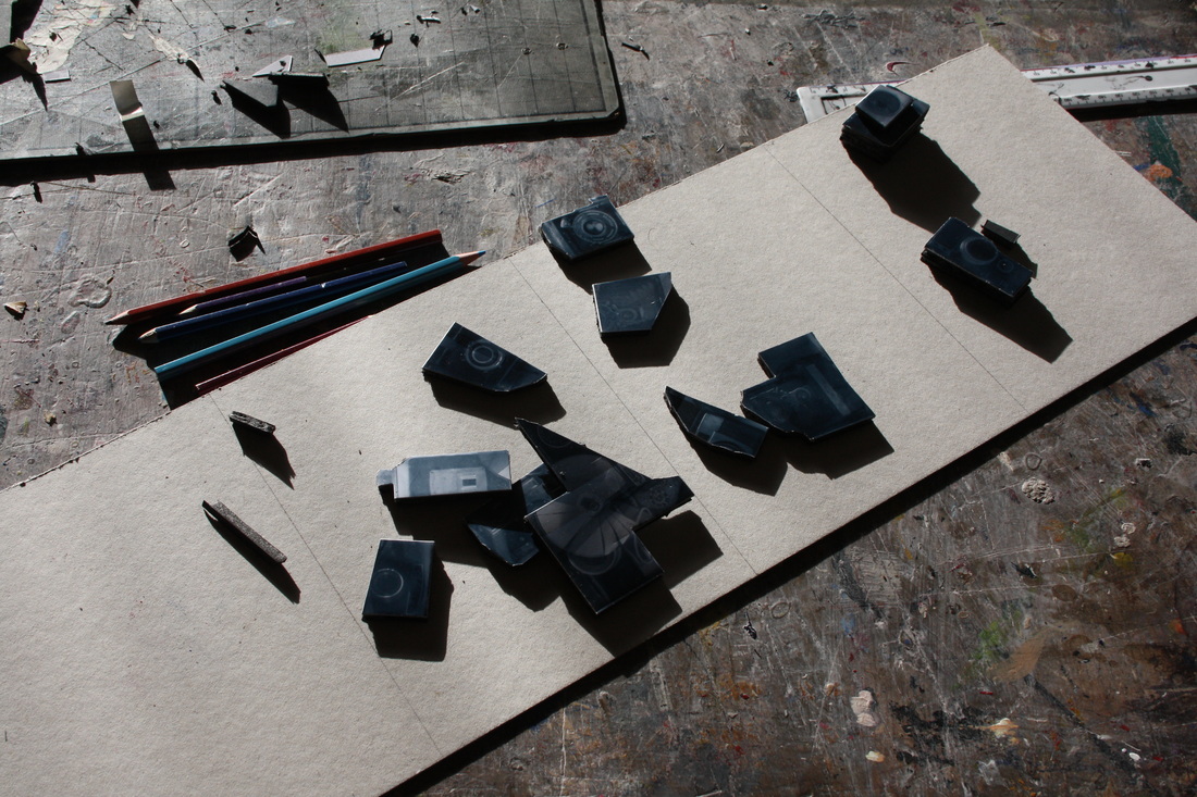
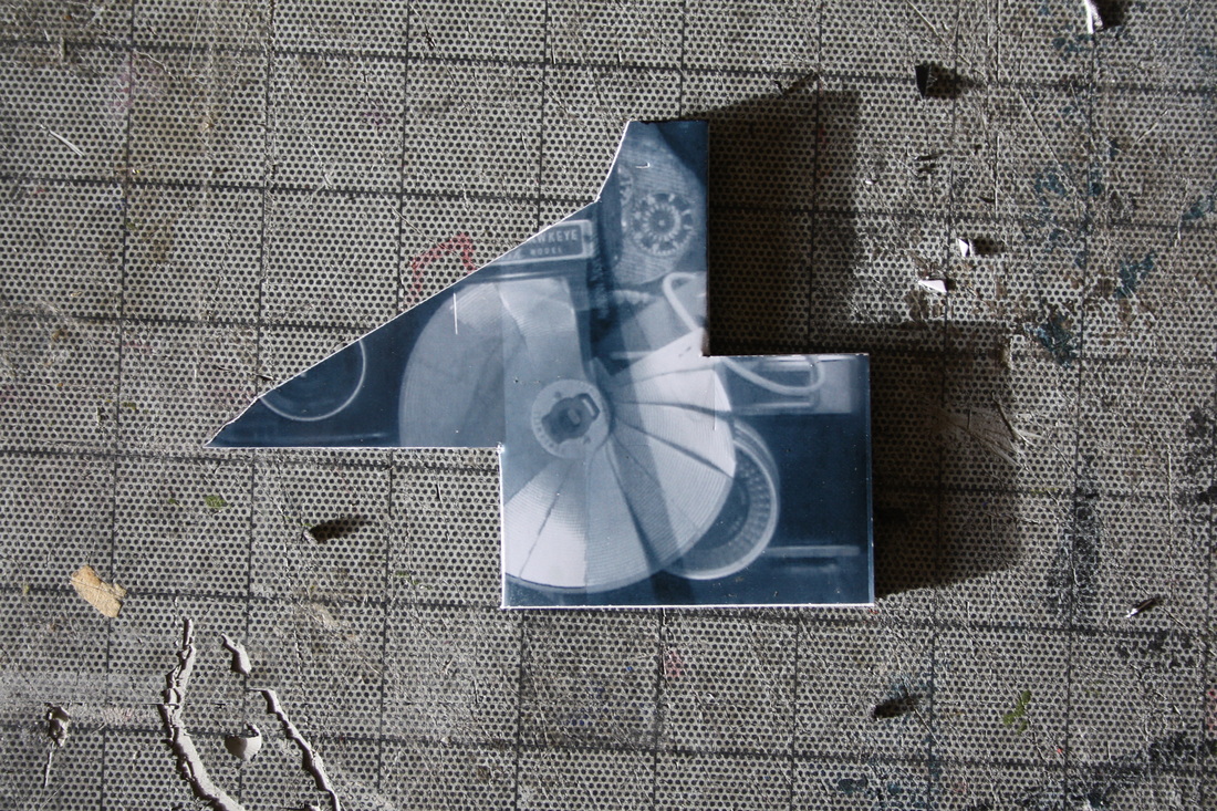
1. 3D Griffin
I am deciding to develop this technqiue for two main reasons, the first being that it demonstrates the issue of identity and it can be clouded or shown through materialism and possessions, that you have to look at people in a certain way to see them as they are, the second was i liked the way it dramatically, for obvious reasons, improves the slightly 'flat' appearence my digital versions of the portraits had in common had in common
From this stage I intend to plan what i produce in order to find solutions to what I didn't find successful, whilst focusing on what I did; these problems were on presenation:
- The use of white foamboard to layer the segments should be replaced with something more subtle against the often dark greys of the image, in future I should either use darker foam board, or cover the side surface with dark paper.
- The use of white foamboard to layer the segments should be replaced with something more subtle against the often dark greys of the image, in future I should either use darker foam board, or cover the side surface with dark paper.
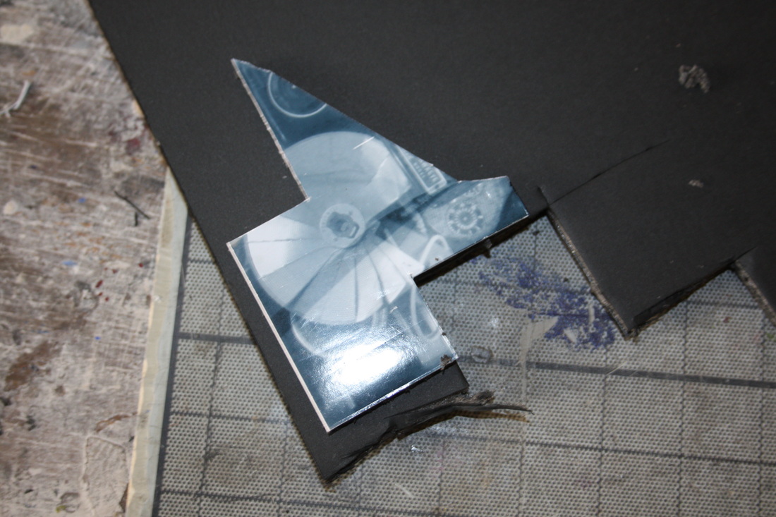
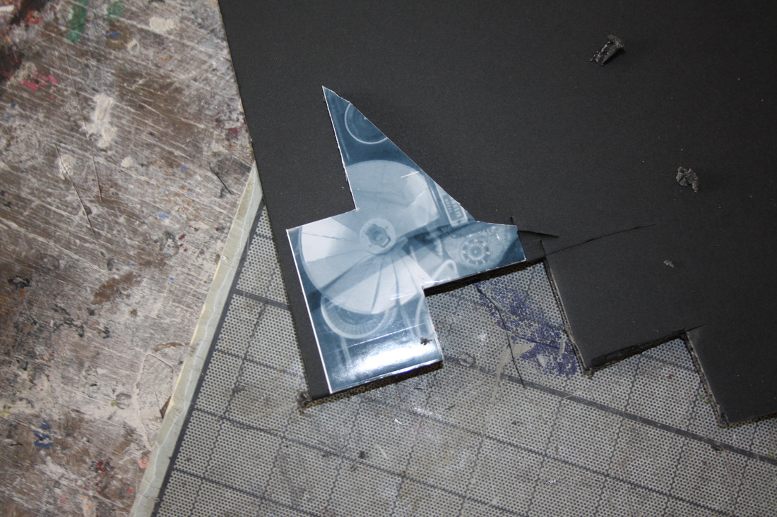
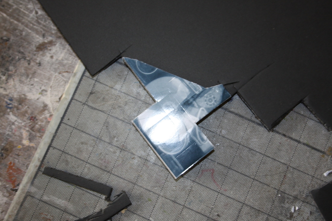
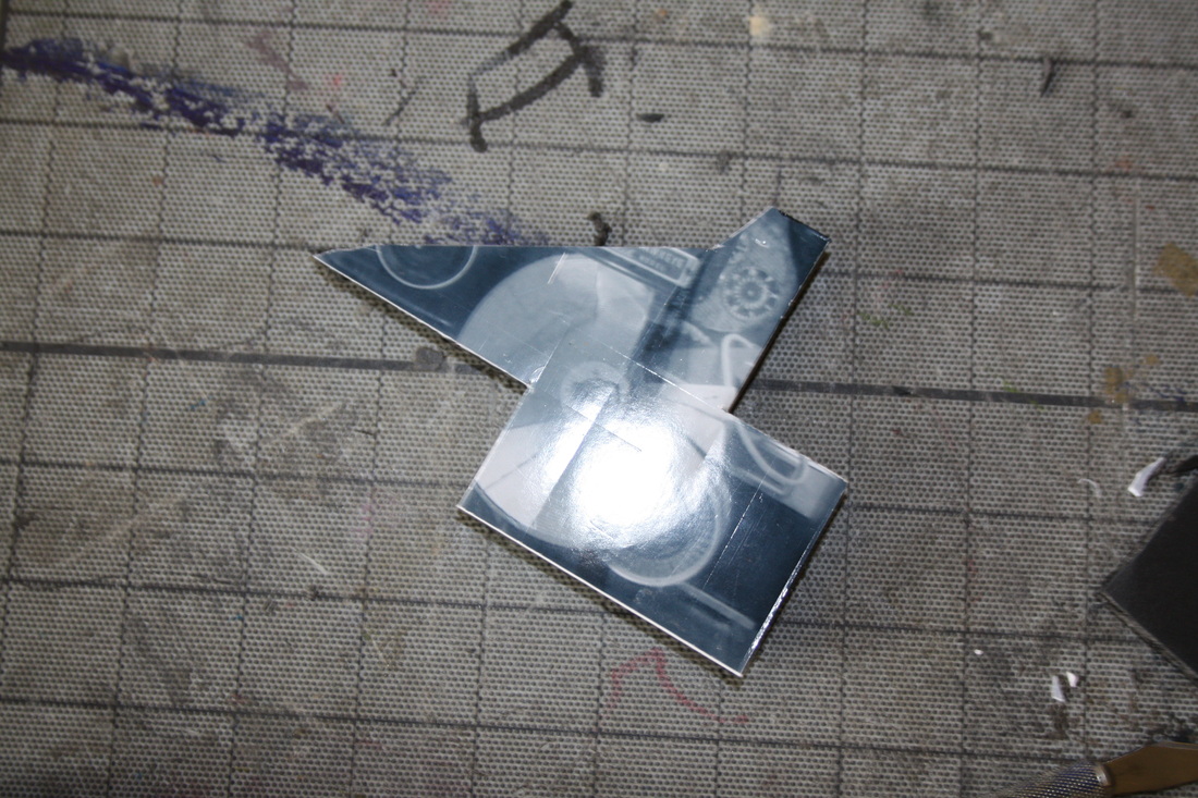
Inspiration - Scott Campbel
Scott Campbel is a tatto artist and man of many talents as deomstrated, he uses a laser cutter to create these interesting 3D sculptures adorned with common tatto iconography such as skulls and religious quotes. His work was the inspiration for the 3d transformation of my 2d potraits.
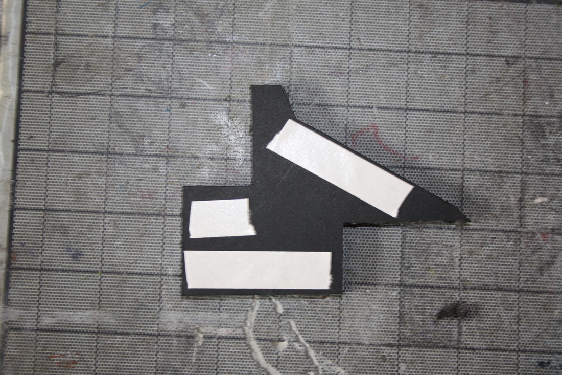
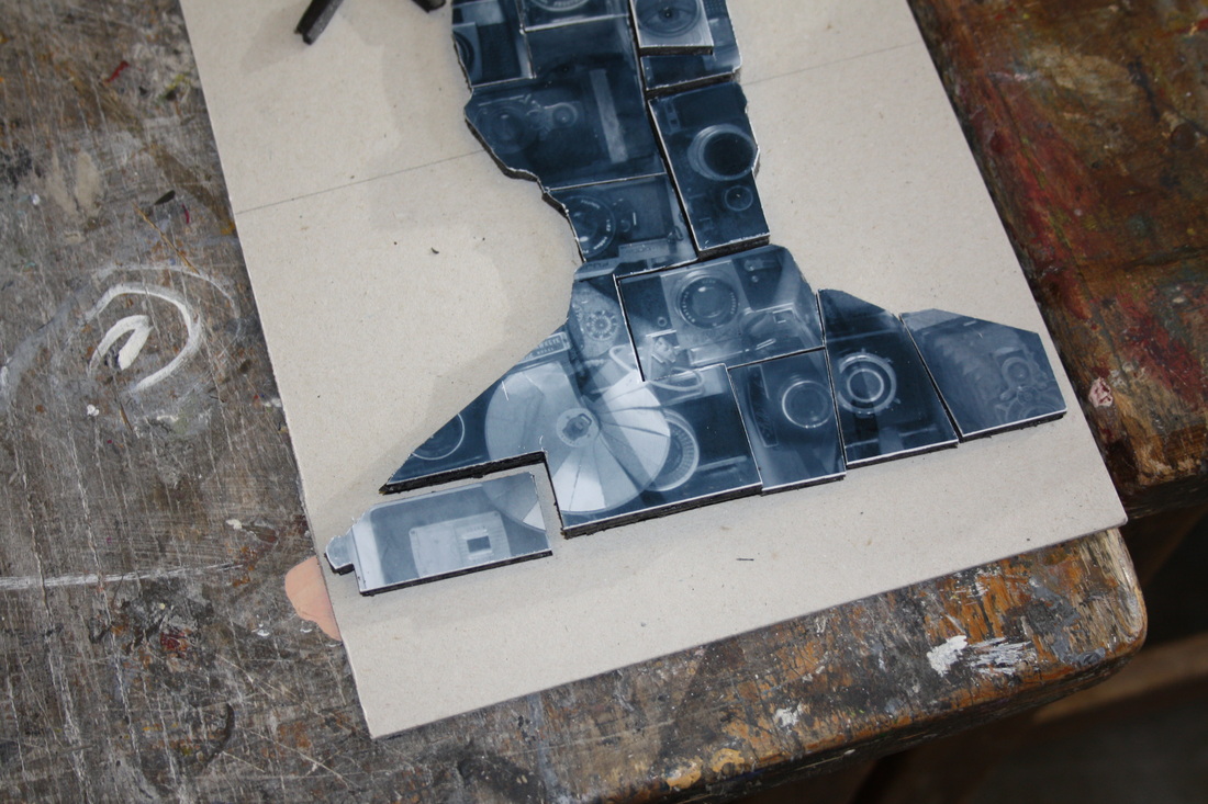
2. 3D Holden
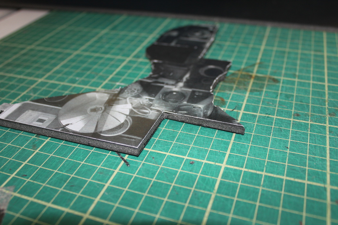
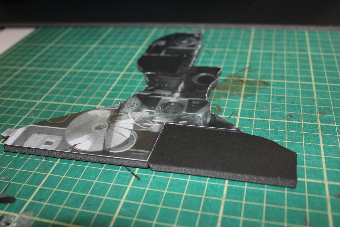
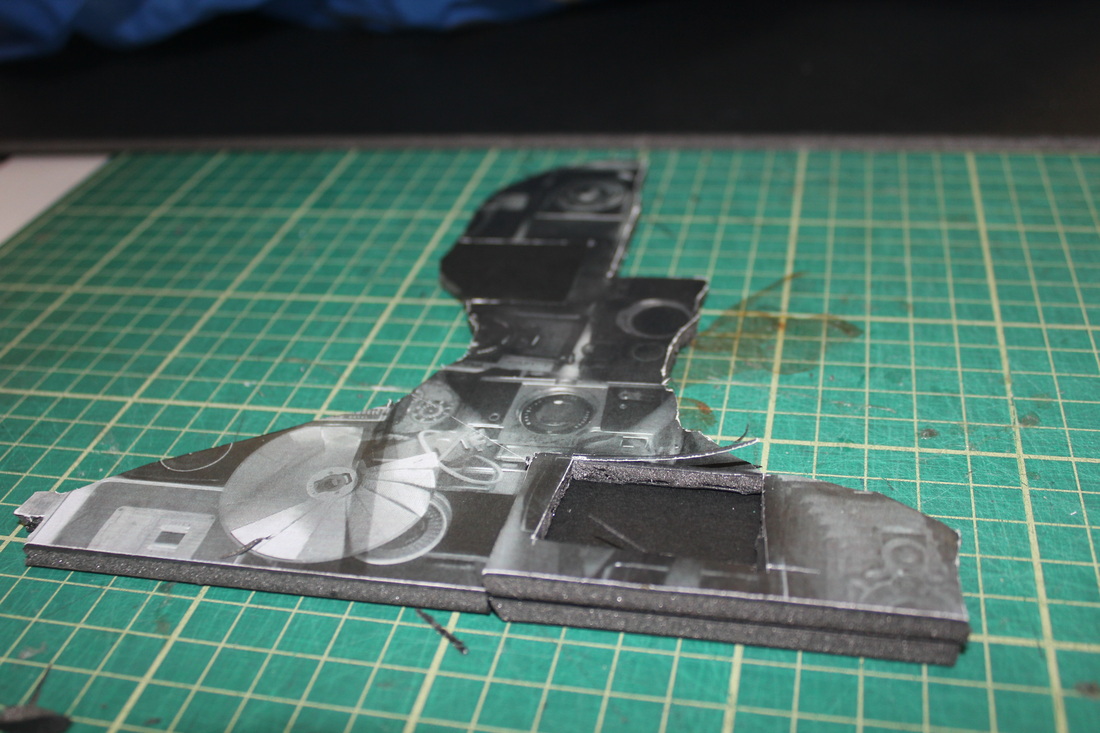
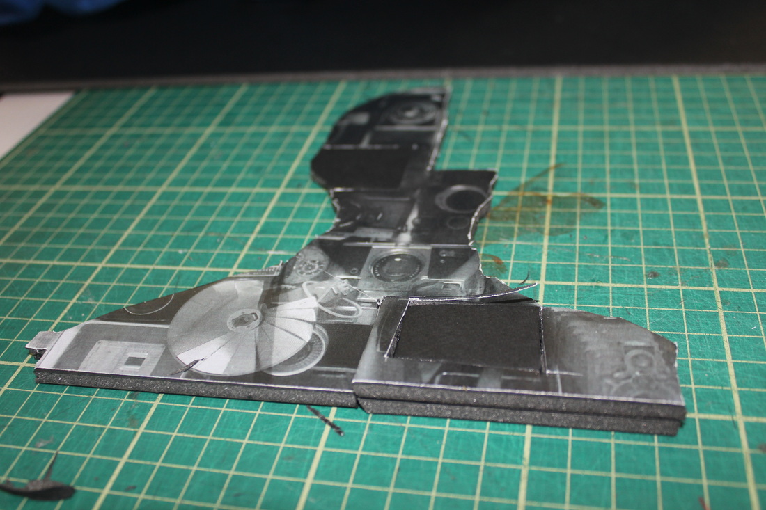
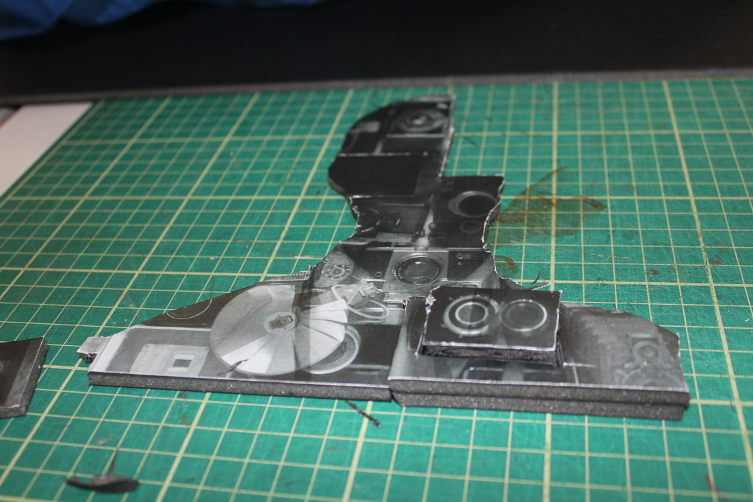
SUCCESS:
- The use of back foam-board does make the piece appear neater, making the distinction from each segment less obvious.
IMPROVEMENTS:
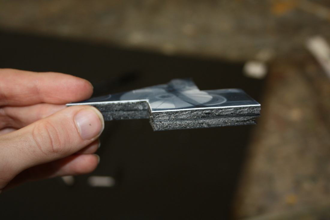
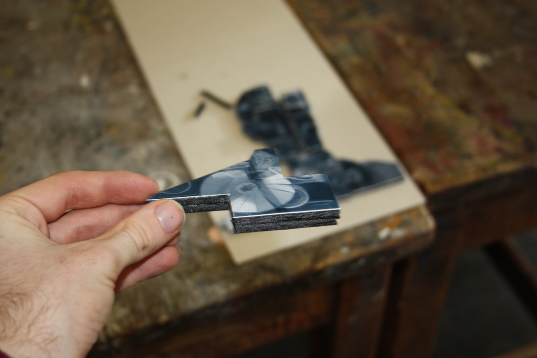
- The benafits of using black foam board are undermined slightly by the white tears at the edges where I have cut the paper, perhaps using a different type of paper would avoid this inperfecttion.
- As demonstrated above, instead of simply layering one piece of foam board over the other, I have had to cut replicate every raised piece, which requires this, rather long-winded. 'jig-saw' method, this, and the fist problem of cutting, could possibly be averted by using several images over a laser cutter .
- The piece appears messy, and the fact that you are able to see the sides undermines the illusion of it being three dimensional, perhaps creating the piece in a frame and cutting them more neatly would solve this.
- The use of back foam-board does make the piece appear neater, making the distinction from each segment less obvious.
IMPROVEMENTS:
- The benafits of using black foam board are undermined slightly by the white tears at the edges where I have cut the paper, perhaps using a different type of paper would avoid this inperfecttion.
- As demonstrated above, instead of simply layering one piece of foam board over the other, I have had to cut replicate every raised piece, which requires this, rather long-winded. 'jig-saw' method, this, and the fist problem of cutting, could possibly be averted by using several images over a laser cutter .
- The piece appears messy, and the fact that you are able to see the sides undermines the illusion of it being three dimensional, perhaps creating the piece in a frame and cutting them more neatly would solve this.
Plan:
I have decided to mount my work using thick square frames in order to enhance their presentation in preparation for my final piece(s), to implement this next stage to my idea, this is what I will require:
1. Ikea Frames - http://www.ikea.com/gb/en/catalog/products/00078032/#/00078051
Width: 25 cm
Depth: 4.5 cm
Height: 25 cm
Picture, width: 23 cm
Picture, height: 23 cm
2. PRINT PICTURES OFF, BUY NEW CATRADGE FROM CATRAGE WORLD
3. BUY MORE FOAM BOARD
1. Ikea Frames - http://www.ikea.com/gb/en/catalog/products/00078032/#/00078051
Width: 25 cm
Depth: 4.5 cm
Height: 25 cm
Picture, width: 23 cm
Picture, height: 23 cm
2. PRINT PICTURES OFF, BUY NEW CATRADGE FROM CATRAGE WORLD
3. BUY MORE FOAM BOARD
Mounting 3D portraits - Test
WHAT WORKED WELL:
- Ultimatly, the piece looked more presetable when mounted in a frame
- I would like to continue the mounting of these pieces in frames as they are perfect in terms of the depth they allow for the 3D foamboard portraits.
WHAT COULD DO WITH IMPROVEMENT
- When applying the layers of foam board to elevate the image, I should make full use of the depth of the frame, this will make it more eye-catching.
- As this is a test, I just used a simple background, just to stick all the seperate components of the image to, but in future, I would use the same gradient background I used in the original image (3. Mr Holden).
- I should take more effort to assure that the bottom of the portrait meets the edge of the frame it is placed in neatly.
Final Pieces:
3D Mr Holden