Inside Outside and In Between, Possible Themes:
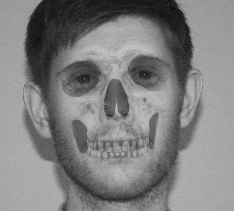
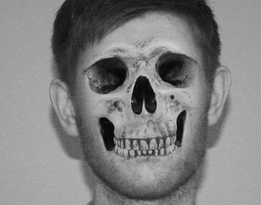
1. Inside and Outside the body
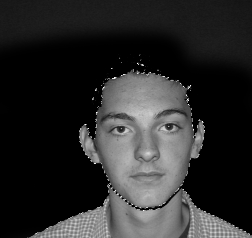
This possible route includes things such as diagrams of how the body works, skeletons, gory photographs, looking in through people's mouths, essentially, anything where the inside of the person is view-able from the outside. Issues could be raised by the use of this particular pathway such as what it is that makes us feel so uncomfortable about seeing things we all have such as bones and organs.
2. Microscopic
I could examine photos of things such as DNA and bacteria, ideally DNA because that is responsible for everything they are, which can be a rather powerful encapsulation of their identity.
3. Personality
One route this project could venture towards would be the theme of personality. I could explore how people present themselves externally and how they, or others, view them on the inside. This takes a less literal interpretation of the exam title.
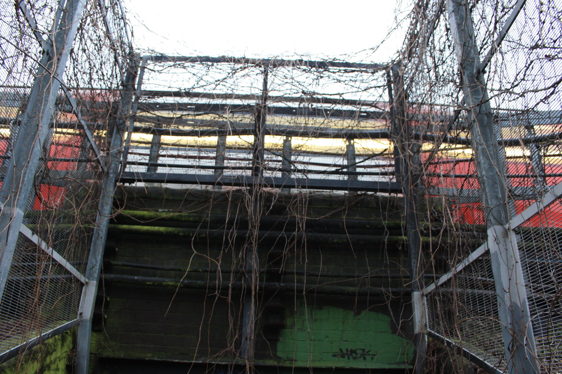
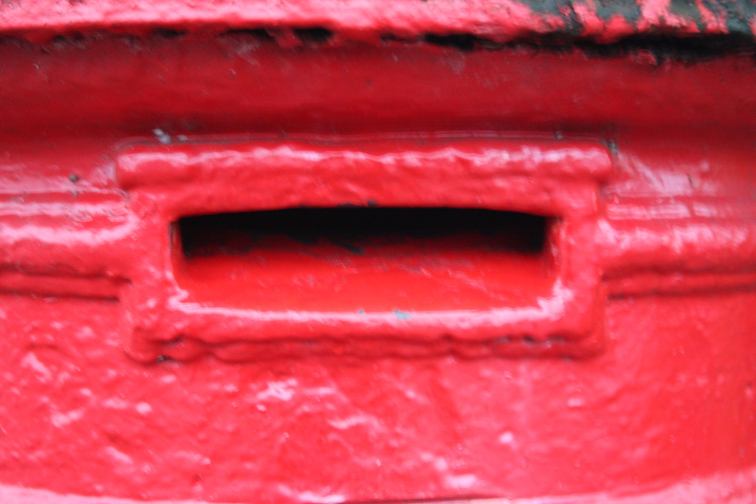
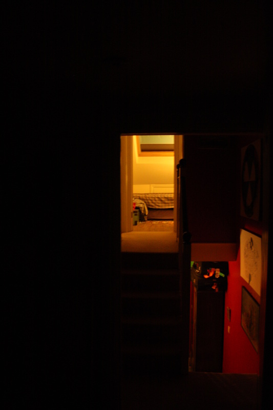
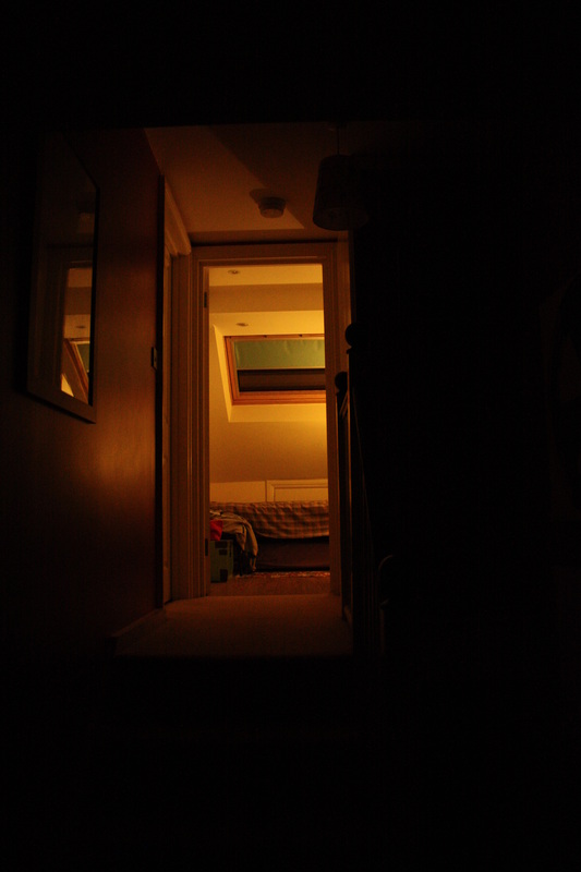
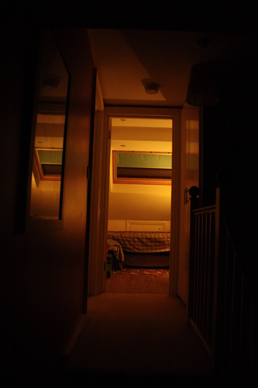
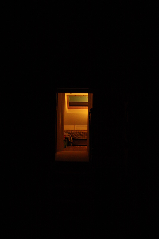
4. Holes and openings
This more literal interpretation of the exam theme would consider holes and try to, either, capture the potential mystery of what the image is leading to, or consider what significance this door, hole or opening has to different people.
5. Interior vs Exterior
For this, I would study the difference in appearance between inside and outside buildings and houses, possibly reinventing something usually used for instructional purposes into something more artistic.
This possible route includes things such as diagrams of how the body works, skeletons, gory photographs, looking in through people's mouths, essentially, anything where the inside of the person is view-able from the outside. Issues could be raised by the use of this particular pathway such as what it is that makes us feel so uncomfortable about seeing things we all have such as bones and organs.
2. Microscopic
I could examine photos of things such as DNA and bacteria, ideally DNA because that is responsible for everything they are, which can be a rather powerful encapsulation of their identity.
3. Personality
One route this project could venture towards would be the theme of personality. I could explore how people present themselves externally and how they, or others, view them on the inside. This takes a less literal interpretation of the exam title.
4. Holes and openings
This more literal interpretation of the exam theme would consider holes and try to, either, capture the potential mystery of what the image is leading to, or consider what significance this door, hole or opening has to different people.
5. Interior vs Exterior
For this, I would study the difference in appearance between inside and outside buildings and houses, possibly reinventing something usually used for instructional purposes into something more artistic.
1. Inside and Outside the Body
Development:
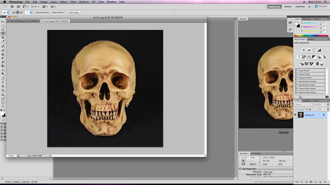
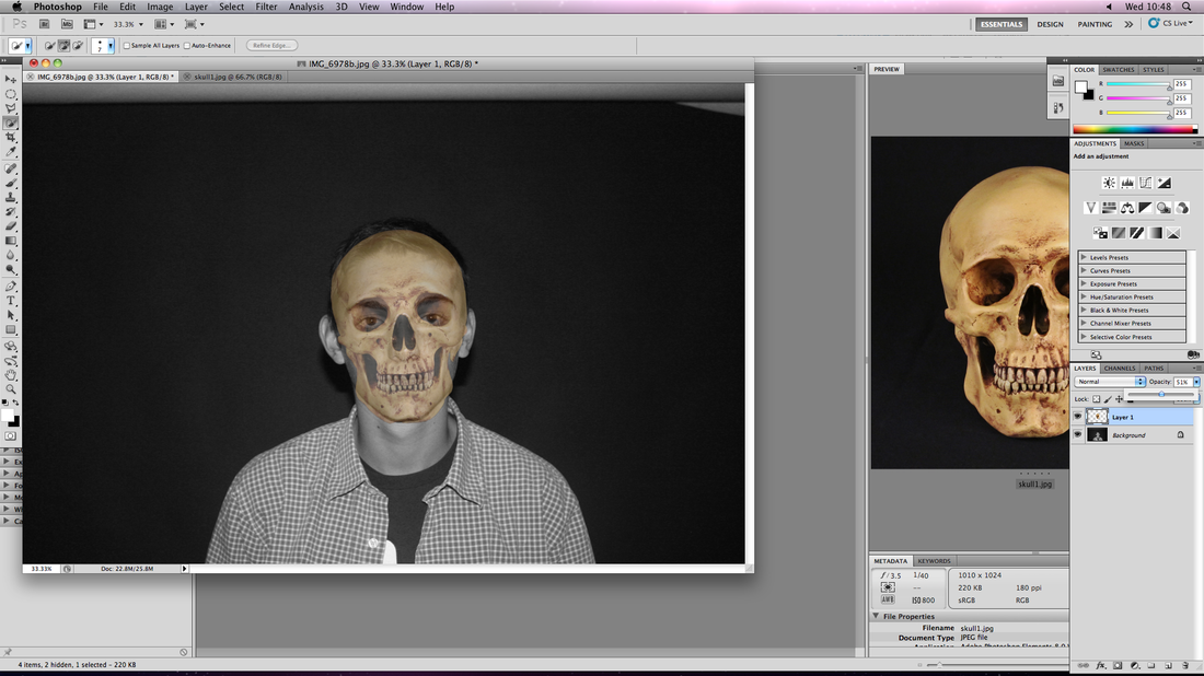
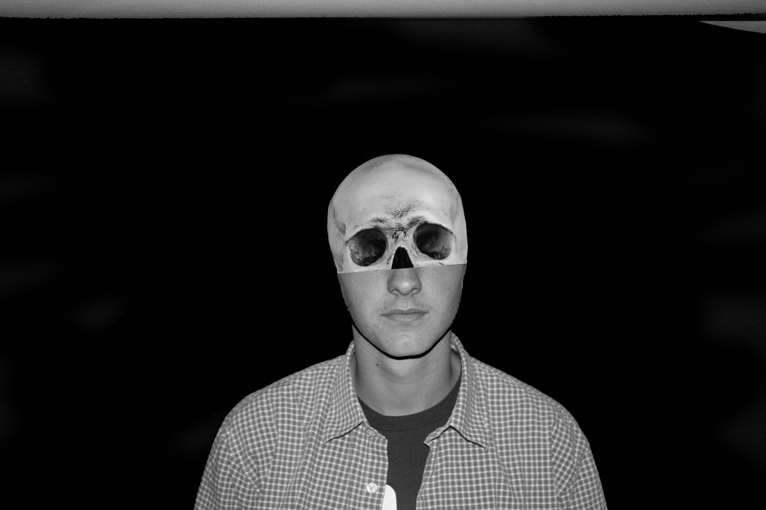
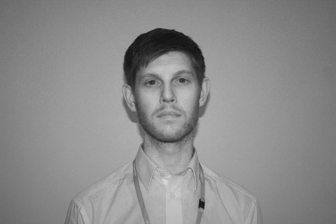

This is a more literal interpretation of the Exam Project theme that would focus on the exposing of things you would not usually be able to see due to being hidden.
3. Personality
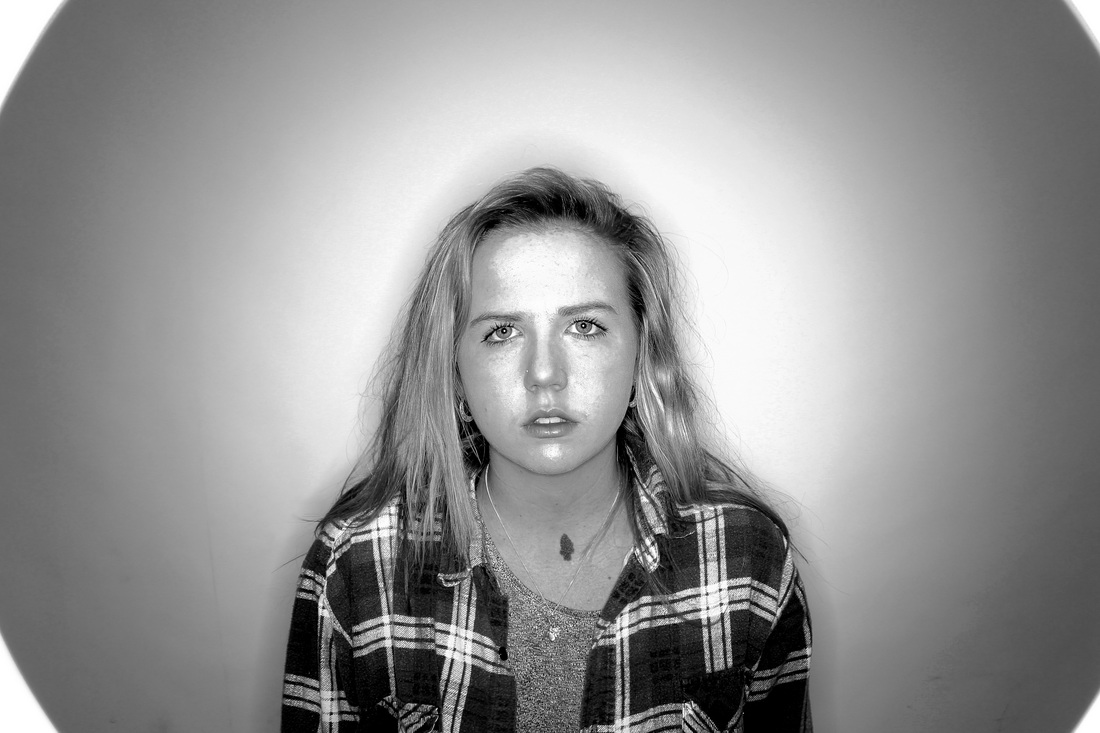
The aim of adopting this interpretation of the theme was to attempt to capture people's personalities visually or, in other words, capture what was on the inside externally.
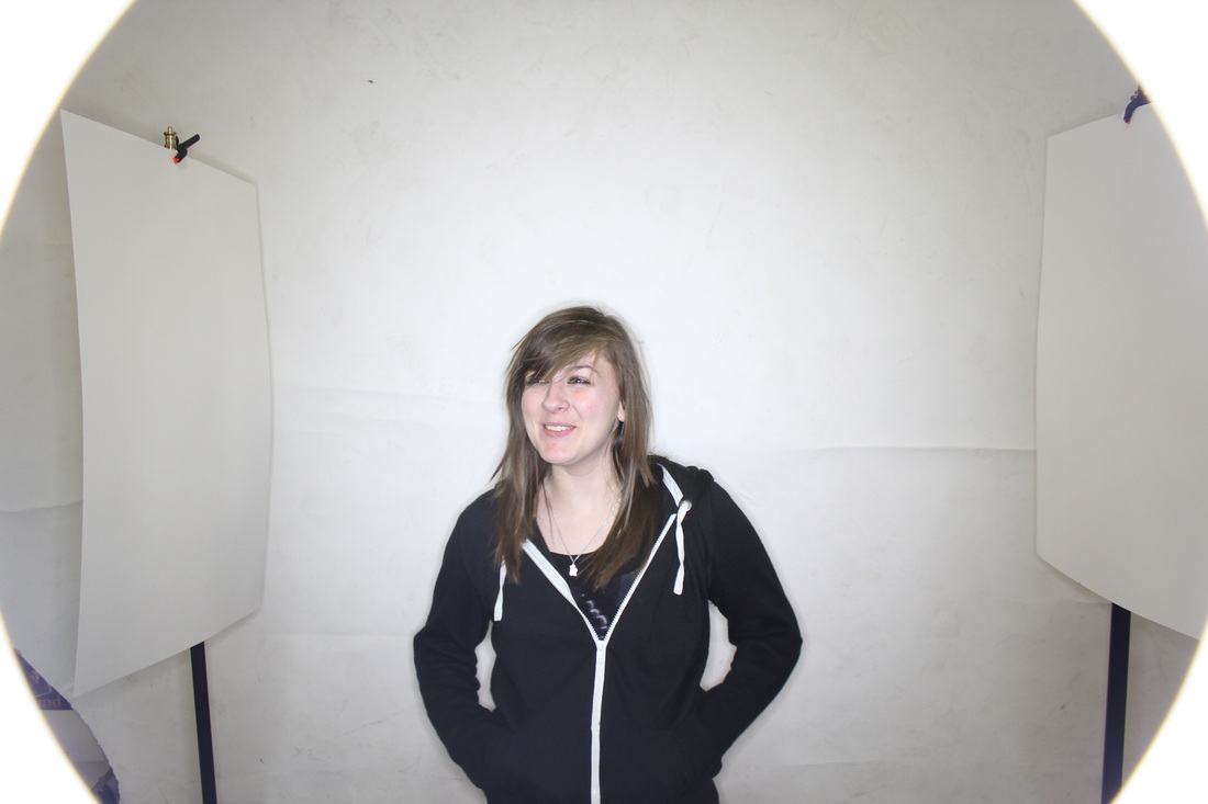
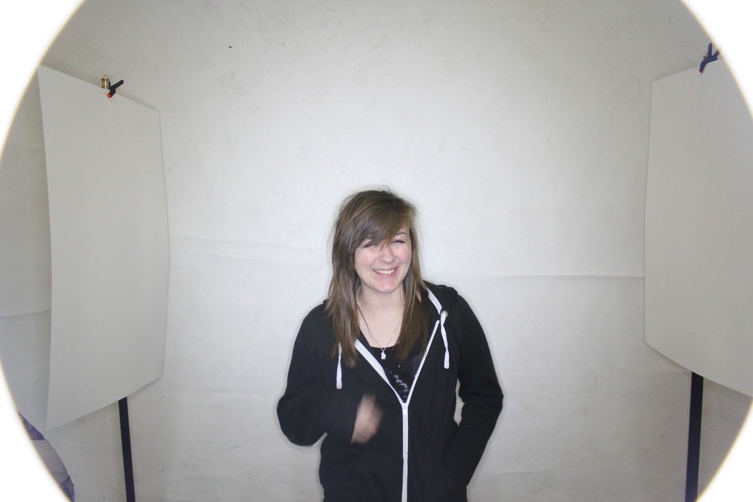
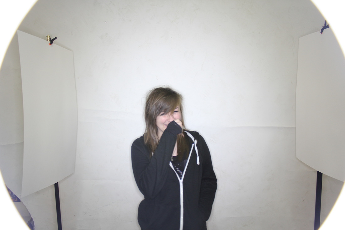
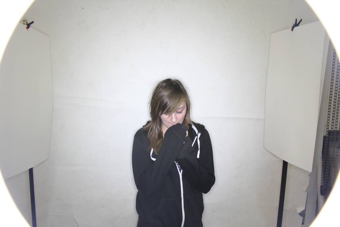
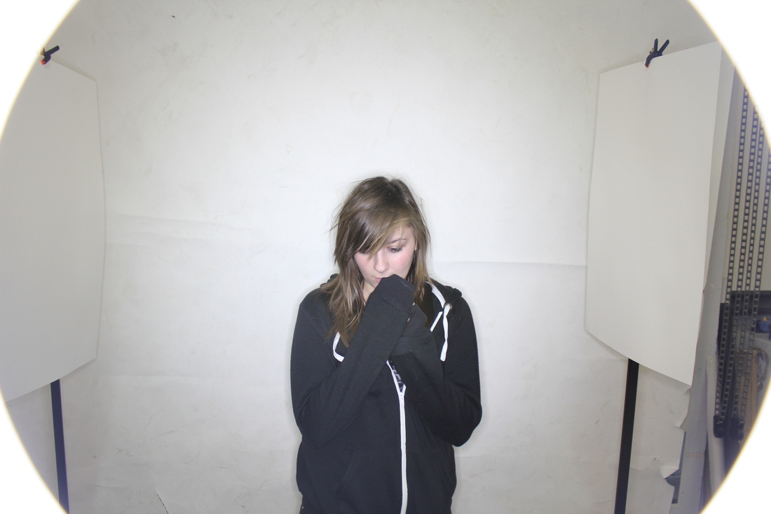
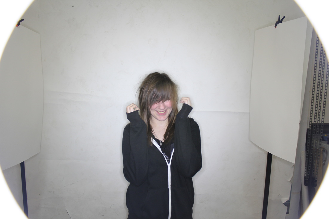
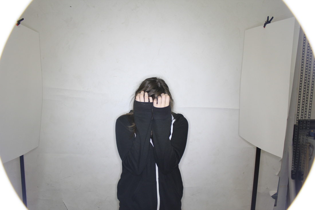
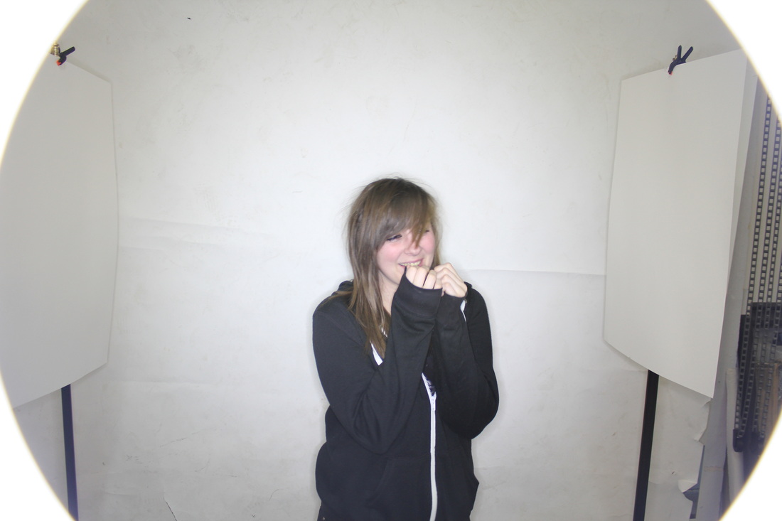
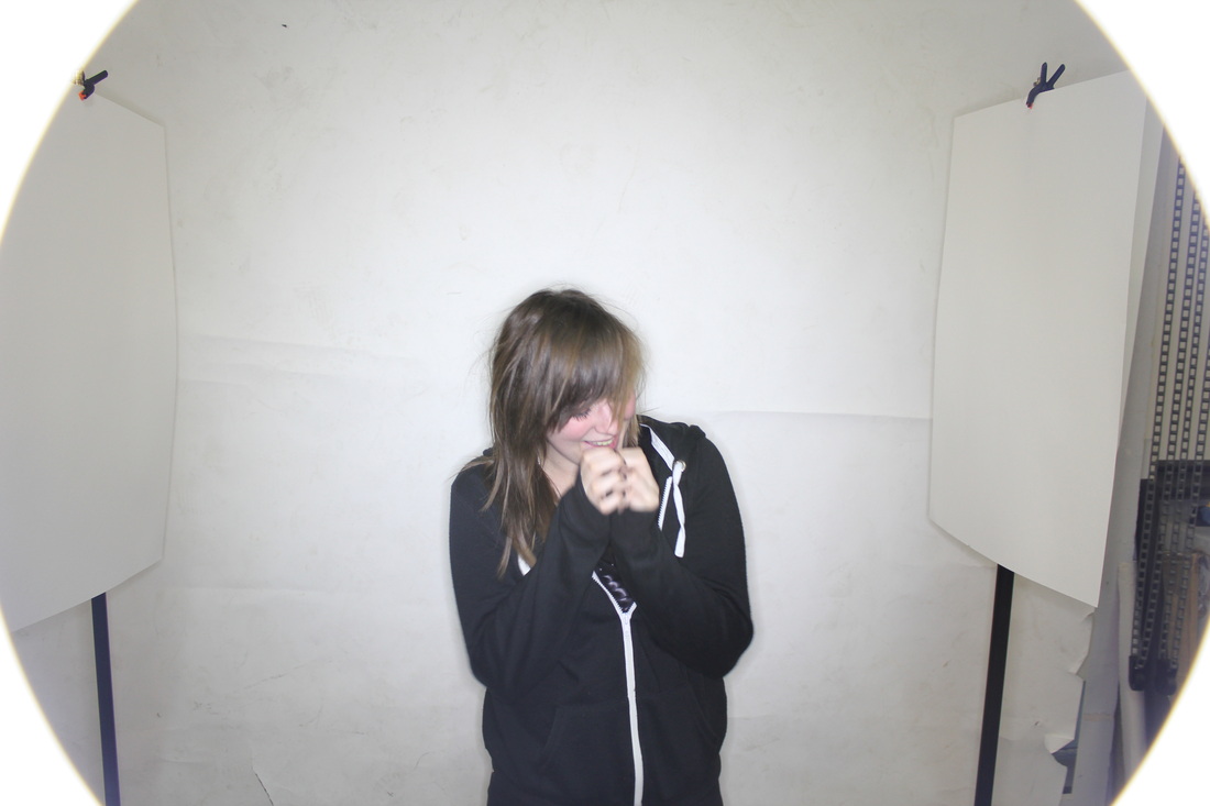
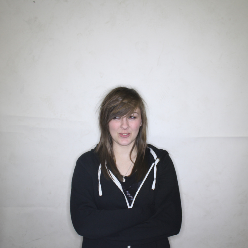
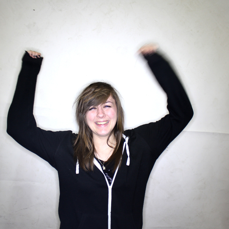
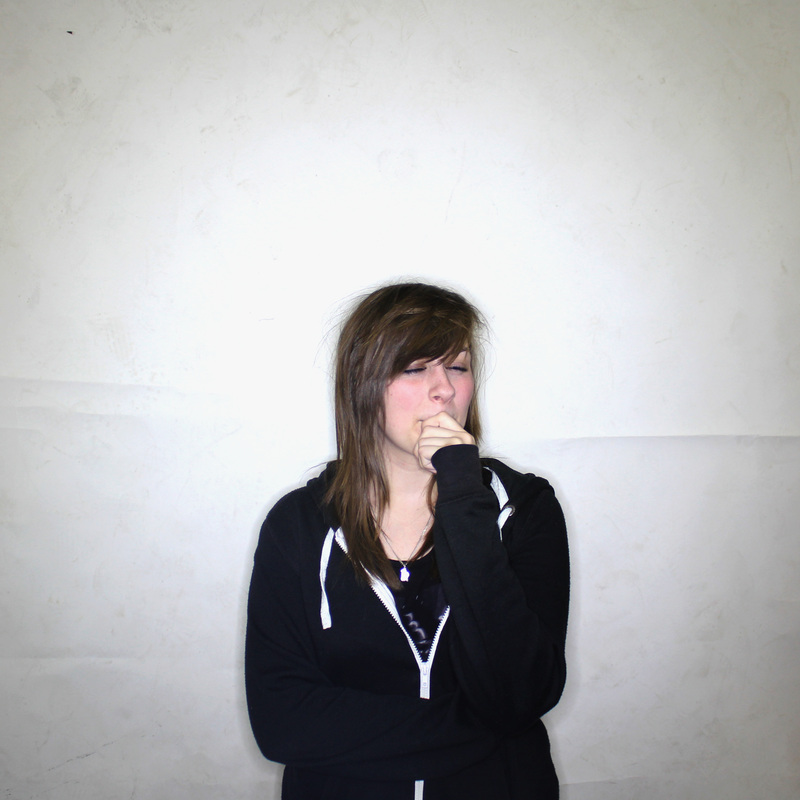
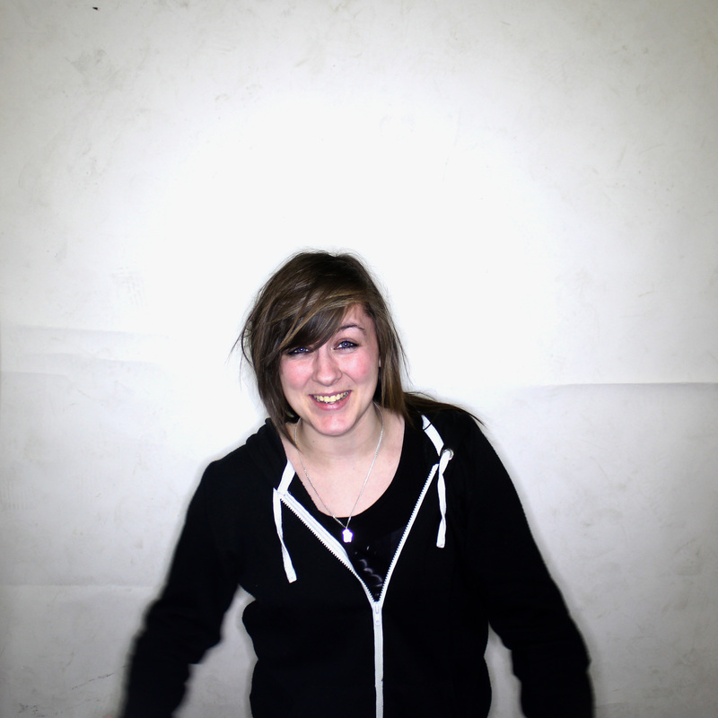
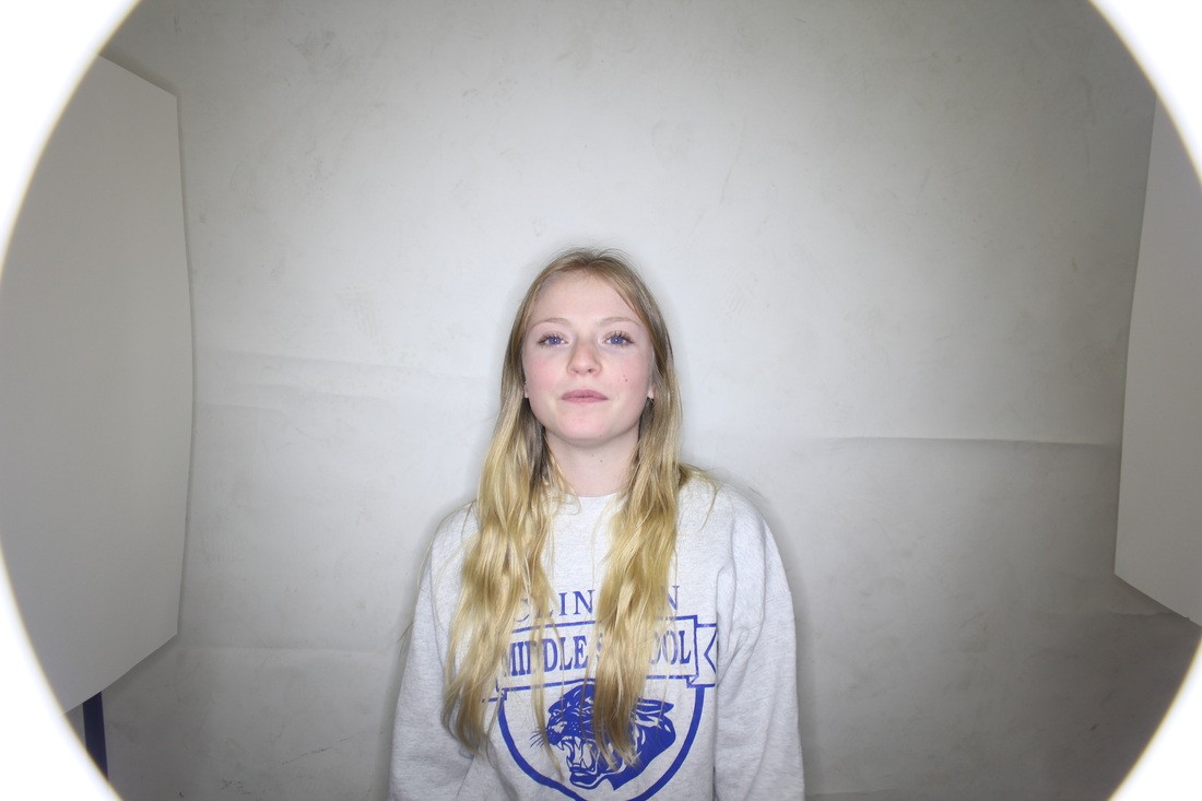
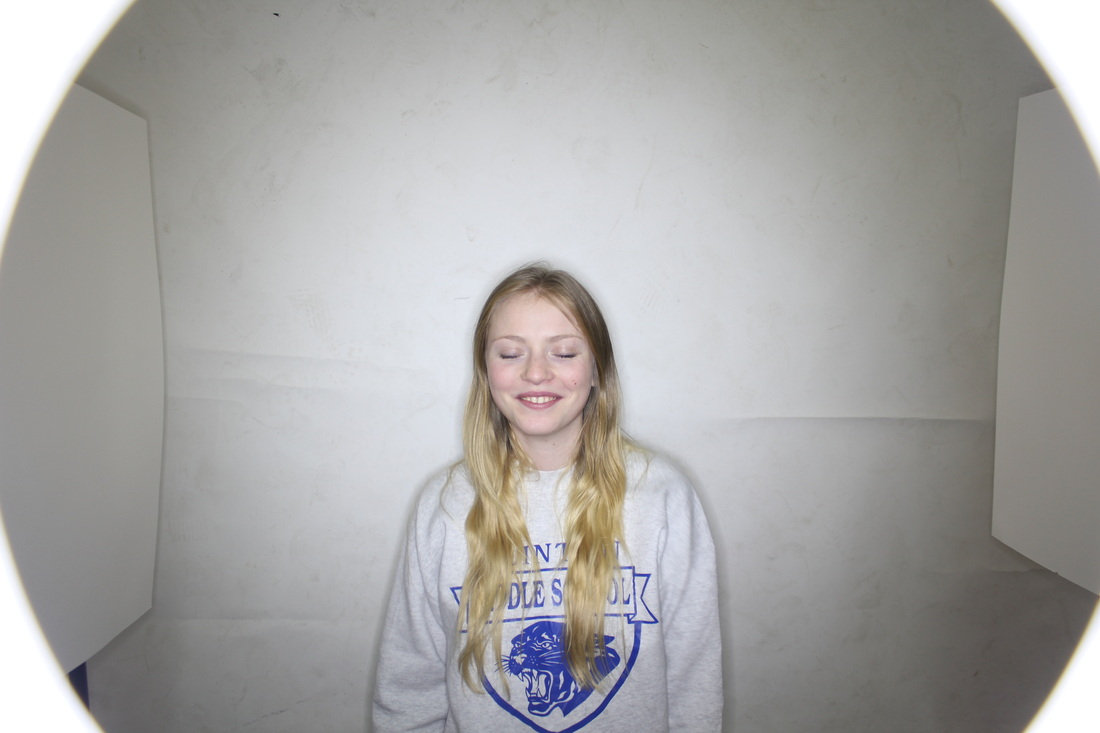
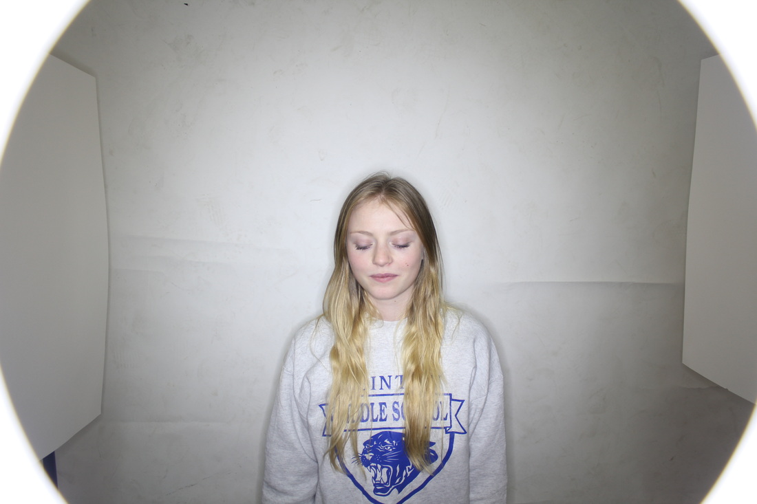
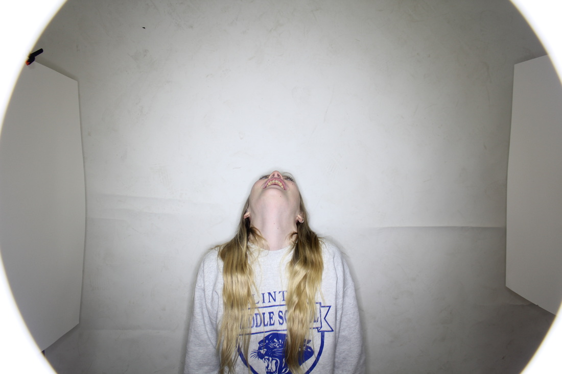
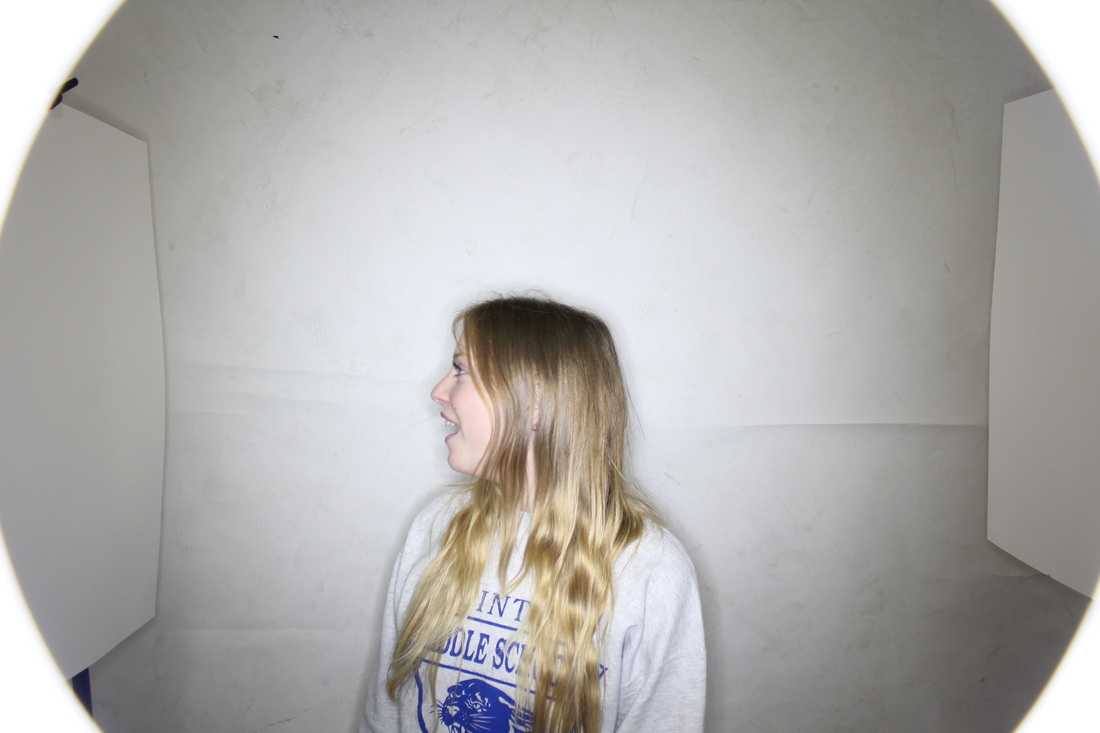
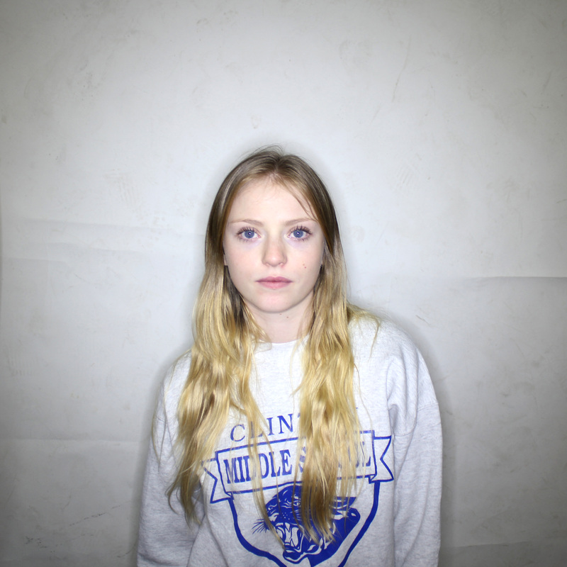
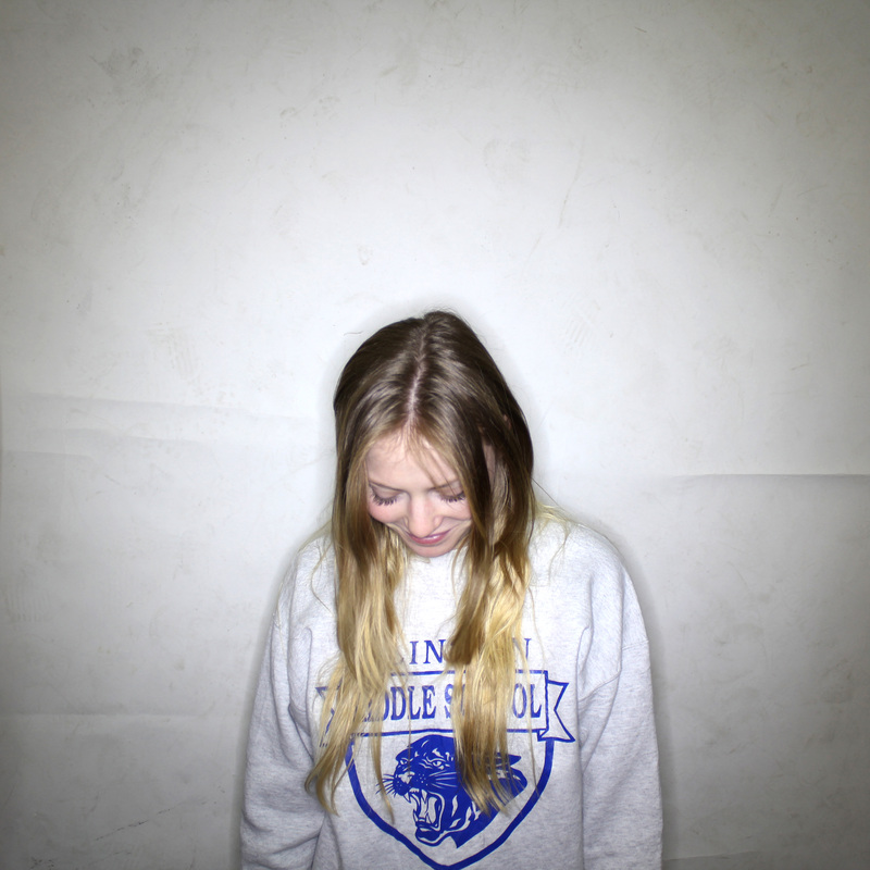
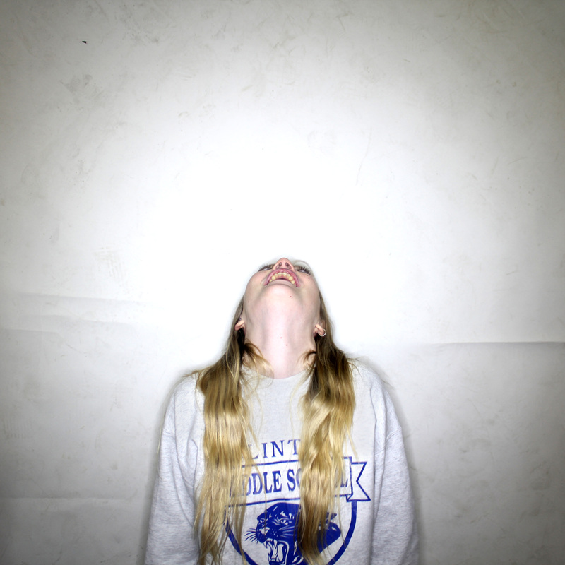
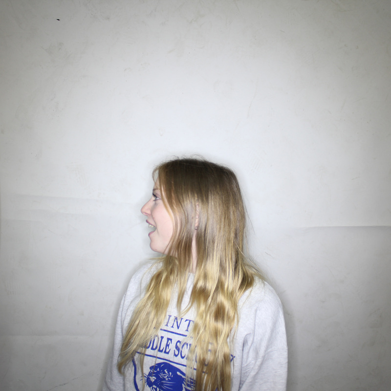
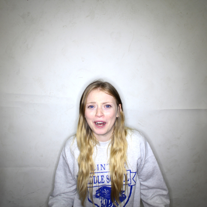
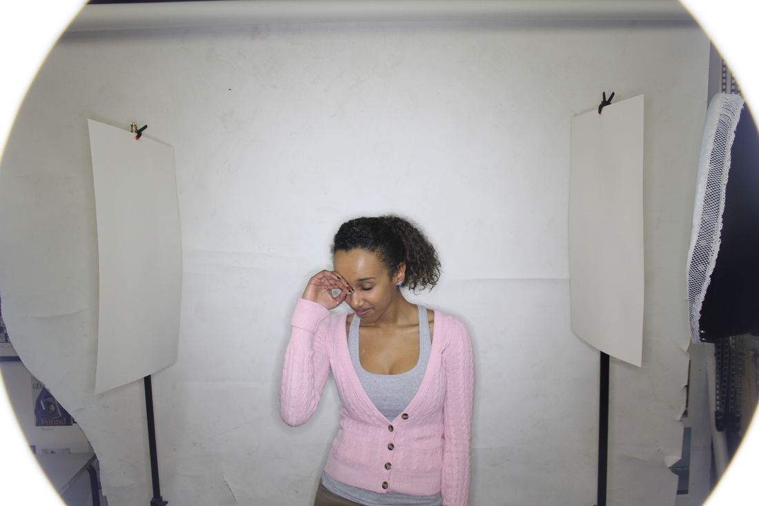
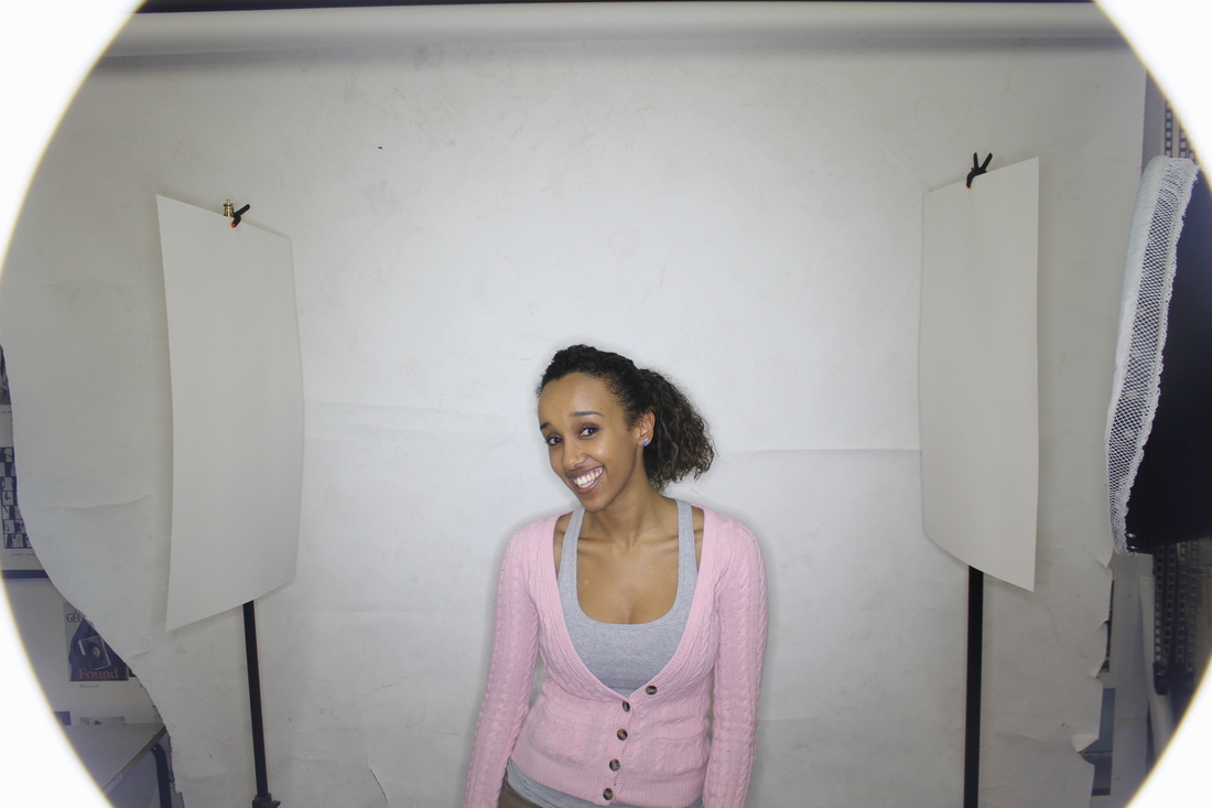
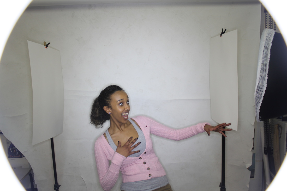
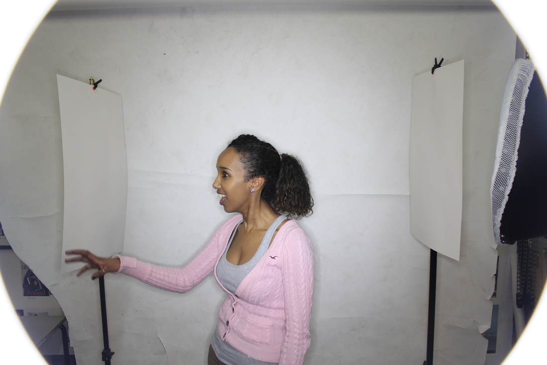
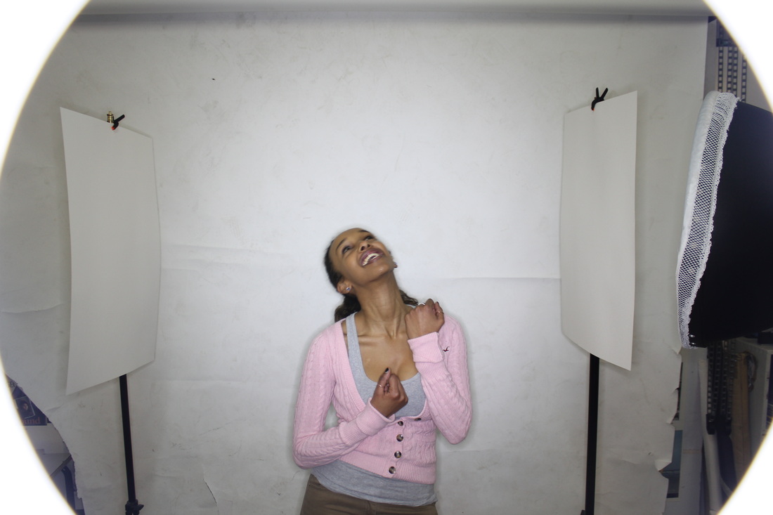
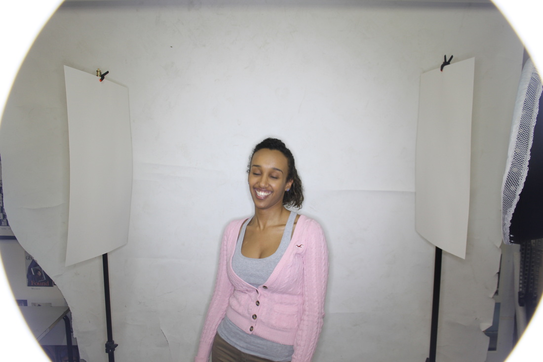
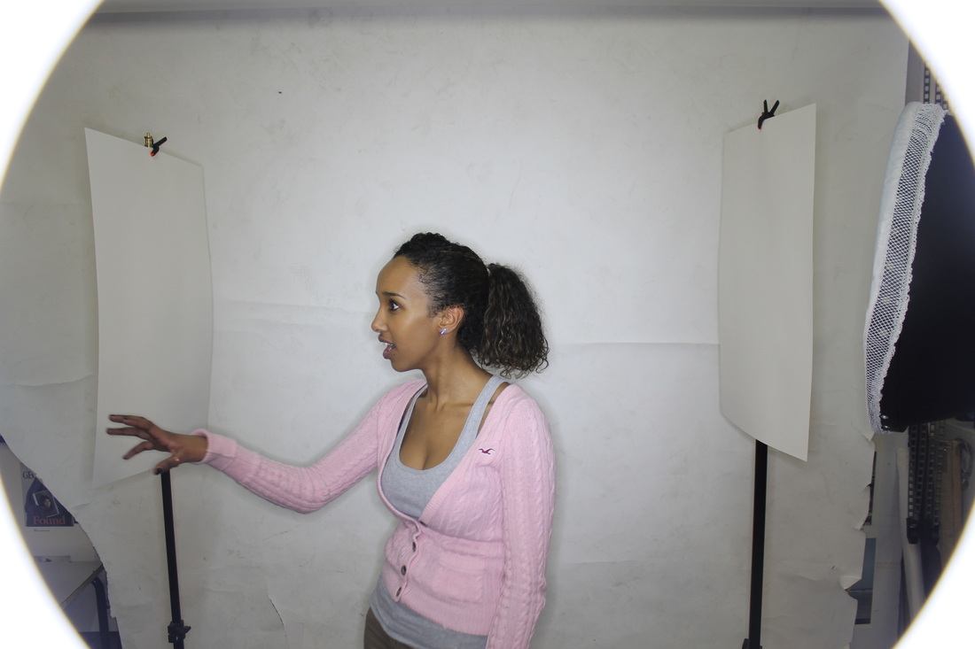
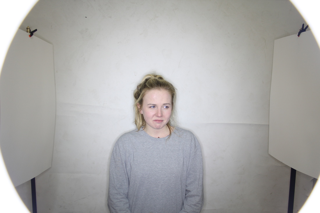
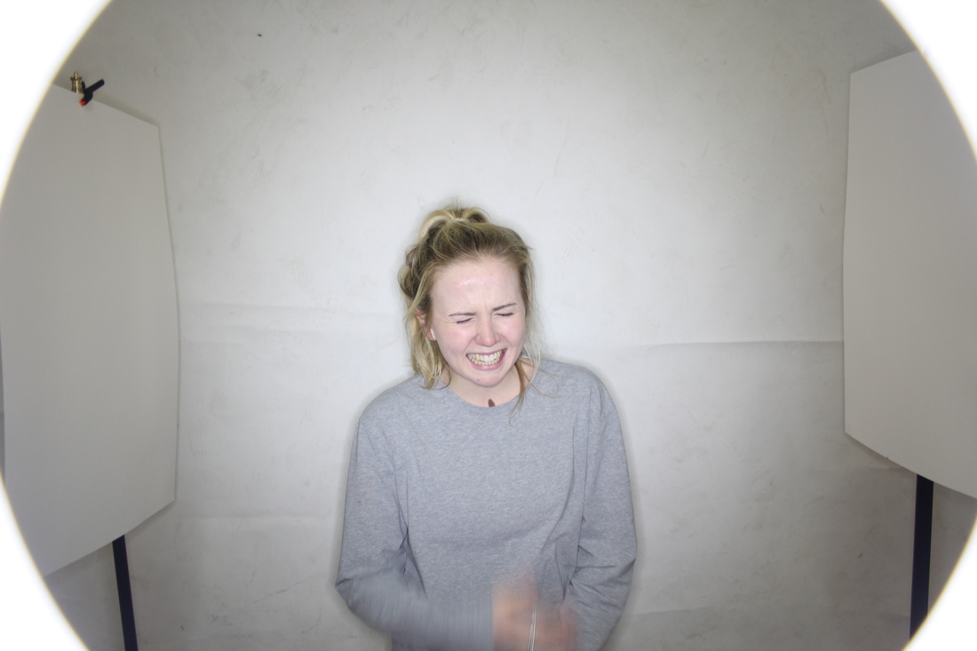
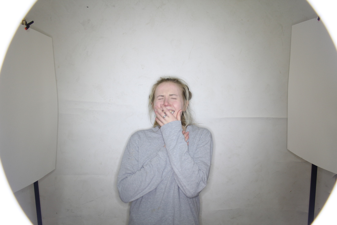
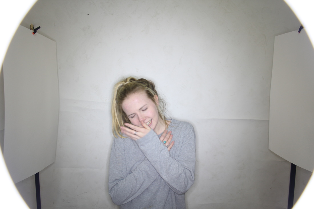
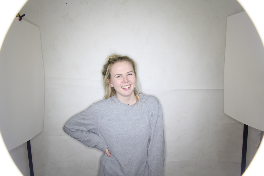
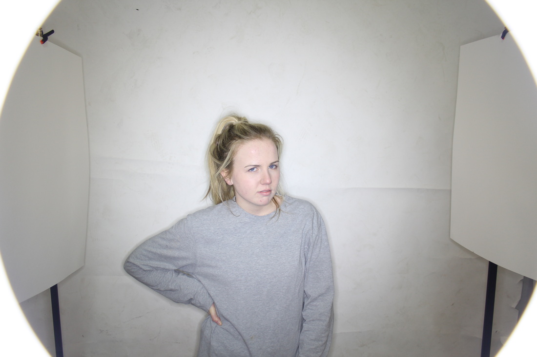
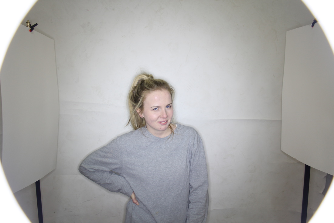
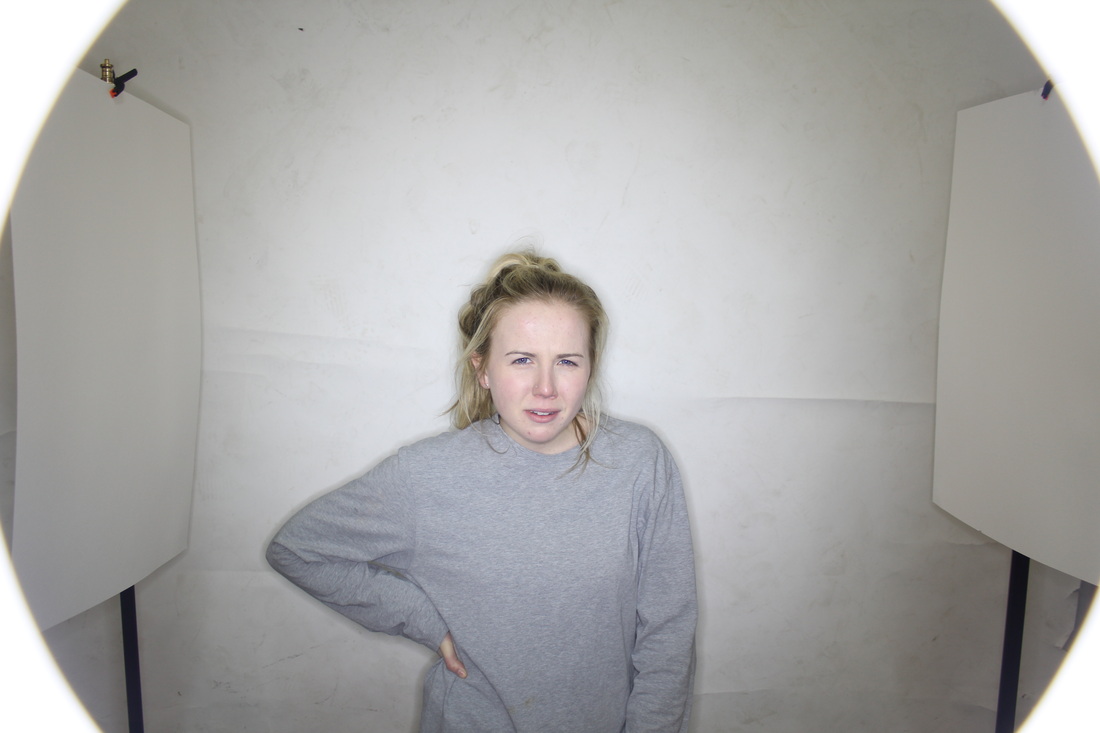
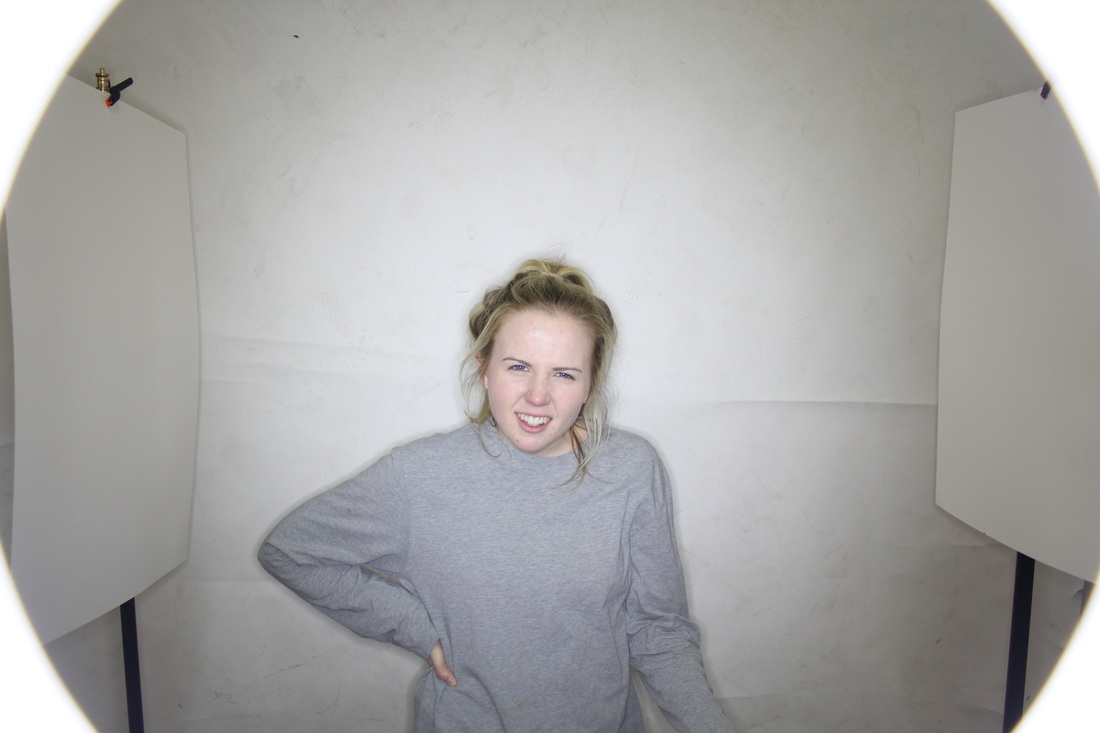
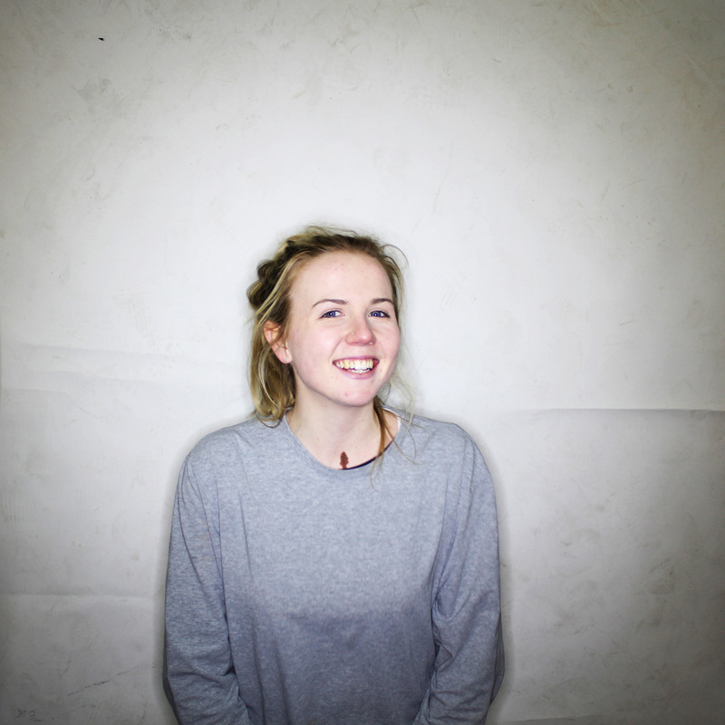
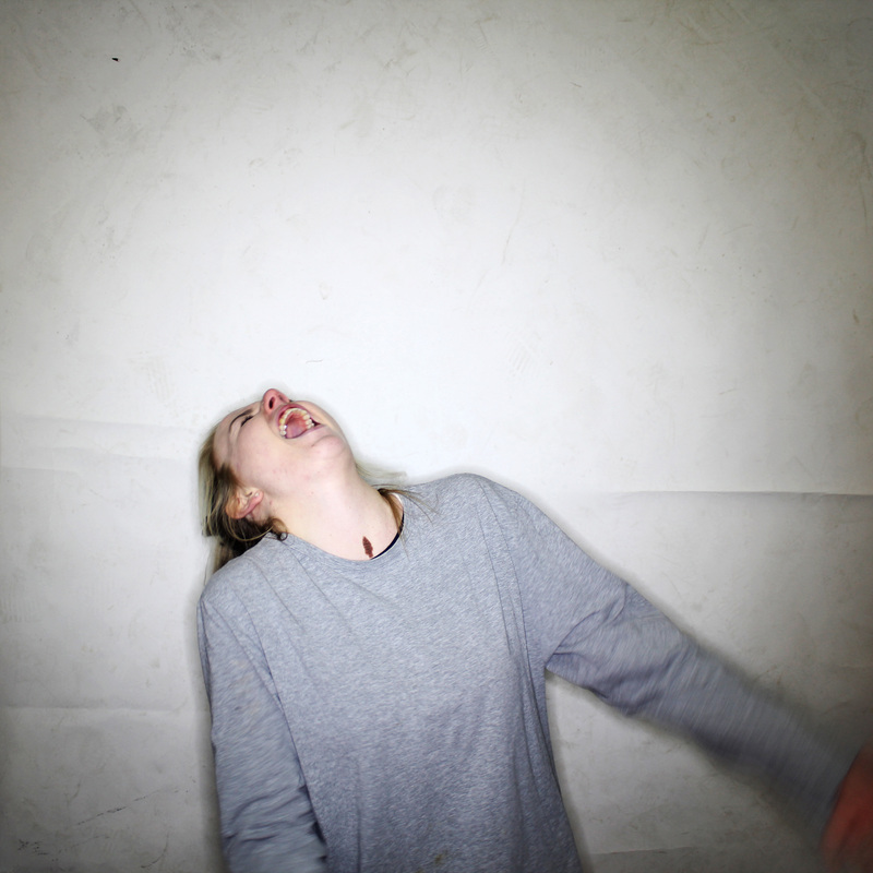
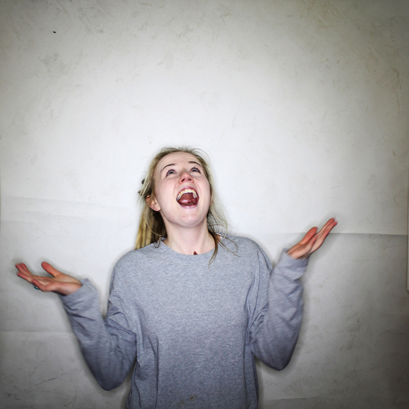
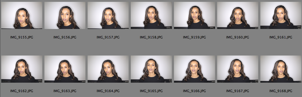
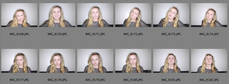
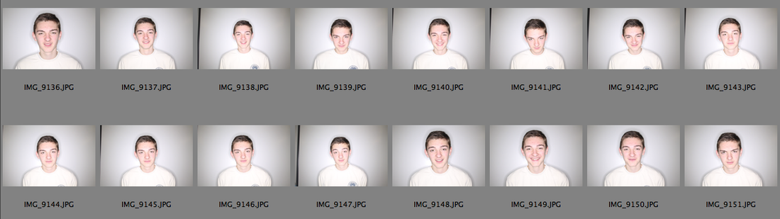
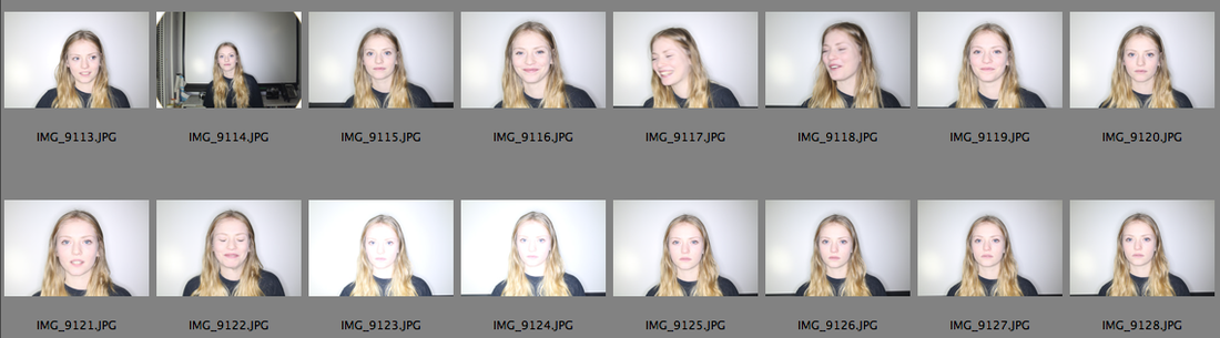
The first way I tried to capture this was through taking a wide variety of pictures where people would react to hypothetical situations that would evoke different emotions in them. In doing this with the same questions for each person, you, hopefully, get an idea of what kind of person they are, or to put it crudely, what they are like on the 'inside'.
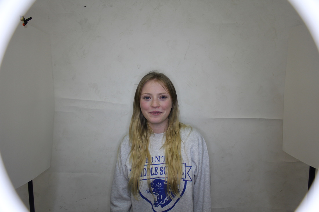
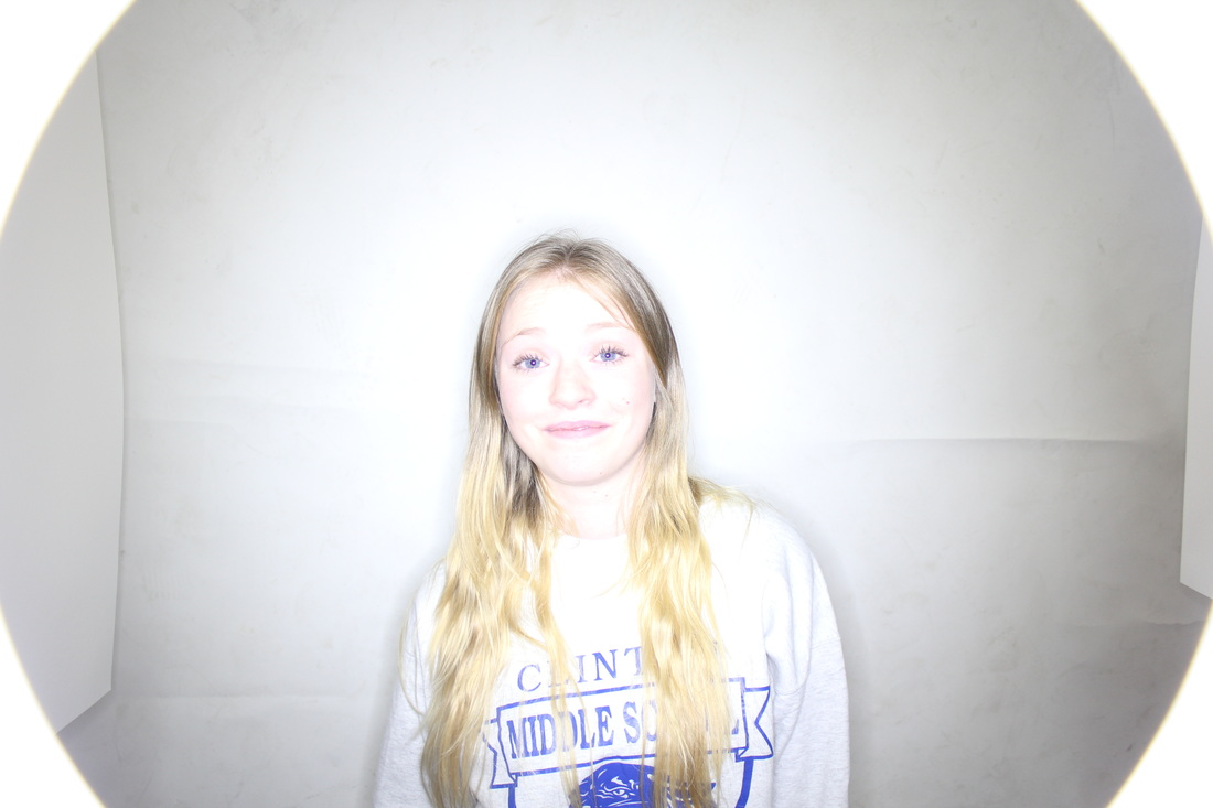
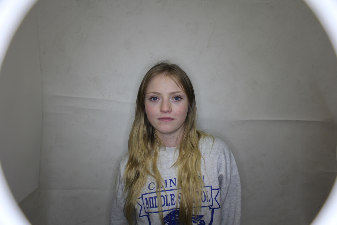
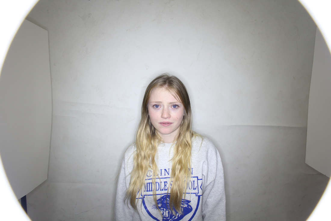
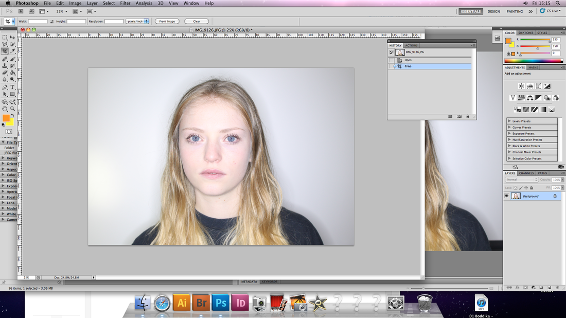
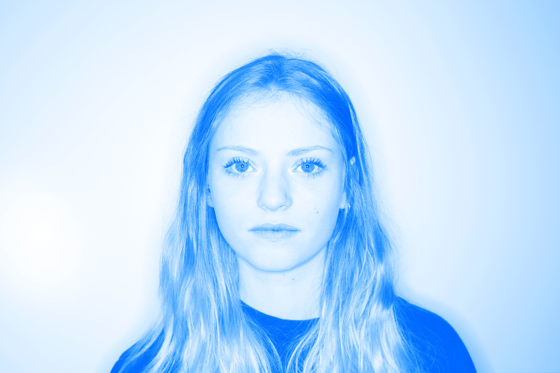
The pictures themselvs were taken using a Canon SLR with a ring flash attached. I used the ring flash in combination with the studio backdrop in order to achieve a style you would typically find in fashion photography. This was mainly due to aesthetic reasons but also because it helps to lift the subject from the backdrop more effectively which is important as they are the only focus of the pictures.
The first way I tried to capture this was through taking a wide variety of pictures where people would react to hypothetical situations that would evoke different emotions in them. In doing this with the same questions for each person, you, hopefully, get an idea of what kind of person they are, or to put it crudely, what they are like on the 'inside'.
The pictures themselvs were taken using a Canon SLR with a ring flash attached. I used the ring flash in combination with the studio backdrop in order to achieve a style you would typically find in fashion photography. This was mainly due to aesthetic reasons but also because it helps to lift the subject from the backdrop more effectively which is important as they are the only focus of the pictures.
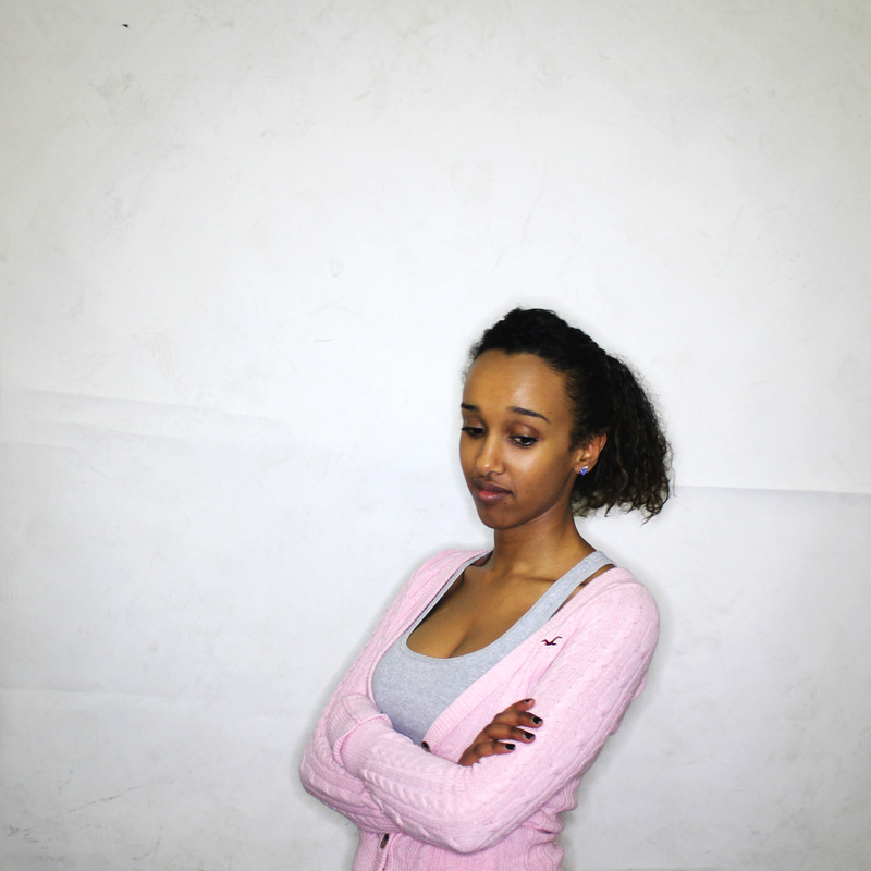
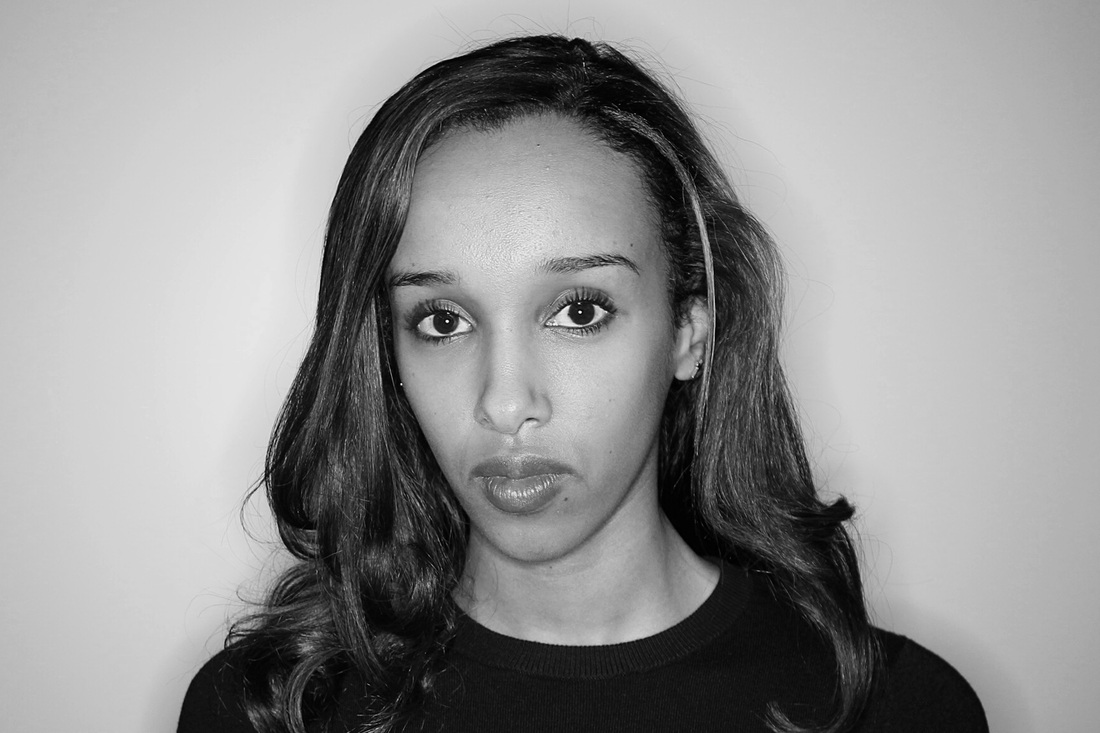
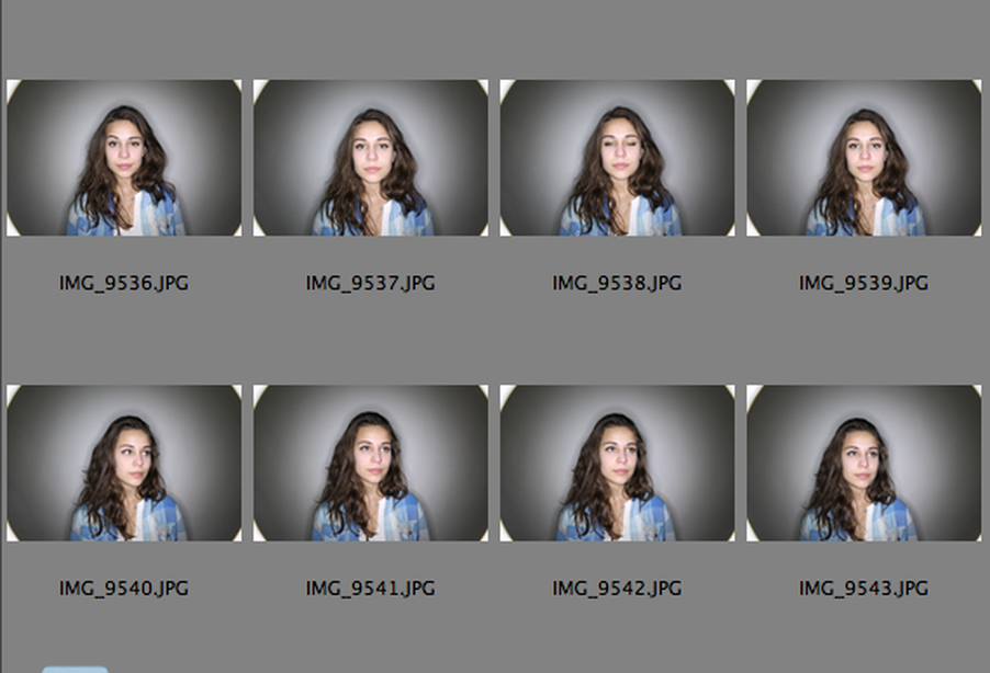
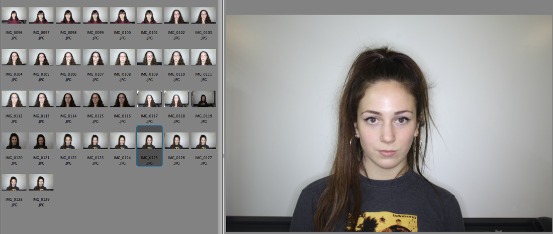
Becca - Raw Photos


Becca - Selection

Edie - Raw Photos


Edie - Selection
Banait - Raw Photos
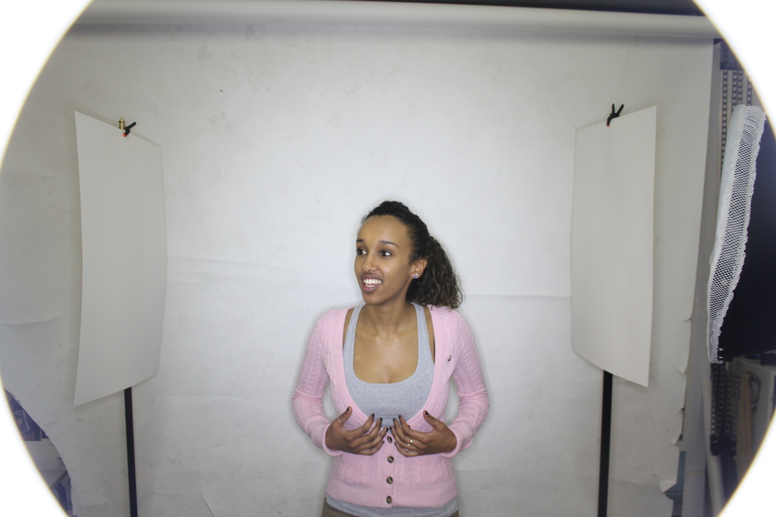
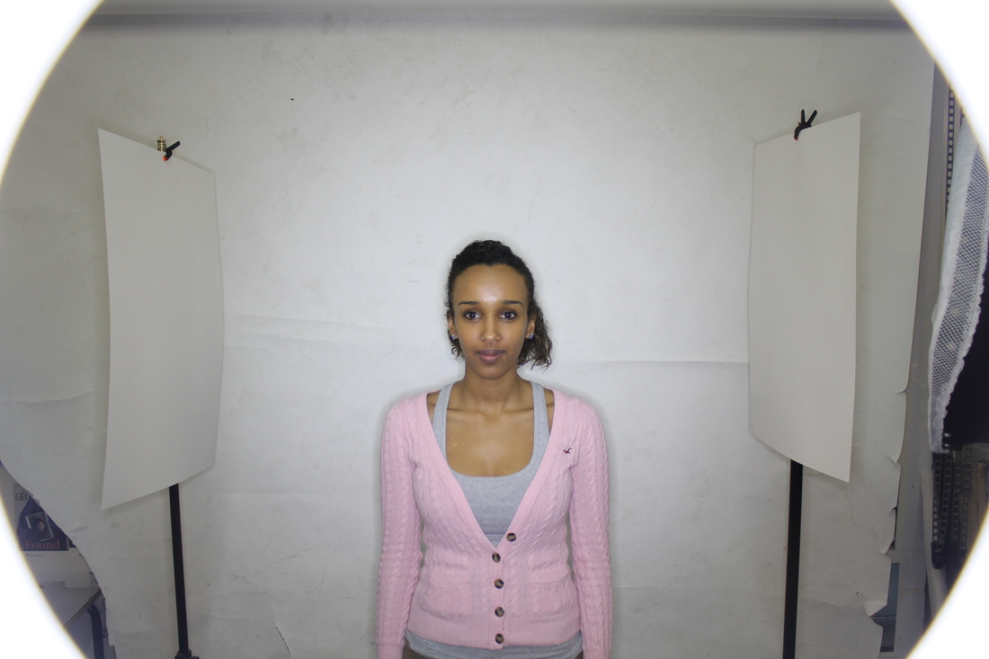


Banait - Selection

Bronte - Raw Photos


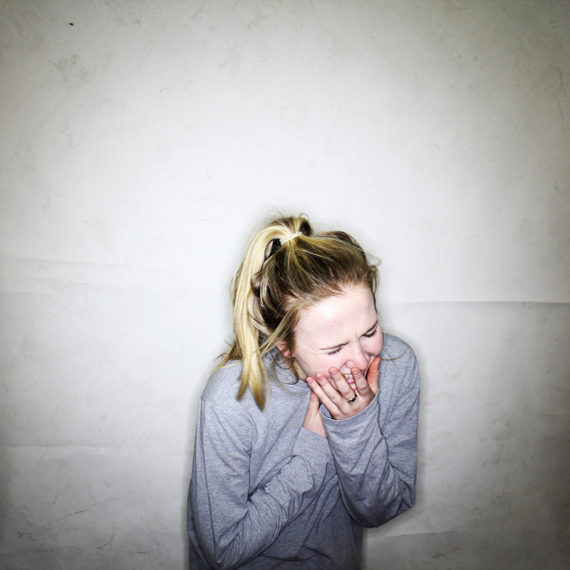
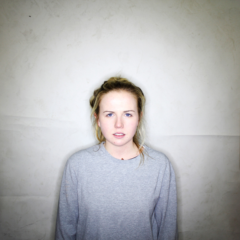
Bronte - Selection
The notion of expressing people's characteristics through photography is one I would be interested in developing. If I were to develop this strand I would probably focus on a clearer way of presenting the characteristics of the subjects visually.
4. Holes and Openings
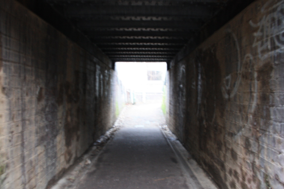
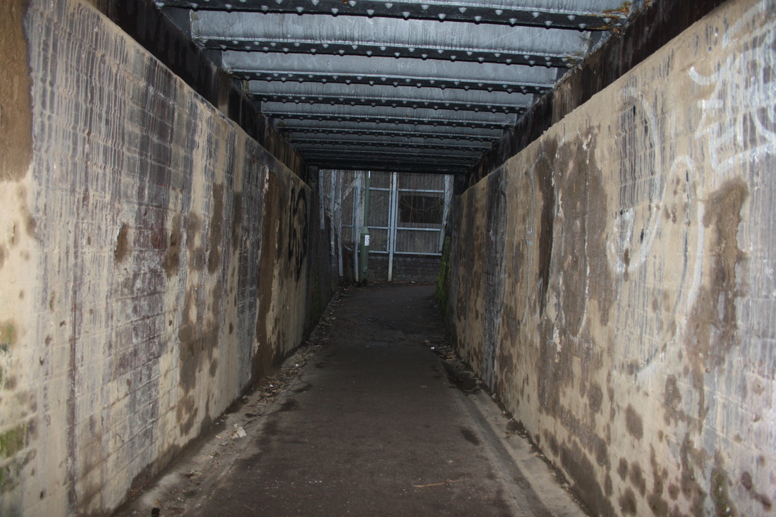

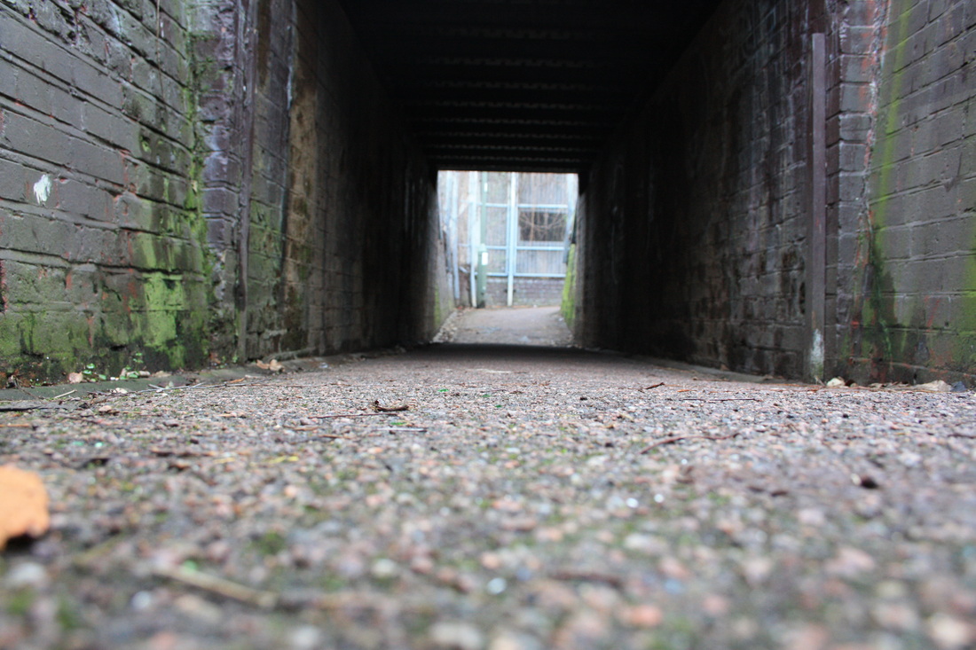

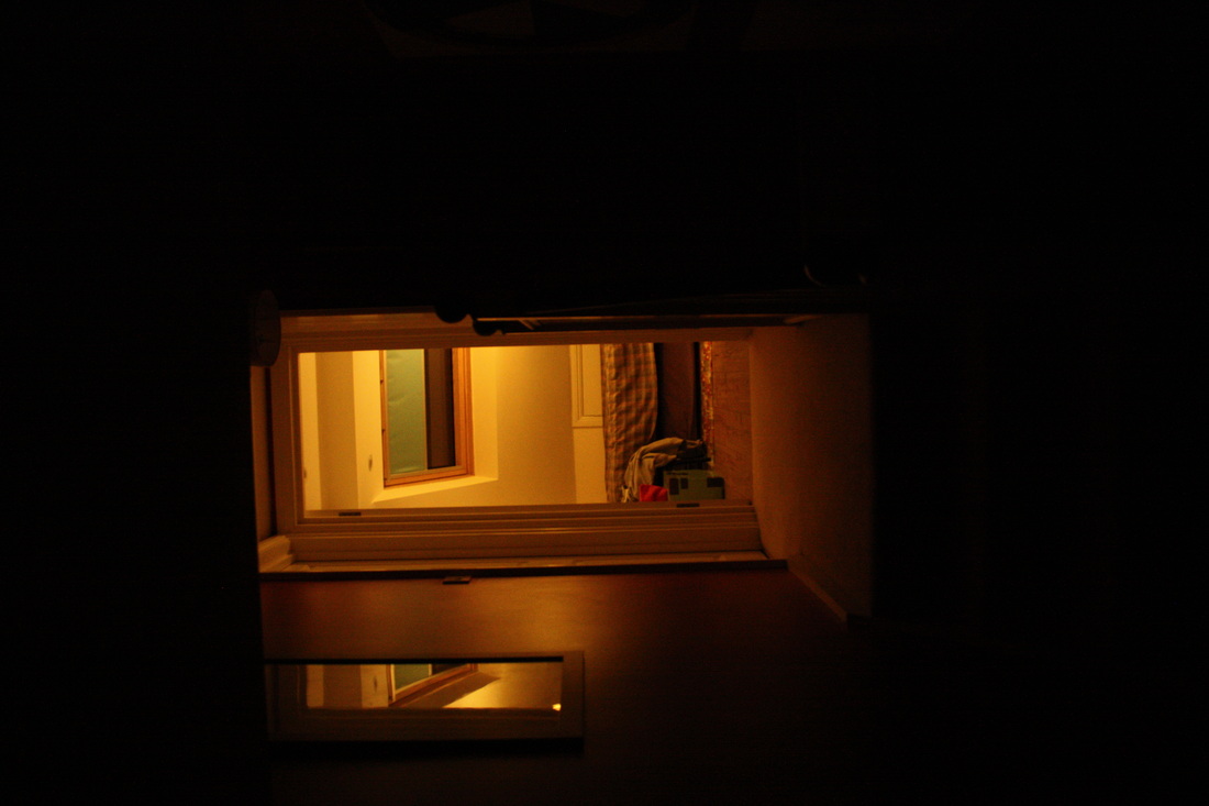
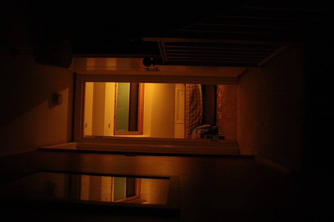
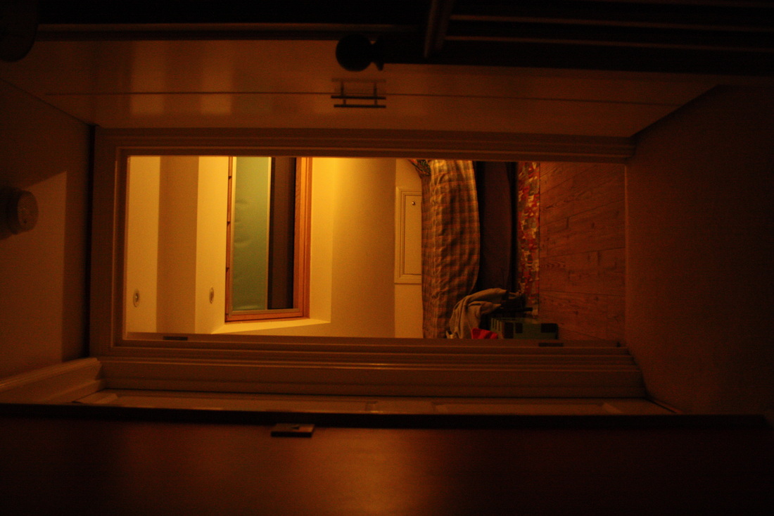


Selected Photos:
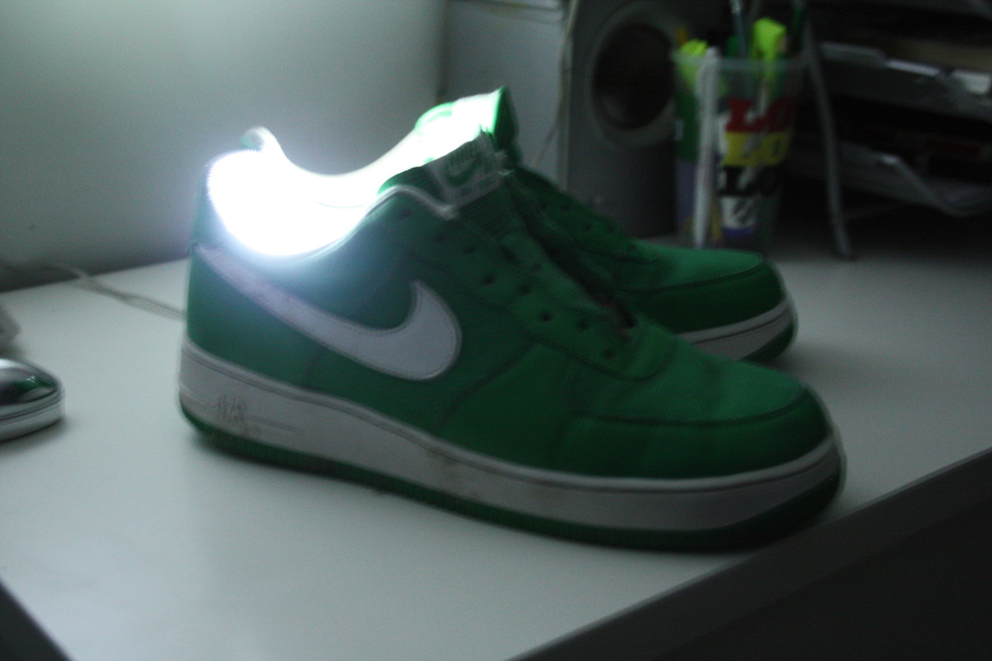
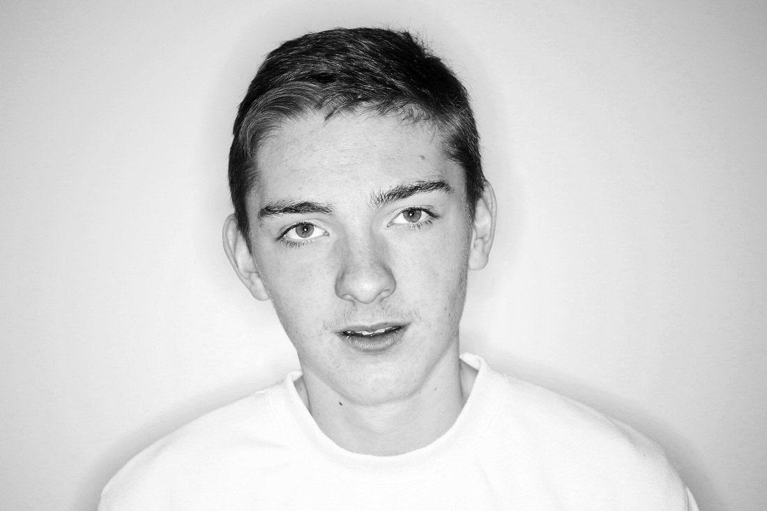
Sean Bloodworth
The first four pieces in this slideshow were inspired by Sean Bloodworth's untitled piece simply of a dim light in a dimmer room. What I applied from this piece to my own photos was the style in which it was shot; it captures every-day objects with no artistic purpose in a way that is dramatic and striking. This notion of making day-to-day objects interesting resonates with my photographic experiments (above).
Sean Bloodworth's work was first introduced to me through my taste in music. He created the cover for Skream's debut album, titled 'Skream!''. The photo itself is part of an exhibition documenting the UK and US underground bass music scene since 2005.
Sean Bloodworth's work was first introduced to me through my taste in music. He created the cover for Skream's debut album, titled 'Skream!''. The photo itself is part of an exhibition documenting the UK and US underground bass music scene since 2005.
Experimenting with outside space
Chosen Strand - Personality
I have chosen to develop the strand of personality, expanding the notion of being able to represent aspects of our personality visually or, in other words, to show the inside on the outside. I touched on this notion previously under the more experimental, initial section of my exam project where I would take a selection of photos of people as I told them different things designed to evoke different, unplanned emotional responses.
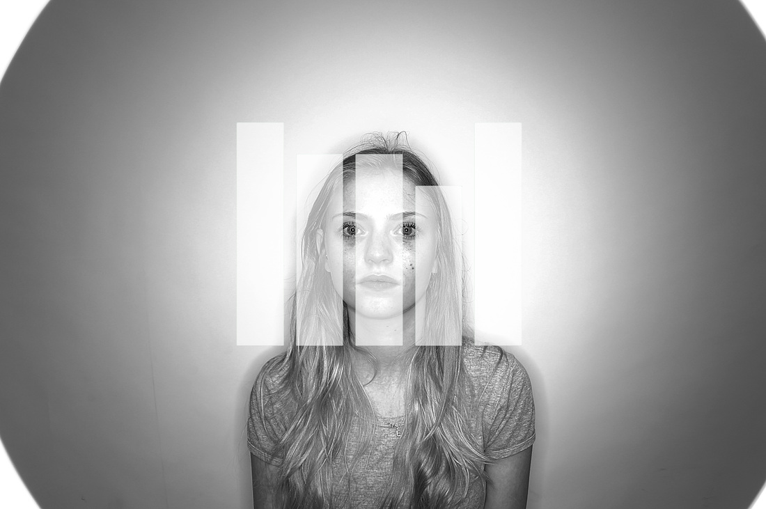
'DNA Portraits'
In America I noticed there had been a new trend for art structured by samples of people's genetic makeup; this interested me for two main reasons, aesthetically, conceptually and, of course, how these two aspects co-operated together. This expression on what is inside all of us artistically resonates with the underlying concept driving my chosen strand in this exam theme and I would be interested in using inspiration from this work to find a way I could interpret my own way of portraying personality visually.
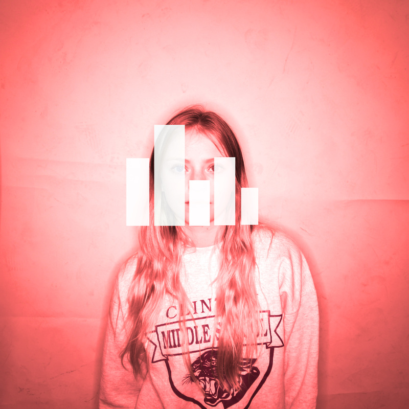
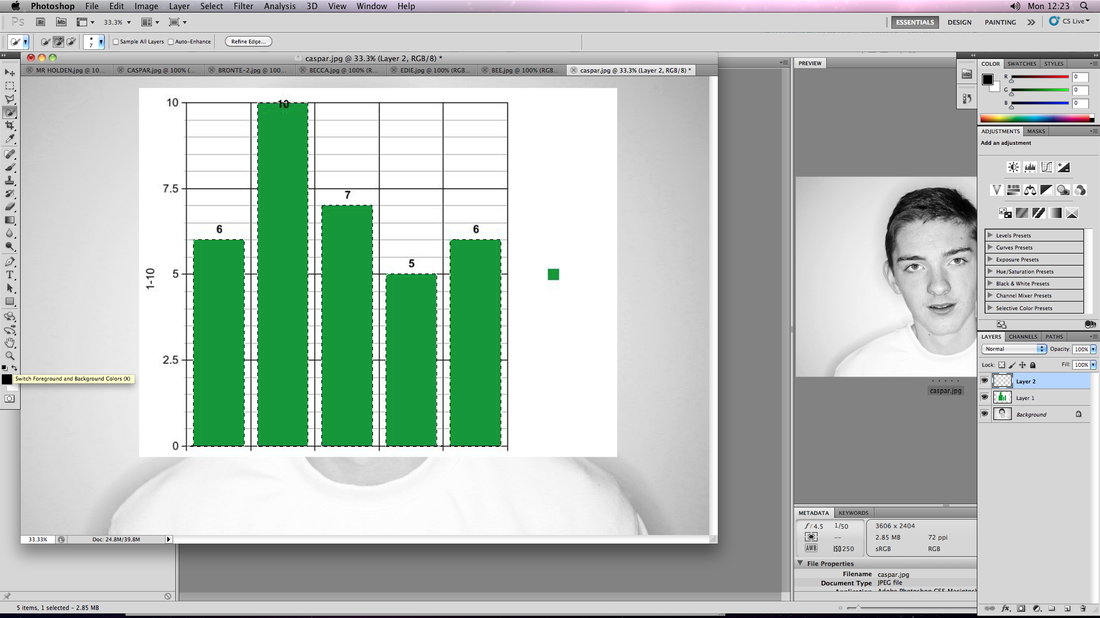
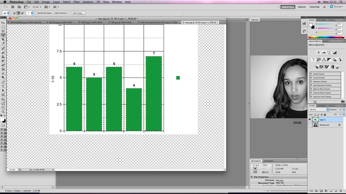
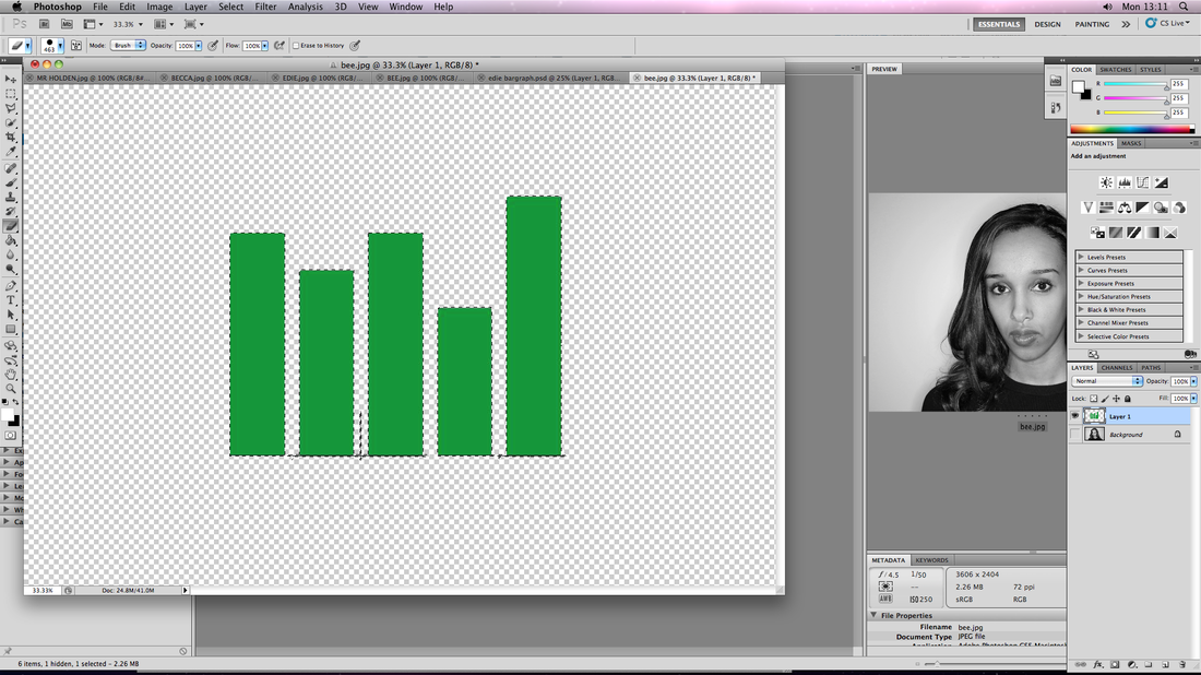
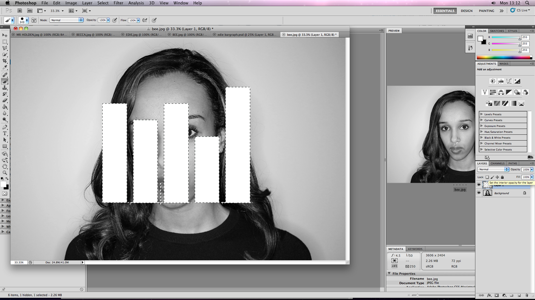
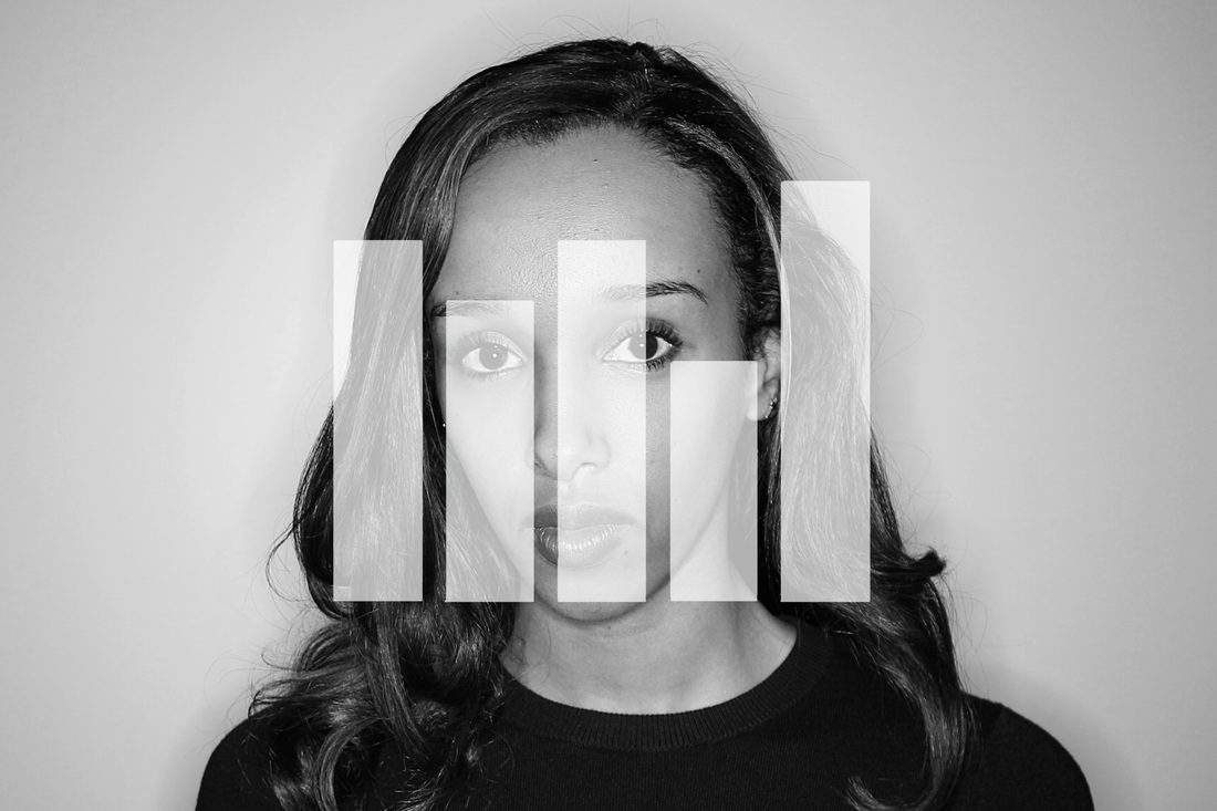
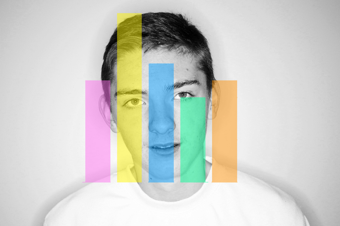
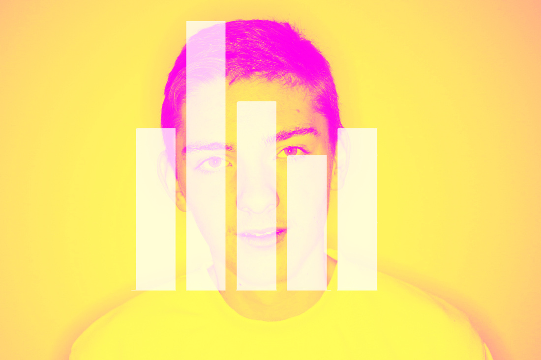
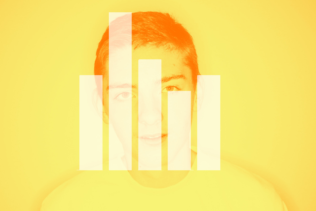
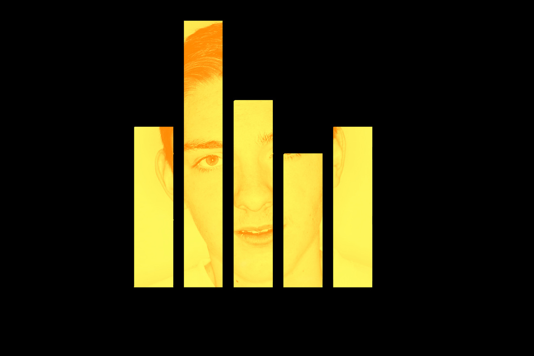
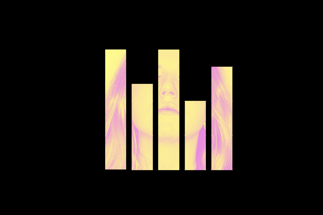
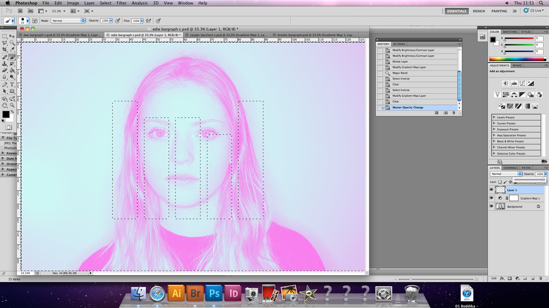
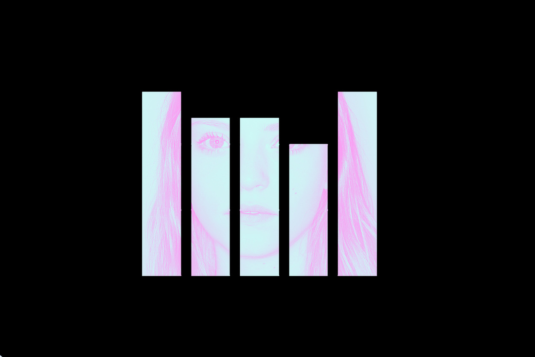
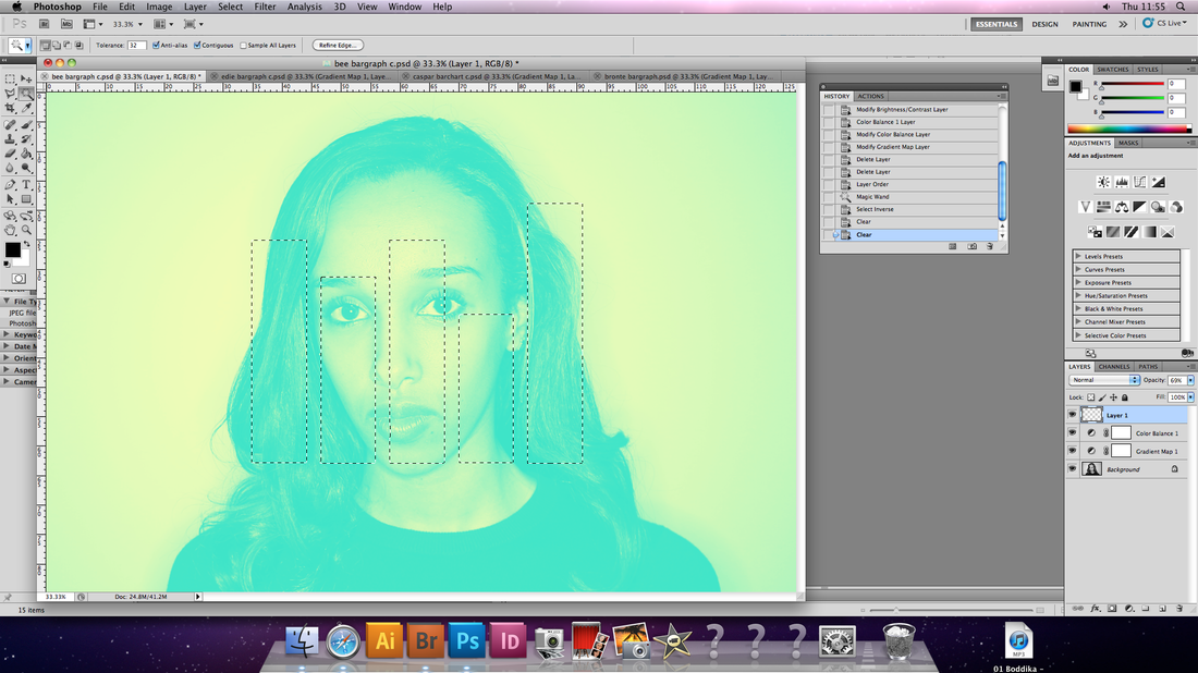
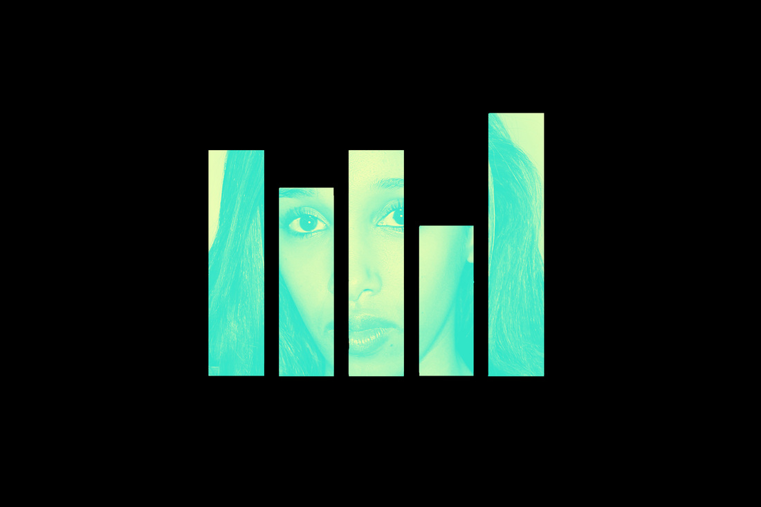
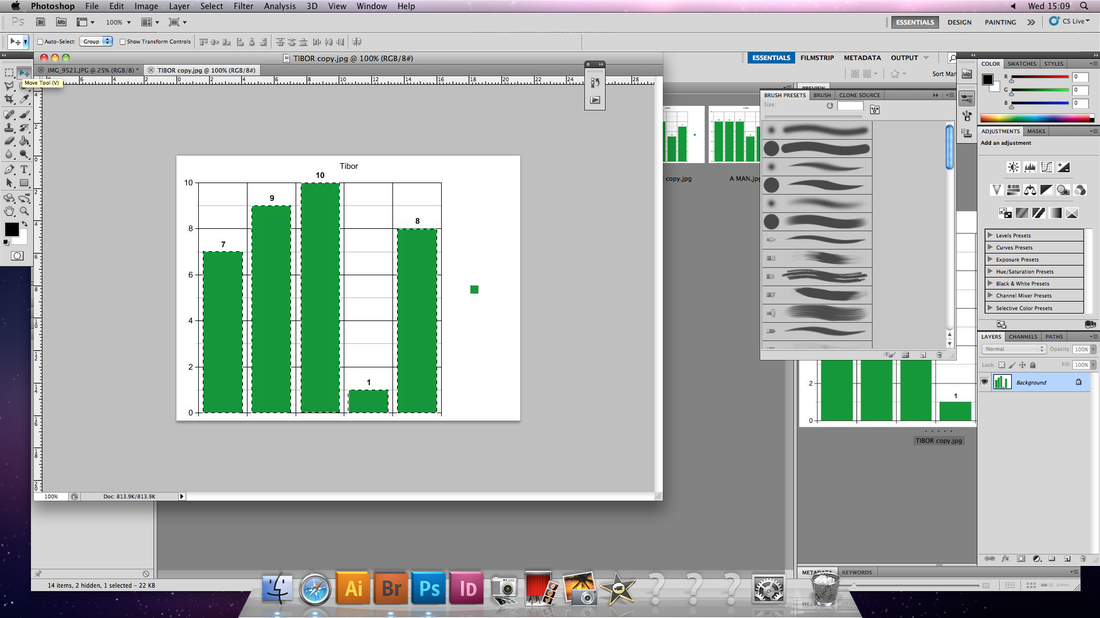
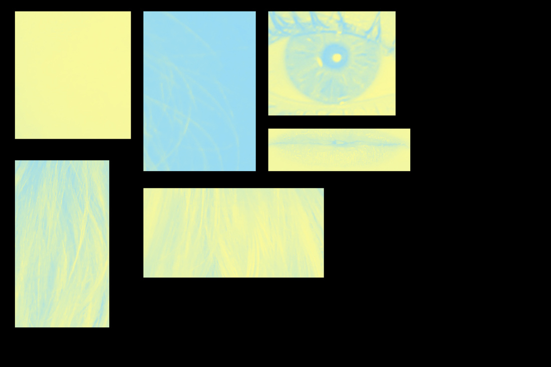
Quick Ilustration of my idea
The varied lengths of the bars doesn't represent any data, nor was the photo used taken with this purpose in mind. This is simply a chance to illustrate what I envisage for the work I am about to undergo whilst also being an opportunity to experiment with slightly different ways of presenting the two elements involved. In turn, this should create a more solid idea of how to create the 'proper' photos for this idea, from what works and what doesn't in this mock-up.

Potential Personality Questions
Inspired by the 'DNA Portraits' I aim to use this block method to convey someone's personality using a new take on portrait photography. I could possibly use a similar block image to represent different people's characteristics. I thought this would take place by using questions listing different character traits and representing them in a bar graph format.
1. How tolerant do you think of yourself as being?
2. How loving do you think of yourself as being?
3. How generous do you think of yourself as being?
4. How argumentative do you think of yourself as being?
5. How brave do you think of yourself as being?
6. How selfish do you think of yourself as being?
7. How stubborn do you think of yourself as being?
8. How polite do you think of yourself as being?
9. How shy do you think of yourself as being?
10. How lazy do you think of yourself as being?
11. How sentimental do you think of yourself as being?
12. How Hard working do you think of yourself as being?
13. How Passionate do you think of yourself as being?
Refined selection of Personality Questions
- These are the questions that I thought would be the most useful when it came to getting a general overview of their personality and how they perceived themselves to be: the character traits and attitudes which should vary most in different people.
The reason I use refine my original set of questions is for two reasons. The first is suggested by the term 'refine'; I wanted use the first set as a spontaneous mind-storm of ideas and then I would cherry-pick the ones which I considered would be most effective. The second reason is becuase the more data (bars) I imposed over the photographs the less visually dramatic the bars would be, I wanted to limit the sharing of attention between many bars and focus them a select few, ideally less than five.
A. How hard working do you consider yourself to be? - '1' for extremely weak willed and lazy, '10' for extremely focused and hard working, strong willed.
B. How Impulsive would you think of yourself as being? '1' if you consider yourself to be extremely rational, logical and calculating - you don't do much without diligently planning it first, '10' for extremely impulsive - you'll do almost anything if it feels right at the time.
C. In meeting new people socially, how introverted/shy are you? - '1' extremely shy, '10' for extremely outgoing.
D. To you, whose needs generally take priority? The needs of others? or your own? - '1' for the needs of others always taking absolute priority and'10' for your own having absolute priority to you.
(This excludes the feeling of 'need' to help others)
E. How open are you to change/difference? '1' If you like routine and don't like anything outside of it, you stick to what you know , '10' If you would always want to do something different and meet new people for example.
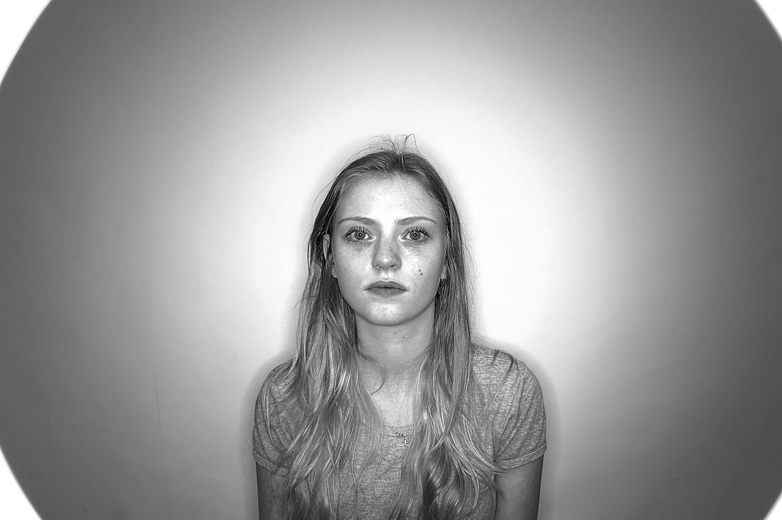
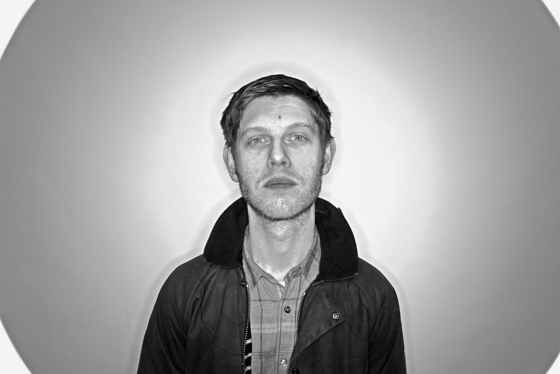
Answers
Mr Holden
A: 7
B: 6
C: 6
D: 5
E: 6
Caspar
A: 6
B: 10
C: 7
D: 5
E: 6
Bronte
A: 7
B: 5
C: 7
D: 4
E: 6
Becca:
A: 8
B: 3
C: 5
D: 4
E: 6
Edie:
A: 7
B: 6
C: 6
D: 5
E: 7
Bee:
A: 6
B: 5
C: 6
D: 4
E: 7
A: 7
B: 6
C: 6
D: 5
E: 6
Caspar
A: 6
B: 10
C: 7
D: 5
E: 6
Bronte
A: 7
B: 5
C: 7
D: 4
E: 6
Becca:
A: 8
B: 3
C: 5
D: 4
E: 6
Edie:
A: 7
B: 6
C: 6
D: 5
E: 7
Bee:
A: 6
B: 5
C: 6
D: 4
E: 7


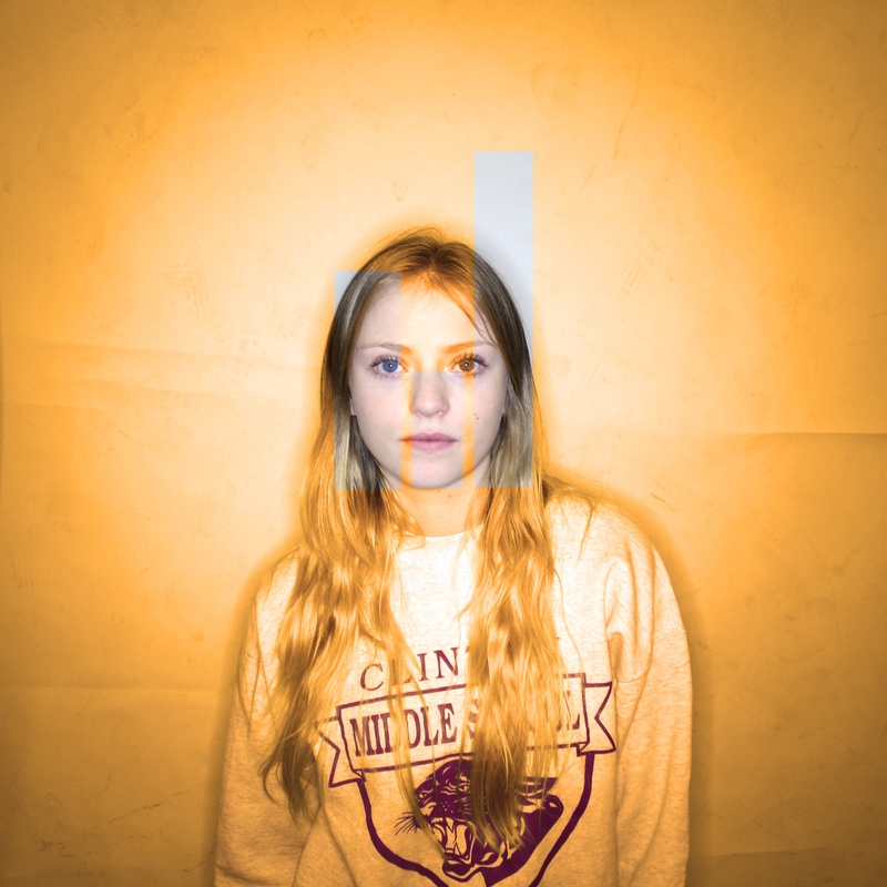
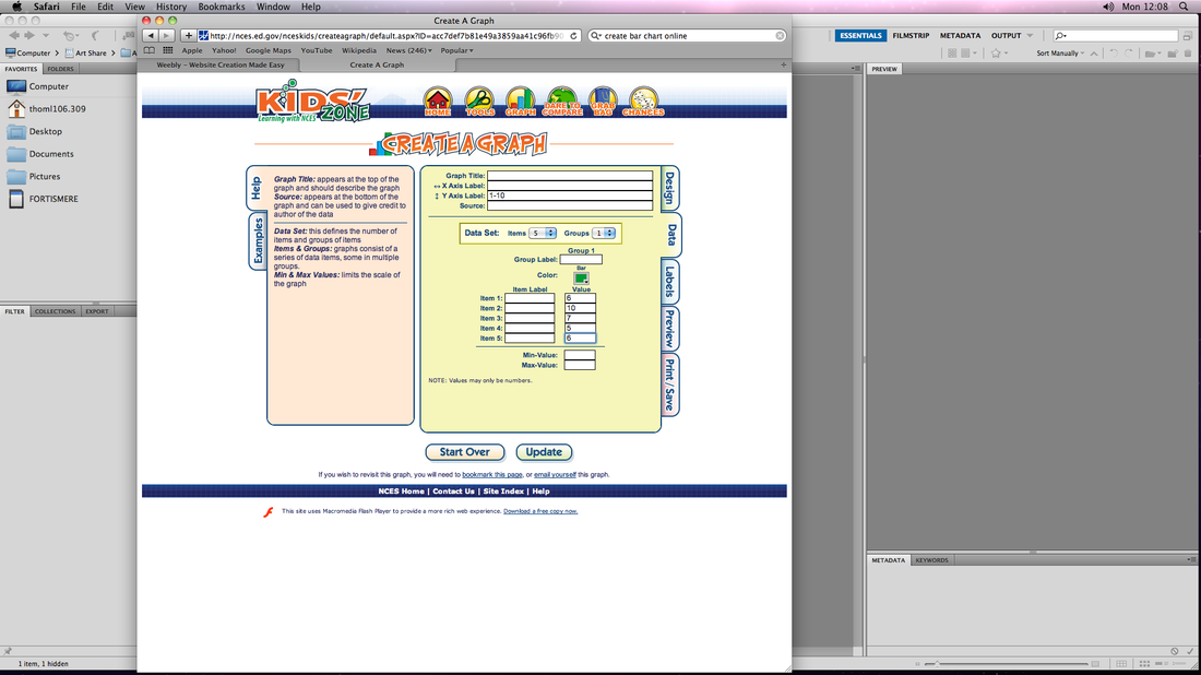
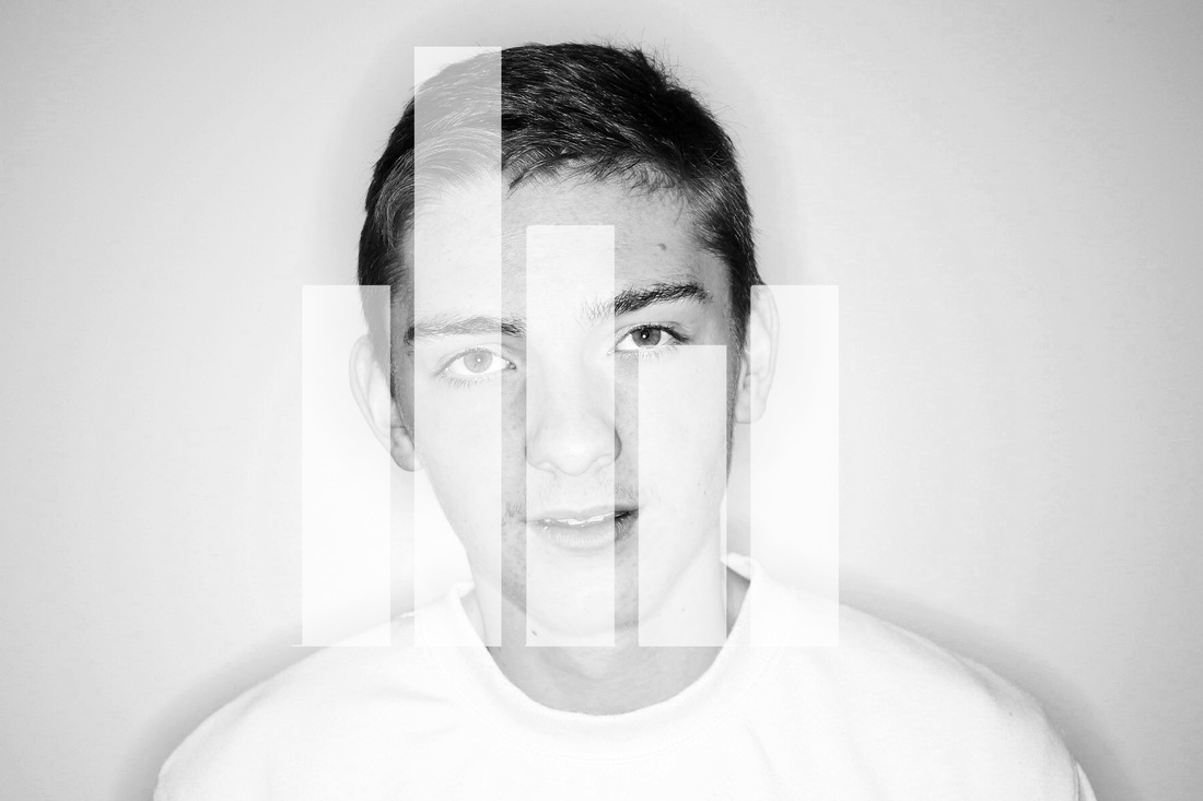
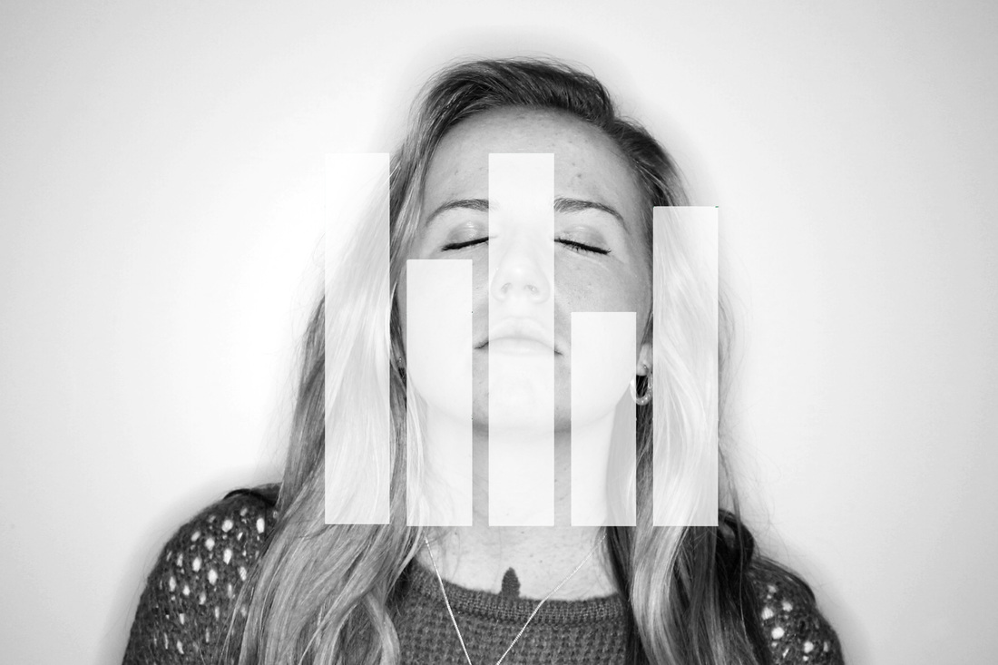
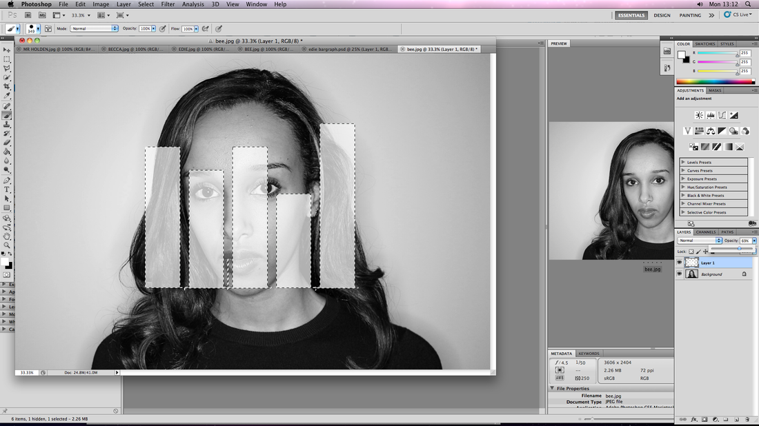
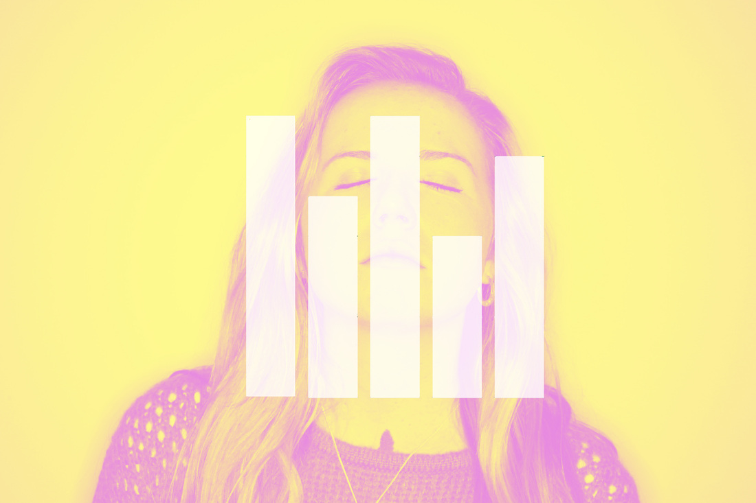
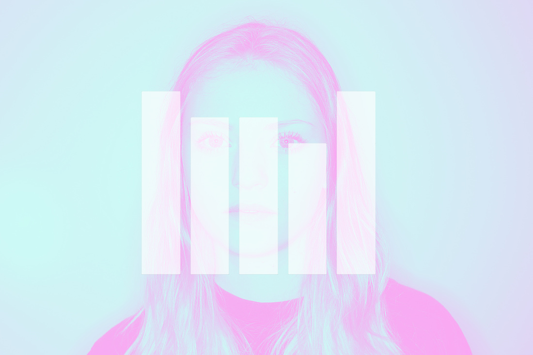
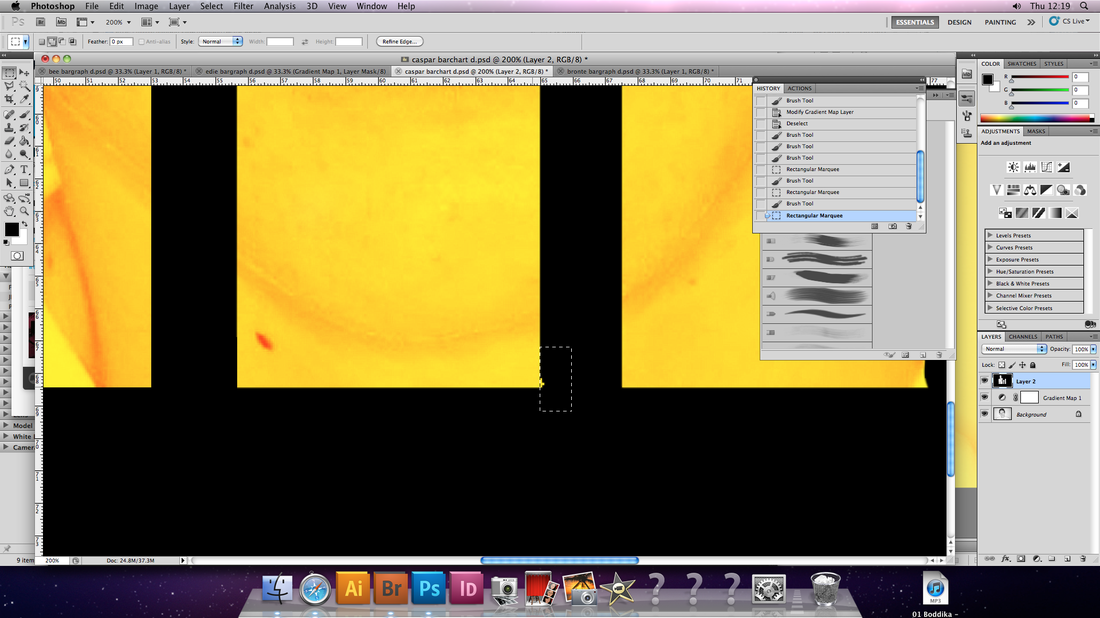
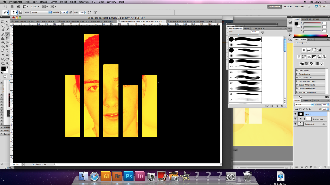
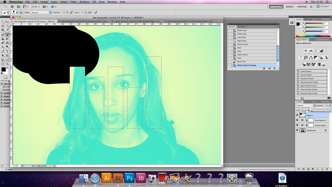
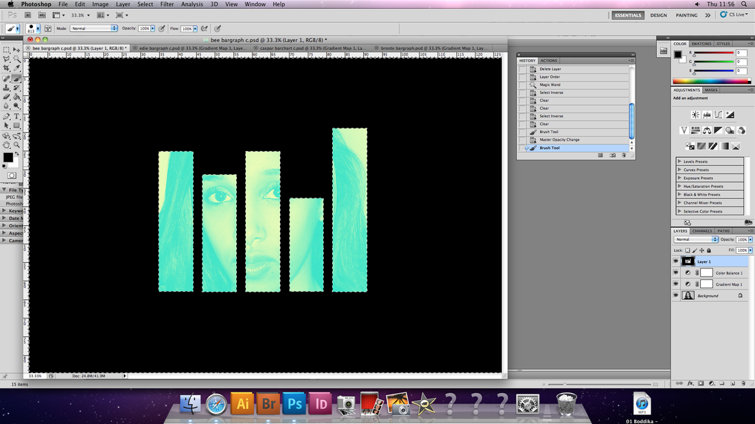
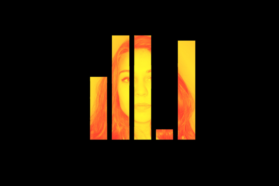
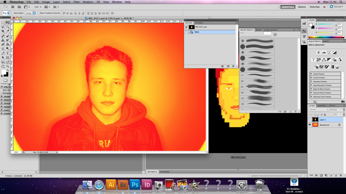
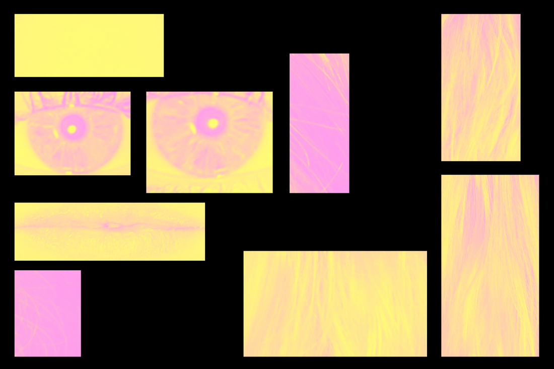
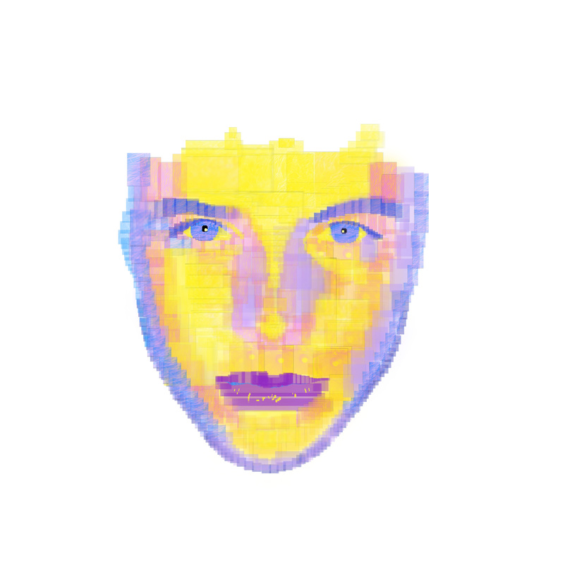
For the creation of the graphs, I entered the numerical results from each personality test into an online bar graph creator. This was the most practical and effective way of ensuring their accuracy which would help achieve the sense of neatness I had envisaged, to contrast with the more human element(s) of the portraits themselves.

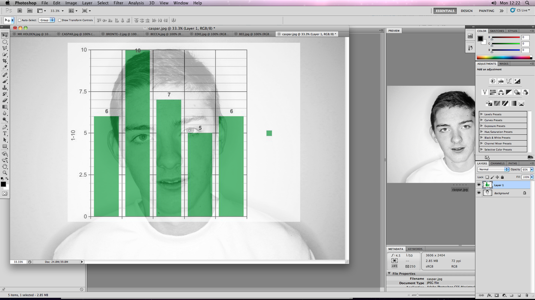

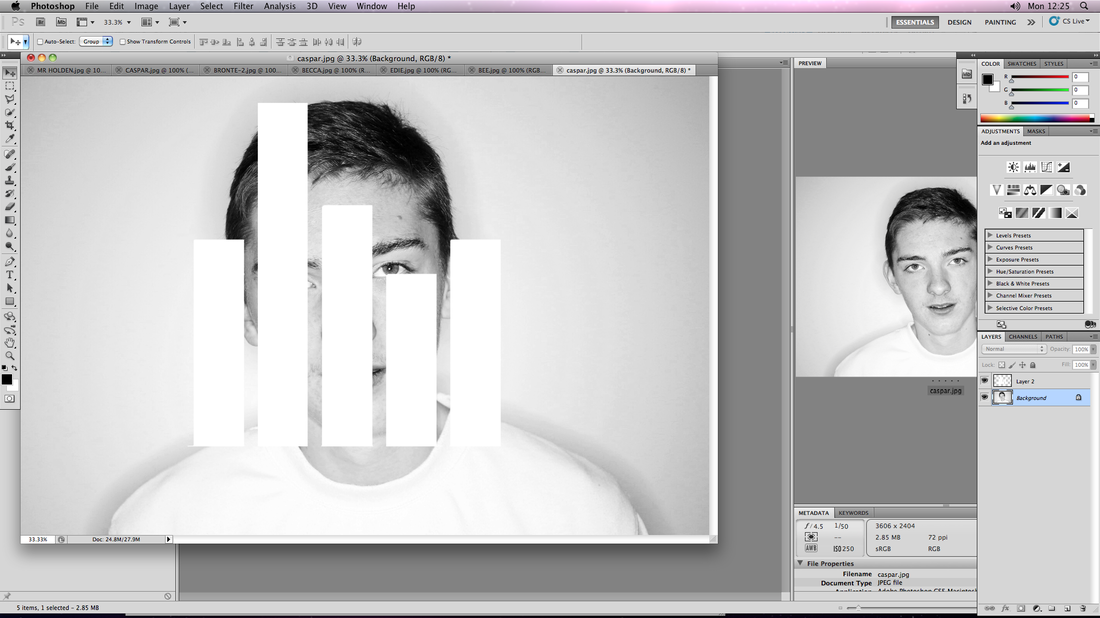
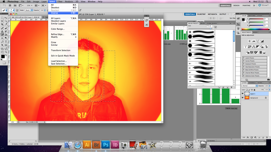
- Once the graphs were completed, I imposed them over the original picture of the subject they were meant to represent.
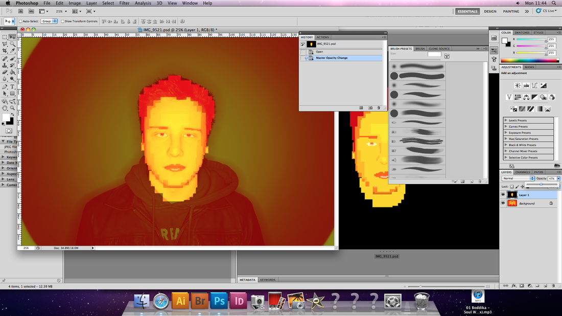
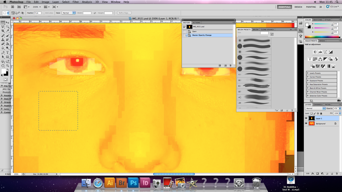
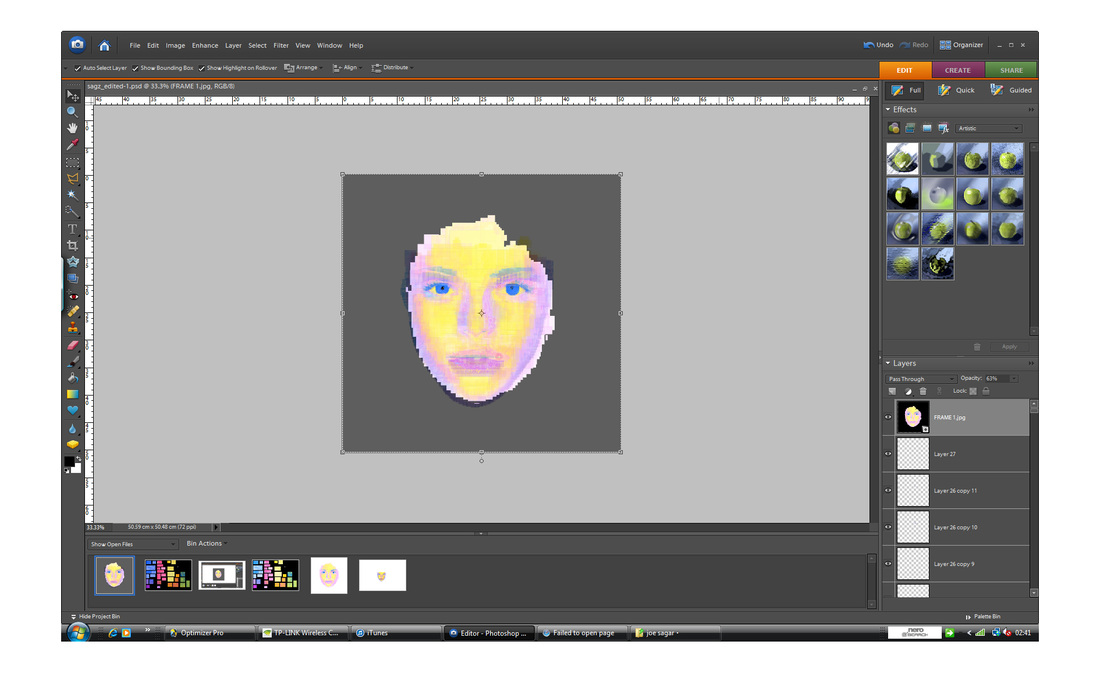
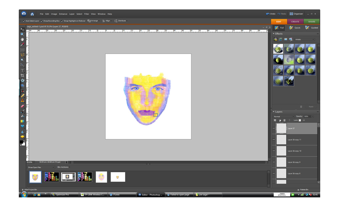
- I continued to select each of the blocks using the 'quick selection' tool, and then used the 'paint brush' to colour them in a solid white.
- After this, I 'inverted' the selected area, use the 'rubber tool' to erase the remainder of the graph.
- When this was complete, I followed by decreasing the 'opacity level' to 50%.
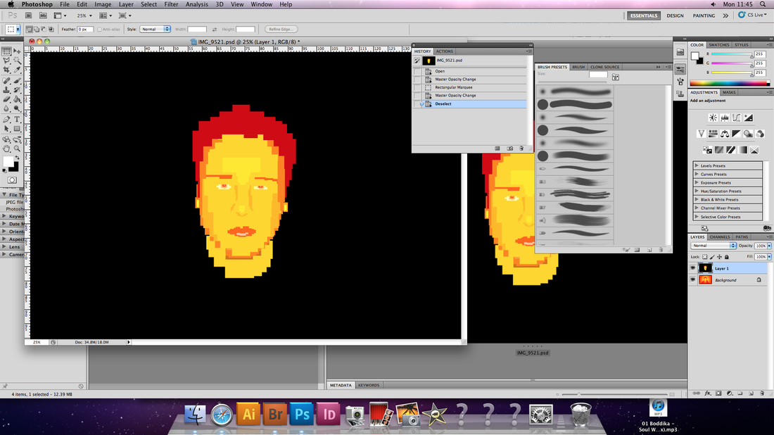
Below are the products of this development sequence:
- I continued to select each of the blocks using the 'quick selection' tool, and then used the 'paint brush' to colour them in a solid white.
- After this, I 'inverted' the selected area, use the 'rubber tool' to erase the remainder of the graph.
- When this was complete, I followed by decreasing the 'opacity level' to 50%.
Below are the products of this development sequence:
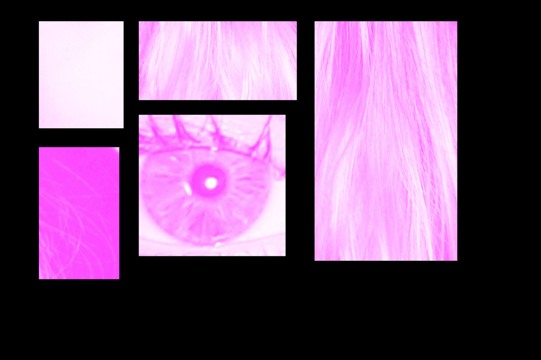
Experimenting with HDR
Pleased with the resullts of my previous selection, I began to look at aspects of the photos I could improve. I wanted to experiment with HDR, in an attempt to create a more dramatic portrait, whist picking up more detailed aspects of the subject, unearthing a wider spectrum of tones, which would hopefully contrast with the blank plainness of the blocks imposed on their faces.
The process:
1. I set the exposure on my Cannon SLR to manual, bracketed setting.
2. I took at least three different photos of each subject with both them, and the camera, in the exact same position.
3. After this I selected the option on Photoshop to "merge HDR".
4. I configured the brightness, sharpness and other levels to achieve the photos you see below this list.

The photo directly above is the only photo I found to be successful; the use of the HDR method brings a certain level of contrast in tone. However, the other photos appeared un-natural and they all lost the sense of freshness the previous batch of photos had. For these reasons I don't think I will continue with this method in the rest of this project and instead I will search for more experimental ways to potentially develop these pictures.
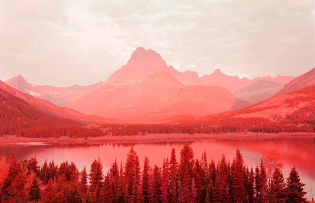
David Benjamin Sherry
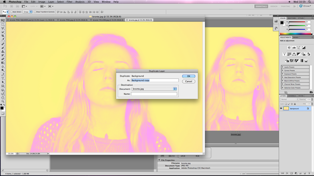
Sherry was born in 1981, Woodstock - New York. He has been the subject of five solo exhibitions and featured in ten group exhibitions, one of these being at the Saatchi Gallery in 2012 where I first saw his series of dramatic landscape pictures. He would manually develop them with the addition of different chemicals to create specific colour gradients in each picture, usually a monolithic photograph but with a slight hue of some lighter colour.
These pictures inspired me to experiment with this use of colour in my own work in this project.
These pictures inspired me to experiment with this use of colour in my own work in this project.
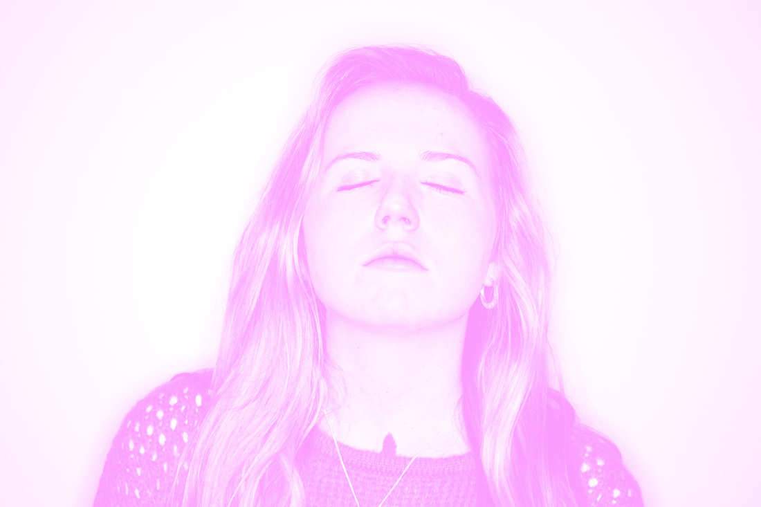
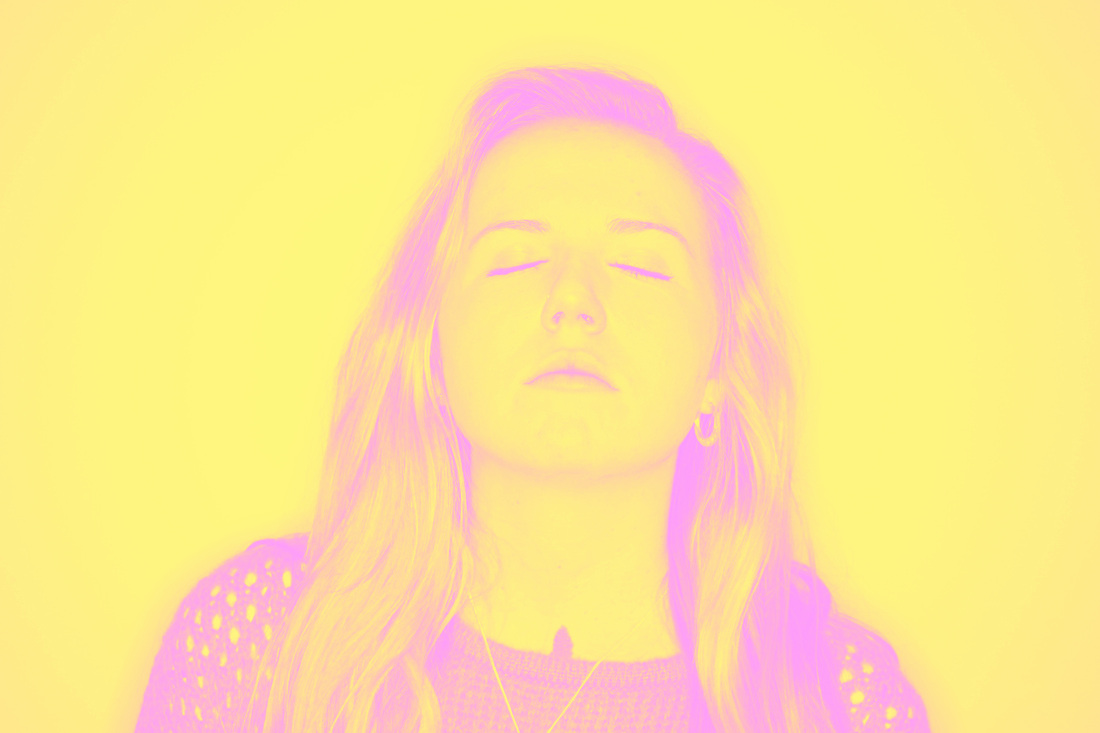
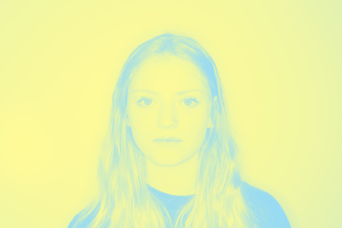
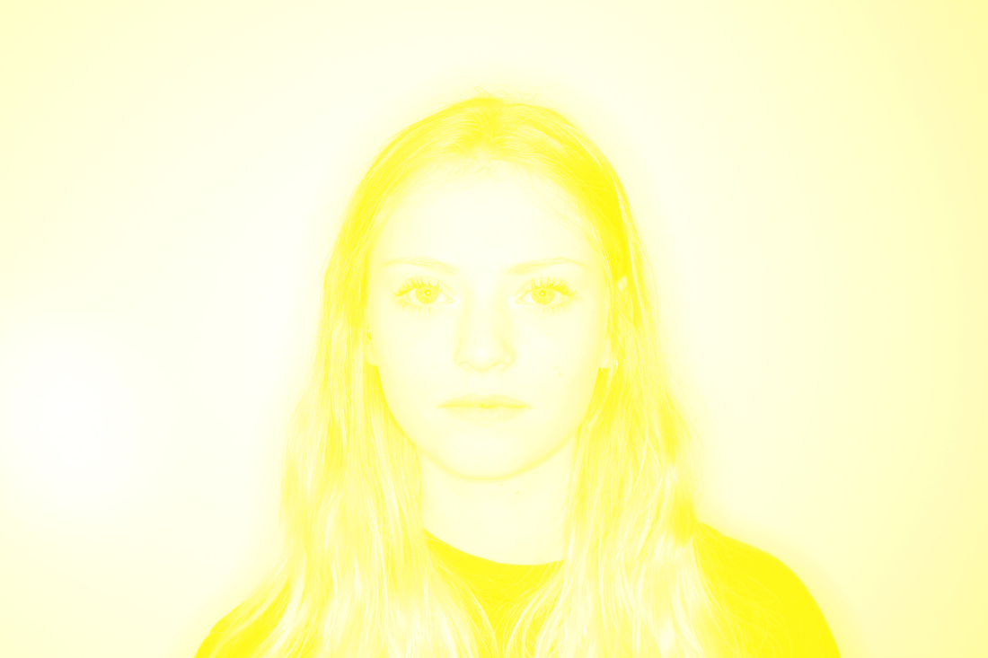
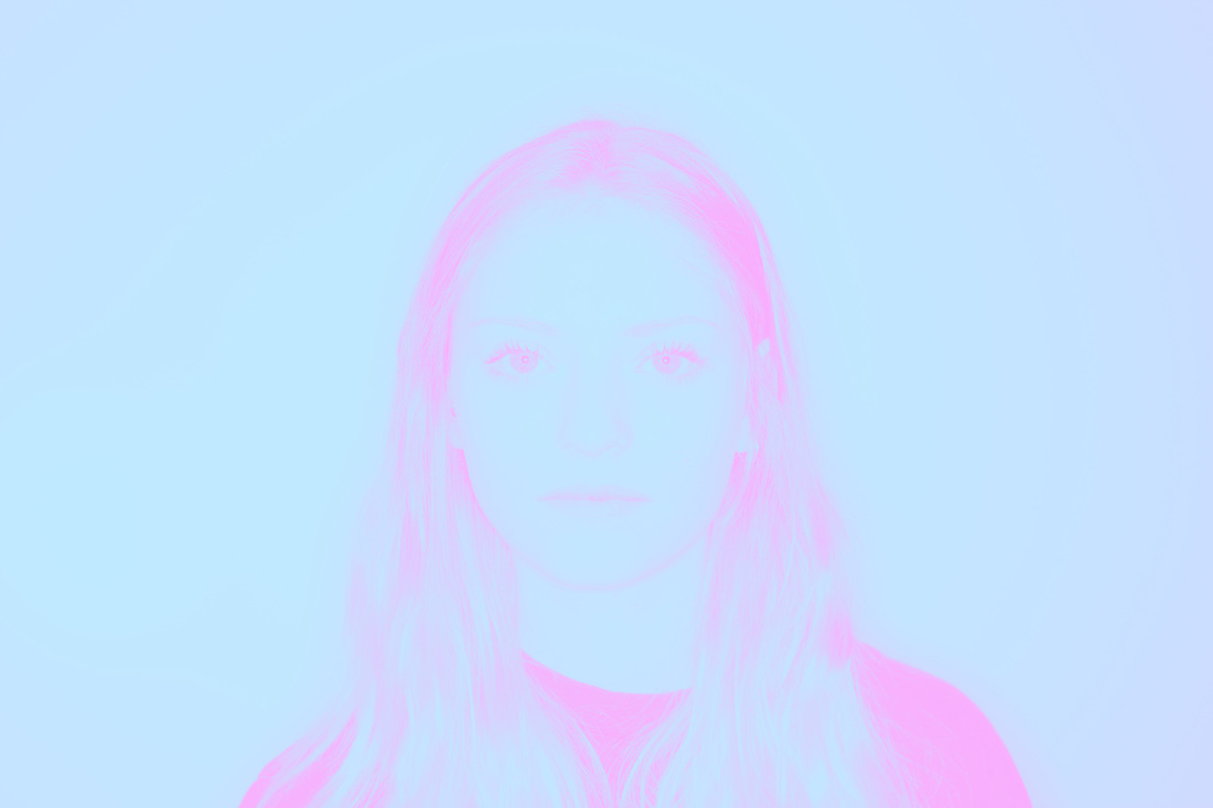
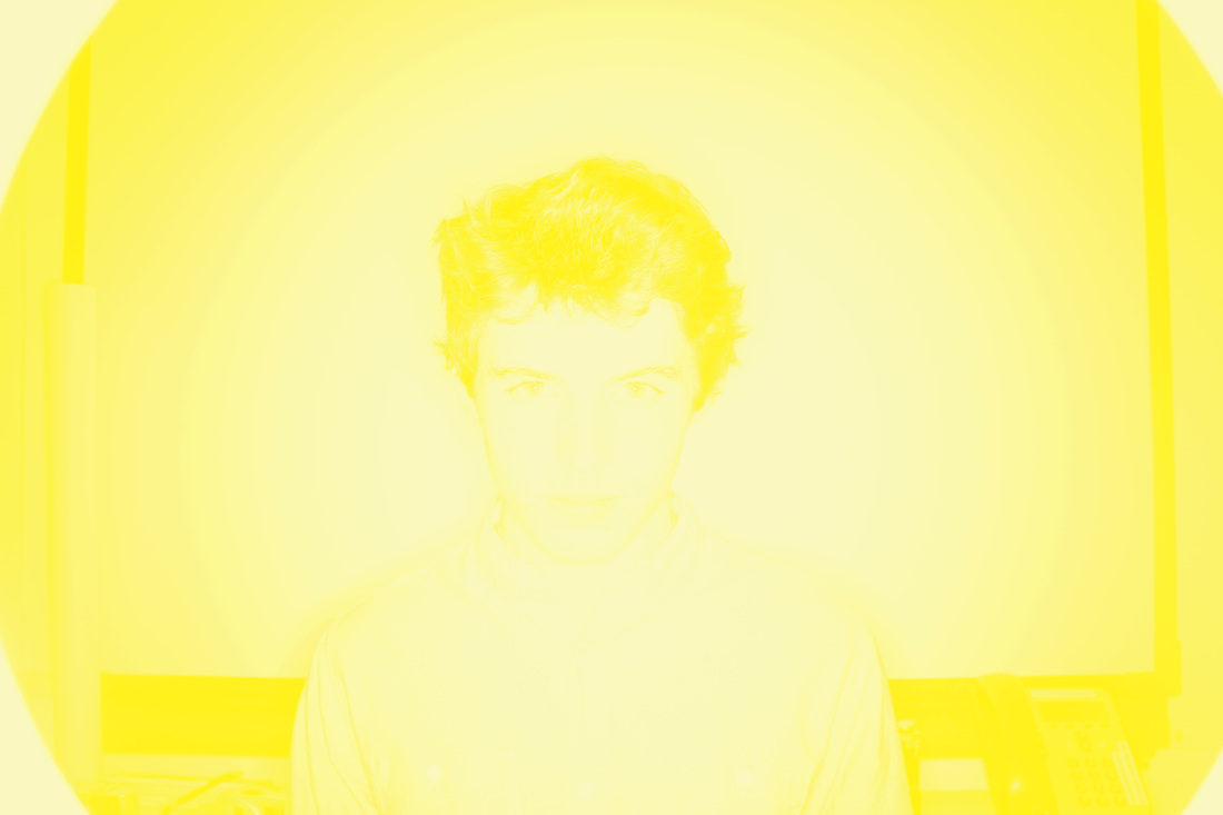
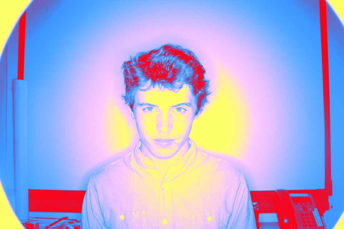
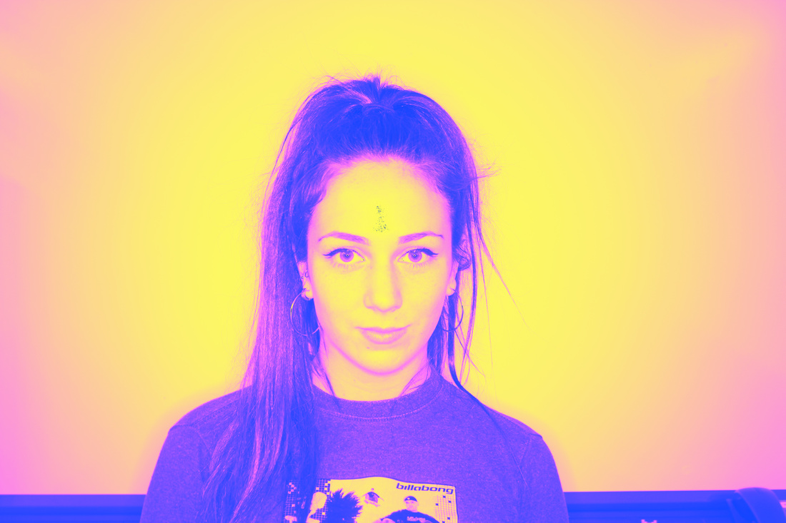
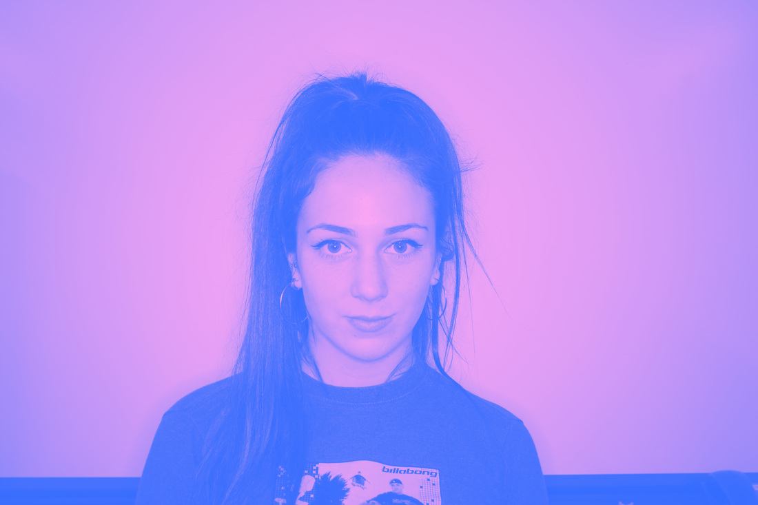
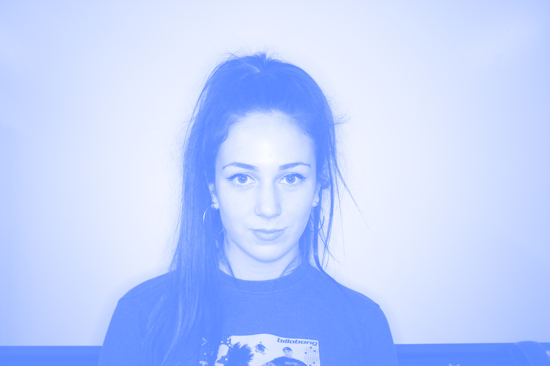
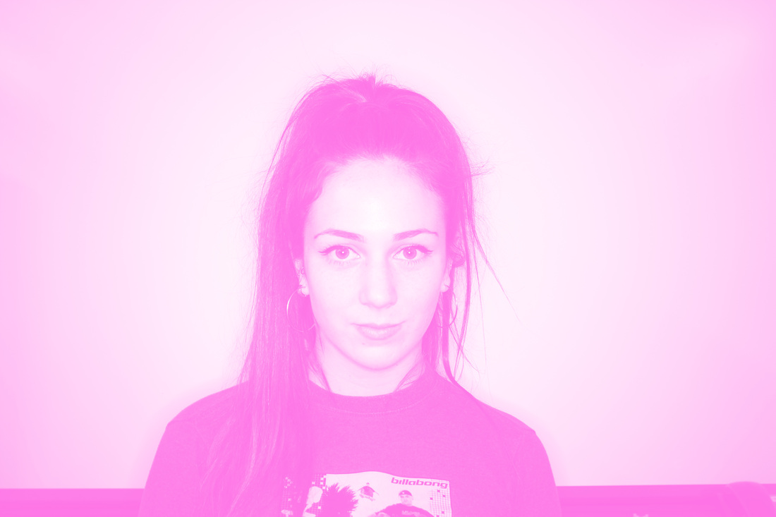
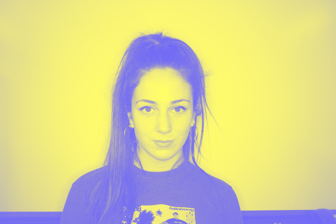
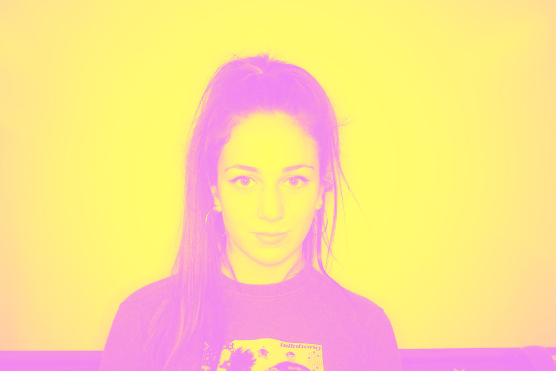
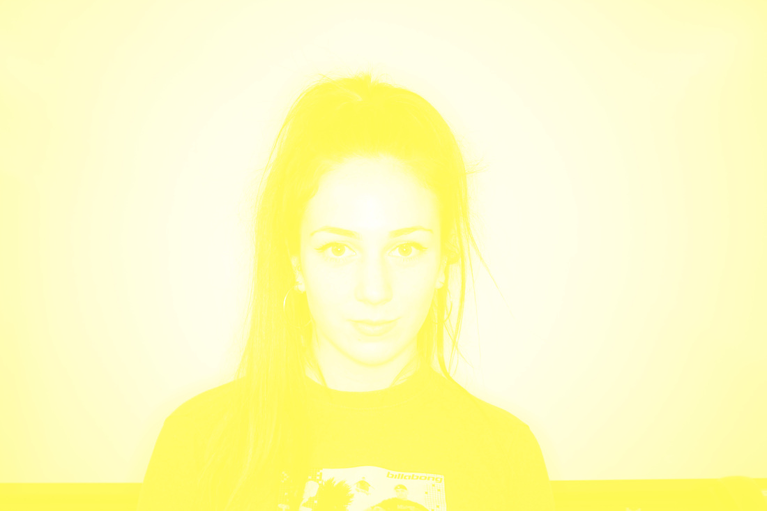
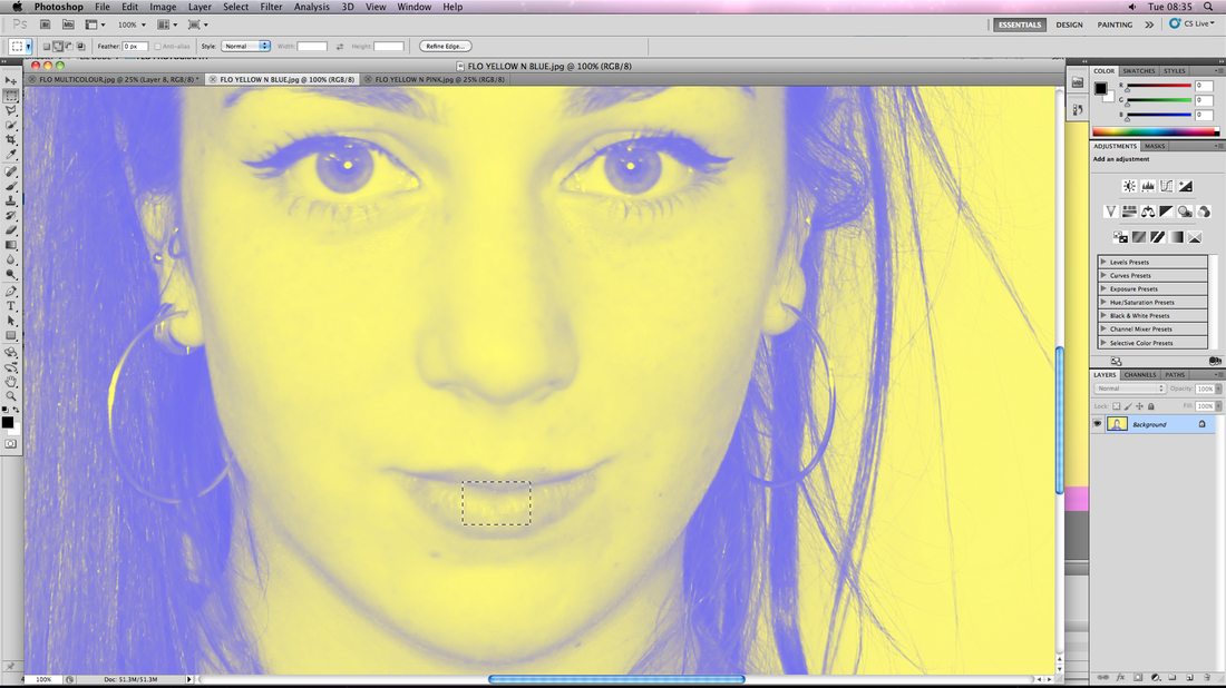
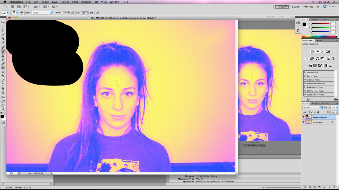
Experimenting with Colour and its Significance
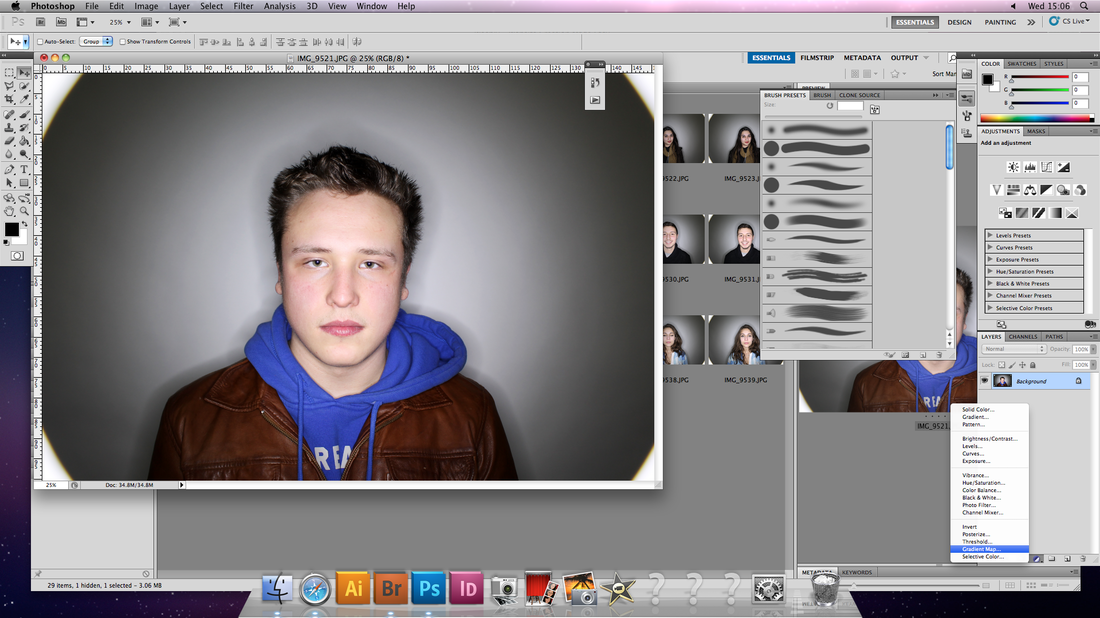
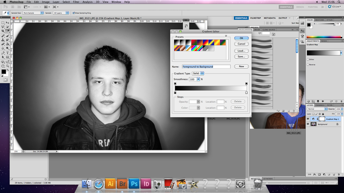
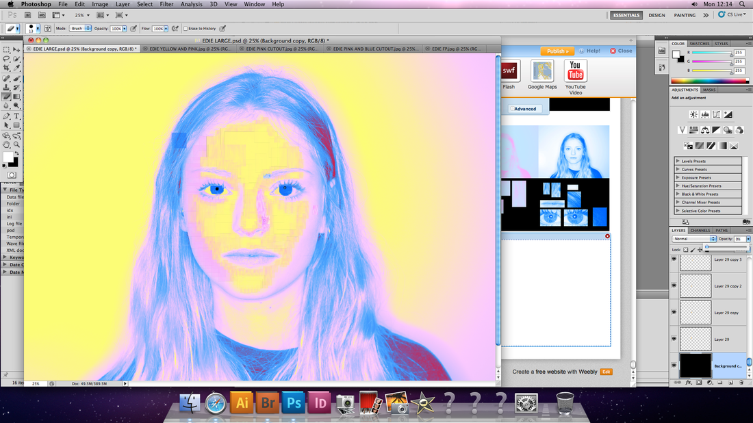
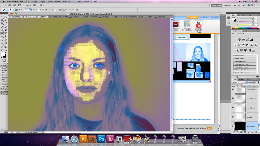
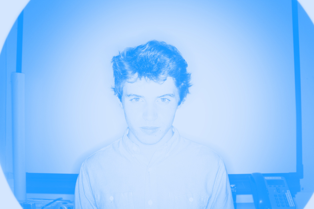
I thought a possible way to develop the work I was doing was to find some way that I could incorporate another means of showcasing their personality visually. One way I could do this was using colour; I decided I could try assigning each of the personality traits a colour, then I could use a gradient map on Photoshop to re-colour the picture based on their two most prominent personality traits.
Assigning Colours to Questions
A. How hard working do you consider yourself to be?
B. How impulsive would you think of yourself as being?
C. In meeting new people socially, how introverted/shy are you?
D. To you, whose needs generally take priority? The needs of others? or your own?
E. How open are you to change/difference?
B. How impulsive would you think of yourself as being?
C. In meeting new people socially, how introverted/shy are you?
D. To you, whose needs generally take priority? The needs of others? or your own?
E. How open are you to change/difference?
Channel 4 Audio Description Advertisements
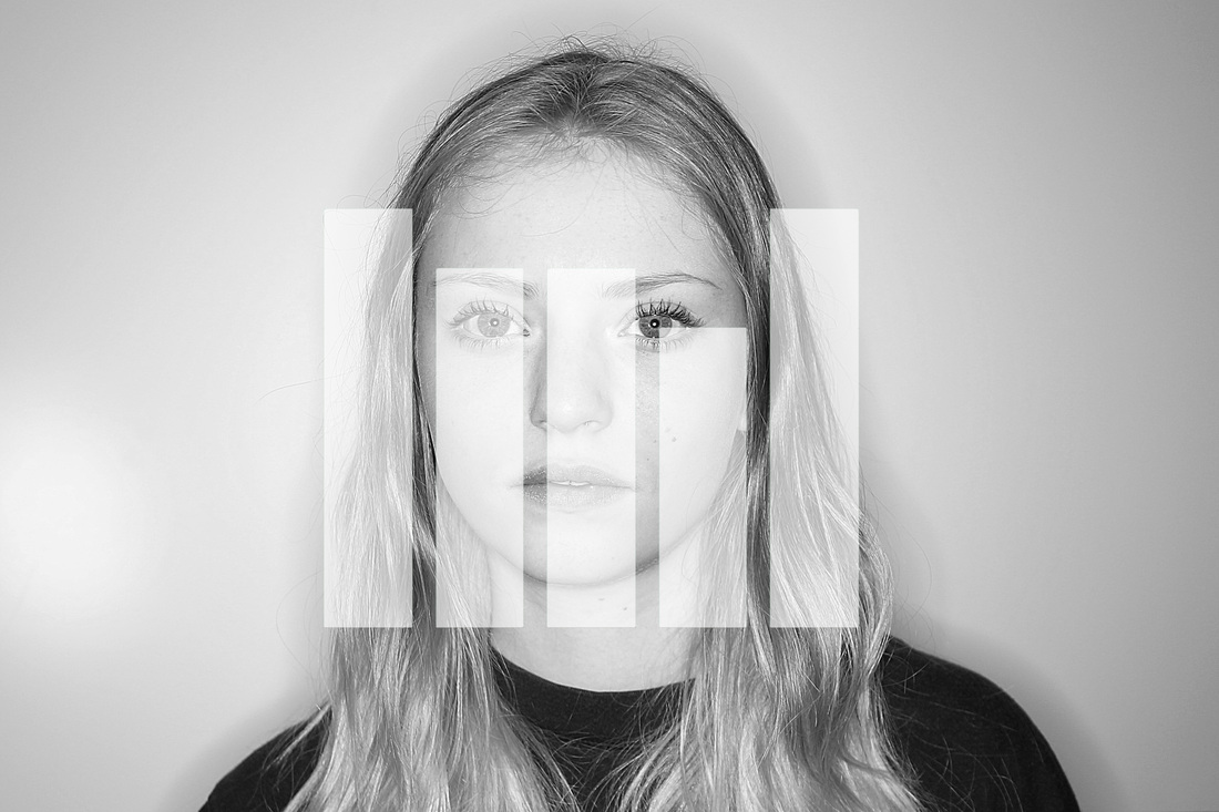
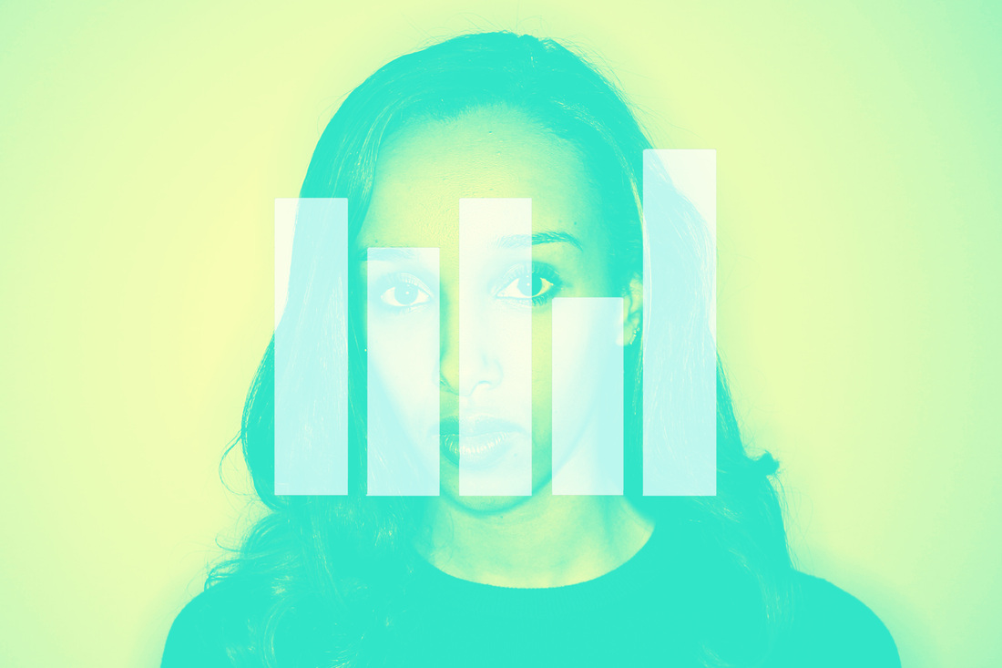
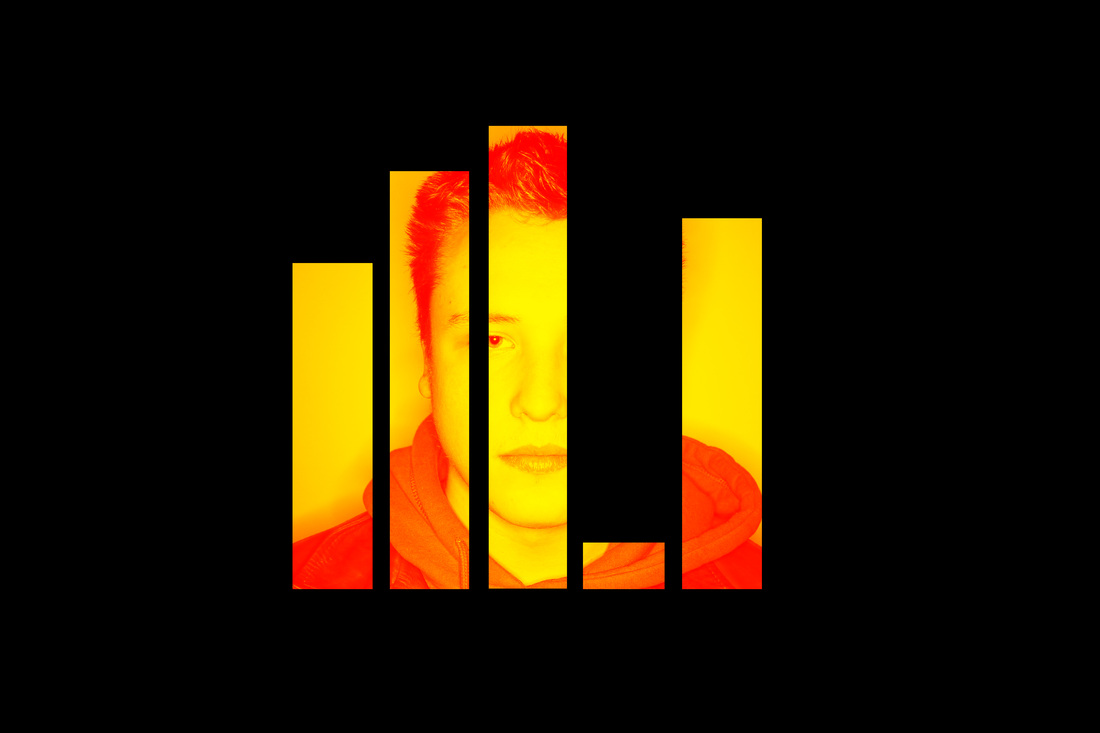
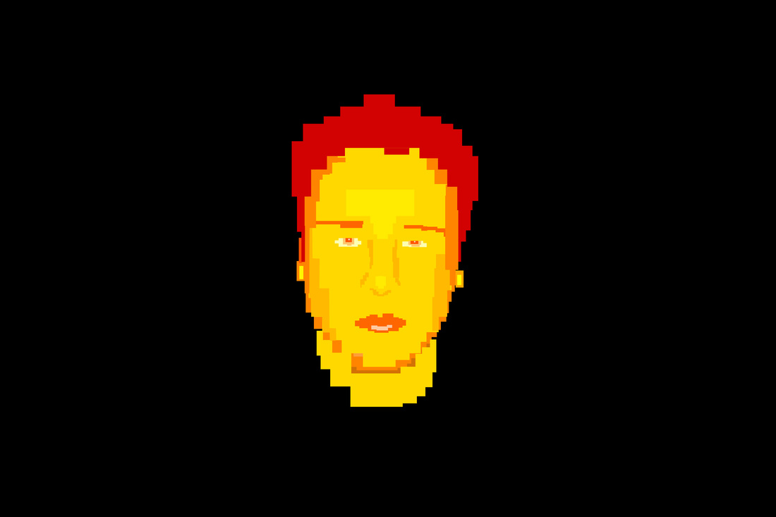
At this stage, I decided to experiment with the space around the bar-charts, seeing what effects I could create. I thought that if I limited what you could see of the subject to the size and shape of the barcharts documenting their personality traits, it would not only force you to focus on this element, but simultaneously introduce the notion that without knowledge of someone's personality you cannot claim to know them; without the bar-charts there, you would not be able to see the subject of the photo at all.
This was inspired by the Audio Description adverts of Channel 4 a few years back as it resonates with the notion of information you can receive visually being contingent on another source, in their case, an audio description; in mine, data about the subjects' personalities.
This was inspired by the Audio Description adverts of Channel 4 a few years back as it resonates with the notion of information you can receive visually being contingent on another source, in their case, an audio description; in mine, data about the subjects' personalities.


File:Marcus-Harvey-Myra.jpg
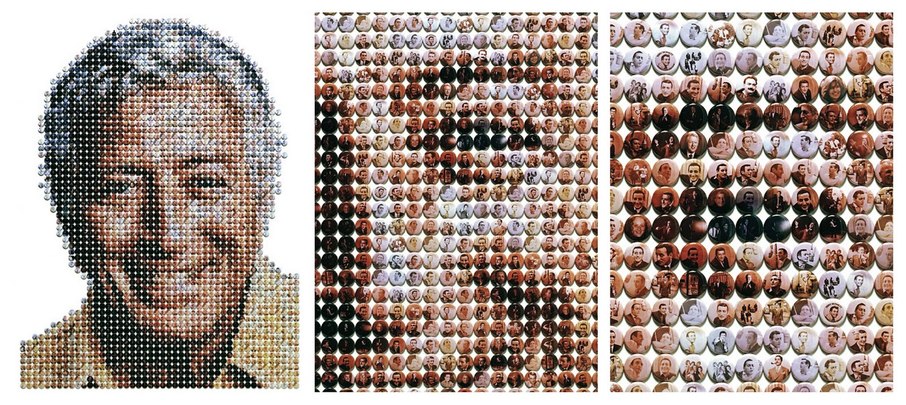
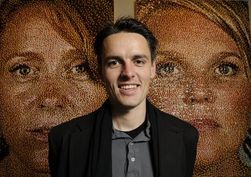
Ian Wright
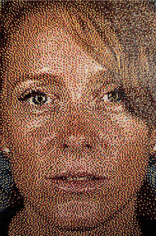
Since Ian Wright set up his own studio in 1981, he has been famed for his commercial work including such work as the sleeve for 'Teenage Kicks' by The Undertones, illustrative artwork in The Face magazine in their 1980s heyday, weekly black and white portraits for the New Musical Express (NME). However, what has inspired me most is his series of portraits created from a vast and varied spectrum of media, specifically his portrait of Tony Bennet (as shown below). The portrait itself is compiled of a selection of one inch button badges, 120 of them displaying images of Tony Bennet himself and an additional 80 being from personal photos/inspiration.
I would like to use this inspiration in developing my own work in light of the exam theme and conceptual theme I have chosen, possibly creating portraits out of their personality bars in the bar graphs created previously.
I would like to use this inspiration in developing my own work in light of the exam theme and conceptual theme I have chosen, possibly creating portraits out of their personality bars in the bar graphs created previously.
Joanna
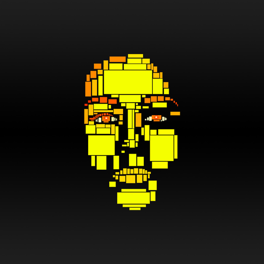
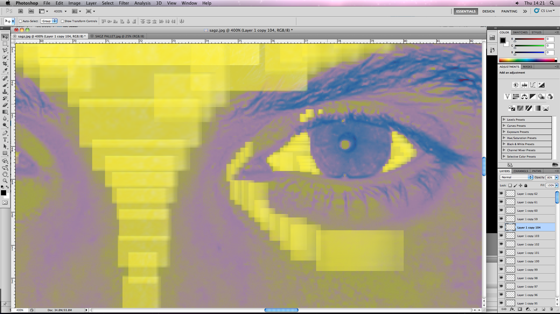
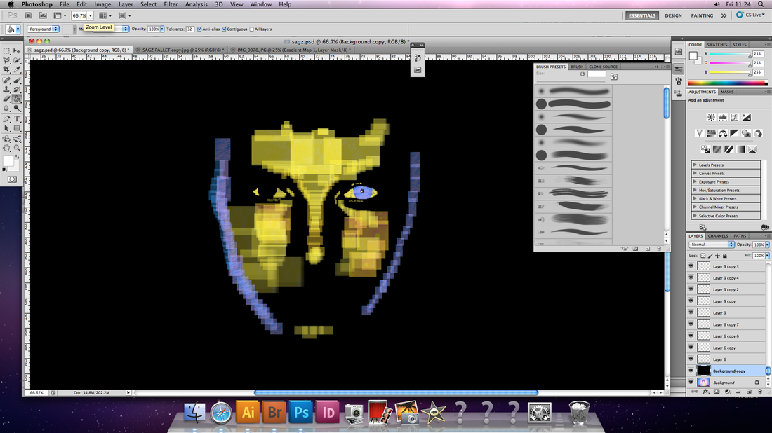
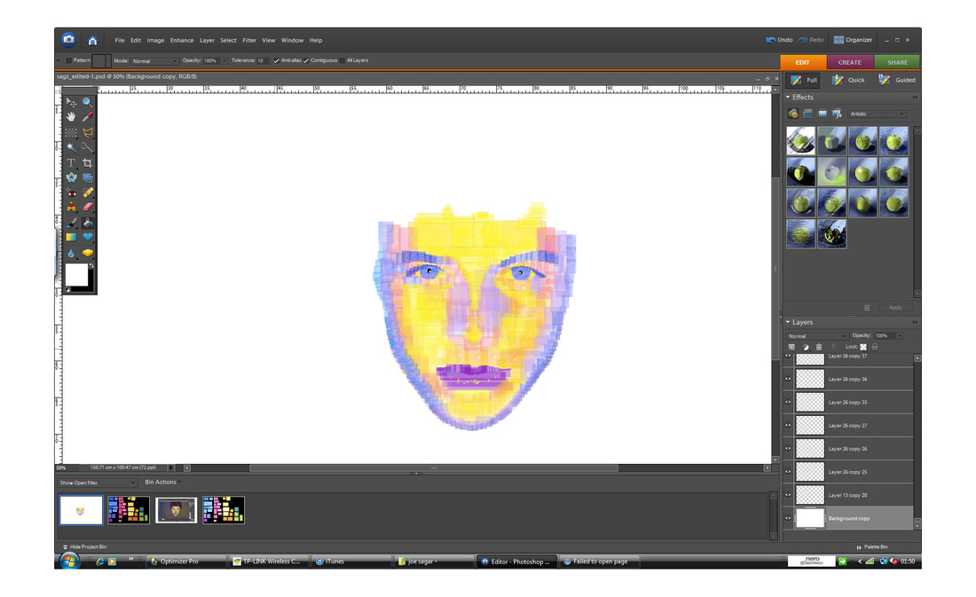
This piece builds on the theme of portraying someone's personality through the editing and presentation of their photographic portrait, in this case using blocks. In the previous set, you could only see her through her personality (the blocks). I thought I would experiment going one step further by having it so that her face was compiled completely of these segments of personality.
WHAT WENT WELL:
Interesting idea, conceptually relevant, leaves scope for creative details often lost in simple portrait photos.
WHAT COULD BE IMPROVED:
I think the spaces in between the blocks makes it appear unfinished possibly.
WHAT WENT WELL:
Interesting idea, conceptually relevant, leaves scope for creative details often lost in simple portrait photos.
WHAT COULD BE IMPROVED:
I think the spaces in between the blocks makes it appear unfinished possibly.
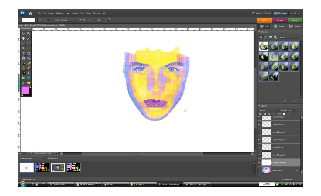
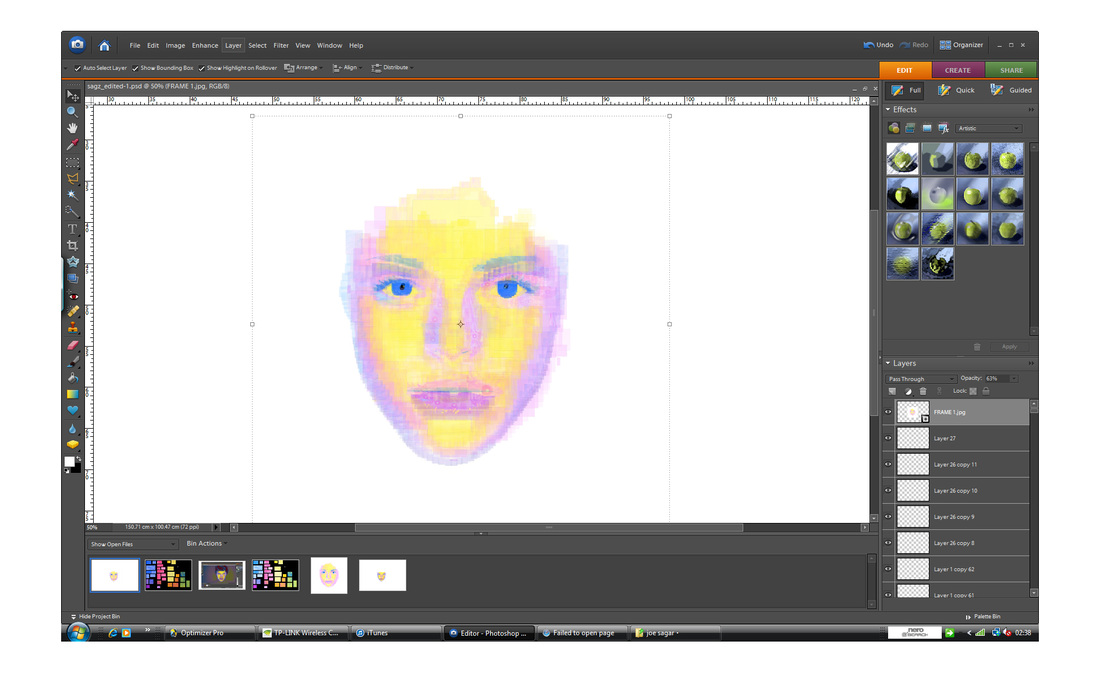
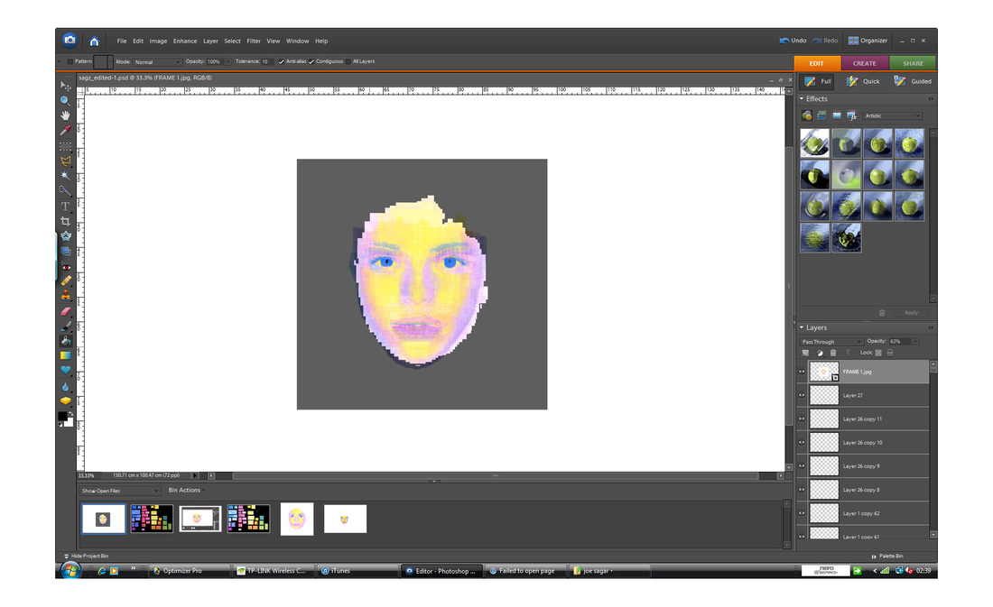
Tibor

WHAT WENT WELL:
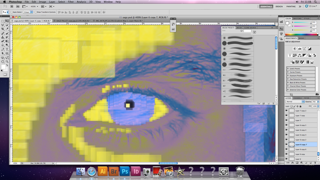
The main problem I had with the previous piece was that "the spaces in between the blocks makes it appear unfinished" but I think this merging and overlapping of blocks is more effective.
WHAT NEEDS IMPROVEMENT:
My work at this stage has stayed true to the conceptual theme but I possibly strayed too far from the medium of photography itself. In future work I should go back to using actual coloured photos to portray the subject, through collage for example.
Eric Dahl - Pushpin Portraits
Eric Dahl's Pushpin portraits encapsulate a sense of intricate detail I look to build on in my own work. These portraits were partly the inspiration for the work below. The media/technique used to his pictures resonate conceptually with my own work as well with a shared notion that we are perceived by ourselves and others as a combination and crowded accumulation of different things, my case: personality traits.
I was interested by the way his portraits take something seemingly random and playful up-close yet you have to properly stand back the appreciate the bigger picture, this maxim could be applied to my subject of personality, suggesting the view that, with just one or even many coloured squares you still can't see who they are depicting until you view all of them, you can't see someone for who they really are until you properly get to know them through standing back and taking the time learn their character fully.
I was interested by the way his portraits take something seemingly random and playful up-close yet you have to properly stand back the appreciate the bigger picture, this maxim could be applied to my subject of personality, suggesting the view that, with just one or even many coloured squares you still can't see who they are depicting until you view all of them, you can't see someone for who they really are until you properly get to know them through standing back and taking the time learn their character fully.


Bronte (test)
Inspired by the pushpin portraits of Eric Dahl I intend to expand the direction my work is going down in light of my self-assessment of my last piece:

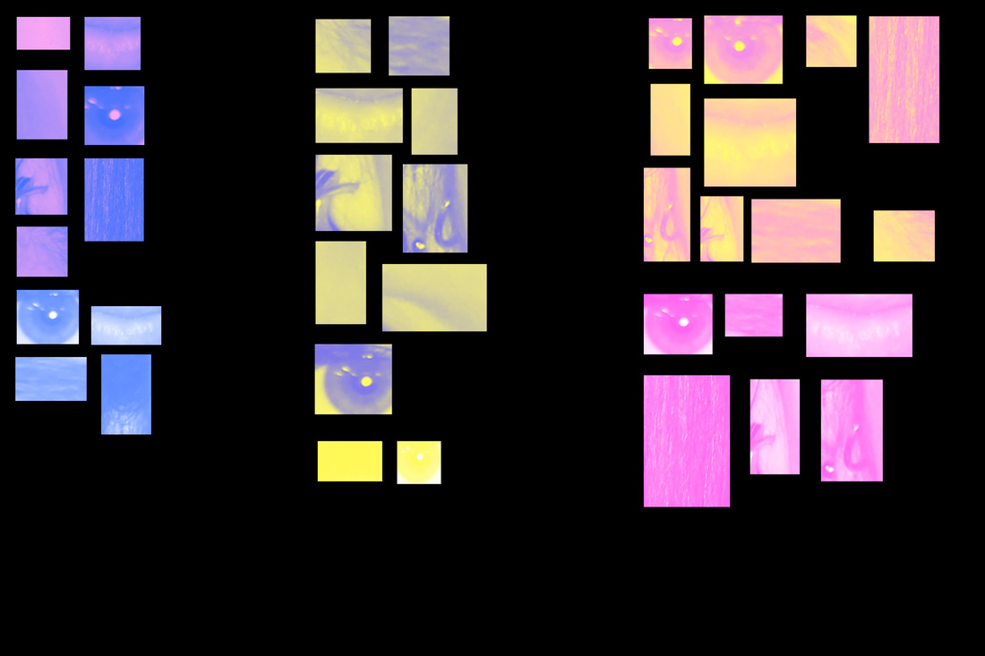
The images above are the documentation of my experimentation with the best ways to do this detailed form of digital collage so I can approach this potential new stage of my project in the best confidence.
What I have found to work best:
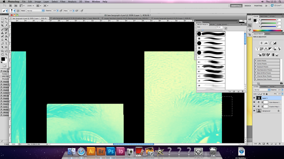
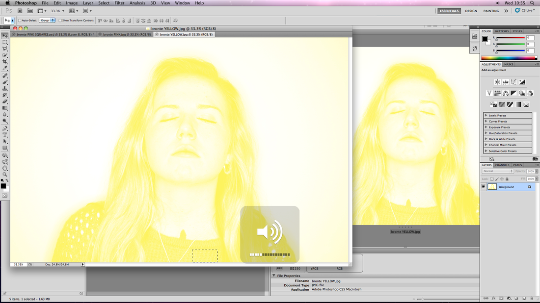
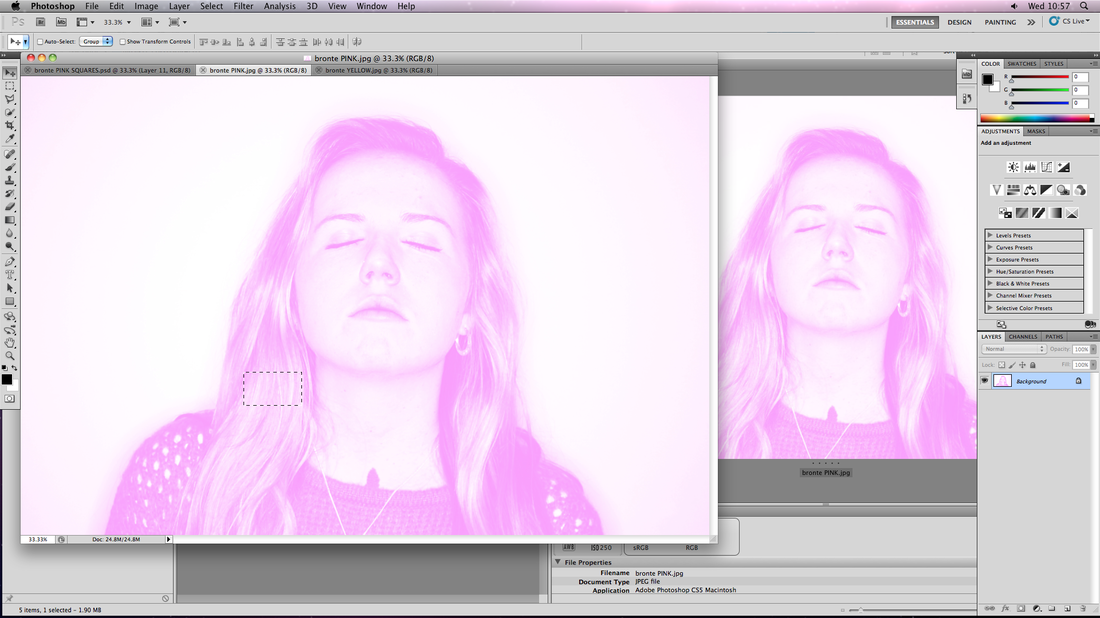
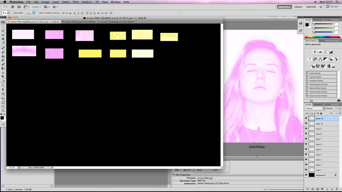
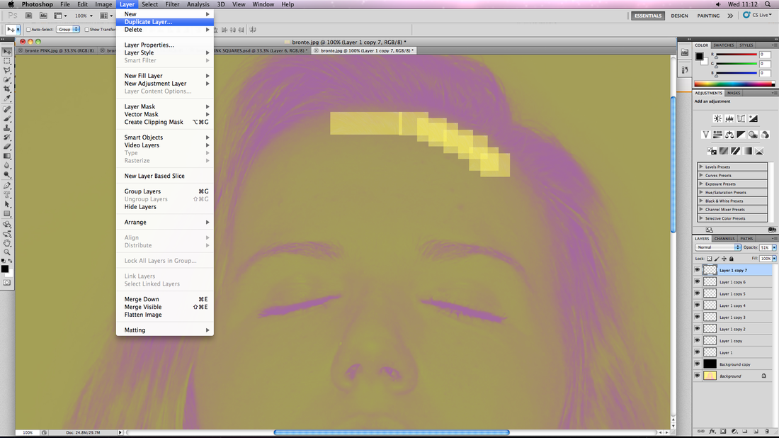
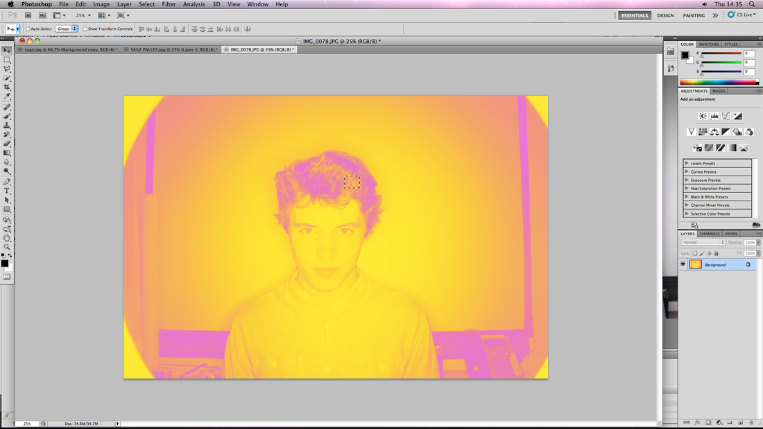
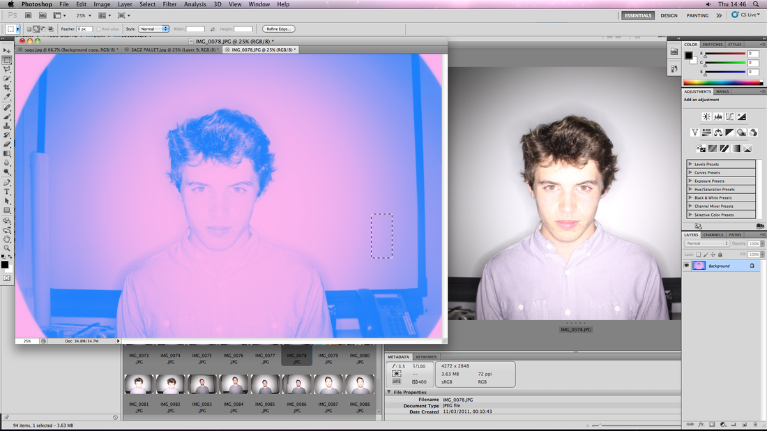
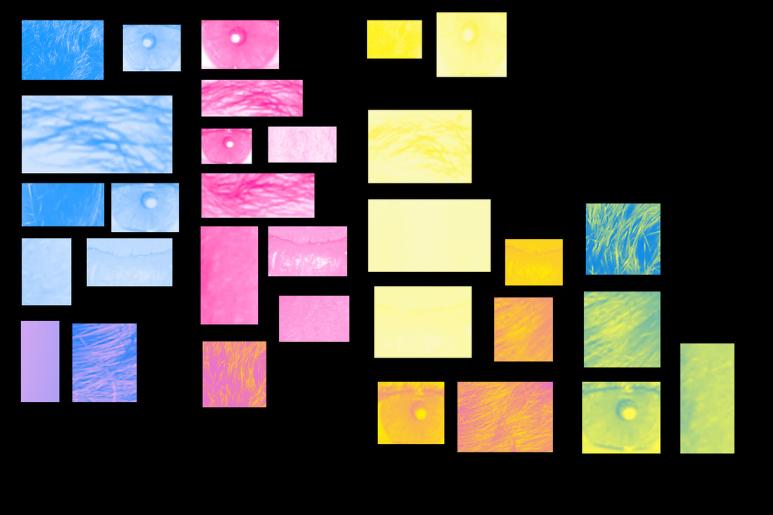
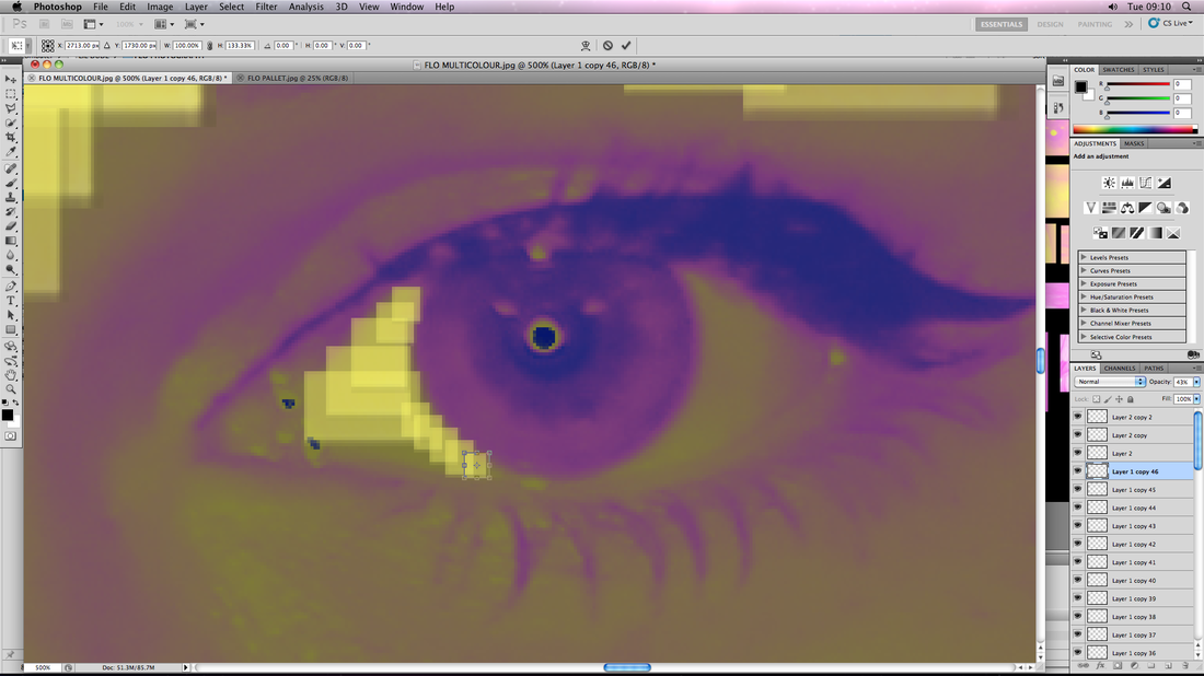
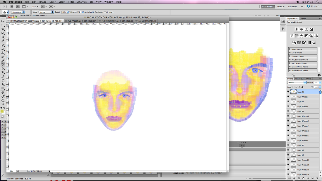
1. Save multiple, separate pictures of the original, each with a different gradient map of their post prominent personality colours.
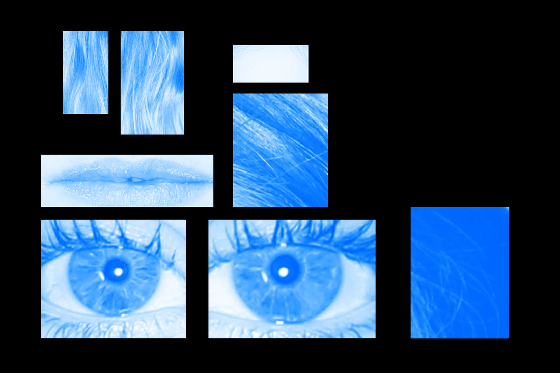
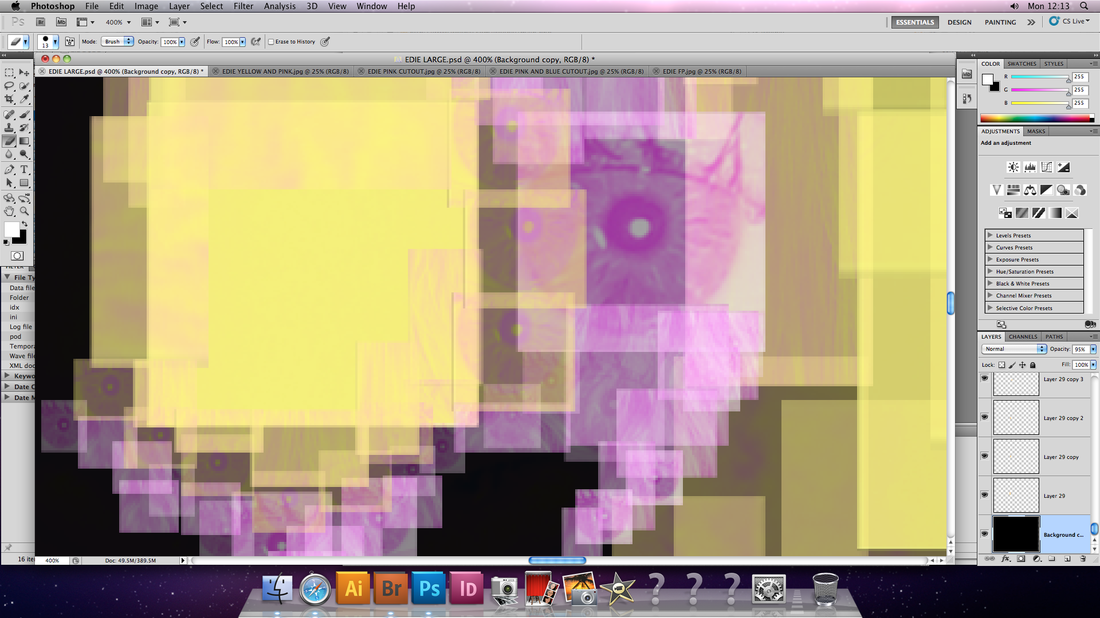
2. Create a digital pallet for the collage. Cut out (using the 'square cutter' tool) different shades of the different colours and isolate them in the pallet (as pictured in the third screenshot).
What I have found to work best:
1. Save multiple, separate pictures of the original, each with a different gradient map of their post prominent personality colours.
2. Create a digital pallet for the collage. Cut out (using the 'square cutter' tool) different shades of the different colours and isolate them in the pallet (as pictured in the third screenshot).
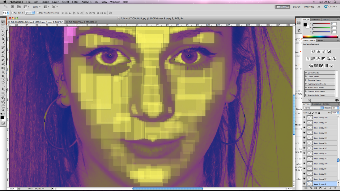
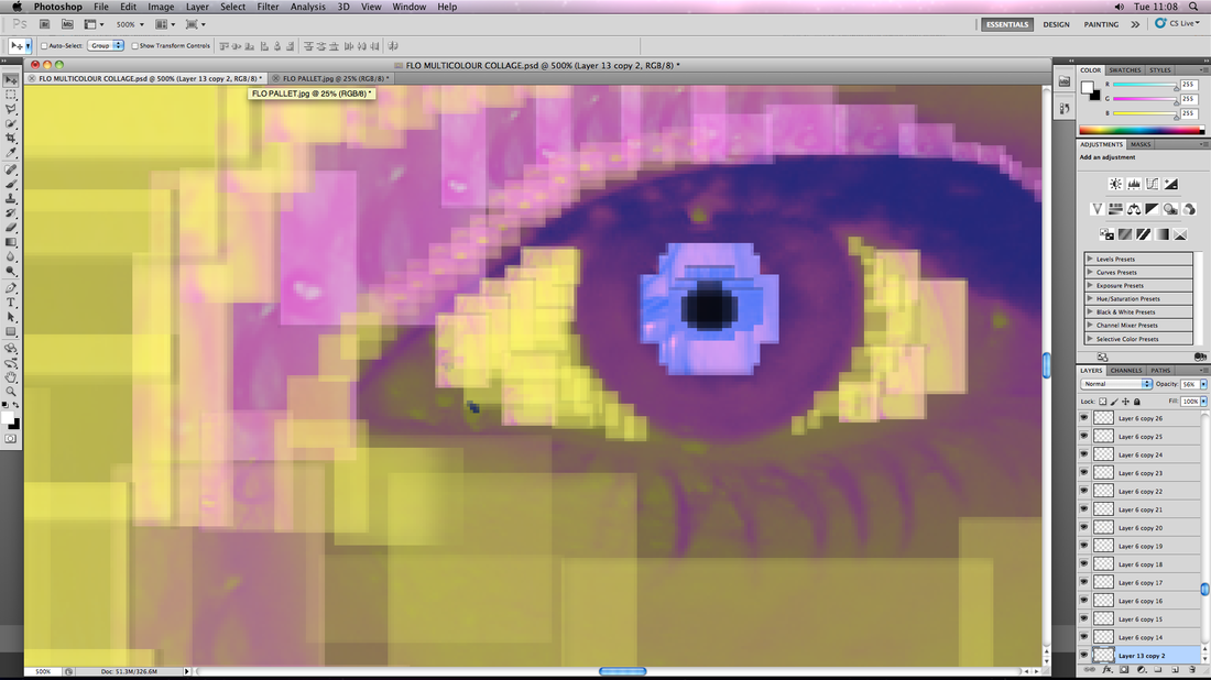
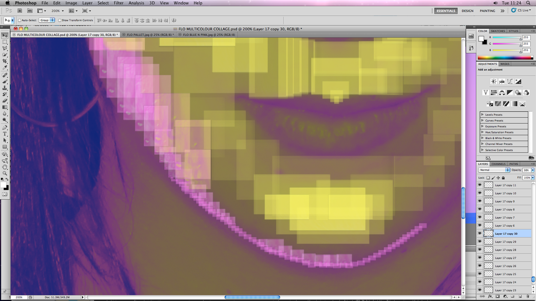
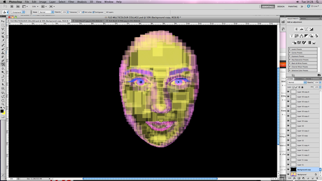
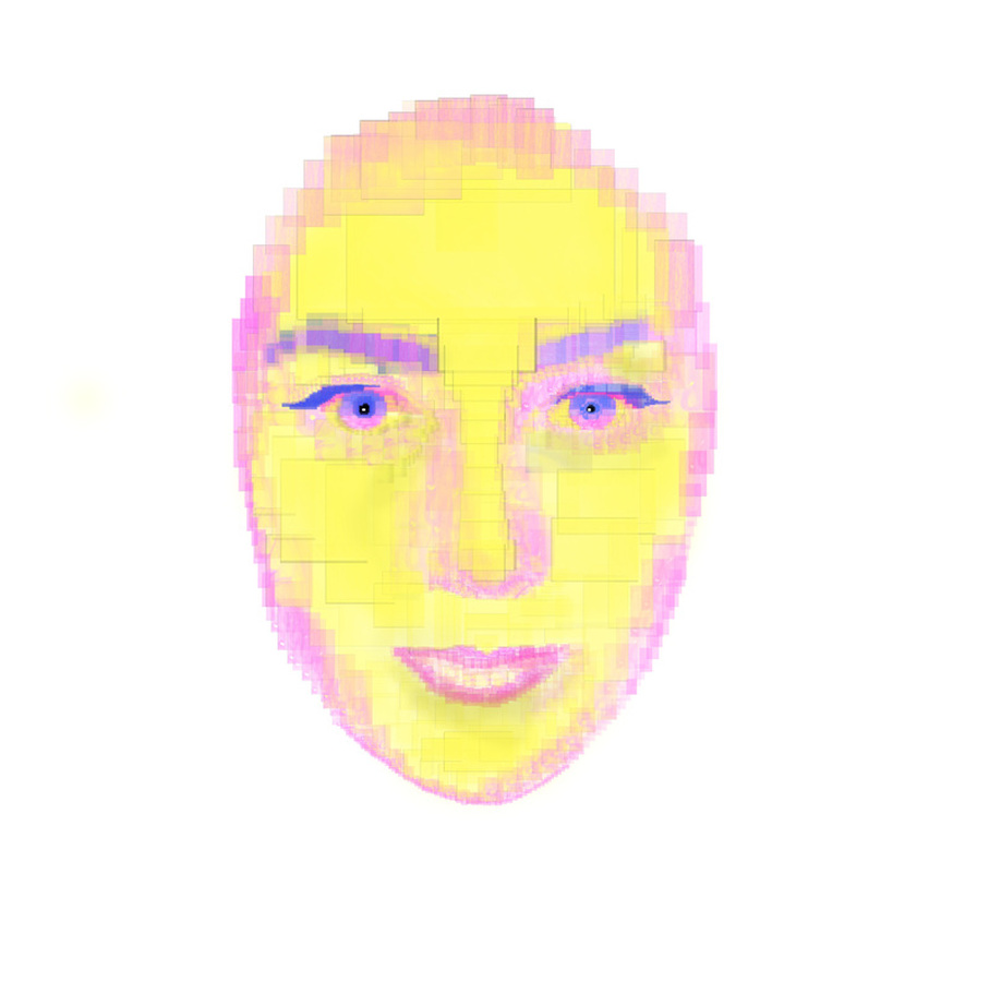
Edie ----------------------------------------------------------------------------------------------------------


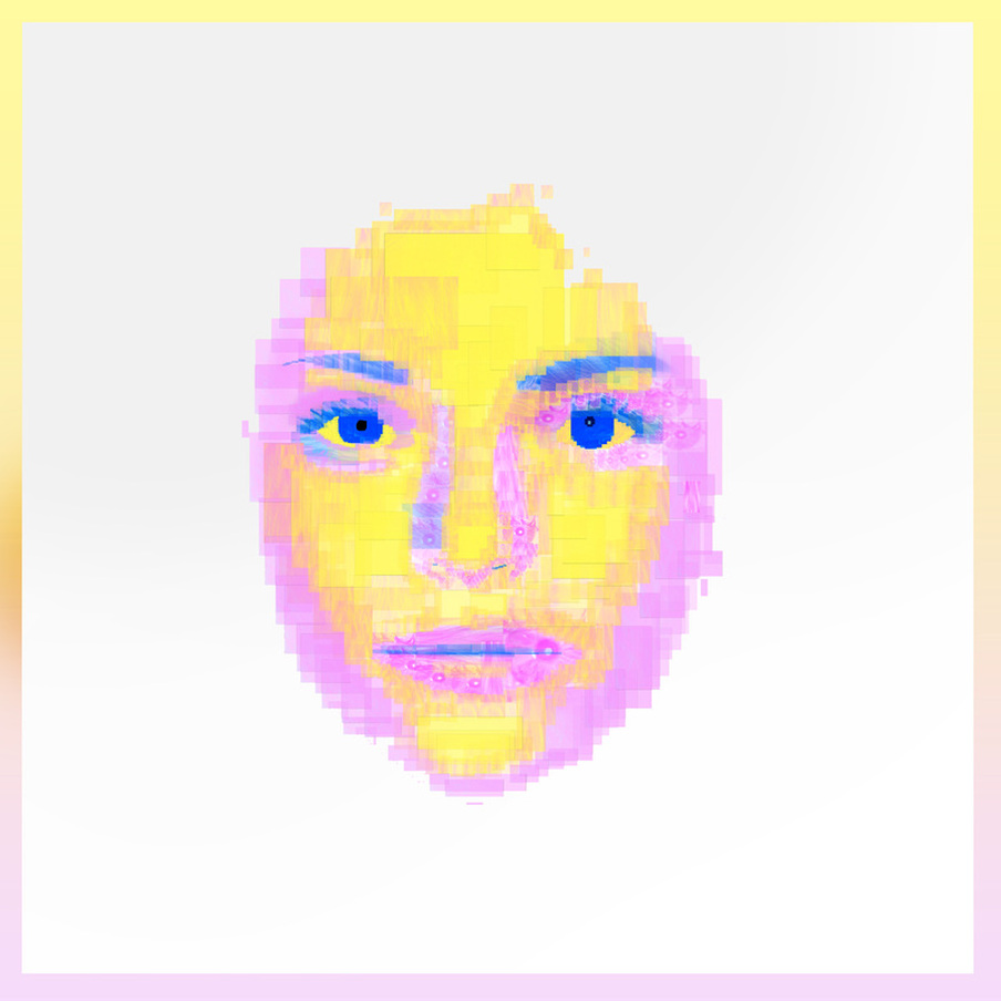
The piece above this sentence is compiled of over 900 separate Photoshop layers, each made from different coloured images of the same subject, moved and re-sized to create an all-digital portrait collage. This technqiue is considerably time-consuming but I would still consider it to be worth the effort due to how this is reflected in the intricate complicated looking nature of the end product. This would be a technique I would be interested in expanding in future work.
If I were to expand on this technique I would look into using darker, or stronger shades of each colour to create the collage as this one appears slightly faded, this lack of contrast also lends to the perception of it having a slightly 'flat' feel.
If I were to expand on this technique I would look into using darker, or stronger shades of each colour to create the collage as this one appears slightly faded, this lack of contrast also lends to the perception of it having a slightly 'flat' feel.
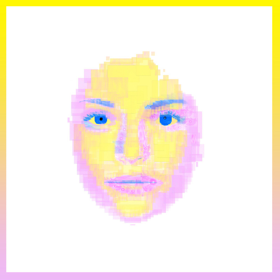
Michel Gondry - 'Fell in Love with a Girl'
This piece interested me because of the playful assignment of visual animated blocks to music. Considering the use of blocks in my own work, it would be an interesting route to go down with my digital portraits.
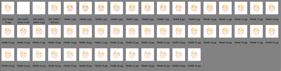
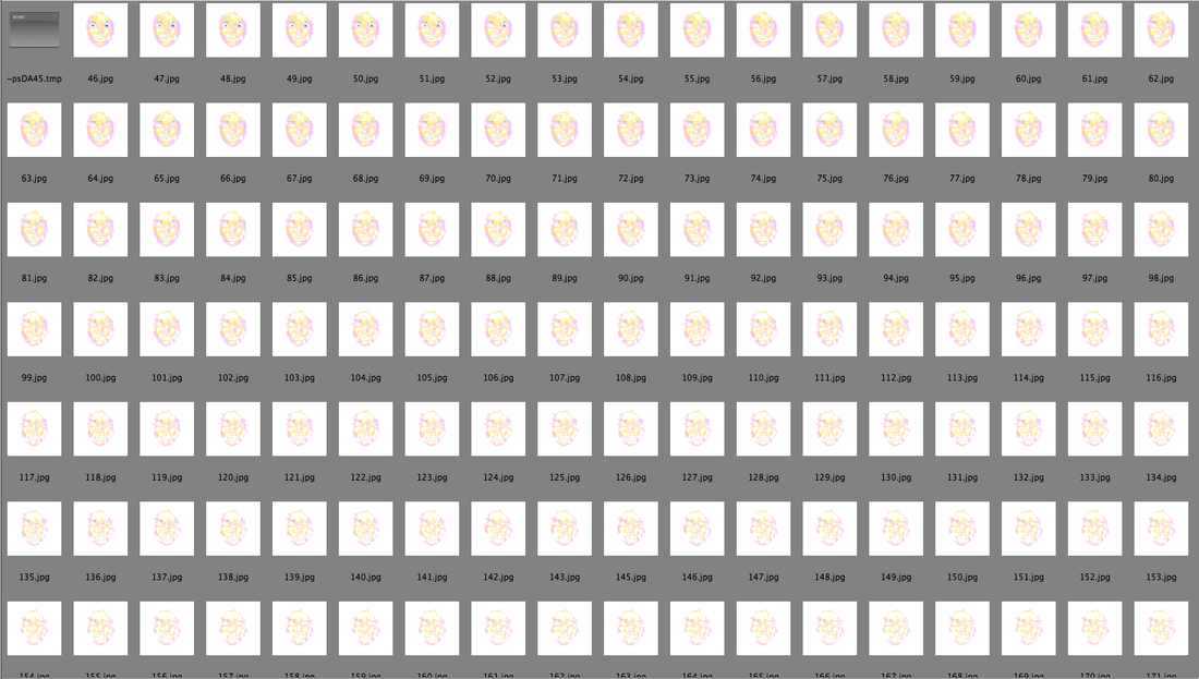
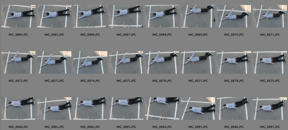
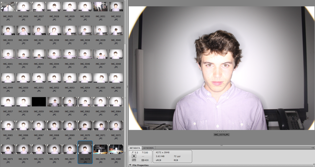
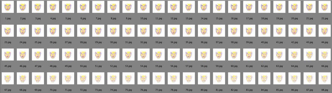
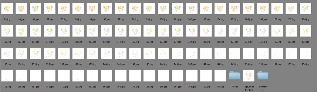
The animated construction of Edie's face was achieved by sequentially deleting 1-7 blocks of the face, and each time saving that version as an individual high resolution JPEG until there were no blocks left. This technique took 6 hours and resulted in having just under 320 separate images.
The Video
I figured a potential way to add to the video would be to put it to music and experiment with that. I started selecting potential tracks to accompany the animation based on a specific criteria:
1. Simplistic
- I would want the track used to complement and work cooperatively with the animation. It would, ideally, musically portray the simple, cumulative layering of the images into something more impressive and distinctive.
2. Basic 4x4 House Beat (What is this? Here is an example: http://www.youtube.com/watch?v=0QZ7LZTbUcY&safe=active )
- If I were to add audio to my animation, I would want the animation to be, in some way, in time with the music used; this would make them appear relevant to each other. In order to edit the audio and visuals together I would have to place both into Windows Movie Maker. If I wanted to match the individual pictures with the beat of the audio track I would have to do this by looking at the waveforms of the track and using that information to sync with the spacing of the image sequence. Traditionally, the beat in 'House' music is the most obvious on the waveform display; not only this, but the beats themselves are always the exact same distance apart. The use of a 4x4 'House' beat would be the most effective beat to use to accompany my animation.
3. Mellow
- What I mean by this is that the tracks used shouldn't be too aggressive. The first reason illustrated by my first criteria objective; aggressive music tends to, whether positive or negative, tends to draw attention to itself, and I wouldn't want that attention to distract from the visuals. The second reason is determined by the way I intend the piece to be viewed. I would want it to become a feature of the room it was in, and not too feel too out of place in the context of an art gallery/exhibition, so people can relax and appreciate the subtle changes.
Potential track no. 1: Doubleheart - Salsa
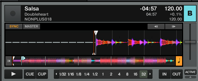
Salsa by Australian electronic house producers 'Doubleheart' reflects the simple laying of of many multiple, complicatedly organised smaller elements. The only thing that hinders from being used in the video is the fact that the beat pattern is less obvious than ideal, and the song gives off a distinctly dark feel which may not jell correctly with the bright shades of blue. pink and yellow, which, in turn, ma complicate and compromise the mood generated by the end product.
Potential Track no. 2: San Soda - 'Ode Aan De Verkeersdrempel'
Potential Track no. 3: Burial + Four Tet - Moth
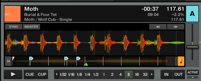
The beat pattern is perfect, gives off a mellow house feel whist layering in an exiting way.. It would work perfectly in my animation.
Potential Track no. 4: San Soda - 'Doorsnee'
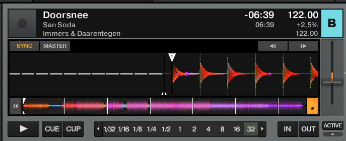
Perfect simple beat pattern. Perfect speed. Interesting layering. This would also be perfect for my animation
Potential Track no. 5: Maya Jane Coles - The High Life
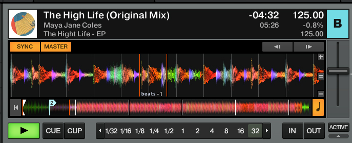
This track bas more snares in-between the beats of it which may be confusing when trying to visually match the structure of the track to images.
The majority of the feel of the song is compiled from the higher tones, as opposed to mid tones with the other tracks, this means that it is more susceptible to sound out of key when played too quickly or too slowly, making the mix possibly sound awkward and forced.
The majority of the feel of the song is compiled from the higher tones, as opposed to mid tones with the other tracks, this means that it is more susceptible to sound out of key when played too quickly or too slowly, making the mix possibly sound awkward and forced.
Potential Track no. 6: Arkist and Kiduct - One Year Later
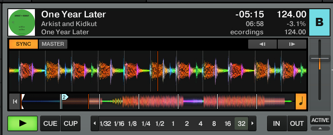
Beat pattern is perfect and simple. This track maybe too hard-hitting, aggressive and, as I mentioned earlier, this may distract from the animation itself, which would be a problem.
1 Min Test:
Joe -----------------------------------------------------------------------------------------------------------


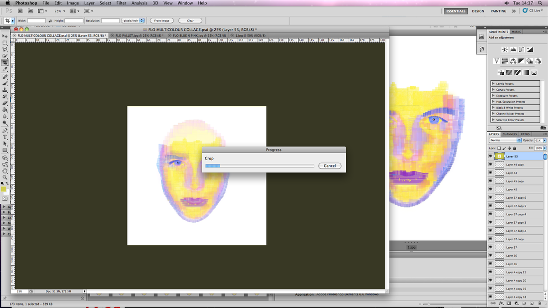
Flo ------------------------------------------------------------------------------------------------------------


Final Exam Piece
Personal Evaluation
Over all, I am pleased with the result of this piece. I am pleased with how the end product has not only stayed true to, but expanded and developed on the conceptual framework of my project, conveying someone's personality through visual means, or in other words, showing how someone is on the inside, on the outside. This strand of my project started with this simple idea exclusively, showing pictures of people with rectangles of differing lengths contingent on their results to a personality test. This theme was expanded with the second main series of photo edits where you could see visual representations of their personalities, but in addition, you could only see them through this personality graph, suggesting that in order to formulate an opinion or judgement of someone you must know them on a more personality based level as opposed to more instant shallow impressions based on their natural appearance and self-presentation. This piece is the result of the final stage in refining the conceptual messages and artistic techniques formulating my work. Although the previous still images this animation is made from used new techniques, it made no significant expansion of the conceptual message behind those photo edits before them, my final piece however uses the rapid and gradual accumulation and dissemination of the personality graph blocks to capitalize on the maxim that not only do you have to see someone for their inner qualities in order to gain a more rounding understanding of them but that we are nothing more than an accumulation and building of these dinner traits and that these two sides two us are very closely linked. The people in the personality graphs selected because they all received similar results on the personality tests, which is why their portraits have all been edited to be compiled of the same three colours, mainly yellow, then pink and blue. Although they are all compiled of the same coloured boxes, in the same way, from the same pose, Only Edie's boxes are used for Edie's picture, Joe's for Joe's and Flo's for Flo's, no two people are made using the same blocks, illustrating how complicated and specific each individual's persona is and how they cannot possibly be judged collectively, this is demonstrated further by how, although each portrait is made from a similar colour of block, the construction of a portrait in the video is never in the same frame as the deconstruction an other and vice versa.
The tracks used in the animation I feel work well with the artwork they accompany.
The tracks used in the animation I feel work well with the artwork they accompany.
