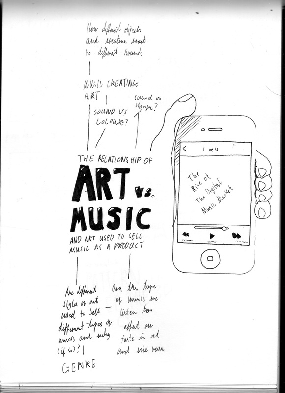
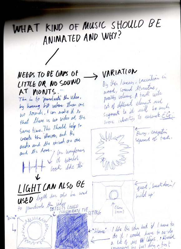
Chris Hamilton Interview
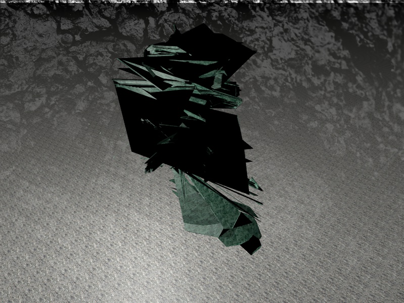
Chris Hamilton from Chicago works mostly as a graphic designer for Zoic Studios using an enticingly eclectic spectrum of media such as film, hand drawn work and digital 3D modelling. He was first brought to my attention however by his work in the music scene: A label which produces artwork that i generally find most interesting (Night Slugs) was about to release an EP and sent a group Facebook status out asking for people to work with in making the cover, of the people that replied, his work really stood out to me. I decided to ask him about his inspirations and this is what he had to say:
"I get a lot of inspiration from music for my personal art and design style I suppose. Often times, when designing professionally, I try and let a client's problem be the source of inspiration but I always try and make it my own by putting my influence into the piece. For creating the stuff I do - I use all the Adobe Creative Suite, and Cinema 4d. I have used other programs like real flow for instance, but mainly just the two that I have mentioned prior. As far as Night Slugs goes, their aesthetic is pretty cool and it fits the genre and market that they cater too. I often really relate to the small labels in regards to their style. I like the work of Michael Cina for the Ghostly International Label as well, you probably are familiar with them. I think electronic music is at the forefront of culture creation and it's truly a huge source of inspiration for me. I think it currently reflects the true zeitgeist and has had a tremendous impact on my work. The sounds and textures that a lot of the musicians use are very visual for me - often times I just like to translate an auditory song into something visual... whether that be video or a static piece doesn't matter. But I guess to answer your question... I'm heavily influenced by music. Also, the world around me. It's so easy and cool to find inspiration with the internet at your fingertips. But on that same note, it's nice to go outside once and awhile and be inspired by that. I also really like thinking about science, aliens, psychedelic drugs, and dimensional theory. Hope this helps."
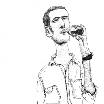
The video he worked on that inspired me:
'FACT' Magazine - Mix Covers
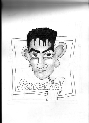
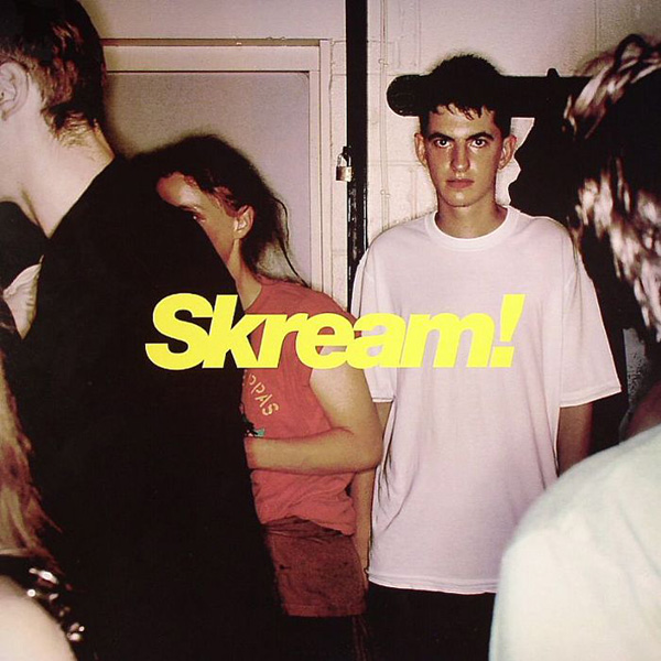
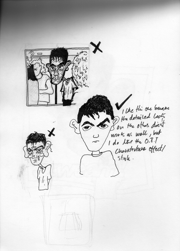
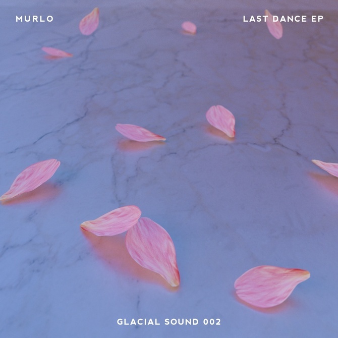
Every month a music magazine called FACT releases a mix/podcast from an artist who features in their articles and interviews. They came to my attention through my own musical interests. I was interested by how the portraits were architectures rather than more passive interpretations of their appearance for such as photos for example. To me, it seems to be a comment on how your art-form can often change the way people see you. I experimented with this notion myself using Sean Bloodworth's cover for Skream!'s debut album as an example:
|
I focused on the caricature element of the FACT illustrations... and yes the spelling is on purpose. I did that because of the rather informal way a lot of them were done and it's parallels with my own experiences from playing gigs and radio shows; a collection of people who take their music very seriously but playing it in such a relaxed colloquial way. I spent weeks preparing some tracks for a live radio guest mix and just ended up getting slightly drunk and not playing them but just having a great time.
|
|
Commercial Art for Music
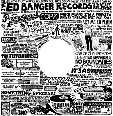
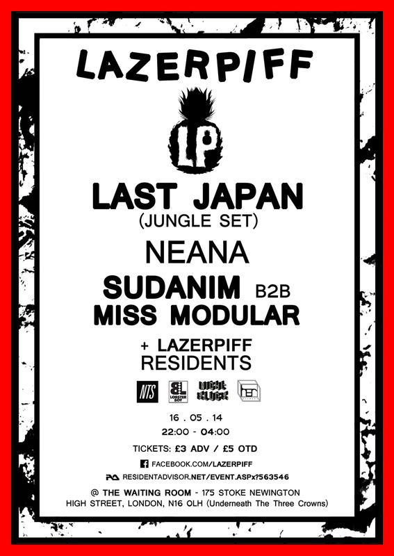
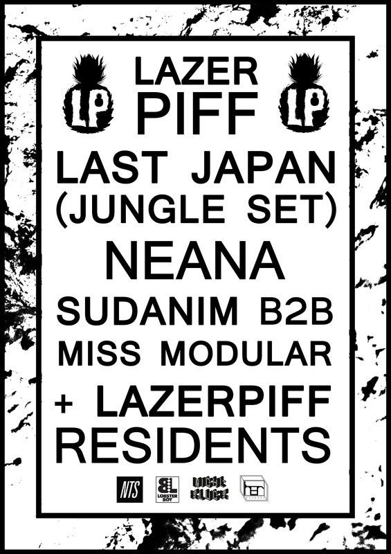
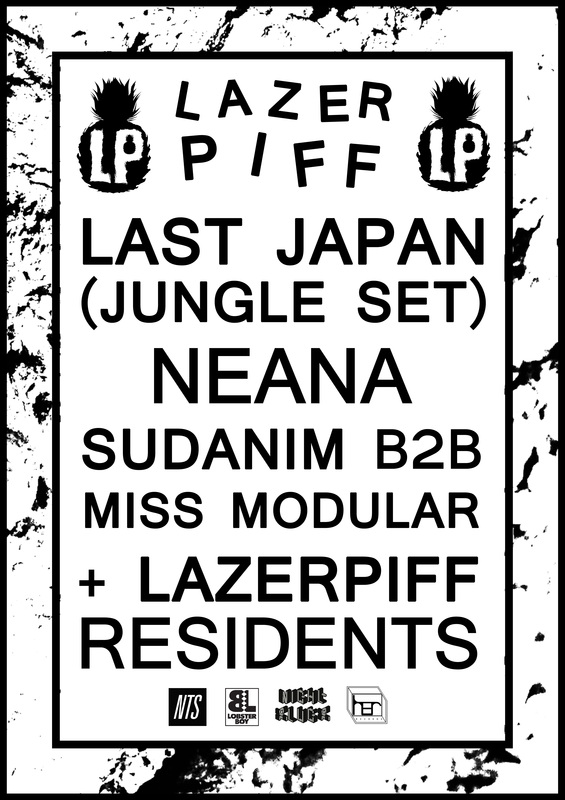
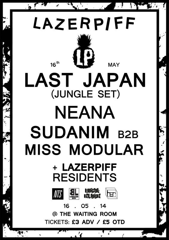
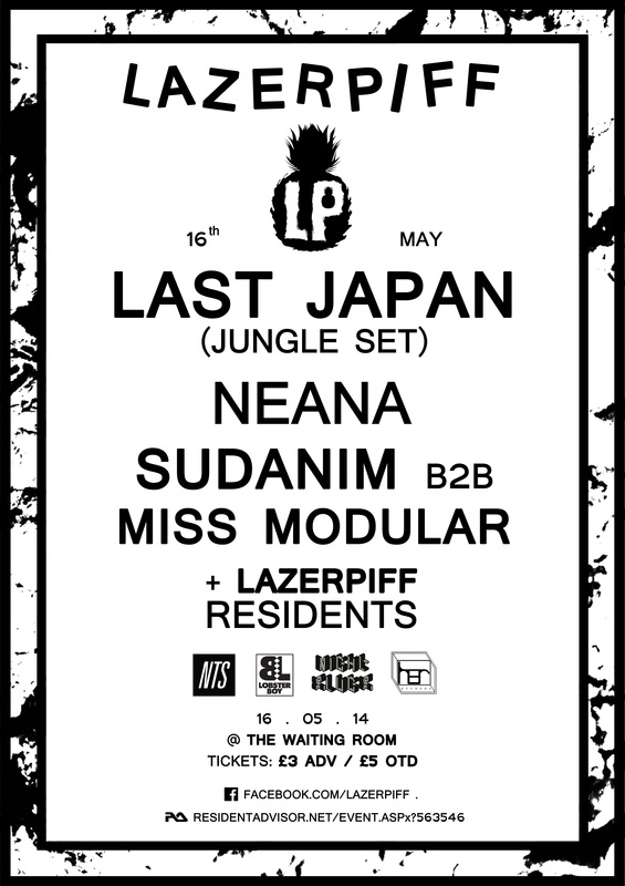
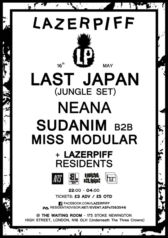
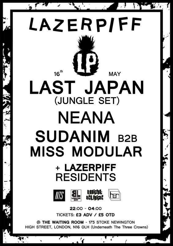
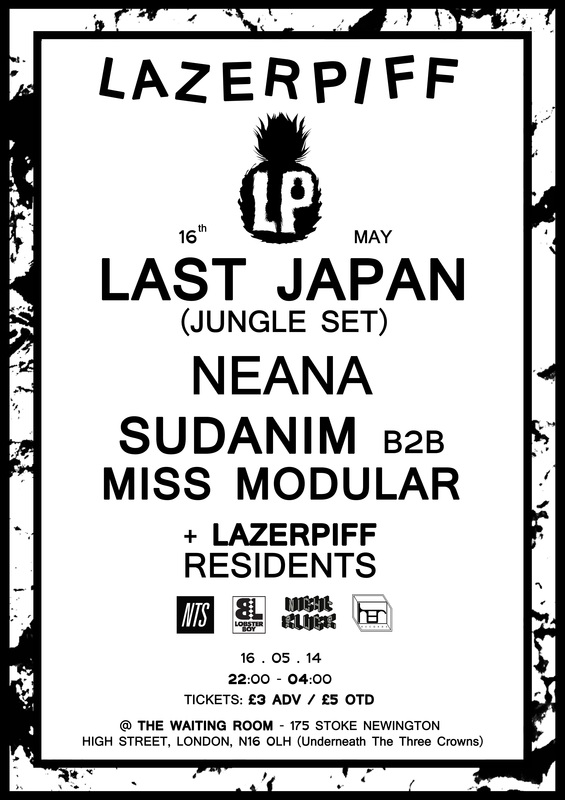
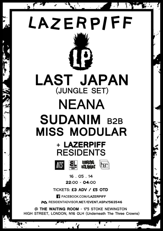
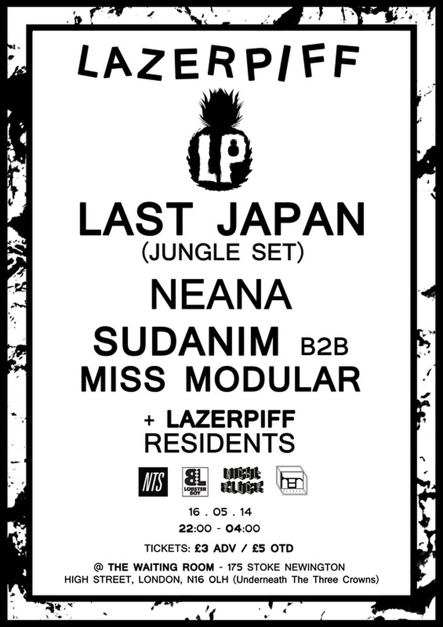
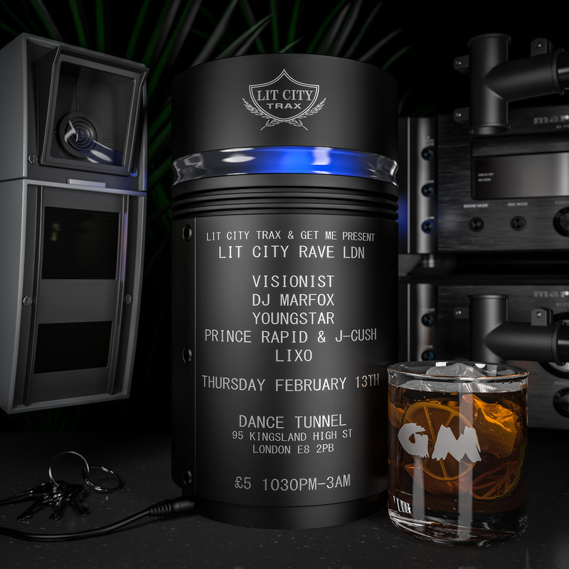
LAZERPIFF
As a way of gaining experience in and researching my chosen topic, I tried my hand at some actual commercial work promoting a forthcoming club night in London.


Alex Sushon Explains The Artwork of His EP Covers
Alex Sushon currently a DJ, Producer and multi-platform graphic designer living in London. He claims to have always had a 'healthy obsession' with music sinse a young age but he only started to properly emerce himself in the more electronic music he is famed for today when he was in the latter year of sixth form like me.
He started out producing grime instrumentals for local MC's under the name of Bok Bok which (as he had to work and collaberate with range of people throughout London) helped to Prublicise his work, mainly through word of mouth at the time.
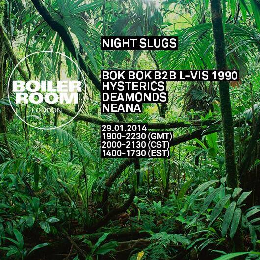
One key component in my fascination with Sushon's work is the link between the art and the music he produces. While making music and Dj'ing at club nights he was studying art at Camberwell collage of arts in London and created all the artwork for his EP's . His music at this point was starting to merge into Dnace music reviving the house music movement that originally grew stagnant around 7 years prior. This new stile of house was a breath of fresh air for many DJ's and clubbing ethusiasts as Dubstep (the dominating dance gernre previously) started to go commercial and lost alot of interested from labels and punters promoting more innovative 'up-and-coming' music. This was Sushon's chance to create something intierly new and he siezed this oppertunity with the openening of a series of club nights under the event label Night Slugs in early 2010. The following extract is an interview done with XLR8R Magazine about these EP covers:
He started out producing grime instrumentals for local MC's under the name of Bok Bok which (as he had to work and collaberate with range of people throughout London) helped to Prublicise his work, mainly through word of mouth at the time.
One key component in my fascination with Sushon's work is the link between the art and the music he produces. While making music and Dj'ing at club nights he was studying art at Camberwell collage of arts in London and created all the artwork for his EP's . His music at this point was starting to merge into Dnace music reviving the house music movement that originally grew stagnant around 7 years prior. This new stile of house was a breath of fresh air for many DJ's and clubbing ethusiasts as Dubstep (the dominating dance gernre previously) started to go commercial and lost alot of interested from labels and punters promoting more innovative 'up-and-coming' music. This was Sushon's chance to create something intierly new and he siezed this oppertunity with the openening of a series of club nights under the event label Night Slugs in early 2010. The following extract is an interview done with XLR8R Magazine about these EP covers:
"XLR8R: What is a typical day when you are at home?
Bok Bok: I wake up around 11 a.m. at the earliest. Breakfast is usually either eggs and chorizo or a banh mi sandwich. This part is important! Then I get down to work for the rest of the day: emails and taking care of business get done as quickly as possible and then I get down to some music by mid-to-late afternoon and into the night.
Did you start doing graphics before music?
I was doing graphics first. It's definitely something I was staying late after school learning to do for fun. A lot of people at that time were trying to make garage in the music lab on Fruity Loops. I dunno why that wasn't me, but there you go. I did go to art school but they don't teach you how to make work there… at least not the one I went to. It's all "theory," apparently (but that's a conversation for another day). You basically get four years to teach yourself as much as possible. I definitely learnt a lot about cohesion, continuity, and how to communicate with an audience in general, though.
Growing up, did have any visual influences that stand out to you now?
In music (as well as any other design), I have always loved series. I find them so satisfying: modularity, repetition, having a template. The Penguin Books are an obvious example. I have so many in the house. I'm referring to this kind of series, with the redesign and new modernist template they brought in.
When you started off with Night Slugs, did you have a particular palette or a general aesthetic in mind?
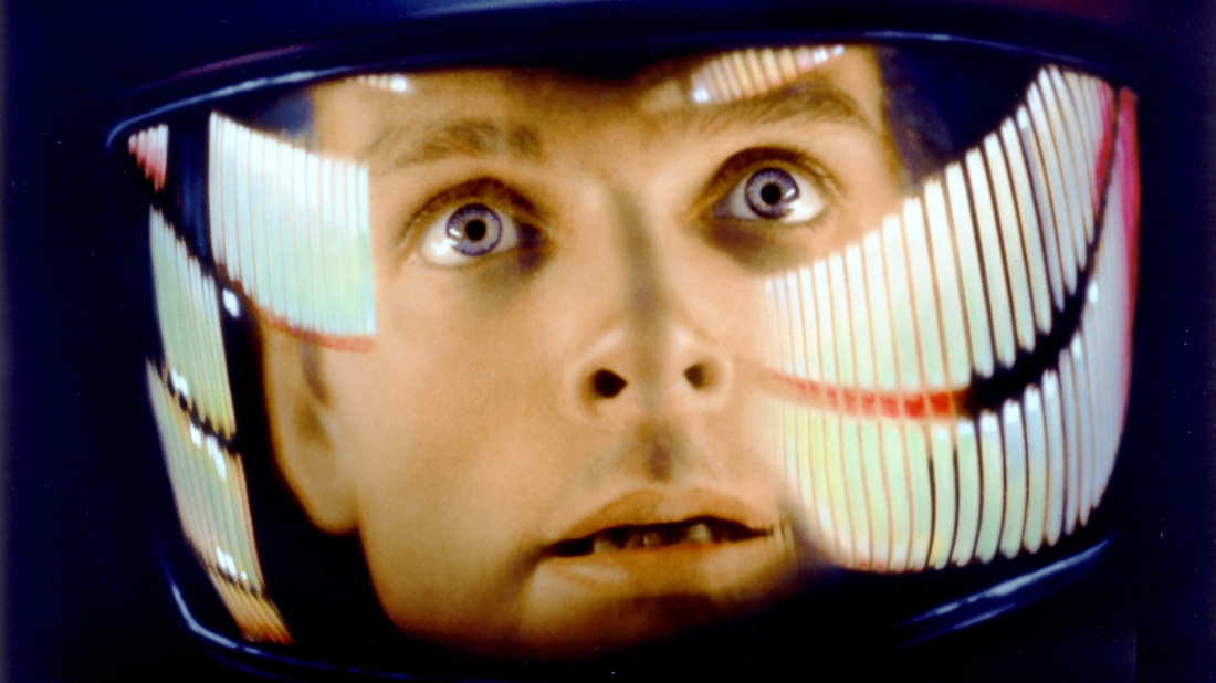
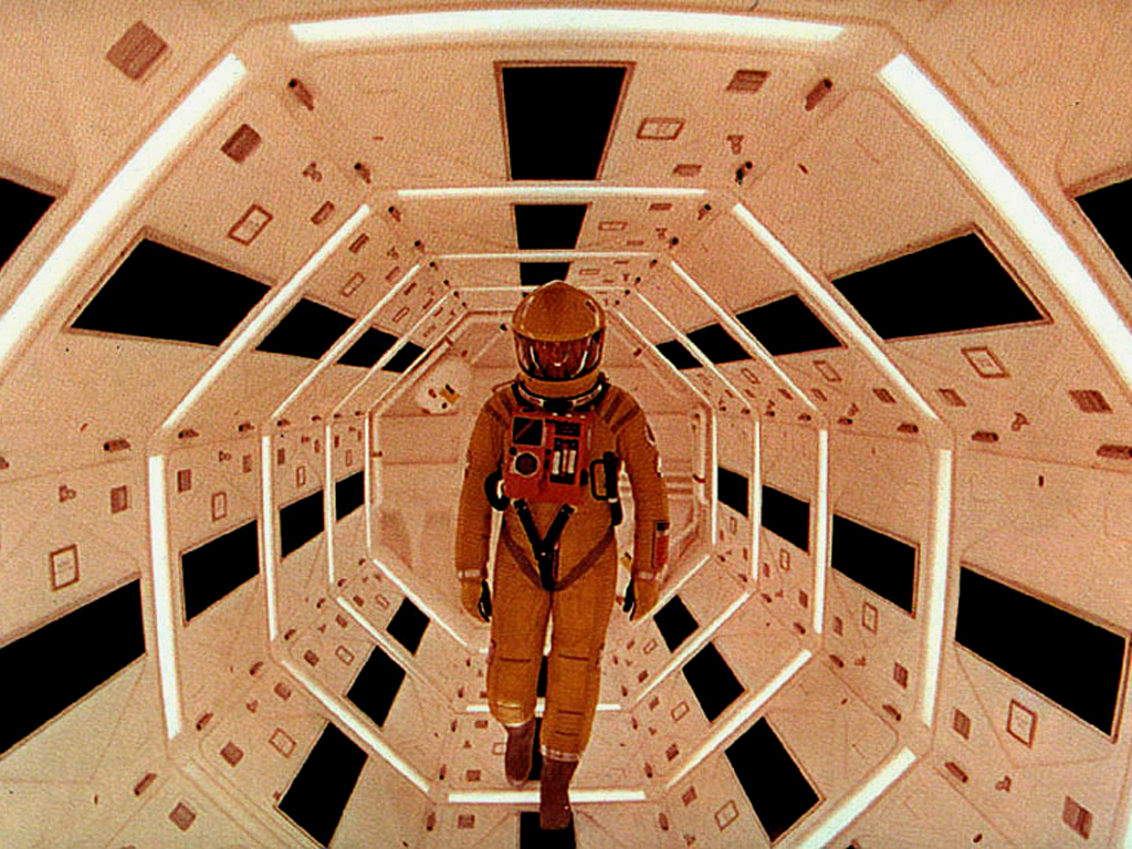
Yeah, absolutely. I kept thinking about the Panasonic Glider commercial and the original Tron, too. They're both such beautiful examples of what you can create with a really limited palette—and even though they're trying to describe digital environments, they're both so warm. I'm generally just really interested in early computer art of this kind, depicting a world of wireframes and light-structures.
That's interesting, given your love of grime music. It seems like another example of something that is simple and often made with limited equipment but really powerful.
Exactly, it's the same thing to me… It's about how to be really wild and expressive with very few elements.
To what extent do you fetishize the 1980s?
[laughs] That's a great question, because I guess it can be leveled at our team as a whole! I mean, we're children of the '80s; for me, the mid '80s. But I'd like to think it's more than just fetishization or tapping into an aesthetic. It was an important time because of where technology and pop culture came to a head, you know? In a lot of ways, it's the last time a lot of things felt truly new and glowed with vibrance.
I'm asking about the '80s because some of the recent Night Slugs releases, Girl Unit and the Jam City in particular, seem to reflect an interest in an '80s electro-funk or freestyle sound refracted through a modern prism.
Yeah, there's definitely a lot of that going on lately. We're all close in age, so I guess that syndrome sort of runs across the whole camp, but I always like to circumvent thinking about time in a normal way. I always joke that in Night Slugs time doesn't exist, so we can just pluck whatever we want from wherever. I don't think about being futuristic any more than I think about being retro. It's all more abstract to me; it's all arranging structures and shapes until they're in a really bold formation.
I also wanted to talk about virtual reality in relation to Night Slugs. Girl Unit was once telling me how you guys used to be into Second Life. What interests you about those kind of virtual environments?
Second Life is kinda dying, but it's really interesting for so many reasons, not all of them good. On a really basic level, I like just cruising around and getting vibes from the scenery. People make, like, their own islands and stuff. I think of it as tourism. Kinda like this [Minecraft recreation of Frank Lloyd Wright's Ennis House]. I'm into a lot of 3-D representation in general; it just makes me laugh a lot of the time, which is a big part of the appeal. At Christmas time, we tend to get mad high and just fly airplanes on San Andreas into sunsets and stuff. In terms of Night Slugs, the artwork has always definitely always been a place for the music to inhabit. It sort of works to put all the releases together in their own world or worlds.
Do other Night Slugs artists think of their music as being made for virtual environments?
It's interesting because yeah, a lot of the time we do talk about an idea of the location or situation [the music is set in]. It might not be in [the artist's] head when they're writing, or maybe it is…
I know you didn't do the cover of the Jam City Classical Curves album but I think it ties in so well to this idea.
I'm glad you think that. The whole art direction of the label is definitely in a new phase. It's slightly different the way we did the Jam City cover, but I still think it ties in to the aesthetic just as much. It's the same thing [we've been doing, but] with a lot more definition because that's what his vision dictated. He was more focused on a very specific situation for a lot of reasons, some of which he goes into in thisinterview with Dummy Mag. The cover was done by a genius team called Bowyer, and then Ms. Muzik Channel made the videos. It was an involved project for sure.
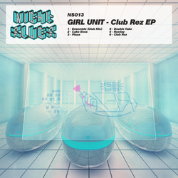
For [Girl Unit's] Club Rez, the rendering was done by Sina Taherkhani, an NYC-based multimedia designer. He does a lot of really cool stuff in 3-D, so we'd give him a really specific spec of exactly what we wanted and he would bring it to life. The music is becoming more high-res, so I feel the art should follow. This will mean more collaborations for sure. I might not be the one drawing the covers, but it will still be me putting together the concept or [me] in collaboration with the artist. The ones where the artist has a really strong input are always the best."


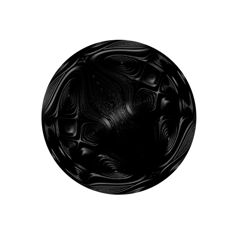
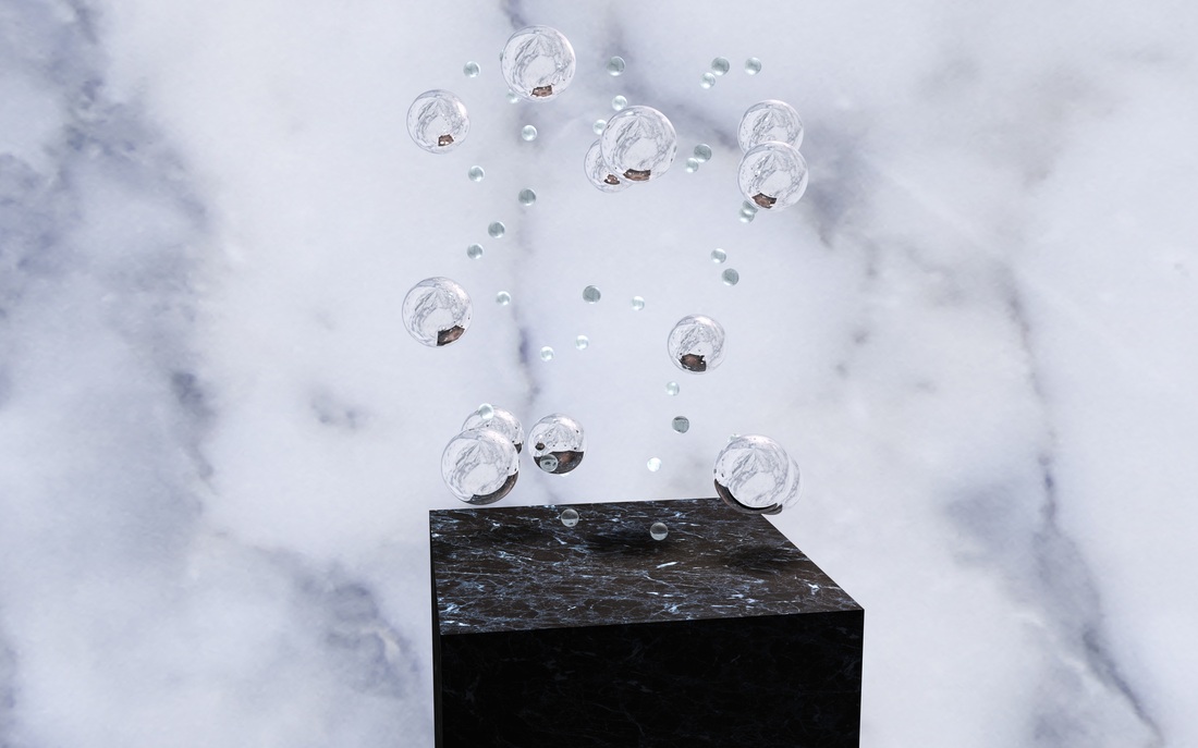
'I like the 2nd one, but it Needs more contrast between the ball and the background'


'I like the shadow but it needs to be more subtle'

'Higher contrast generally'
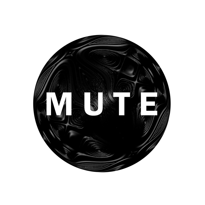
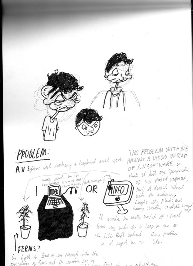
Problem:
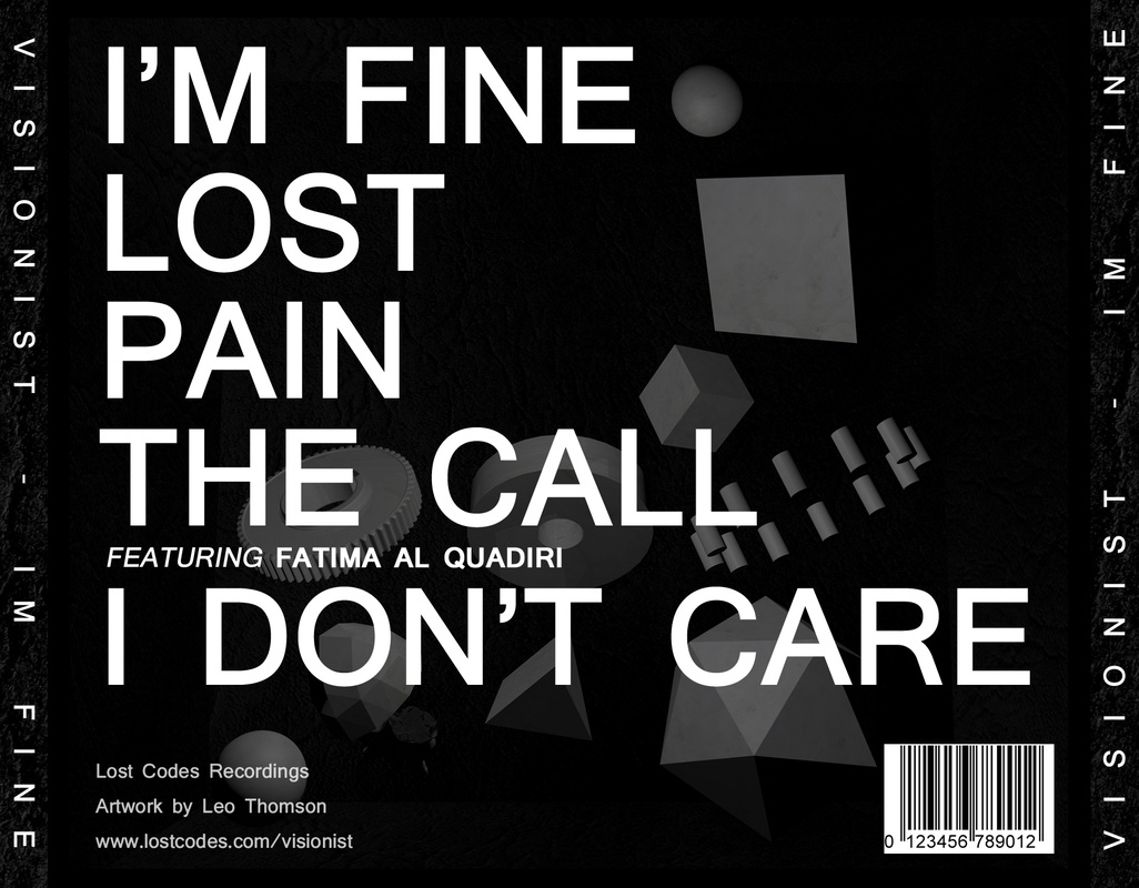
I encountered a problem at this stage. I needed to display the text in a way that complimented the other artwork on the EP cover. Using white letters was preferable, they looked the best in initial tests, however, you the background was far too light for them to be sufficiently visible. One attempt to solve this problem is pictured on the left. I don't think the semi-transparent black text went well with the rest of the cover so I experimented with some more potential solutions, as pictured below:
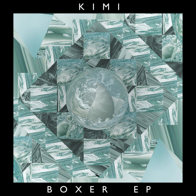

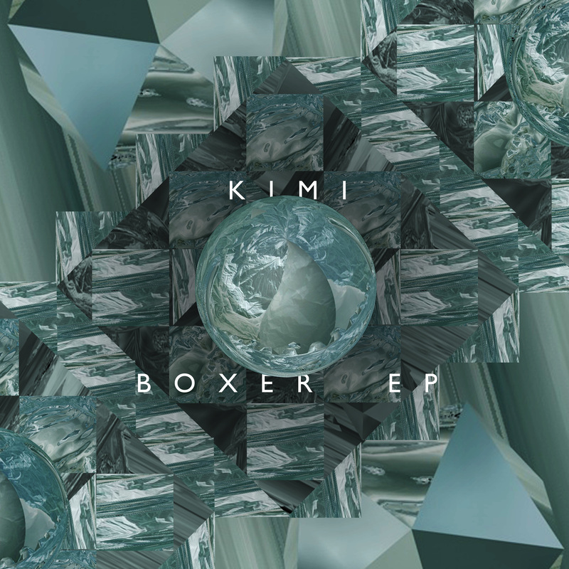
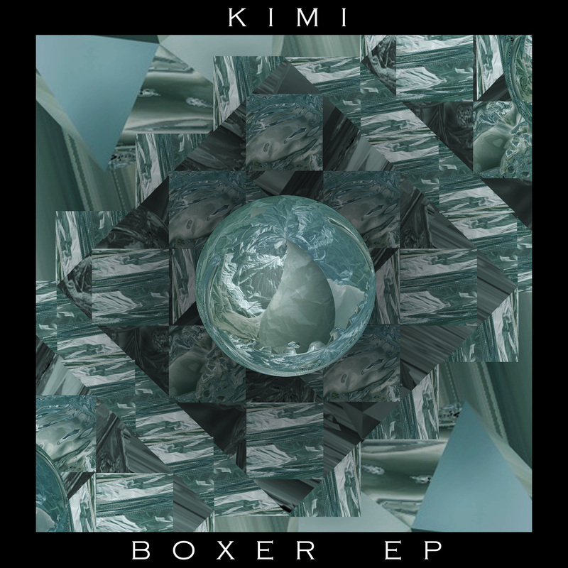
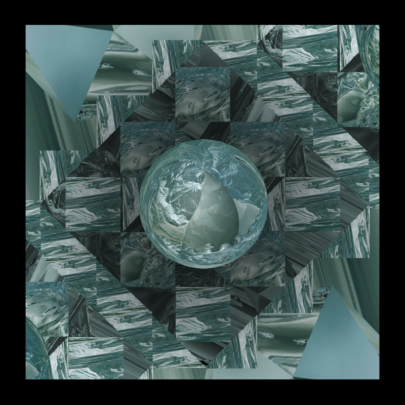

'Needs to be closer-up'
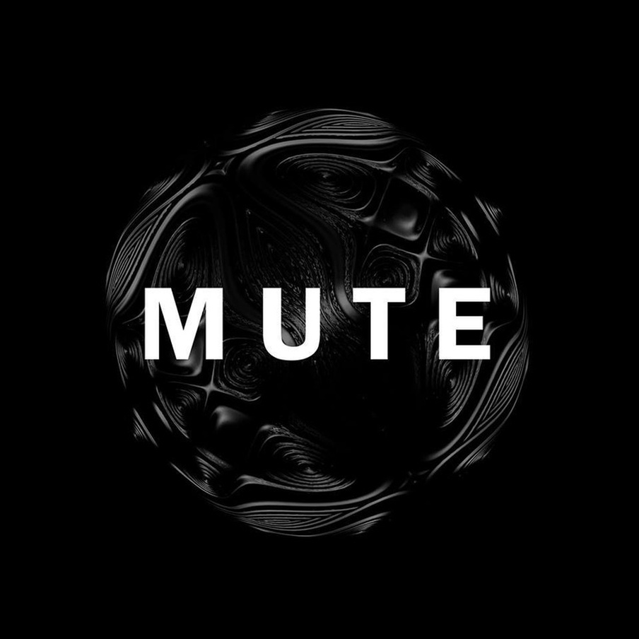
Final Version


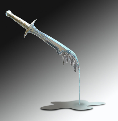
Inspiration:
|
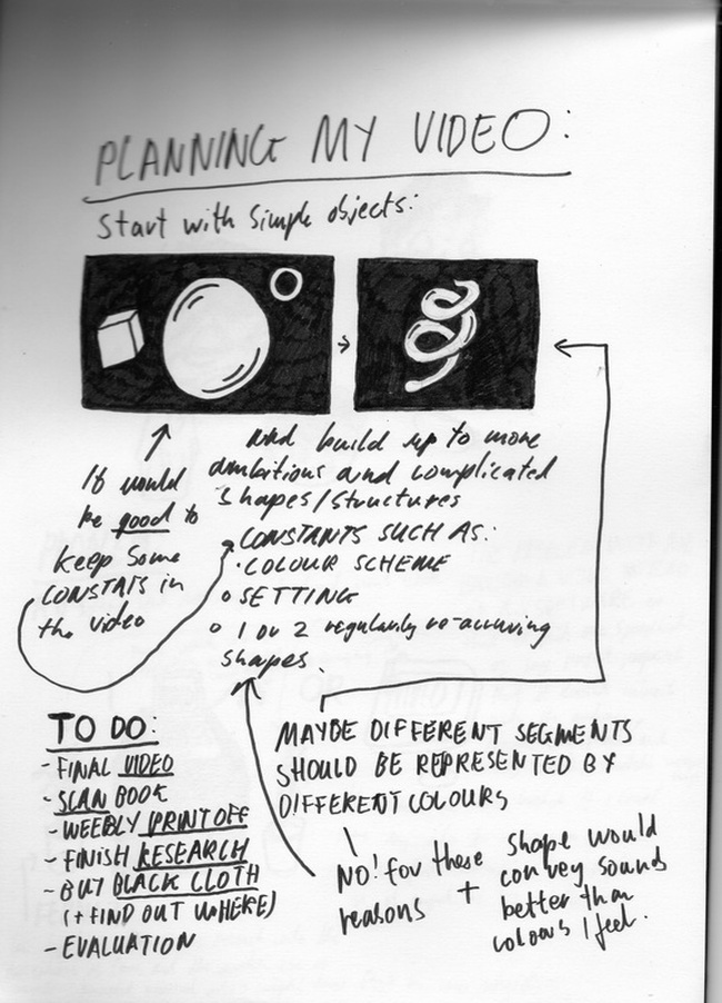
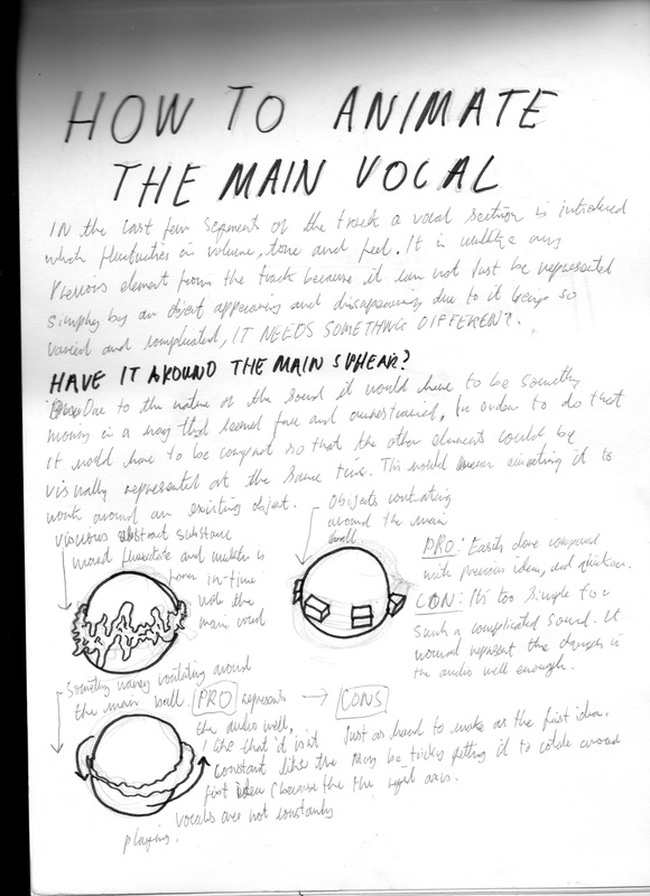
I found the visuals were very well synchronized with the music in the sense that it seemed to build from an initial simplicity to something more elaborate and vibrant at the same pace as the music. By the end of the video you seem to see the music and the visual representations of them as one and the same, I like this and if possible I would like to achieve this in my video. Here is a simple test I did with this in mind (below):
|
|
Test:
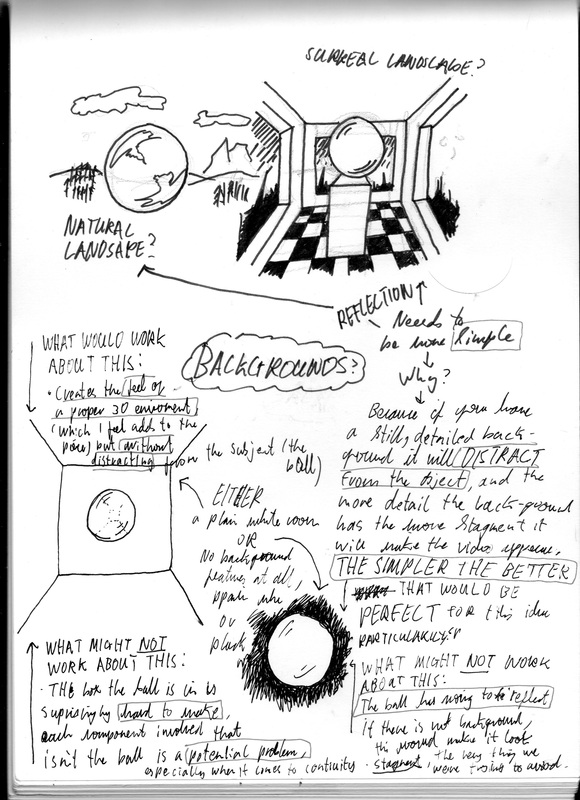
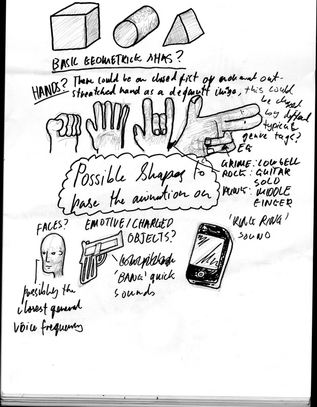
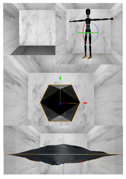
Kim Laughton's use of the box
Kim Laughton's use of white boxes helps to give a certain continuity and theme to each of the artworks which use them but in a way that doesn't really distract from the art within box itself. My idea for a series of videos has the requirements so this method would be perfect.


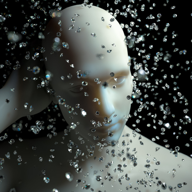
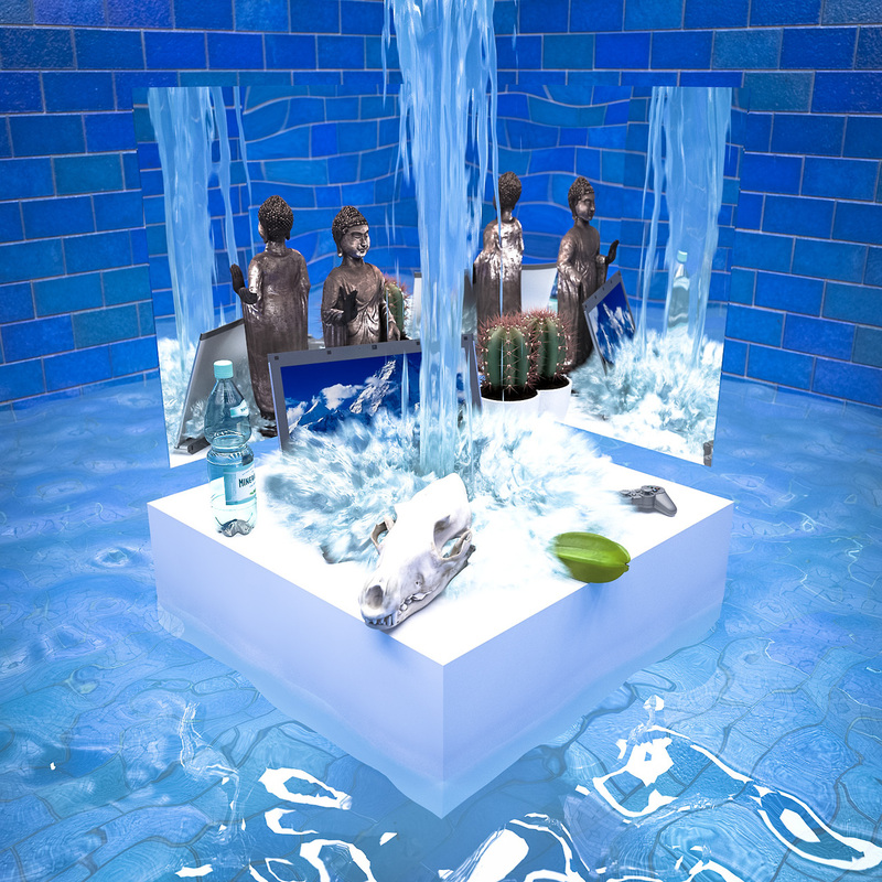
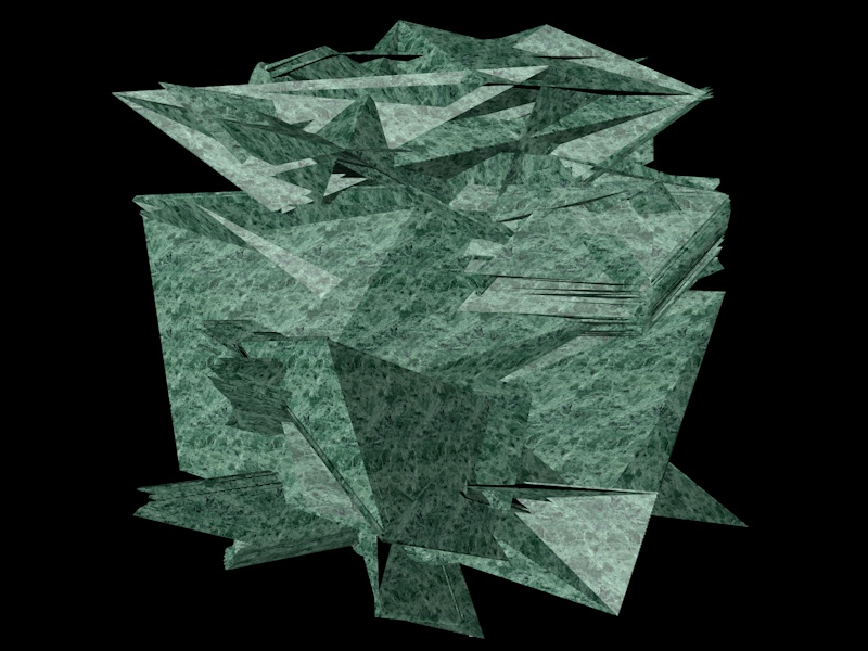
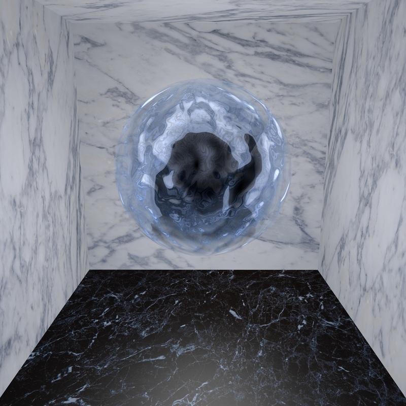
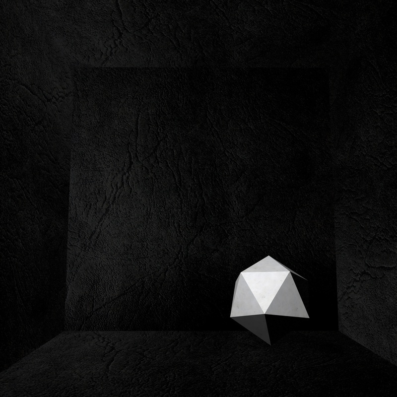
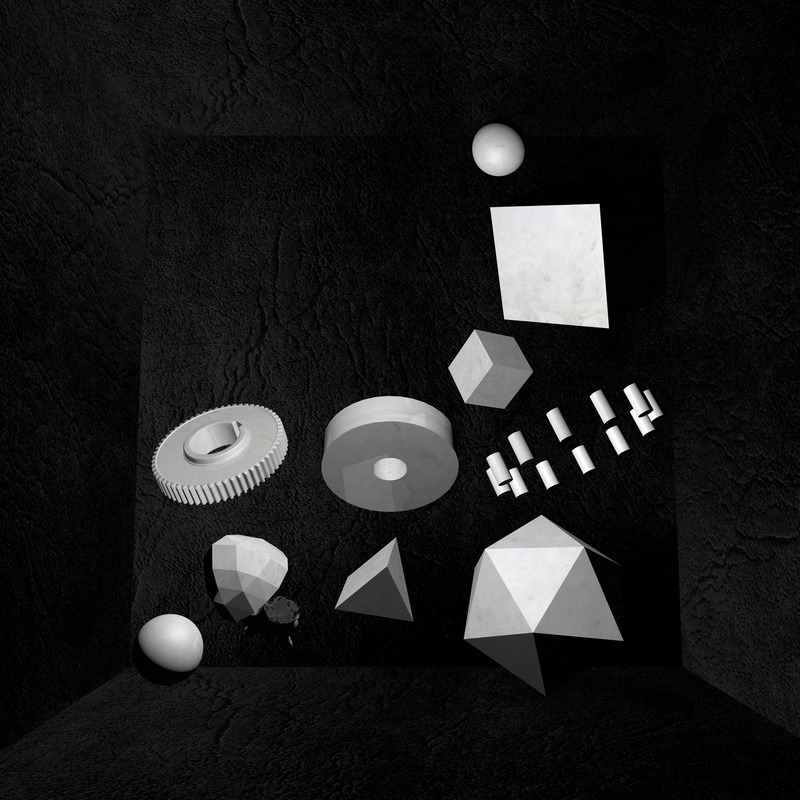
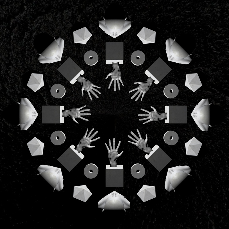
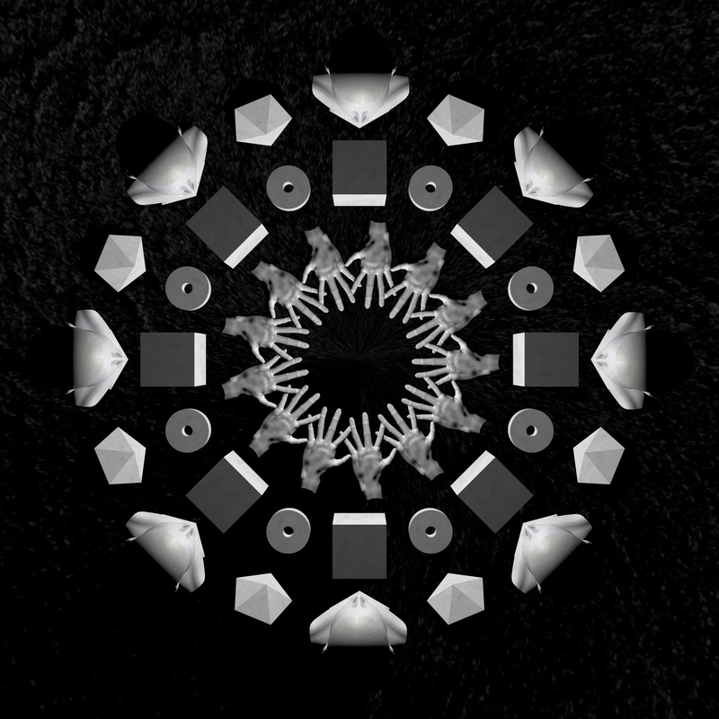
This piece was done in response to the music promotional work of Kim Laughton. I just found the parallels between Jam City's 'Classical Curves' EP cover (as mentioned earlier in the Bok Bok interview) and his 'white box' series, what they both had in common was the way they use objects to set a scene. The effect of this I find to be slightly more powerful in the case of Kim Laughton's work as the objects have no obvious link to each other at all. This tends to stimulate my imagination considerably more than if they did make sense. This is an element I feel I would like to continue to have in all the still images in my project promoting music, why? I base this on the simple even crass philosophy that if something about a project makes you think you will remember it better. This is perfect when you have a product that people can't experience in the way that it was primarily meant to be. This works with things such as perfume you cant smell but you try out because you liked the look of the advert or poster, the same thing goes when it comes to seeing the cover for an album when you don't have time to actually listen to it, a cover that grabbes your attention and makes you think means you are dramatically more likely to give it a listen later. Here is my own experiment with setting the scene
I thought it might be more memorable if i limited the colour pallet more strictly, and I think it looks better for doing so but I still find myself coming back to the one with varied objects more. For this reason, all in all I would consider the 1st test more successful.
The Track I Chose to Animate
|
|


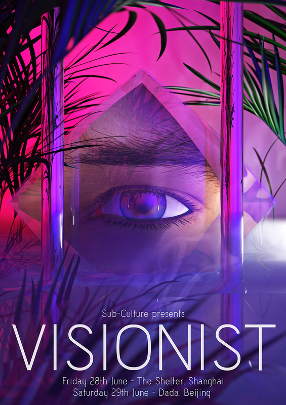
Promotional Teaser Posters

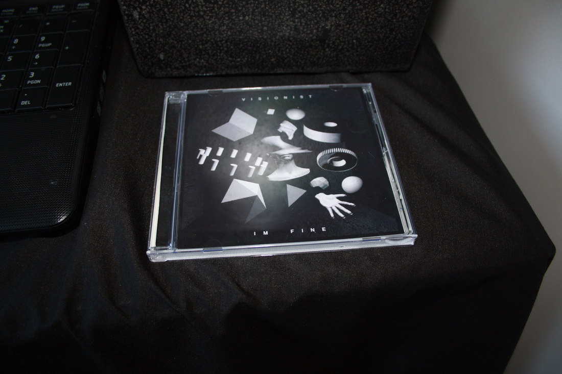
Disk Cover Drafts


- Some parts slightly out of time:
0:58, 1:09, 1:26, 1:30
- Needs to keep building up
- Higher quality on youtube
0:58, 1:09, 1:26, 1:30
- Needs to keep building up
- Higher quality on youtube
2nd Version
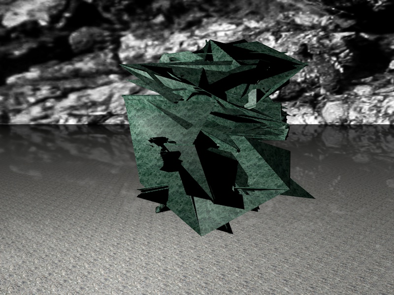
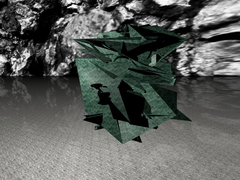
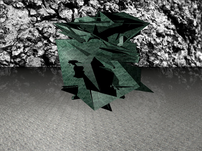
How it should be Presented in the Exhibition
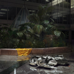
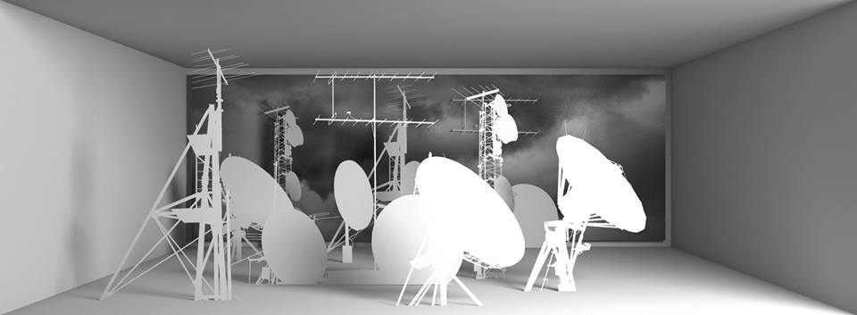
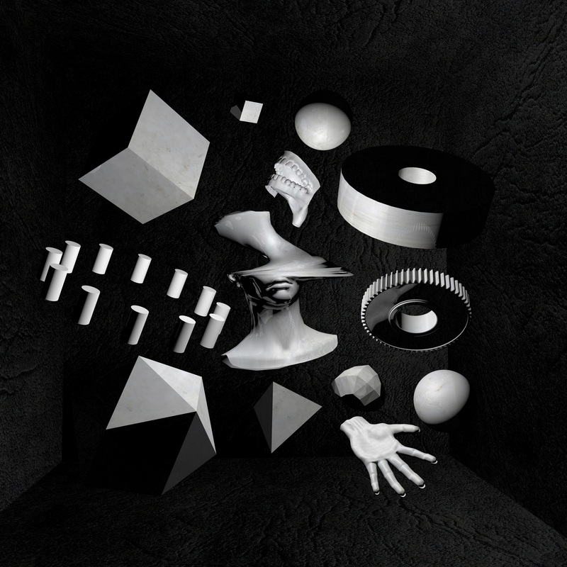
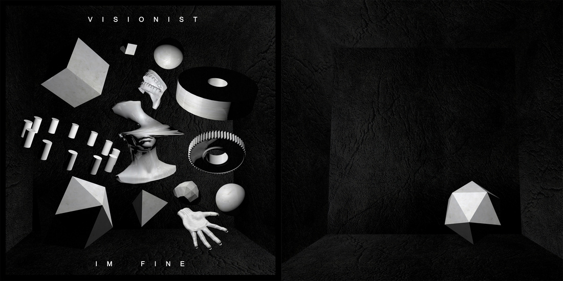
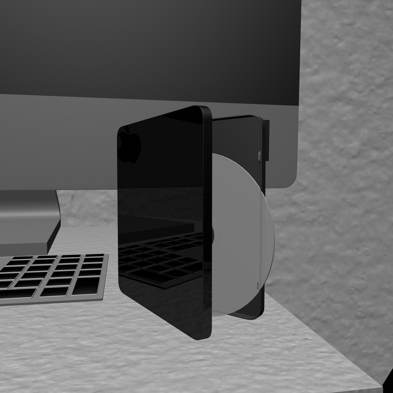
The Role of Plants in Selling and Presenting Modern Dance MusicThis may seem oddly specific but it's something that has always drawn my eye. Recently a use of ferns or plants has become a kind of sub-staple with the visual presentation of modern dance music. It features throughout EP covers, flyers and just general promotional artwork.
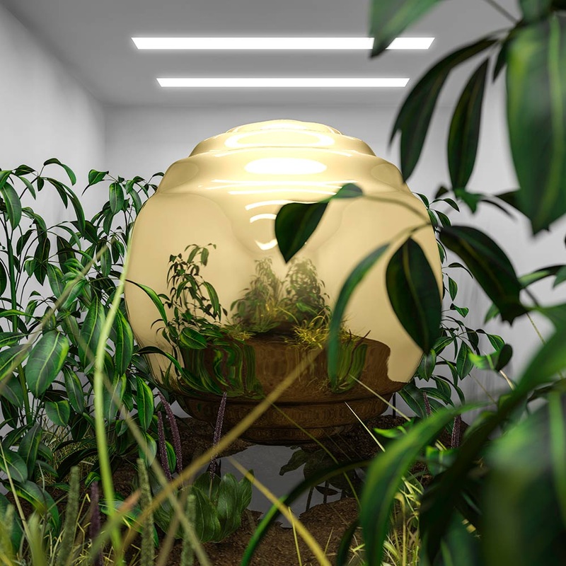
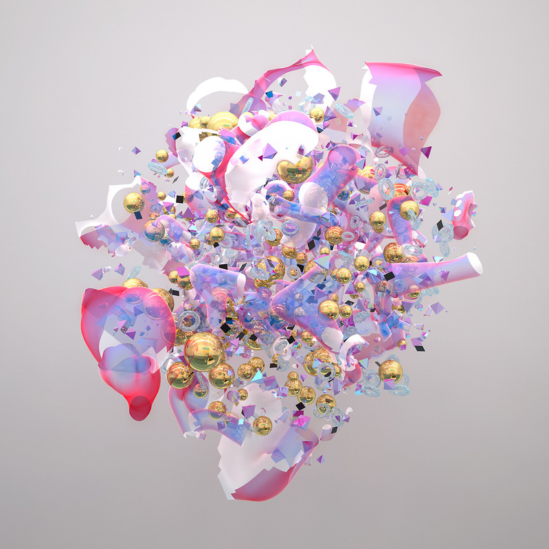
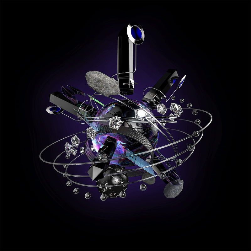
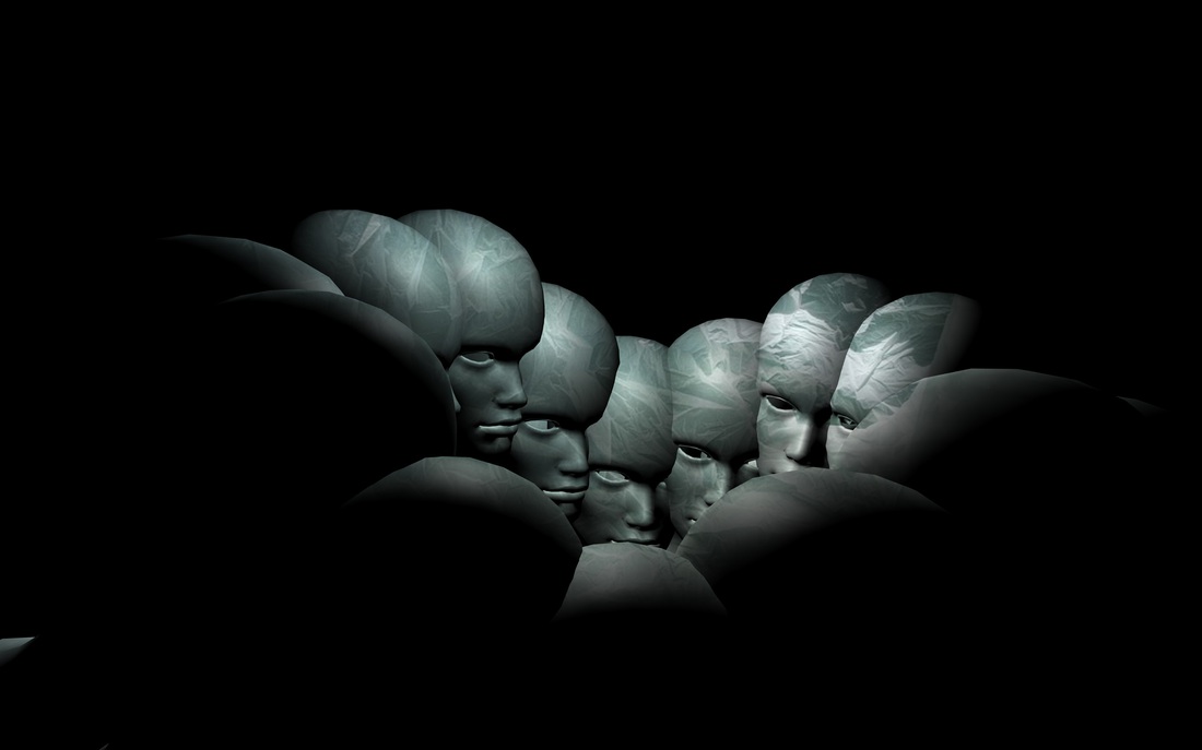
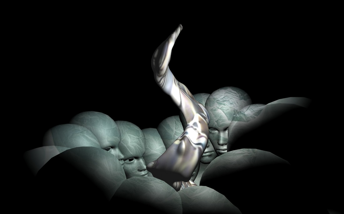
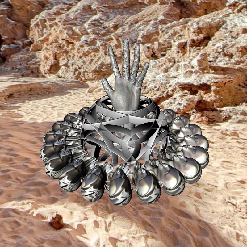
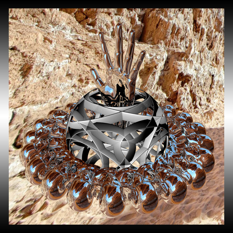
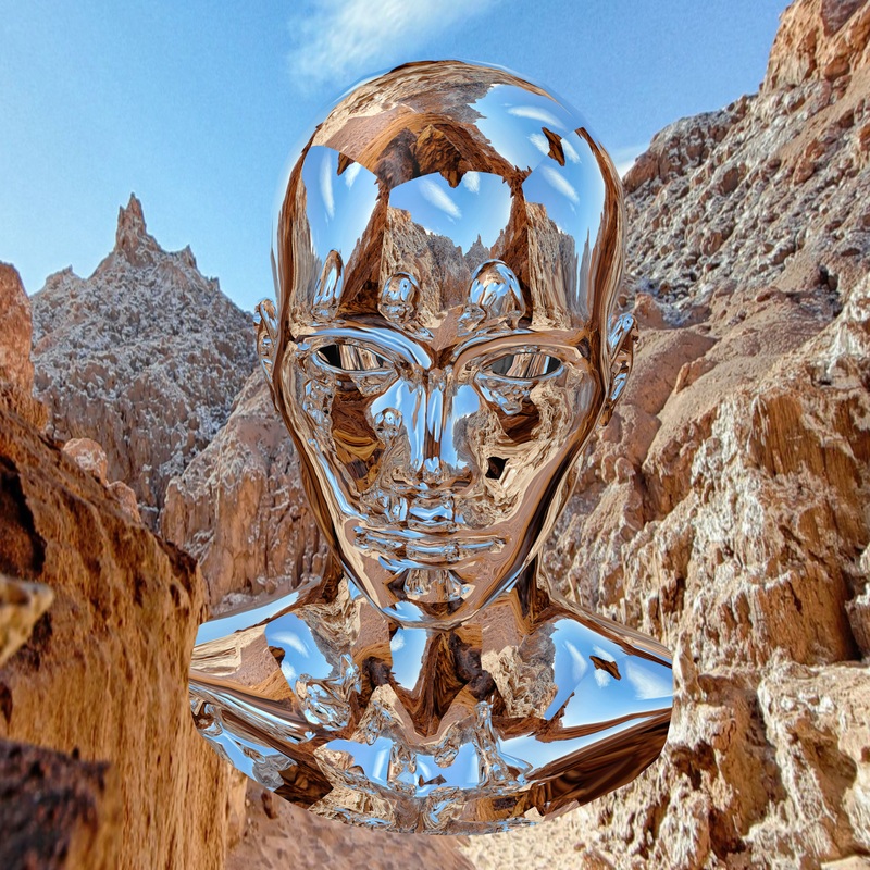
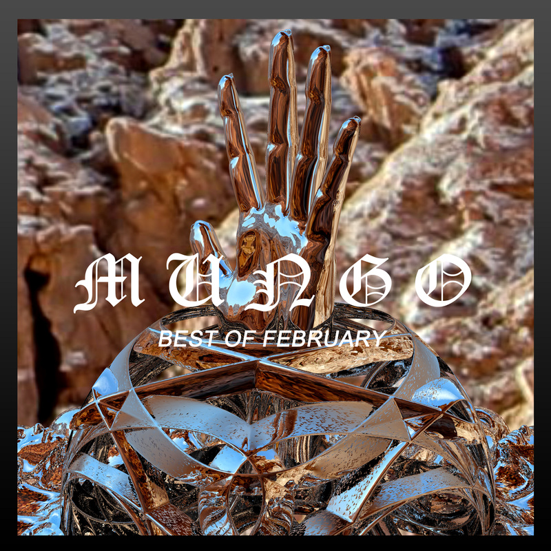
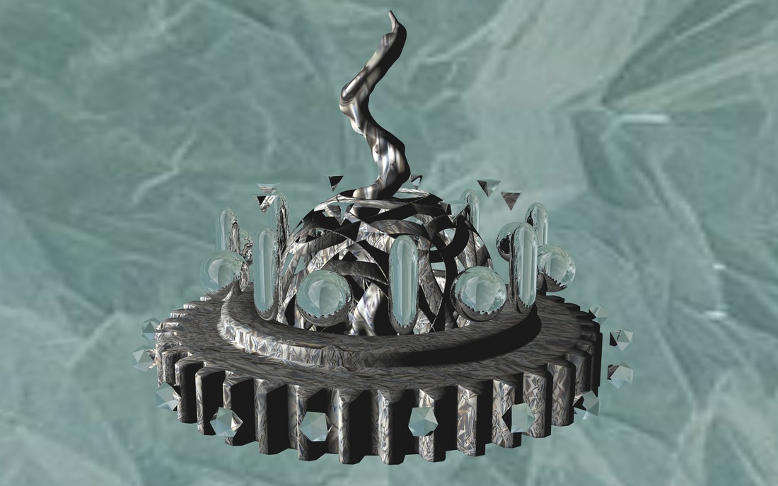
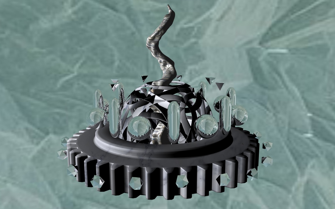
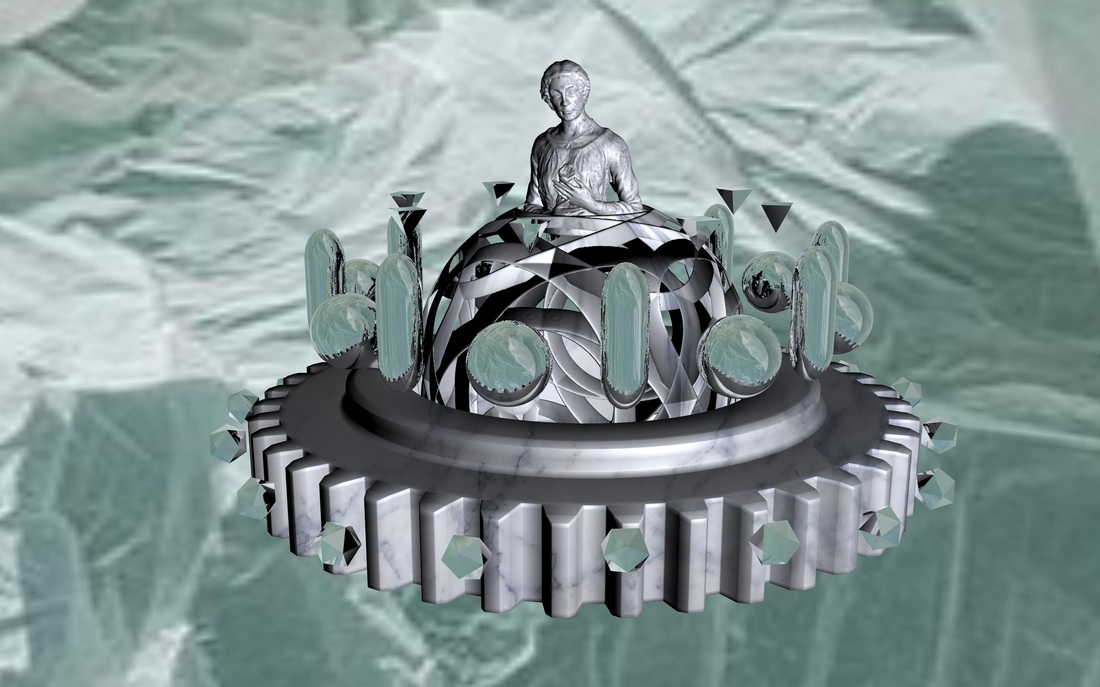
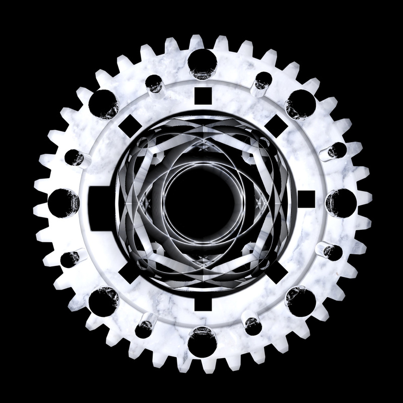
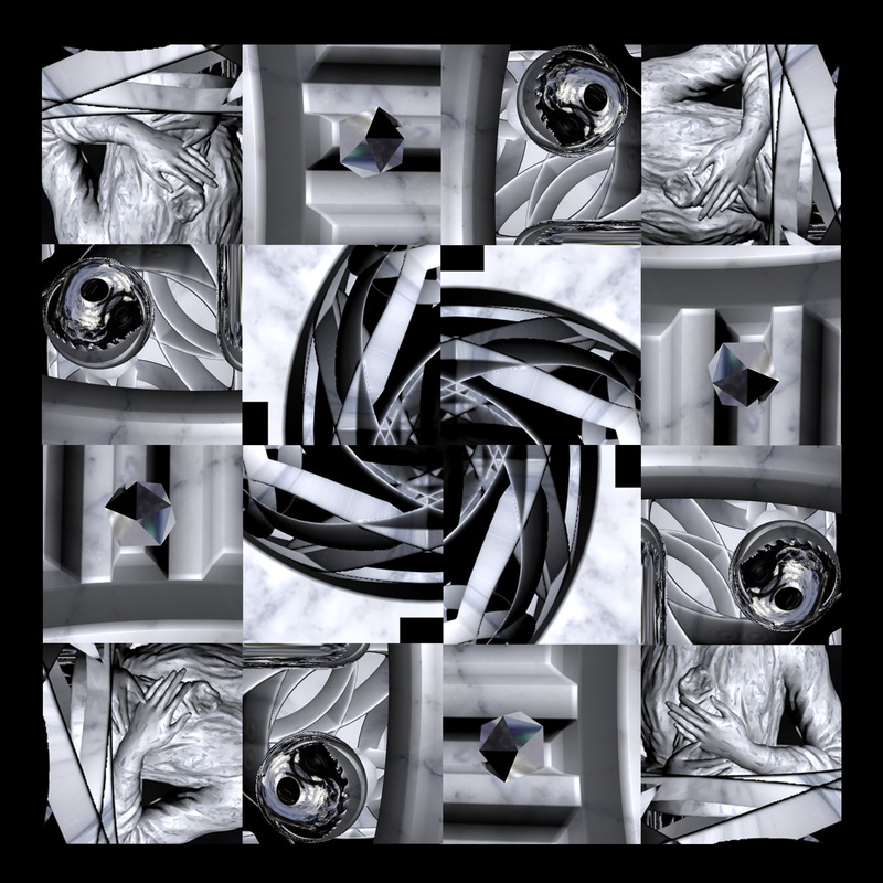
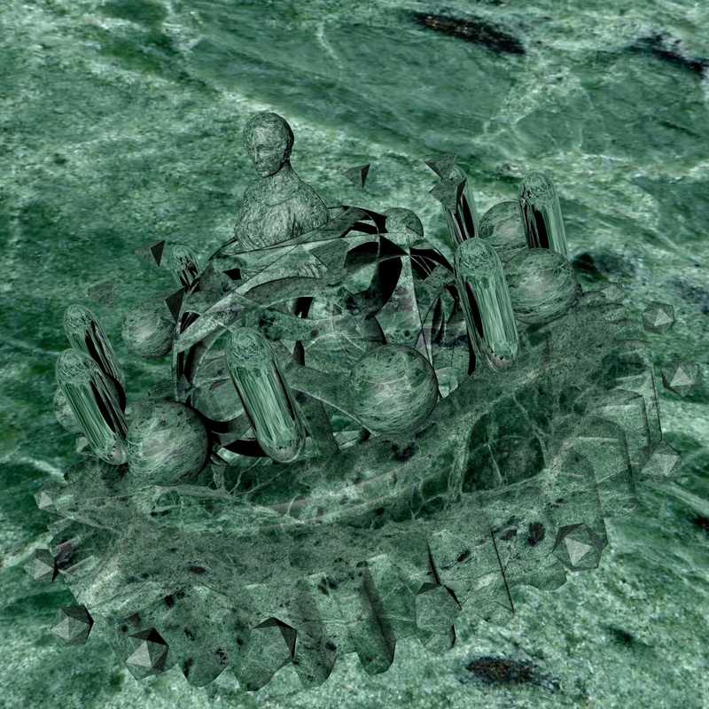
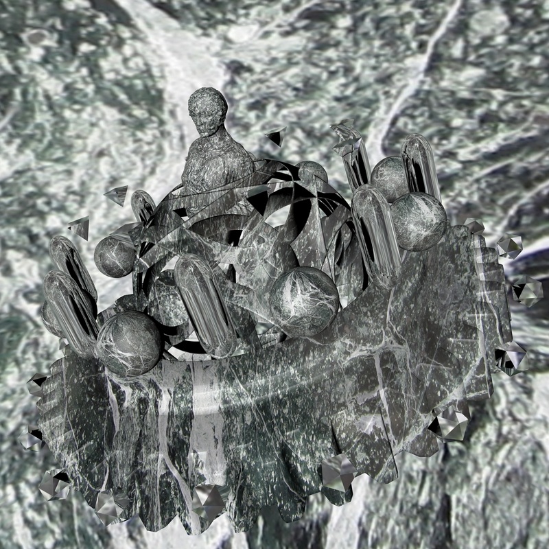
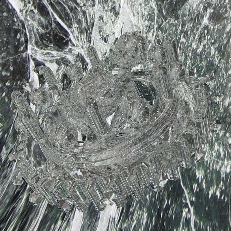
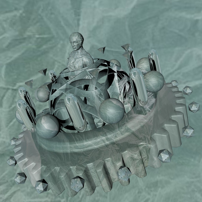
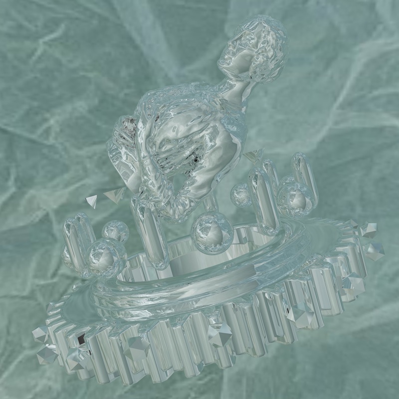
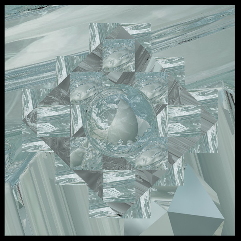
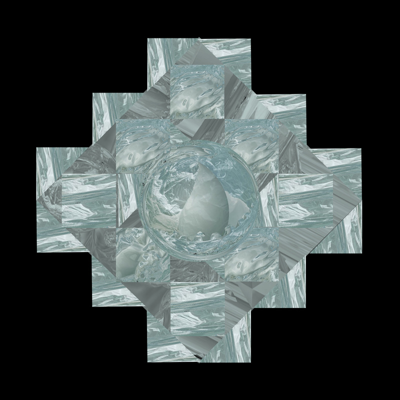
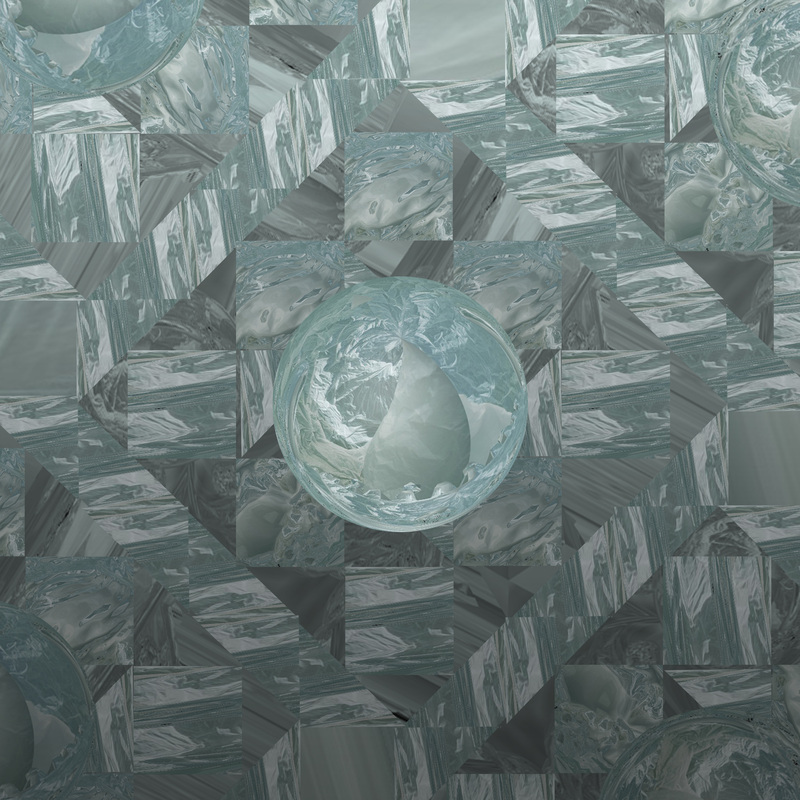
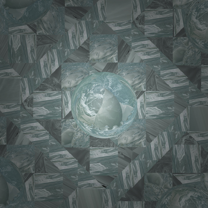
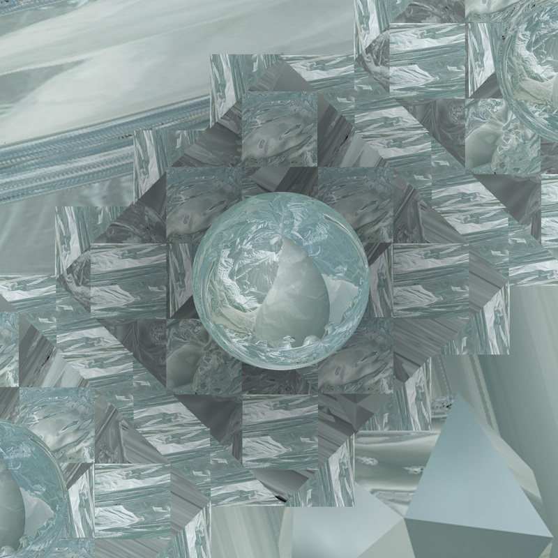
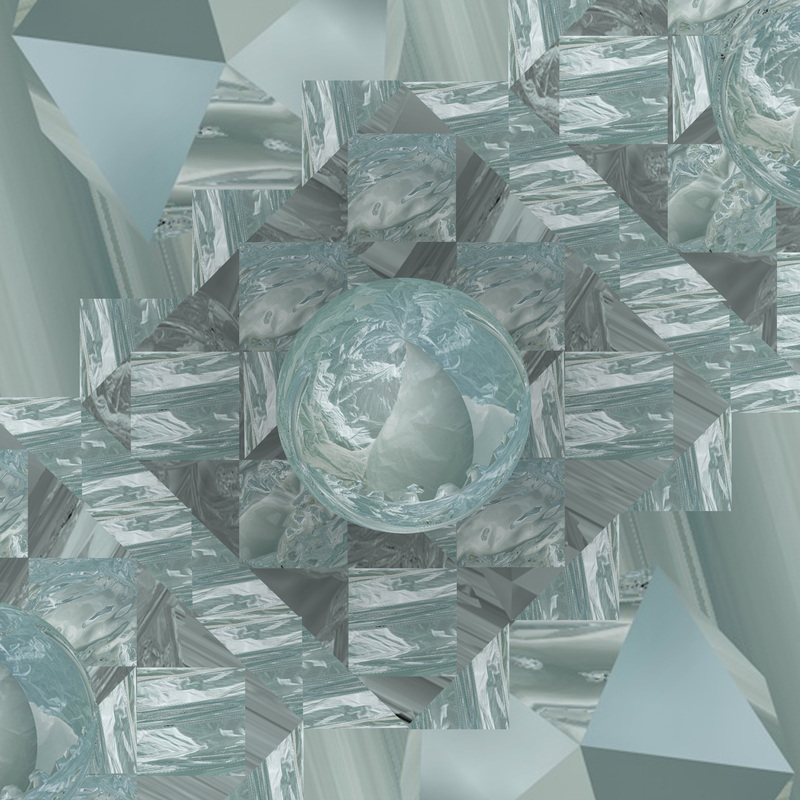
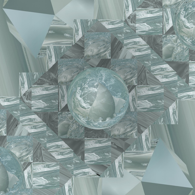
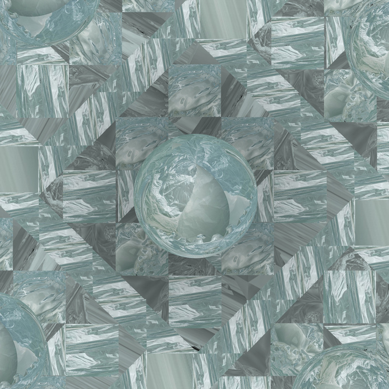
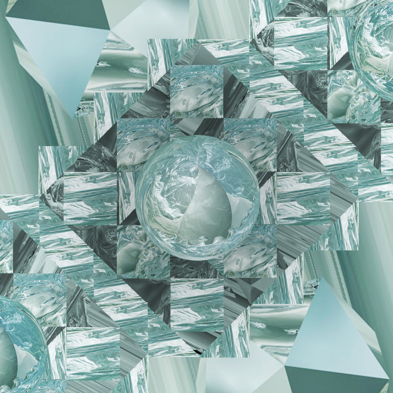
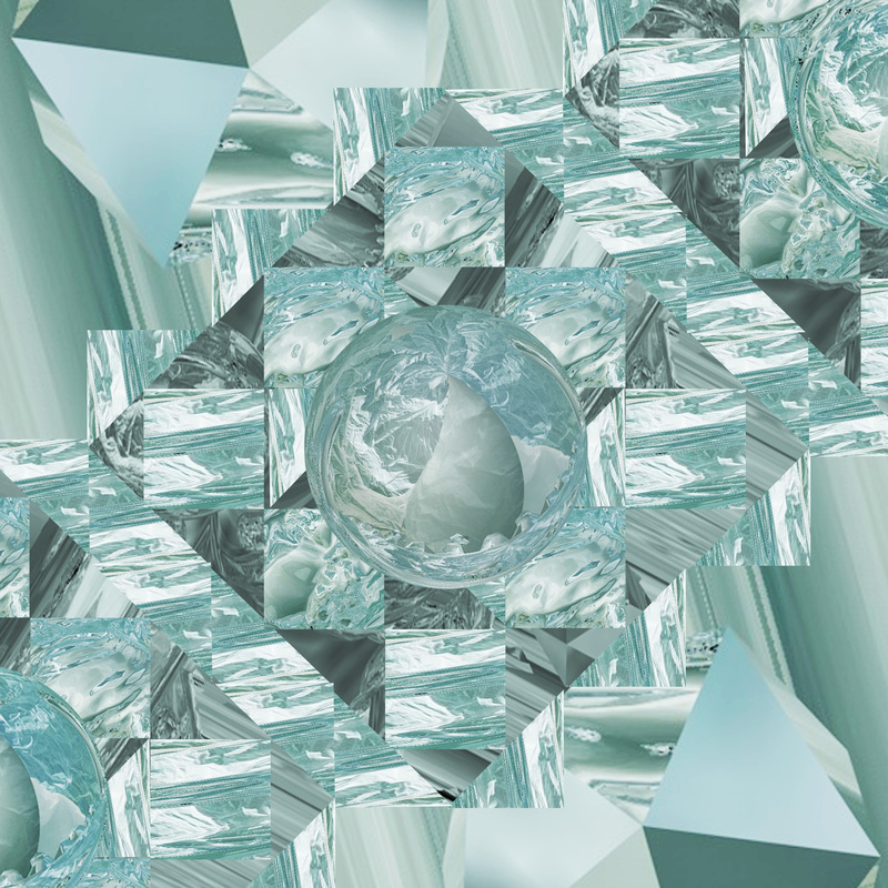
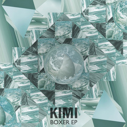
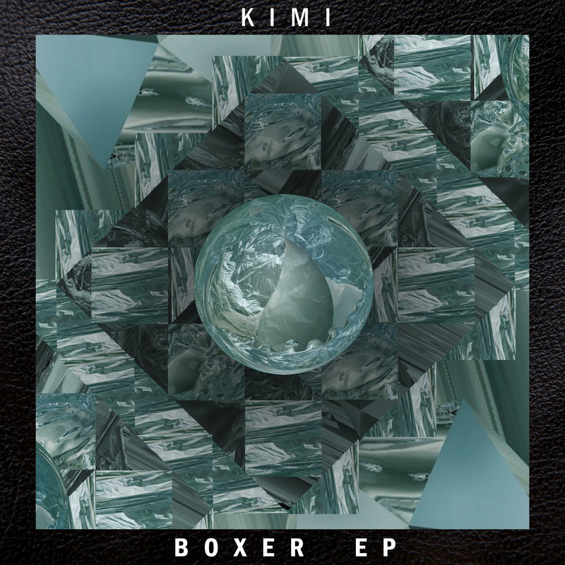
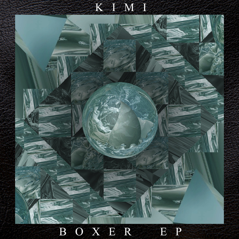
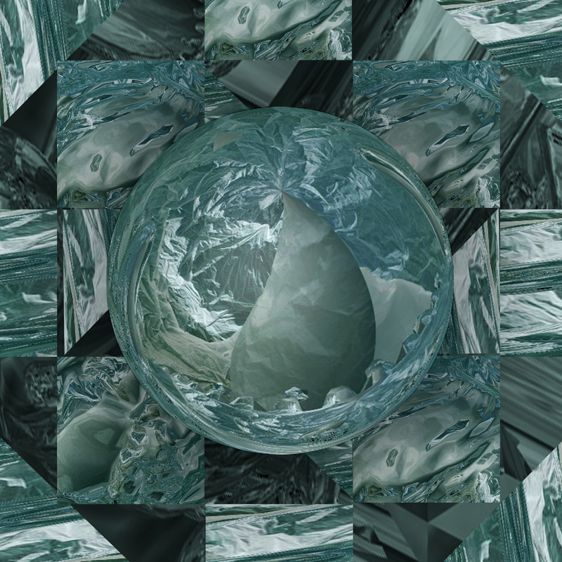
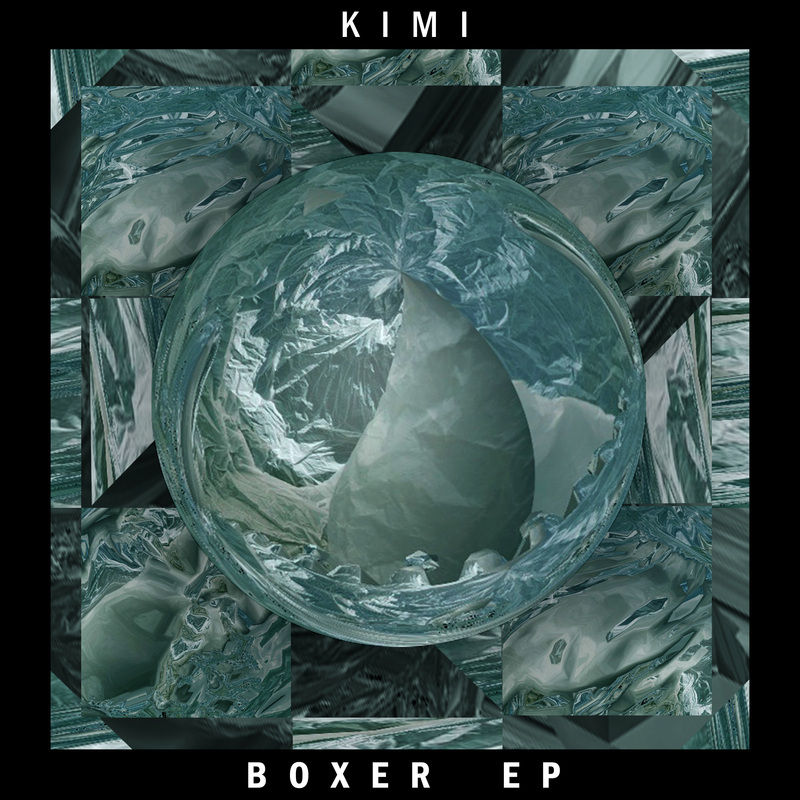
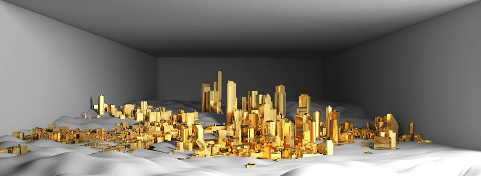
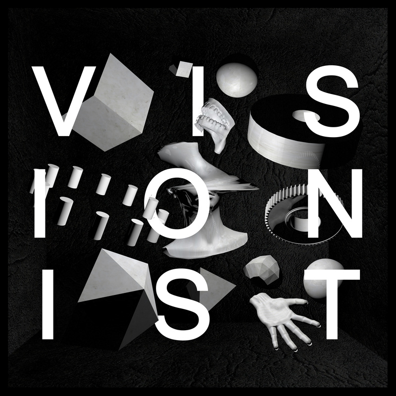
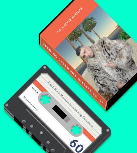
Where did it come from? This trend only seems to have surfaced literally in the last year and its origin escapes me. The thing with trends is that they often arrive out of a selection of works which become popular but there is no way of grouping them together under a name or category, particularly at this stage, in short, this style doesn't have a name yet so it's impossible to google or search for books on in the library. Having said this, we can search for the answer to this question with a different approach: Who was the first person to use them in this context? In the context of promoting and selling modern dance music the first person I notice to use ferns and general plants in such a way was Chris Hamilton (as interviewed previously) in his work on the cover for Night Slugs signed Artist Jam City's 3rd EP - 'Classical Curves'. When it was released it stood out initially in a mixed and controversial way. Instead of using the seemingly infinite possibilities of computer art to escape the reality it has instead tried to replicate it and has used the media its made in to eventually create what the designers of it (Alex Sushon, James Connolly, Chris Hamilton) believed to be a sort-of perfect photo. By this I mean that it is essentially an image of an environment like real life except you are in complete control of every single element of it. Possibly becuase of it's innovative approach this later became a sort of staple of Night Slugs and their American sister label Fade to Mind. I guess this all relates back to the connotations of art and music and how they bounce off each other. People, (me being no exception) who liked the music tended to like the covers that came with them and vice-vesa. Before long it became a staple of the label istelf and eventually a symbol for forward thinking underground music. |
|

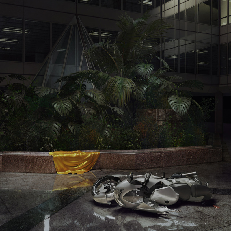


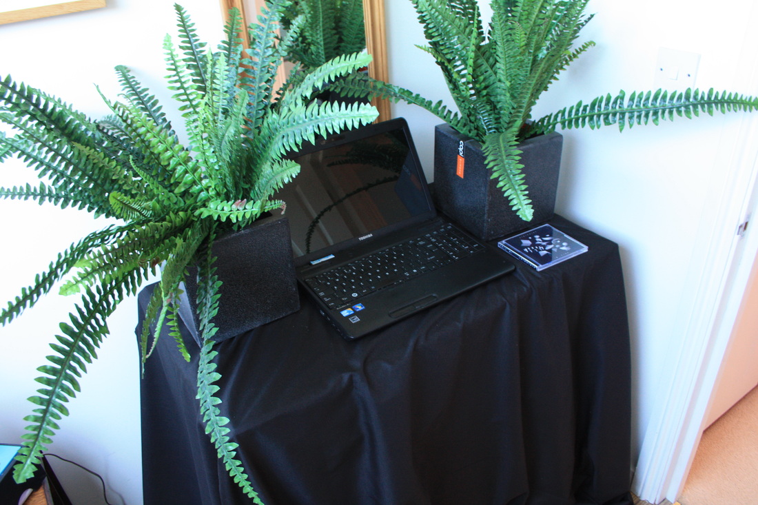

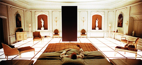
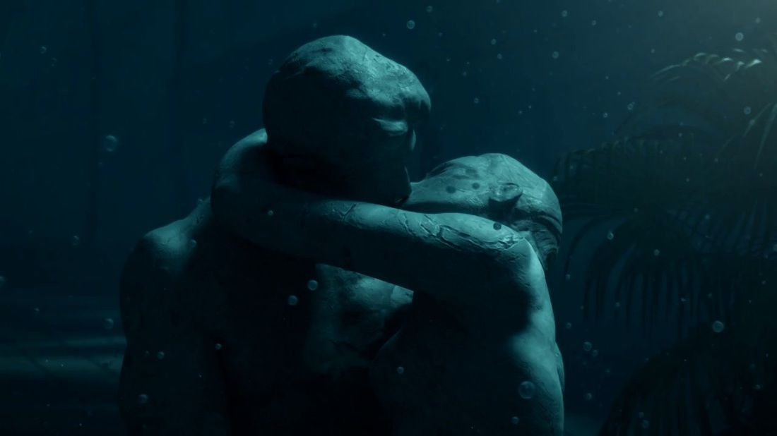
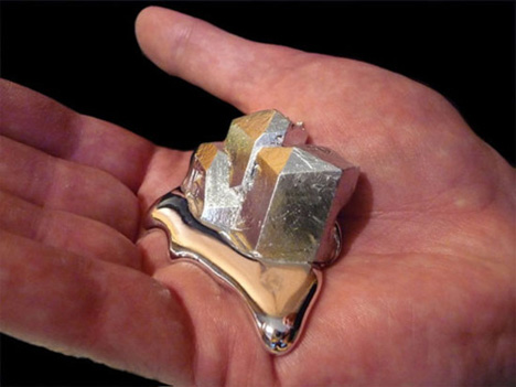
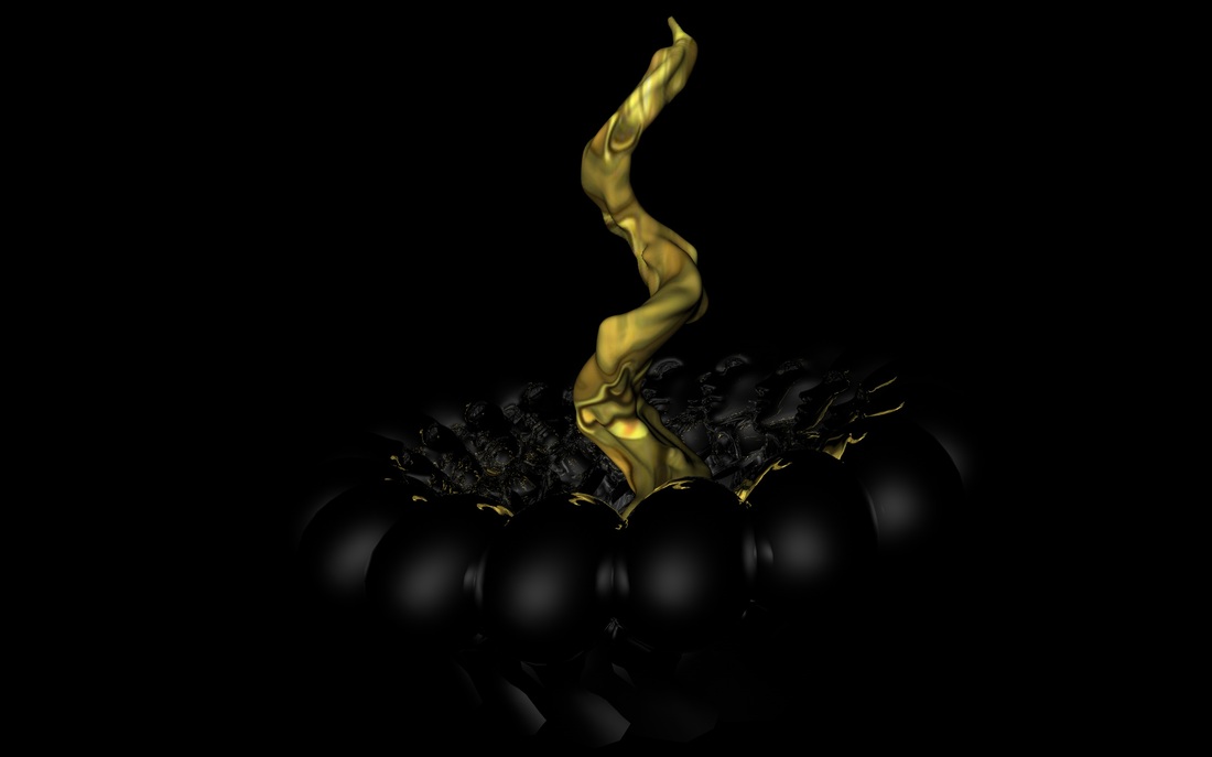
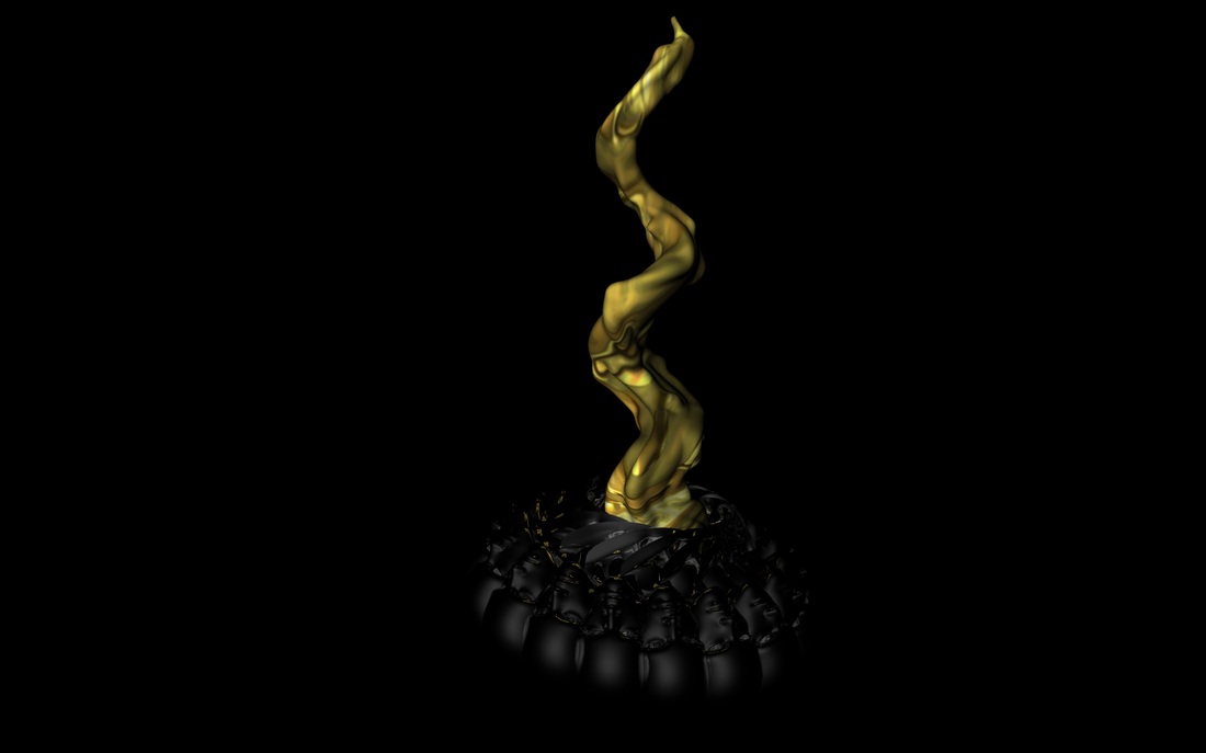
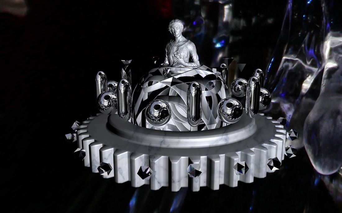
Why the black draped cloth? The black draped cloth is not just a nod to the gold draped cloth in the main inspiration of this piece (also pictured left), but I also wanted it to be in keeping with the very dark, minimal theme that has been set my the video and EP artwork I have created for the track. Of course the platform has practical benefits in the context of the exhibition but I also wanted the way the project was presented to work as a giant extension of the video itself.
